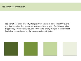
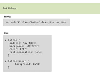
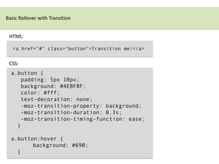
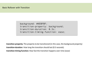
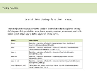
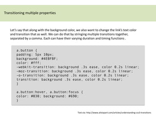
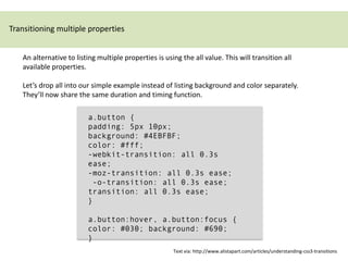
CSS3 transitions allow property values to change smoothly over time during transitions triggered by events like hover or focus. They are defined using transition properties like transition-property, transition-duration, and transition-timing-function. Multiple properties can transition at once or the shorthand "all" can be used. Transition timing functions like ease allow the transition speed to change over its duration. Browser prefixes like -webkit are needed for compatibility. Transitions are useful for hover effects and other interactive transitions.
here's a proof-of-concept approach to process SQS messages with AWS Lambda and incorporate auto-scaling to elastically scale no. of instances of Lambda functions based on load
АПК«Веда Пульс» Решает задачи и потребности специалистов. Позволяет:
- проводит оценку функционального состояния пациентов;
- формировать индивидуальную программу реабилитации в динамике.
АПК«Веда Пульс» Решает задачи и потребности специалистов. Позволяет:
- проводит оценку функционального состояния пациентов;
- формировать индивидуальную программу реабилитации в динамике.
Dynamic CSS: Transforms, Transitions, and Animation BasicsBeth Soderberg
You’ve got the basics of CSS down, but you are ready to kick it up a notch and add a bit more pizazz and interactivity to your websites. In this session we’ll explore the fundamentals of CSS transforms, transitions, and animation. What are the basic building blocks that make up these capabilities? What is the difference between a transition and a transform? What does browser support look like? Most importantly, how can you put these tools to use in your next project and where can you find good resources to learn more? We’ll answer these questions and more as we explore the basics of how to add some of the more truly dynamic elements of CSS to our websites.
Most designers and front-end developers know how to use CSS 3 features on their DotNetNuke websites. From rounded corners to media queries, CSS 3 is now widely used, but there are many additional useful CSS features you may not be aware of. We will discuss some lesser-known CSS properties—both decorative and functional—and demonstrate how to best integrate them into your skins, containers, and modules.
Technoblade The Legacy of a Minecraft Legend.Techno Merch
Technoblade, born Alex on June 1, 1999, was a legendary Minecraft YouTuber known for his sharp wit and exceptional PvP skills. Starting his channel in 2013, he gained nearly 11 million subscribers. His private battle with metastatic sarcoma ended in June 2022, but his enduring legacy continues to inspire millions.
Decormart Studio is widely recognized as one of the best interior designers in Bangalore, known for their exceptional design expertise and ability to create stunning, functional spaces. With a strong focus on client preferences and timely project delivery, Decormart Studio has built a solid reputation for their innovative and personalized approach to interior design.
Storytelling For The Web: Integrate Storytelling in your Design ProcessChiara Aliotta
In this slides I explain how I have used storytelling techniques to elevate websites and brands and create memorable user experiences. You can discover practical tips as I showcase the elements of good storytelling and its applied to some examples of diverse brands/projects..
Fonts play a crucial role in both User Interface (UI) and User Experience (UX) design. They affect readability, accessibility, aesthetics, and overall user perception.
Visual Style and Aesthetics: Basics of Visual Design
Visual Design for Enterprise Applications
Range of Visual Styles.
Mobile Interfaces:
Challenges and Opportunities of Mobile Design
Approach to Mobile Design
Patterns
2. CSS Transitions Introduction
CSS Transitions allow property changes in CSS values to occur smoothly over a
specified duration. This smoothing animates the changing of a CSS value when
triggered by a mouse click, focus or active state, or any changes to the element
(including even a change on the element’s class attribute).
5. Basic Rollover with Transition
background: #4EBFBF;
transition-property: background;
transition-duration: 0.3s;
transition-timing-function: ease;
transition-property: The property to be transitioned (in this case, the background property)
transition-duration: How long the transition should last (0.3 seconds)
transition-timing-function: How fast the transition happens over time (ease)
6. Timing Function
transition-timing-function: ease;
The timing function value allows the speed of the transition to change over time by
defining one of six possibilities: ease, linear, ease-in, ease-out, ease-in-out, and cubic-
bezier (which allows you to define your own timing curve).
7. Timing Function
If you slept through geometry in high school like I did, don’t worry. I recommend
simply plugging in each of these timing function values to see how they differ.
…For longer animations, the timing function you choose becomes more of an
important piece of the puzzle, as there’s time to notice the speed changes over the
length of the animation.
When in doubt, ease (which is also the default value) or linear should work just fine for
short transitions.
- Dan Cederholm
http://www.alistapart.com/articles/understanding-css3-transitions
8. Shorthand Code
transition-property: background;
transition-duration: 0.3s;
transition-timing-function: ease;
Is the same as:
transition: background 0.3s ease;
9. Browser Compatibility
The transition property is not supported in any browsers.
Firefox 4 supports an alternative, the -moz-transition property.
Safari and Chrome support an alternative, the -webkit-transition property.
Opera supports an alternative, the -o-transition property.
-webkit-transition: background 0.3s ease;
-moz-transition: background 0.3s ease;
-o-transition: background 0.3s ease;
transition: background 0.3s ease;
11. Wouldn’t it make more sense if the transition properties were placed in the :hover declaration,
since that’s the trigger for the transition?
The answer is that there are other possible states of an element besides :hover, and you’ll likely
want that transition to happen on each of those without duplication.
For instance, you may want the transition to also happen on the :focus or :active pseudo-classes
of the link as well. Instead of having to add the transition property stack to each of those
declarations, the transition instructions are attached to the normal state and therefore declared
only once.
- Dan Cederholm
http://www.alistapart.com/articles/understanding-css3-transitions
12. Transitioning multiple properties
Let’s say that along with the background color, we also want to change the link’s text color
and transition that as well. We can do that by stringing multiple transitions together,
separated by a comma. Each can have their varying duration and timing functions .
a.button {
padding: 5px 10px;
background: #4EBFBF;
color: #fff;
-webkit-transition: background .3s ease, color 0.2s linear;
-moz-transition: background .3s ease, color 0.2s linear;
-o-transition: background .3s ease, color 0.2s linear;
transition: background .3s ease, color 0.2s linear;
}
a.button:hover, a.button:focus {
color: #030; background: #690;
}
Text via: http://www.alistapart.com/articles/understanding-css3-transitions
13. Transitioning multiple properties
An alternative to listing multiple properties is using the all value. This will transition all
available properties.
Let’s drop all into our simple example instead of listing background and color separately.
They’ll now share the same duration and timing function.
a.button {
padding: 5px 10px;
background: #4EBFBF;
color: #fff;
-webkit-transition: all 0.3s
ease;
-moz-transition: all 0.3s ease;
-o-transition: all 0.3s ease;
transition: all 0.3s ease;
}
a.button:hover, a.button:focus {
color: #030; background: #690;
}
Text via: http://www.alistapart.com/articles/understanding-css3-transitions
14. Example B:
div.exampletransitionb { CSS
width: 520px;
}
div.exampletransitionb div {
background-color: #ED8029;
border-radius: 5px 5px 5px 5px;
color: white;
margin: 5px 0;
padding: 5px;
text-align: right;
width: 100px;
}
div.exampletransitionb:hover div {
width: 500px;
}
div.exampletransitionb div.ease {
-moz-transition: all 3s ease 0s; <div class="exampletransitionb">
HTML
}
div.exampletransitionb div.linear {
<div class="ease">ease</div>
-moz-transition: all 3s linear 0s;
}
<div class="linear">linear</div>
div.exampletransitionb div.easein { <div class="easein">ease-in</div>
-moz-transition: all 3s ease-in 0s; <div class="easeout">ease-out</div>
} <div class="easeinout">ease-in-out</div>
div.exampletransitionb div.easeout {
-moz-transition: all 3s ease-out 0s; </div>
}
div.exampletransitionb div.easeinout {
-moz-transition: all 3s ease-in-out 0s;
} Example via: http://www.css3.info/preview/css3-transitions/