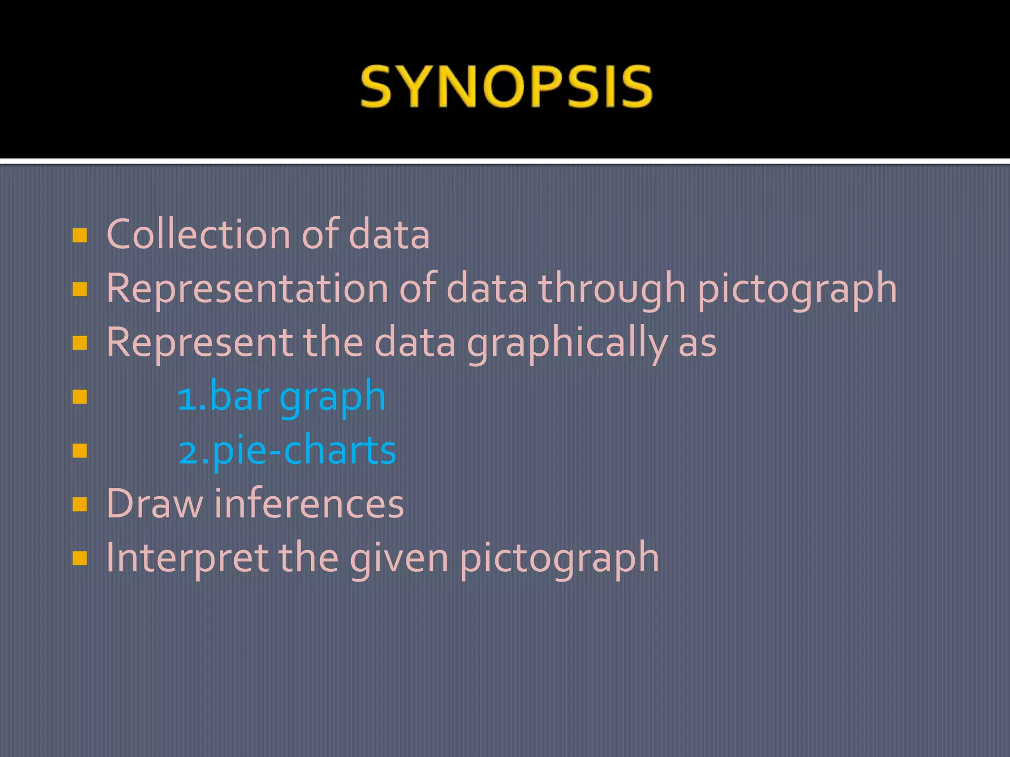
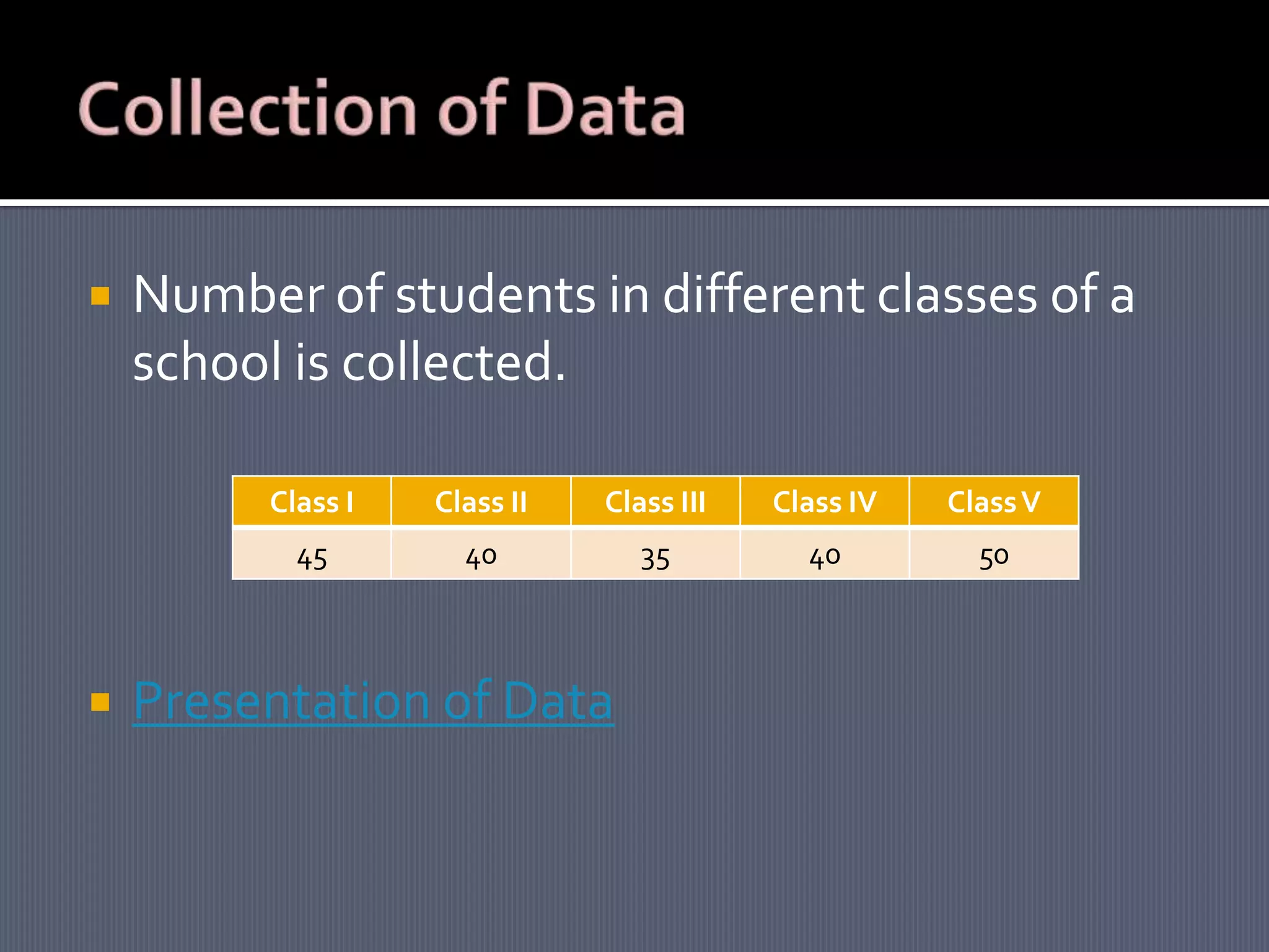
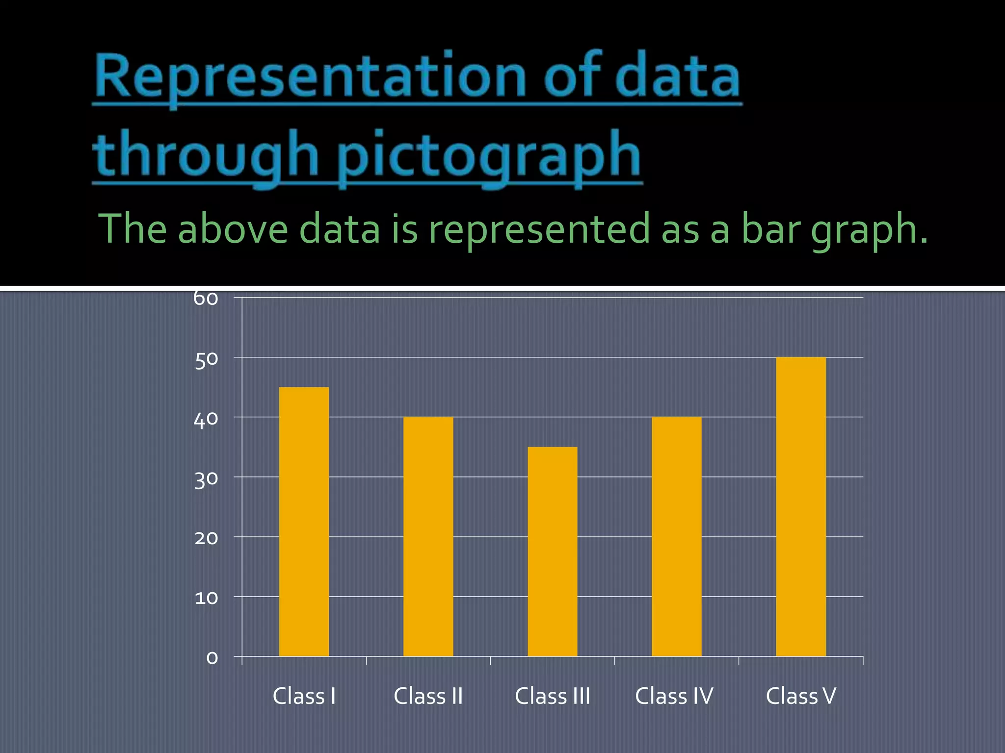
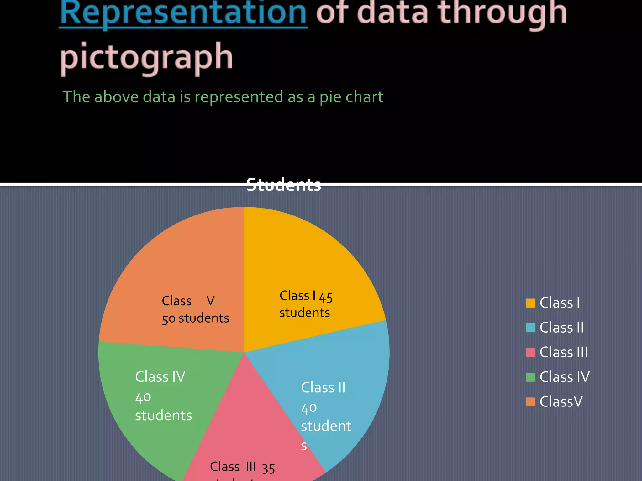
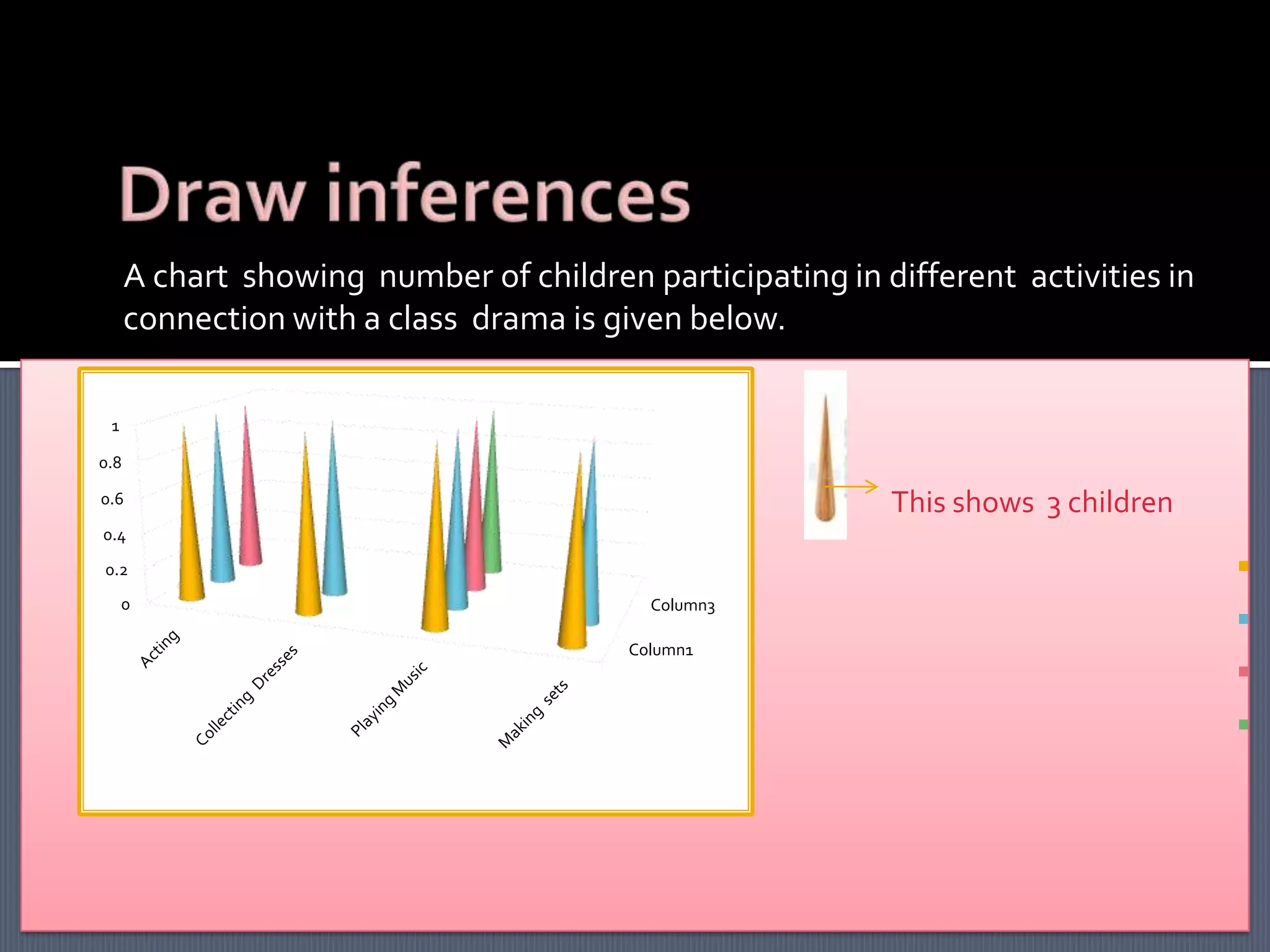
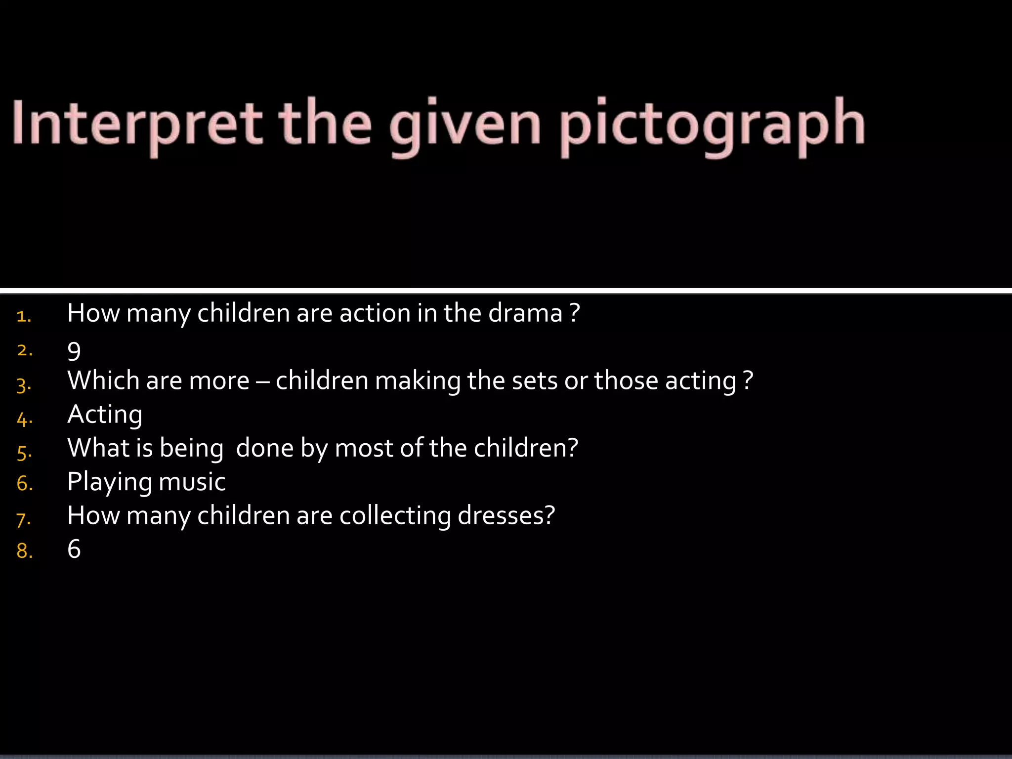
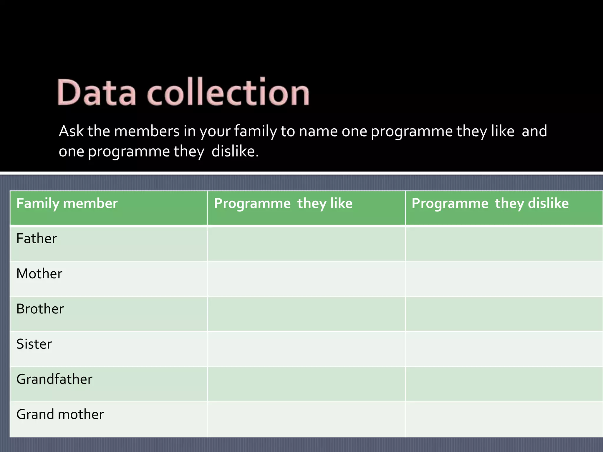
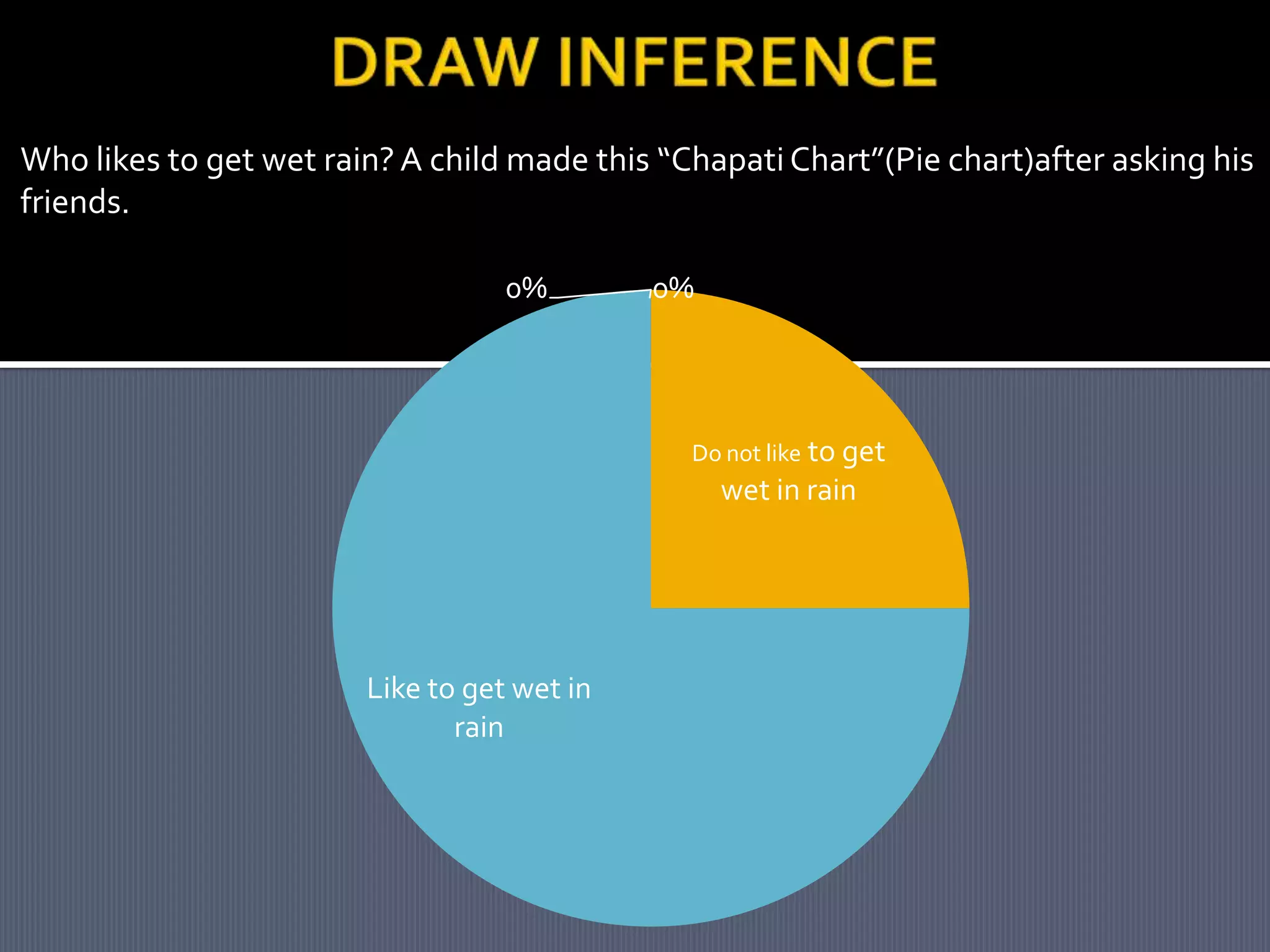
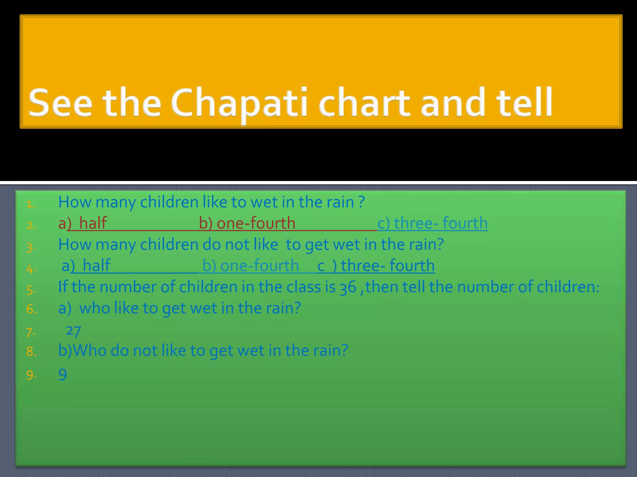
This document discusses representing data through pictographs such as bar graphs and pie charts. It includes examples of using these graphs to display data about the number of students in different school classes and the number of children participating in different activities for a school drama. It also shows a pie chart representing the preferences of children about getting wet in the rain. The document demonstrates how to interpret these graphs by asking questions about the data and determining inferences that can be drawn.