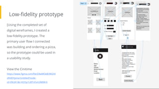
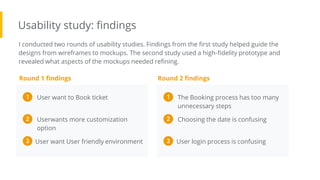
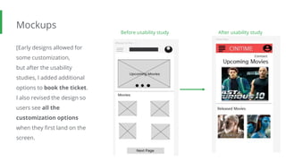
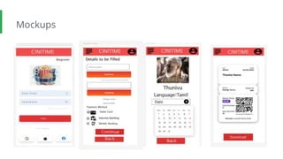
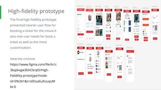
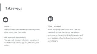
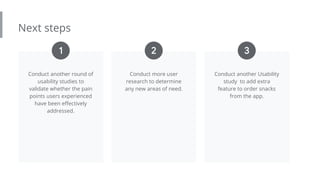
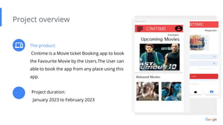
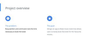
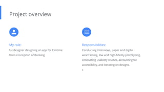
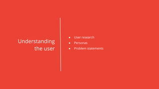
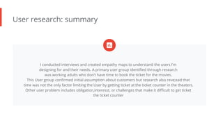
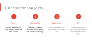
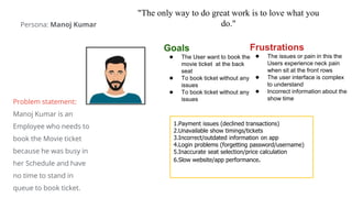
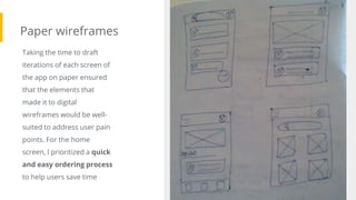
Cinitime is a movie ticket booking app designed to make it easy for busy users to book tickets. User research found that working adults lack time to book tickets at theaters. The app was designed through paper wireframes, digital wireframes, a low-fidelity prototype, and usability studies. The final design included customized booking options, consolidated date/time selection, and accessibility features. Further studies could validate pain points were addressed and add new features like snack ordering.
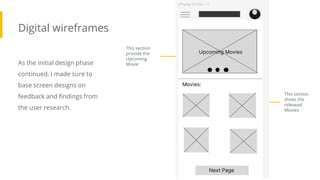
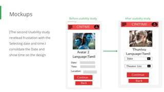
2. The product:
Cinitime is a Movie ticket Booking app to book
the Favourite Movie by the Users.The User can
able to book the app from any place using this
app.
Project overview
Project duration:
January 2023 to February 2023
Preview of selected
polished designs.
3. The problem:
Busy workers and commuters lack the time
necessary to book the ticket
Project overview
The goal:
Idesign an app to Book movie ticket that allows
users to easily book the ticket for thir favourite
movies..
4. My role:
Ux designer designing an app for Cinitime
from conception of Booking
Project overview
Responsibilities:
Conducting interviews, paper and digital
wireframing, low and high-fidelity prototyping,
conducting usability studies, accounting for
accessibility, and iterating on designs.
c
6. User research: summary
I conducted interviews and created empathy maps to understand the users I’m
designing for and their needs. A primary user group identified through research
was working adults who don’t have time to book the ticket for the movies.
This User group confirmed initial assumption about customers but research also reve;ead that
time was not the only factor limiting the User by getting ticket at the ticket counter in the theaters.
Other user problem includes obligation,interesst, or challenges that make it difficult to get ticket
the ticket counter
7. User research: pain points
Time
Working adults are too
busy to spend time in the
ticket counter
Accessibility
Platforms for booking
ticket are not equipped
with assistive technology
Edge cases
Older people feels the
environment is hard to
use
IA
Text-heavy menus in
apps are often difficult
to read and book the
ticket
1 2 3 4
8. "The only way to do great work is to love what you
do."
Goals
● The User want to book the
movie ticket at the back
seat
● To book ticket without any
issues
● To book ticket without any
issues
Frustrations
● The issues or pain in this the
Users experience neck pain
when sit at the front rows
● The user interface is complex
to understand
● Incorrect information about the
show time
1.Payment issues (declined transactions)
2.Unavailable show timings/tickets
3.Incorrect/outdated information on app
4.Login problems (forgetting password/username)
5.Inaccurate seat selection/price calculation
6.Slow website/app performance.
Persona: Manoj Kumar
Problem statement:
Manoj Kumar is an
Employee who needs to
book the Movie ticket
because he was busy in
her Schedule and have
no time to stand in
queue to book ticket.
9. ● Paper wireframes
● Digital wireframes
● Low-fidelity prototype
● Usability studies
Starting
the design
10. Paper wireframes
Taking the time to draft
iterations of each screen of
the app on paper ensured
that the elements that
made it to digital
wireframes would be well-
suited to address user pain
points. For the home
screen, I prioritized a quick
and easy ordering process
to help users save time
Image of paper
wireframes including
five different
versions of the same
screen and one
image of the new,
refined version
11. Digital wireframes
As the initial design phase
continued, I made sure to
base screen designs on
feedback and findings from
the user research.
This section
provide the
Upcoming
Movie
Insert first wireframe
example that
demonstrates design
thinking aligned with
user research This section
shoes the
relesead
Movies
12. Digital wireframes
[]This digital wireframe is
used to select the date and
the showtime of the movie
The movie
selected by the
User
Insert second
wireframe example that
demonstrates design
thinking aligned with
user research This section
used to select
the date and
show time
ovieof the m
13. Low-fidelity prototype
Screenshot of
prototype with
connections or
prototype GIF
[Using the completed set of
digital wireframes, I created a
low-fidelity prototype. The
primary user flow I connected
was building and ordering a pizza,
so the prototype could be used in
a usability study.
View the Cinitime
https://www.figma.com/file/Z4wMOeB3W2IiV
zRI4DYpme/Untitled?node-
id=0%3A1&t=KO5p1U8TnFvm3MtM-0
14. Usability study: findings
I conducted two rounds of usability studies. Findings from the first study helped guide the
designs from wireframes to mockups. The second study used a high-fidelity prototype and
revealed what aspects of the mockups needed refining.
Round 1 findings
The Booking process has too many
unnecessary steps
1
Choosing the date is confusing
2
Round 2 findings
User login process is confusing
3
User want to Book ticket
1
Userwants more customization
option
2
User want User friendly environment
3
16. Mockups
[Early designs allowed for
some customization,
but after the usability
studies, I added additional
options to book the ticket.
I also revised the design so
users see all the
customization options
when they first land on the
screen.
Image of
selected
screen before
usability study
Before usability study After usability study
Image of
selected
screen after
usability study
17. Mockups
[The second Usability study
revelead frustation with the
Selecting date and time.I
consildate the Date and
show time on the design
Before usability study After usability study
Image of
selected
screen before
usability study
Image of
selected
screen after
usability study
19. High-fidelity prototype
The final high fieldlity prototype
presented cleaner user flow for
booking a ticket for the movie.It
also met user needs for book a
ticket as well as the more
customization.
View the cinitime
https://www.figma.com/file/lv1c
3bajikvgw3bXC6rqt5/High-
Fieldility-prototype?node-
id=0%3A1&t=s0fzoafuAUuqoM
bt-0
Screenshot of
prototype with
connections or
prototype GIF
20. Accessibility considerations
Provided access to all
users by considering the
edge case the
environment was friendly
to the user..
Used Icons to help make
navigation easier
Used detailed imagery for
Movie and showtime to
help the users better
understanding the
designs.
1 2 3
22. Takeaways
Impact:
The app makes Users feel like Cinitime really thinks
about how to meet their needs.
One quote from peer feedback:
“the app made it so easy to book my Movie ticket I
would definitely use this app as a got to for a good
movie”.
What I learned:
IWhile designing the Cinitime app, I learned
that the first ideas for the app are only the
beginning of the process. Usability studies and
peer feedback influenced each iteration of the
app’s designs.
23. Next steps
Conduct another round of
usability studies to
validate whether the pain
points users experienced
have been effectively
addressed.
Conduct more user
research to determine
any new areas of need.
Conduct another Usability
study to add extra
feature to order snacks
from the app.
1 2 3
24. Let’s connect!
Thank you for your time reviewing my work on the Zia’s Pizza app! If you’d like to
see more or get in touch, my contact information is provided below.
LinkedIn: www.linkedin.com/in/thirumalaiboobathi-b-902a51233