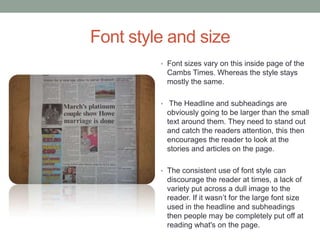
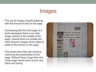
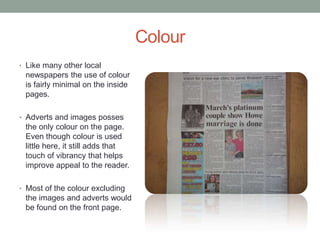
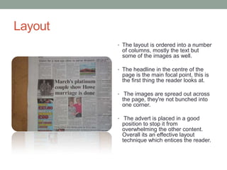
The document analyzes the font style, images, color, and layout used on the inside pages of the Cambs Times local newspaper. It notes that font size varies with headlines and subheadings in larger text to stand out. Images are used more frequently but smaller than the front page to relate to stories. Color is minimal but adds vibrancy when used for ads and images. The layout uses columns and spreads out images and places ads effectively to entice readers without overwhelming other content.