Local newspaper front page layout, worrddd
•Download as DOCX, PDF•
1 like•651 views
Report
Share
Report
Share
Recommended
Newspaper Layouting 
The document discusses layout techniques for print publications. It compares conventional and modern layout methods, with conventional using physical cut-and-paste and modern using desktop publishing software. Key aspects of layout covered include use of illustrations, text, fonts, and balancing elements through principles such as proportion, unity, balance, emphasis, and contrast. Color models CMYK for print and RGB for screens are also distinguished. Sample layouts and guidelines for effective layout are provided.
Layouting Your School Paper
This document defines key parts and pages of a newspaper including the front page, editorial page, feature page, and literary page. It describes common elements of newspaper pages like nameplates, headlines, bylines, columns, photos, and captions. It also discusses principles of excellent newspaper layout design such as unity, balance, emphasis, proportion, movement, and contrast. Layout is described as the arrangement of text, graphics, and photos on a page. The document outlines best practices and issues to avoid in layout like tombstoning, bad breaks, separating related content, and disproportionate or excessive emphasis.
Evaluation question 3 audeince feedback
The document discusses the importance of audience feedback for improving coursework. It notes that audience feedback can be obtained through surveys, comments, and other methods to understand what audiences want and how the product could be improved. While the author received some feedback, it was difficult to gain responses. However, the feedback that was received helped the author develop and refine their local newspaper product by changing fonts, content, and deciding what to include based on the audience research and feedback. More feedback may have allowed for further improvements.
Summary of audience research spider diagram
The target audience for the local newspaper is adults and the elderly aged 20 years and older. Teenagers and children have less interest in local newspapers, as the style and content tends to be more formal and wordy than what appeals to younger readers. Factors like vocabulary level, image usage, color scheme, and topics discussed like politics are better suited to older readers than children and teenagers. Audience research of other local newspapers informed choices about font, layout, and content to match the interests and needs of the target demographic.
Questionnaire results and summary
The questionnaire results show that of the 4 respondents, 2 were male and 2 were female. Two respondents were between 11-20 years old, and 2 were 50+. All 4 respondents read their local newspapers, with 2 reading every week and 2 every month. All 4 pay between 0-99p for their newspaper, with 3 thinking that's a fair price and 1 thinking £1-1.99 is fair. The top appeals were content (3 respondents) and images (1 respondent). Favorite sections included the humor section (1), entertainment section (1), weather news/forecasts (1), and other (1).
Evaluation question 4 technology
The document discusses the various media technologies used at different stages of a coursework project. Software like Publisher, PowerPoint, Popplet, Survey Monkey, Blogger, Wix, and Microsoft Word were utilized for tasks like research and planning, creating products like a newspaper, presenting information, gathering audience feedback, sharing work, building website pages, and drafting texts. Several technologies allowed for easy insertion of images, organization of content, and presentation of ideas.
Evaluation question 4 technology
The document discusses the various media technologies used at different stages of a coursework project. Software like Publisher, PowerPoint, Popplet, Survey Monkey, Blogger, Wix, and Microsoft Word were utilized for tasks like research and planning, creating products like newspapers and websites, gathering audience feedback, documenting and presenting work. Many of the technologies allowed for easy insertion of images, text boxes and layout customization to complete the coursework.
Recommended
Newspaper Layouting
The document discusses layout techniques for print publications. It compares conventional and modern layout methods, with conventional using physical cut-and-paste and modern using desktop publishing software. Key aspects of layout covered include use of illustrations, text, fonts, and balancing elements through principles such as proportion, unity, balance, emphasis, and contrast. Color models CMYK for print and RGB for screens are also distinguished. Sample layouts and guidelines for effective layout are provided.
Layouting Your School Paper
This document defines key parts and pages of a newspaper including the front page, editorial page, feature page, and literary page. It describes common elements of newspaper pages like nameplates, headlines, bylines, columns, photos, and captions. It also discusses principles of excellent newspaper layout design such as unity, balance, emphasis, proportion, movement, and contrast. Layout is described as the arrangement of text, graphics, and photos on a page. The document outlines best practices and issues to avoid in layout like tombstoning, bad breaks, separating related content, and disproportionate or excessive emphasis.
Evaluation question 3 audeince feedback
The document discusses the importance of audience feedback for improving coursework. It notes that audience feedback can be obtained through surveys, comments, and other methods to understand what audiences want and how the product could be improved. While the author received some feedback, it was difficult to gain responses. However, the feedback that was received helped the author develop and refine their local newspaper product by changing fonts, content, and deciding what to include based on the audience research and feedback. More feedback may have allowed for further improvements.
Summary of audience research spider diagram
The target audience for the local newspaper is adults and the elderly aged 20 years and older. Teenagers and children have less interest in local newspapers, as the style and content tends to be more formal and wordy than what appeals to younger readers. Factors like vocabulary level, image usage, color scheme, and topics discussed like politics are better suited to older readers than children and teenagers. Audience research of other local newspapers informed choices about font, layout, and content to match the interests and needs of the target demographic.
Questionnaire results and summary
The questionnaire results show that of the 4 respondents, 2 were male and 2 were female. Two respondents were between 11-20 years old, and 2 were 50+. All 4 respondents read their local newspapers, with 2 reading every week and 2 every month. All 4 pay between 0-99p for their newspaper, with 3 thinking that's a fair price and 1 thinking £1-1.99 is fair. The top appeals were content (3 respondents) and images (1 respondent). Favorite sections included the humor section (1), entertainment section (1), weather news/forecasts (1), and other (1).
Evaluation question 4 technology
The document discusses the various media technologies used at different stages of a coursework project. Software like Publisher, PowerPoint, Popplet, Survey Monkey, Blogger, Wix, and Microsoft Word were utilized for tasks like research and planning, creating products like a newspaper, presenting information, gathering audience feedback, sharing work, building website pages, and drafting texts. Several technologies allowed for easy insertion of images, organization of content, and presentation of ideas.
Evaluation question 4 technology
The document discusses the various media technologies used at different stages of a coursework project. Software like Publisher, PowerPoint, Popplet, Survey Monkey, Blogger, Wix, and Microsoft Word were utilized for tasks like research and planning, creating products like newspapers and websites, gathering audience feedback, documenting and presenting work. Many of the technologies allowed for easy insertion of images, text boxes and layout customization to complete the coursework.
Local newspaper colour schemes
This document outlines 6 different color schemes for a local newspaper. While the document does not provide details on the specific colors in each scheme, it lists 6 different options that could be used for the design and layout of the newspaper.
Cambs times inside page analysis
The document analyzes the font style, images, color, and layout used on the inside pages of the Cambs Times local newspaper. It notes that font size varies with headlines and subheadings in larger text to stand out. Images are used more frequently but smaller than the front page to relate to stories. Color is minimal but adds vibrancy when used for ads and images. The layout uses columns and spreads out images and places ads effectively to entice readers without overwhelming other content.
Fenland citizen inside page analysis
The document discusses the layout and design of a newspaper page. It notes that color is used for the many images on the page while black text promotes readability. The high number of large, prominent images about an important story would appeal to readers, especially younger ones. The neat, tidy layout with columns and isolation of text from images effectively guides readers through the page from top to bottom. Font styles remain consistent while size varies appropriately between the attention-grabbing headline and information-dense text.
Peterborough telegraph inside page analysis
The document analyzes the layout, color, font, and images used on an inside page of the Peterborough Telegraph newspaper. The layout uses two columns to neatly split the content. A large heading at the top draws the reader's eye, and the text and heading next to the main photo relate to it. Only images use color, while the font and background are black and white. The large heading size attracts attention, and the main image is also large to be a focal point that hints at the story's topic.
Newspaper timeline
The document outlines key dates and events in the history of newspapers from 1605 to 2012. Some notable developments include the first newspaper being published in 1605, 12 London newspapers and 24 provincial papers existing by 1720, the Manchester Guardian being founded in 1821, and over 100 newspaper titles existing in London alone by 1900. The timeline shows the gradual growth and expansion of the newspaper industry over the centuries.
Research presentation
The document discusses the typical conventions used in local newspapers, including layout, images, colour, and font. It finds that most local newspapers follow similar designs, with a main central image and text below. While the layout is often similar, each newspaper has its own style. Images are also commonly used but kept orderly. Font size is generally small for articles but larger for mastheads. Color schemes tend to be simple with little used, but some papers incorporate more vibrant hues. The target audience of most local papers is ages 25+ as younger readers prefer magazines, but color and design also influence which demographics are reached.
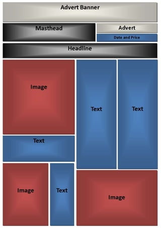
Main product ideas_mind_map
The document provides layout suggestions for newspaper front and inside pages, including positioning of images, text, masthead, and advertisements. It also includes ideas for newspaper names, color schemes, fonts, and sample front page content like headlines about local news stories.
Summary of local newspaper analysis
The document analyzes the layout, design elements, and content of three local newspapers in the area. It finds that the layout and placement of ads is similar across all three papers, with the main image centered and articles below. Font styles differ slightly by newspaper, though sizes are consistent. Two of the papers use bright colors while the third is primarily black and white. Large images are prominently featured on front pages to attract readers' attention to other content on the page.
Newspaper analysis no.2_presentation
The document summarizes the layout and design of a local magazine. It notes that the magazine uses a typical one-image, headline, article format. The font sizes and styles are clear and similar to other local papers. The magazine stands out through its use of vibrant colors like yellow, blue, and green to attract readers' attention and engage them with the articles and information.
Wisbech standard analysis
The document discusses the layout and design of a local newspaper called the Wisbech Standard. It notes that the layout is neat and orderly, with the masthead at the top to draw the reader's eye. Images and articles are placed side by side for easy reading. Advertisements run above or below the headline. The font is simple and clear for older readers, though younger audiences may find it bland. Color is used judiciously to add interest without clashing or distracting from the text.
More Related Content
More from MatthewFire2
Local newspaper colour schemes
This document outlines 6 different color schemes for a local newspaper. While the document does not provide details on the specific colors in each scheme, it lists 6 different options that could be used for the design and layout of the newspaper.
Cambs times inside page analysis
The document analyzes the font style, images, color, and layout used on the inside pages of the Cambs Times local newspaper. It notes that font size varies with headlines and subheadings in larger text to stand out. Images are used more frequently but smaller than the front page to relate to stories. Color is minimal but adds vibrancy when used for ads and images. The layout uses columns and spreads out images and places ads effectively to entice readers without overwhelming other content.
Fenland citizen inside page analysis
The document discusses the layout and design of a newspaper page. It notes that color is used for the many images on the page while black text promotes readability. The high number of large, prominent images about an important story would appeal to readers, especially younger ones. The neat, tidy layout with columns and isolation of text from images effectively guides readers through the page from top to bottom. Font styles remain consistent while size varies appropriately between the attention-grabbing headline and information-dense text.
Peterborough telegraph inside page analysis
The document analyzes the layout, color, font, and images used on an inside page of the Peterborough Telegraph newspaper. The layout uses two columns to neatly split the content. A large heading at the top draws the reader's eye, and the text and heading next to the main photo relate to it. Only images use color, while the font and background are black and white. The large heading size attracts attention, and the main image is also large to be a focal point that hints at the story's topic.
Newspaper timeline
The document outlines key dates and events in the history of newspapers from 1605 to 2012. Some notable developments include the first newspaper being published in 1605, 12 London newspapers and 24 provincial papers existing by 1720, the Manchester Guardian being founded in 1821, and over 100 newspaper titles existing in London alone by 1900. The timeline shows the gradual growth and expansion of the newspaper industry over the centuries.
Research presentation
The document discusses the typical conventions used in local newspapers, including layout, images, colour, and font. It finds that most local newspapers follow similar designs, with a main central image and text below. While the layout is often similar, each newspaper has its own style. Images are also commonly used but kept orderly. Font size is generally small for articles but larger for mastheads. Color schemes tend to be simple with little used, but some papers incorporate more vibrant hues. The target audience of most local papers is ages 25+ as younger readers prefer magazines, but color and design also influence which demographics are reached.
Main product ideas_mind_map
The document provides layout suggestions for newspaper front and inside pages, including positioning of images, text, masthead, and advertisements. It also includes ideas for newspaper names, color schemes, fonts, and sample front page content like headlines about local news stories.
Summary of local newspaper analysis
The document analyzes the layout, design elements, and content of three local newspapers in the area. It finds that the layout and placement of ads is similar across all three papers, with the main image centered and articles below. Font styles differ slightly by newspaper, though sizes are consistent. Two of the papers use bright colors while the third is primarily black and white. Large images are prominently featured on front pages to attract readers' attention to other content on the page.
Newspaper analysis no.2_presentation
The document summarizes the layout and design of a local magazine. It notes that the magazine uses a typical one-image, headline, article format. The font sizes and styles are clear and similar to other local papers. The magazine stands out through its use of vibrant colors like yellow, blue, and green to attract readers' attention and engage them with the articles and information.
Wisbech standard analysis
The document discusses the layout and design of a local newspaper called the Wisbech Standard. It notes that the layout is neat and orderly, with the masthead at the top to draw the reader's eye. Images and articles are placed side by side for easy reading. Advertisements run above or below the headline. The font is simple and clear for older readers, though younger audiences may find it bland. Color is used judiciously to add interest without clashing or distracting from the text.