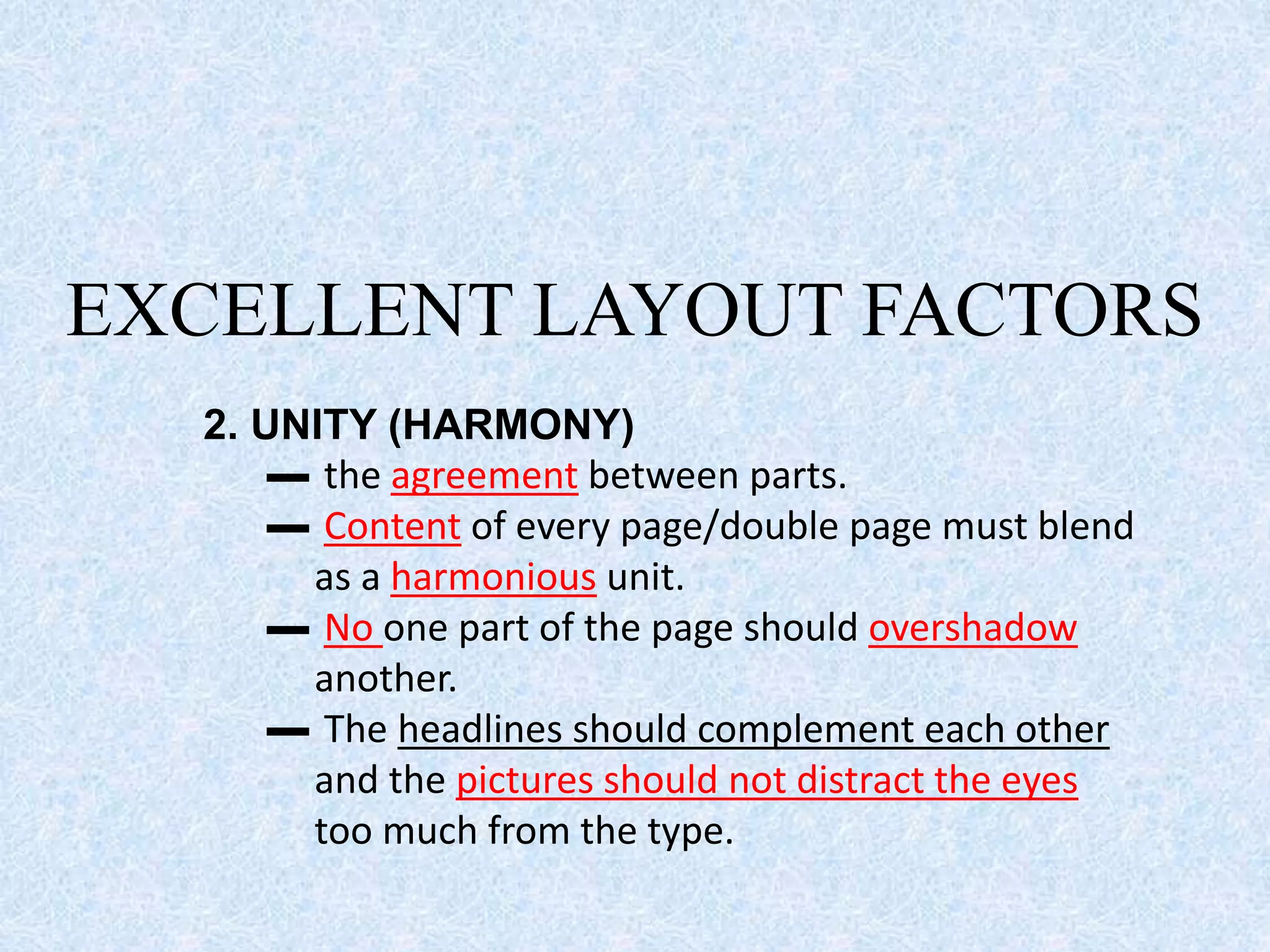
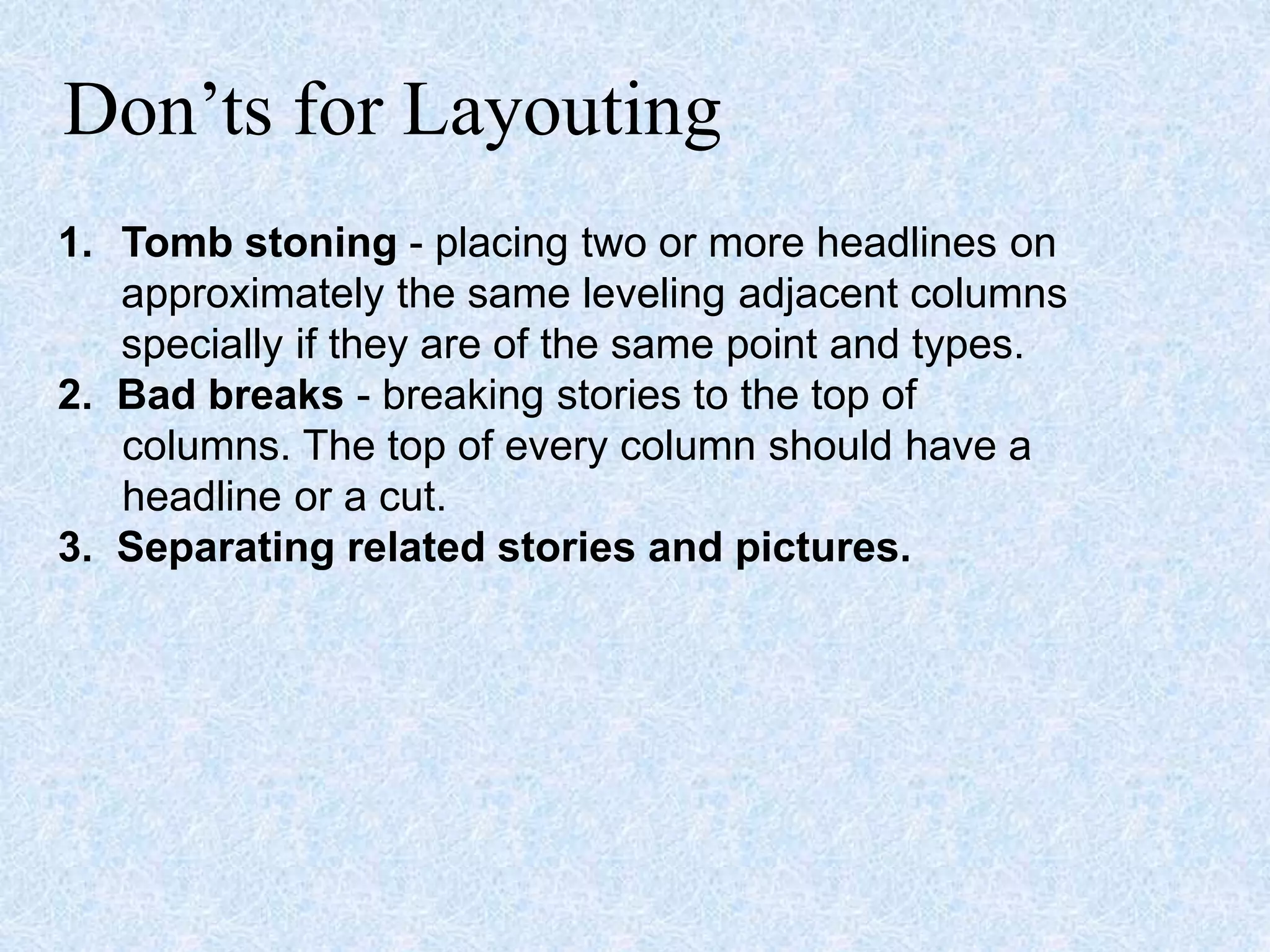
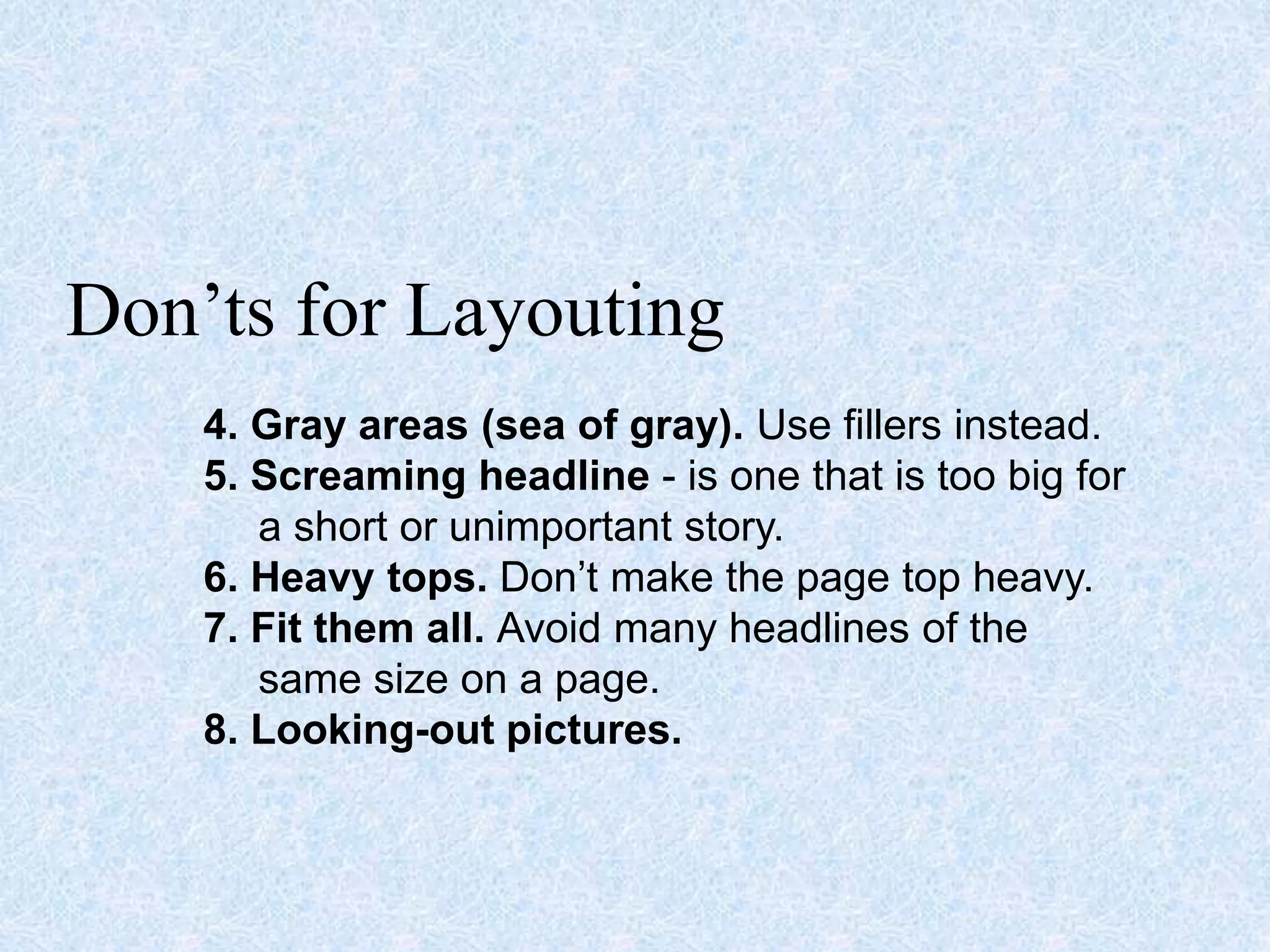
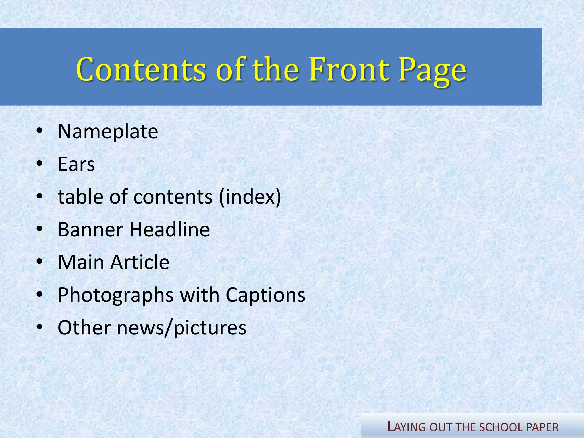
Laying Out
the School Paper
Prepared by Wendell Taraya
SPA Filipino
LAYING OUT THE SCHOOL PAPER
“The layout is a happy
marriage of
AESTHETICS and
MECHANICS”
• Binubuo ng tamang paghahanay ng mga
guhit, ilustrasyon, salita at “graphics” sa
isang pahina kung saan ito ililimbag.
• Kasali rito ang tamang pagpipili ng “font
styles” at mga kulay.
• Tinatawag din itong “makeup”
LAYING OUT THE SCHOOL PAPER
MAKALUMA
(Conventional)
• Old method of layouting
• Cut, paste, and fit method
• Uses layouting paper
• More papers are consumed
Symbols used for
Conventional
Layouting
• Boxes for pictures/graphics
• Lines for headlines
• Arrows for texts/articles
MAKABAGO (Modern)
• softwares and programs are readily
available for desktop publishing
(MicrosoftTM Publisher, AdobeTM
InDesign, Corel Draw)
• not much laborious for all you need
is a computer unit, a program and a
creative designing skill
MAKABAGO (Modern)
• putting up a campus paper becomes easier and
more convenient
• Disadvantage: limited size of the computer
screen. A dummy is still prepared.
LAYING OUT THE SCHOOL PAPER
EXCELLENT LAYOUT FACTORS
1. PROPORTION
▬ deals with the ratio of one part to another and
of the parts to the whole.
▬ Pictures must be sized properly to keep up with
other shapes on the page.
▬ Length of stories must be considered.
▬ A long story may ruin the proportion of the
page.
EXCELLENT LAYOUT FACTORS
2. UNITY (HARMONY)
▬ the agreement between parts.
▬ Content of every page/double page must blend
as a harmonious unit.
▬ No one part of the page should overshadow
another.
▬ The headlines should complement each other
and the pictures should not distract the eyes
too much from the type.
EXCELLENT LAYOUT FACTORS
3. BALANCE
▬ a feeling of equality in weight
EXCELLENT LAYOUT FACTORS
4. EMPHASIS
▬ gives proper importance to the parts and to the
whole.
▬ It involves the differentiation between the
more important and the less important.
EXCELLENT LAYOUT FACTORS
5. CONTRAST
▬ is the blending of units as one.
▬ Every head and cut on a page should contrast
with adjoining materials.
▬Boxes and pictures between heads are
sometimes good makeup devices.
Don’ts for Layouting
1. Tomb stoning - placing two or more headlines on
approximately the same leveling adjacent columns
specially if they are of the same point and types.
2. Bad breaks - breaking stories to the top of
columns. The top of every column should have a
headline or a cut.
3. Separating related stories and pictures.
Don’ts for Layouting
4. Gray areas (sea of gray). Use fillers instead.
5. Screaming headline - is one that is too big for
a short or unimportant story.
6. Heavy tops. Don’t make the page top heavy.
7. Fit them all. Avoid many headlines of the
same size on a page.
8. Looking-out pictures.
Sample Layouts
Contents of the Front Page
• Nameplate
• Ears
• table of contents (index)
• Banner Headline
• Main Article
• Photographs with Captions
• Other news/pictures
LAYING OUT THE SCHOOL PAPER
Contents of the Nameplate
• Logo
• Name of School and Address
• Date of Publication/Coverage
• Volume and Issue Number
• Identity
LAYING OUT THE SCHOOL PAPER
Page-Specific Formats
EDITORIAL PAGES
• Should have a distinctive dignified
appearance
• The masthead should be relatively
small and may be anchored in any
corner
• Titles should be of masculine
appearance, not in italic or script type
LAYING OUT THE SCHOOL PAPER
Page-Specific Formats
FEATURE/
LITERARY PAGES
• Must have a feminine appearance
• Italicized texts may be used
• Fancy font styles are allowed
LAYING OUT THE SCHOOL PAPER
Page-Specific Formats
SPORTS PAGES
• These pages have bolder but livelier
appearance than the others
• The makeup must suggest action,
speed, and color
• Large bold heads are used
LAYING OUT THE SCHOOL PAPER
Importance of a Good Layout
• To give prominence to the news in
proportion to its importance
• To make the different contents easy to
find and read
• To give the pages an attractive
appearance
• To give the paper a personality of its
own
LAYING OUT THE SCHOOL PAPER
Rules on Typography
• Use appropriate font style
• Maintain or make font consistent
• Do not over-emphasize headlines,
• example, bold headline with underline
• Kickers are usually in bold format
• Avoid all caps headline
• Usually headlines are in 14 font size and
articles or text are in 12 font size
LAYING OUT THE SCHOOL PAPER
“Laying out a page is a matter of
personal taste. There are no criteria
set for it. Therefore, YOU may
experiment freely on page makeup
until YOU get the pattern acceptable
to YOU & THE READERS.”

Laying Out the School Paper

  • 1.
    Laying Out the SchoolPaper Prepared by Wendell Taraya SPA Filipino
  • 18.
    LAYING OUT THESCHOOL PAPER “The layout is a happy marriage of AESTHETICS and MECHANICS”
  • 19.
    • Binubuo ngtamang paghahanay ng mga guhit, ilustrasyon, salita at “graphics” sa isang pahina kung saan ito ililimbag. • Kasali rito ang tamang pagpipili ng “font styles” at mga kulay. • Tinatawag din itong “makeup” LAYING OUT THE SCHOOL PAPER
  • 21.
    MAKALUMA (Conventional) • Old methodof layouting • Cut, paste, and fit method • Uses layouting paper • More papers are consumed
  • 22.
    Symbols used for Conventional Layouting •Boxes for pictures/graphics • Lines for headlines • Arrows for texts/articles
  • 23.
    MAKABAGO (Modern) • softwaresand programs are readily available for desktop publishing (MicrosoftTM Publisher, AdobeTM InDesign, Corel Draw) • not much laborious for all you need is a computer unit, a program and a creative designing skill
  • 24.
    MAKABAGO (Modern) • puttingup a campus paper becomes easier and more convenient • Disadvantage: limited size of the computer screen. A dummy is still prepared.
  • 25.
    LAYING OUT THESCHOOL PAPER
  • 26.
    EXCELLENT LAYOUT FACTORS 1.PROPORTION ▬ deals with the ratio of one part to another and of the parts to the whole. ▬ Pictures must be sized properly to keep up with other shapes on the page. ▬ Length of stories must be considered. ▬ A long story may ruin the proportion of the page.
  • 27.
    EXCELLENT LAYOUT FACTORS 2.UNITY (HARMONY) ▬ the agreement between parts. ▬ Content of every page/double page must blend as a harmonious unit. ▬ No one part of the page should overshadow another. ▬ The headlines should complement each other and the pictures should not distract the eyes too much from the type.
  • 28.
    EXCELLENT LAYOUT FACTORS 3.BALANCE ▬ a feeling of equality in weight
  • 29.
    EXCELLENT LAYOUT FACTORS 4.EMPHASIS ▬ gives proper importance to the parts and to the whole. ▬ It involves the differentiation between the more important and the less important.
  • 30.
    EXCELLENT LAYOUT FACTORS 5.CONTRAST ▬ is the blending of units as one. ▬ Every head and cut on a page should contrast with adjoining materials. ▬Boxes and pictures between heads are sometimes good makeup devices.
  • 31.
    Don’ts for Layouting 1.Tomb stoning - placing two or more headlines on approximately the same leveling adjacent columns specially if they are of the same point and types. 2. Bad breaks - breaking stories to the top of columns. The top of every column should have a headline or a cut. 3. Separating related stories and pictures.
  • 32.
    Don’ts for Layouting 4.Gray areas (sea of gray). Use fillers instead. 5. Screaming headline - is one that is too big for a short or unimportant story. 6. Heavy tops. Don’t make the page top heavy. 7. Fit them all. Avoid many headlines of the same size on a page. 8. Looking-out pictures.
  • 33.
  • 37.
    Contents of theFront Page • Nameplate • Ears • table of contents (index) • Banner Headline • Main Article • Photographs with Captions • Other news/pictures LAYING OUT THE SCHOOL PAPER
  • 38.
    Contents of theNameplate • Logo • Name of School and Address • Date of Publication/Coverage • Volume and Issue Number • Identity LAYING OUT THE SCHOOL PAPER
  • 39.
    Page-Specific Formats EDITORIAL PAGES •Should have a distinctive dignified appearance • The masthead should be relatively small and may be anchored in any corner • Titles should be of masculine appearance, not in italic or script type LAYING OUT THE SCHOOL PAPER
  • 40.
    Page-Specific Formats FEATURE/ LITERARY PAGES •Must have a feminine appearance • Italicized texts may be used • Fancy font styles are allowed LAYING OUT THE SCHOOL PAPER
  • 41.
    Page-Specific Formats SPORTS PAGES •These pages have bolder but livelier appearance than the others • The makeup must suggest action, speed, and color • Large bold heads are used LAYING OUT THE SCHOOL PAPER
  • 42.
    Importance of aGood Layout • To give prominence to the news in proportion to its importance • To make the different contents easy to find and read • To give the pages an attractive appearance • To give the paper a personality of its own LAYING OUT THE SCHOOL PAPER
  • 43.
    LAYING OUT THESCHOOL PAPER
  • 44.
    Rules on Typography •Use appropriate font style • Maintain or make font consistent • Do not over-emphasize headlines, • example, bold headline with underline • Kickers are usually in bold format • Avoid all caps headline • Usually headlines are in 14 font size and articles or text are in 12 font size LAYING OUT THE SCHOOL PAPER
  • 45.
    LAYING OUT THESCHOOL PAPER
  • 46.
    LAYING OUT THESCHOOL PAPER
  • 47.
    LAYING OUT THESCHOOL PAPER
  • 48.
    LAYING OUT THESCHOOL PAPER
  • 49.
    LAYING OUT THESCHOOL PAPER
  • 50.
    LAYING OUT THESCHOOL PAPER
  • 51.
    LAYING OUT THESCHOOL PAPER
  • 52.
    LAYING OUT THESCHOOL PAPER
  • 53.
    LAYING OUT THESCHOOL PAPER
  • 54.
    “Laying out apage is a matter of personal taste. There are no criteria set for it. Therefore, YOU may experiment freely on page makeup until YOU get the pattern acceptable to YOU & THE READERS.”