Downloaded 2,631 times
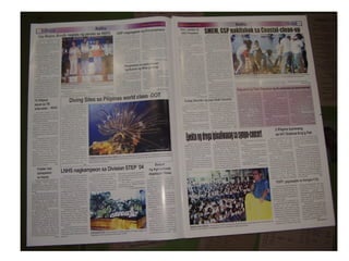
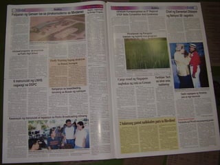
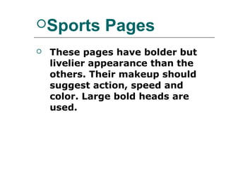
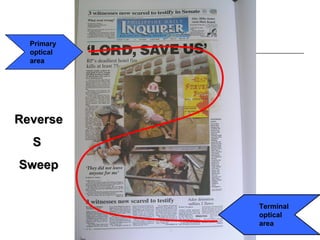
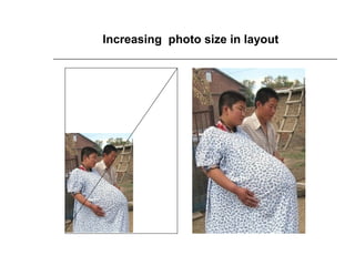
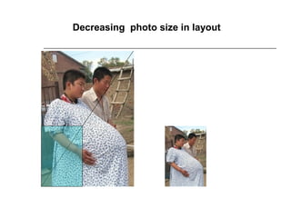
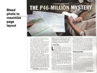
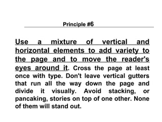


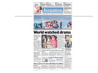


The document discusses principles of page design and newspaper layout. It defines page design as the arrangement of illustrations, photos and text on a page. Effective page design considers the size and type of newspaper, balances different elements, and draws the reader's eye in strategic ways. The document outlines various layout techniques like symmetrical, focused, broken column and contrast designs. It provides tips for effective inside page, editorial, feature and sports page layouts. Key principles emphasize ranking stories, using a dominant visual element, varying sizes and orientations of graphics, and using white space purposefully.