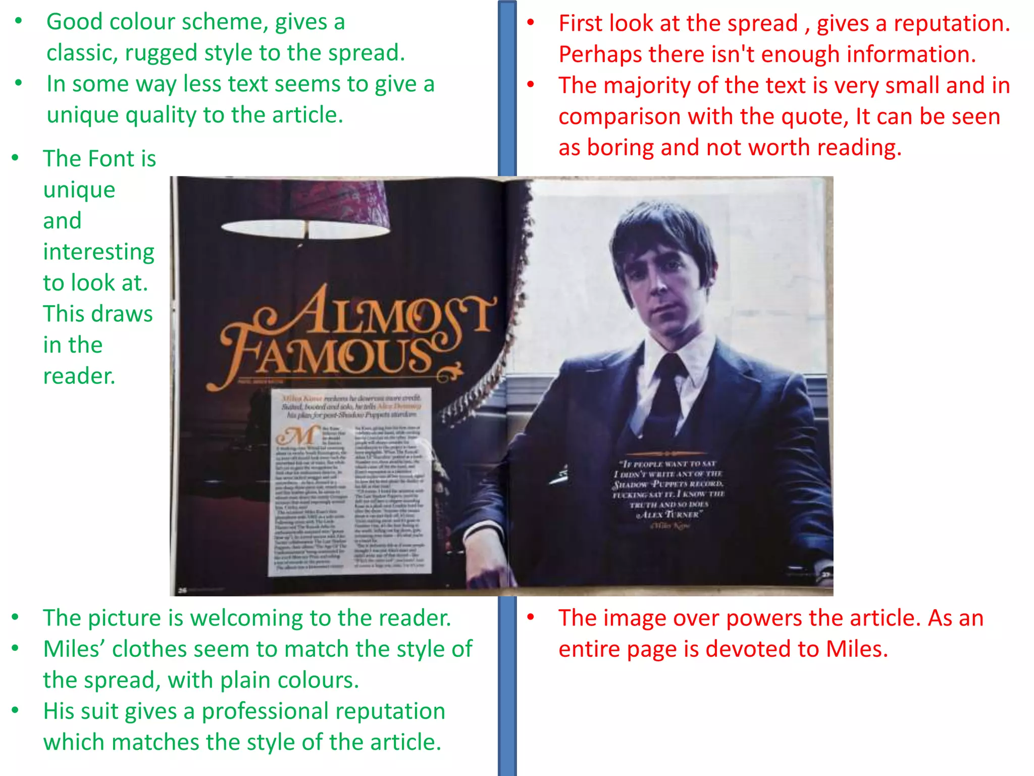
• Good colour scheme, gives a
classic, rugged style to the spread.
• In some way less text seems to give a
unique quality to the article.

• The Font is
unique
and
interesting
to look at.
This draws
in the
reader.

• The picture is welcoming to the reader.
• Miles’ clothes seem to match the style of
the spread, with plain colours.
• His suit gives a professional reputation
which matches the style of the article.

• First look at the spread , gives a reputation.
Perhaps there isn't enough information.
• The majority of the text is very small and in
comparison with the quote, It can be seen
as boring and not worth reading.

• The image over powers the article. As an
entire page is devoted to Miles.
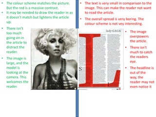
• The colour scheme matches the picture.
But the red is a massive contrast.
• It may be needed to draw the reader in as
it doesn’t match but lightens the article
up.
• There isn’t
too much
going on in
the article to
distract the
reader.
• The image is
large, and the
model is
looking at the
camera. This
welcomes the
reader.

• The text is very small in comparison to the
image. This can make the reader not want
to read the article.
• The overall spread is very boring. The
colour scheme is not vey interesting.
• The image
overpowers
the article.
• There isn't
much to catch
the readers
eye.

• The headline is
out of the
way, the
reader may not
even notice it
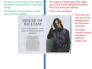
• The colour scheme matches the model to
the extent it is plain and dull, it does work
though.

• The image isn't welcoming as the model
may or may not be looking at the camera.
This is due to the poor lighting.

• The Headline and sub heading are both
clear and easily readable.

• There is not a lot of text.
• The article isn't
very clear as the
background an
the font colour
are similar.
• The colour
scheme is boring
and doesn’t
catch the
reader’s eye.

George dps analysis

  • 1.
    • Good colourscheme, gives a classic, rugged style to the spread. • In some way less text seems to give a unique quality to the article. • The Font is unique and interesting to look at. This draws in the reader. • The picture is welcoming to the reader. • Miles’ clothes seem to match the style of the spread, with plain colours. • His suit gives a professional reputation which matches the style of the article. • First look at the spread , gives a reputation. Perhaps there isn't enough information. • The majority of the text is very small and in comparison with the quote, It can be seen as boring and not worth reading. • The image over powers the article. As an entire page is devoted to Miles.
  • 2.
    • The colourscheme matches the picture. But the red is a massive contrast. • It may be needed to draw the reader in as it doesn’t match but lightens the article up. • There isn’t too much going on in the article to distract the reader. • The image is large, and the model is looking at the camera. This welcomes the reader. • The text is very small in comparison to the image. This can make the reader not want to read the article. • The overall spread is very boring. The colour scheme is not vey interesting. • The image overpowers the article. • There isn't much to catch the readers eye. • The headline is out of the way, the reader may not even notice it
  • 3.
    • The colourscheme matches the model to the extent it is plain and dull, it does work though. • The image isn't welcoming as the model may or may not be looking at the camera. This is due to the poor lighting. • The Headline and sub heading are both clear and easily readable. • There is not a lot of text. • The article isn't very clear as the background an the font colour are similar. • The colour scheme is boring and doesn’t catch the reader’s eye.