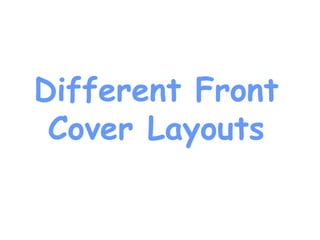
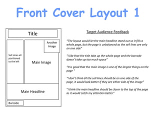
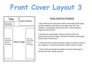
Different Front
 Cover Layouts
Front Cover Layout 1
                                                       Target Audience Feedback
                 Title
                                       “The layout would let the main headline stand out so it fills a
                             Another
                                       whole page, but the page is unbalanced as the sell lines are only
                              Image
                                       on one side”

Sell Lines all                         “I like that the title take up the whole page and the barcode
positioned                             doesn’t take up too much space”
to the left        Main Image
                                       “It is good that the main image is one of the largest things on the
                                       page “

                                       “I don’t think all the sell lines should be on one side of the
                                       page, it would look better if they are either side of the image”

                                       “I think the main headline should be closer to the top of the page
             Main Headline             as it would catch my attention better”


Barcode
Front Cover Layout 2
                                                        Target Audience Feedback
               Title
                                        “Because the main headline is on the top it would catch my
            Main Headline               attention best”

                                        “I think the layout of the sell lines should be changed, they are at
                                        the top of the page on the left and the bottom of the page on the
Sell Line
                                        right. I don’t think it will look good”

             Main Image                 “It’s good that there is another image on the front cover as it
Sell Line                   Sell Line   would make the magazine look like it has more content”

                                        “ I think the headline and title will merge together they are both
                                        on the top of the page and are as big as one another”
                            Sell Line
                            with
                            image

Barcode
Front Cover Layout 3
     Title                                             Target Audience Feedback
                  Main Headline
Barcode                                “I don’t like that the title doesn’t take up the whole of the page
                                       and the headline would take up less space than the main
                                       headline. I would prefer to know the title, so that should be
                                       larger than the sell line”

                                       “I like that the main image is central and the sell line are
                                       positioned around the image. This keep the balance of the page
Sell Lines                Sell Lines   similar doesn’t look weird”
positioned                positioned
around       Main Image   around       “I think that there should be another image on the front cover of
the image                 the image    the magazine, it may look quite bare without another image”

                                       “ I don’t think the headline should be at the top of the page in
                                       line with the title. It looks unusual.”
Front Cover Layout 4
                                                           Target Audience Feedback
               Title
                                           “ I like that the title takes up the whole page, unlike layout 3.”

                   Main Headline           “ It’s good that the main image is central as it seems like that’s
                   Positioned around the   what other magazines do”
                           image
Sell Lines                                 “I think that the positioning of the main headline is quite good as
around                                     it does not take up the whole page and distract from the title but
the image                                  looks like it will be bigger than the other sell lines.”
on the       Main Image
left hand                                  “I don’t know if the main headline might be a little bit too small
side                                       because if it was too big it would cover the main image”


                            Sell Line
                            and
                            Image
Barcode
Conclusion
I am going to take into consideration all of the comments people
of my target audience have said and when I am designing my front
cover I will experiment with the different things. I think it shows
that two images on the front cover are a good idea as the target
audience seem to like that. Obviously it is conventional that the
main headline is the biggest sell line on the page and the main
image should be the largest thing on the page.

Also the barcode should probably be quite hidden on the page, as
I personally dislike how layout 3 has the barcode right under the
title. This is because it draws more attention to the barcode than
necessary.

Different Layout for Front Cover

  • 1.
  • 2.
    Front Cover Layout1 Target Audience Feedback Title “The layout would let the main headline stand out so it fills a Another whole page, but the page is unbalanced as the sell lines are only Image on one side” Sell Lines all “I like that the title take up the whole page and the barcode positioned doesn’t take up too much space” to the left Main Image “It is good that the main image is one of the largest things on the page “ “I don’t think all the sell lines should be on one side of the page, it would look better if they are either side of the image” “I think the main headline should be closer to the top of the page Main Headline as it would catch my attention better” Barcode
  • 3.
    Front Cover Layout2 Target Audience Feedback Title “Because the main headline is on the top it would catch my Main Headline attention best” “I think the layout of the sell lines should be changed, they are at the top of the page on the left and the bottom of the page on the Sell Line right. I don’t think it will look good” Main Image “It’s good that there is another image on the front cover as it Sell Line Sell Line would make the magazine look like it has more content” “ I think the headline and title will merge together they are both on the top of the page and are as big as one another” Sell Line with image Barcode
  • 4.
    Front Cover Layout3 Title Target Audience Feedback Main Headline Barcode “I don’t like that the title doesn’t take up the whole of the page and the headline would take up less space than the main headline. I would prefer to know the title, so that should be larger than the sell line” “I like that the main image is central and the sell line are positioned around the image. This keep the balance of the page Sell Lines Sell Lines similar doesn’t look weird” positioned positioned around Main Image around “I think that there should be another image on the front cover of the image the image the magazine, it may look quite bare without another image” “ I don’t think the headline should be at the top of the page in line with the title. It looks unusual.”
  • 5.
    Front Cover Layout4 Target Audience Feedback Title “ I like that the title takes up the whole page, unlike layout 3.” Main Headline “ It’s good that the main image is central as it seems like that’s Positioned around the what other magazines do” image Sell Lines “I think that the positioning of the main headline is quite good as around it does not take up the whole page and distract from the title but the image looks like it will be bigger than the other sell lines.” on the Main Image left hand “I don’t know if the main headline might be a little bit too small side because if it was too big it would cover the main image” Sell Line and Image Barcode
  • 6.
    Conclusion I am goingto take into consideration all of the comments people of my target audience have said and when I am designing my front cover I will experiment with the different things. I think it shows that two images on the front cover are a good idea as the target audience seem to like that. Obviously it is conventional that the main headline is the biggest sell line on the page and the main image should be the largest thing on the page. Also the barcode should probably be quite hidden on the page, as I personally dislike how layout 3 has the barcode right under the title. This is because it draws more attention to the barcode than necessary.