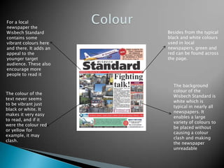
The document discusses the layout and design of a local newspaper called the Wisbech Standard. It notes that the layout is neat and orderly, with the masthead at the top to draw the reader's eye. Images and articles are placed side by side for easy reading. Advertisements run above or below the headline. The font is simple and clear for older readers, though younger audiences may find it bland. Color is used judiciously to add interest without clashing or distracting from the text.