Downloaded 198 times
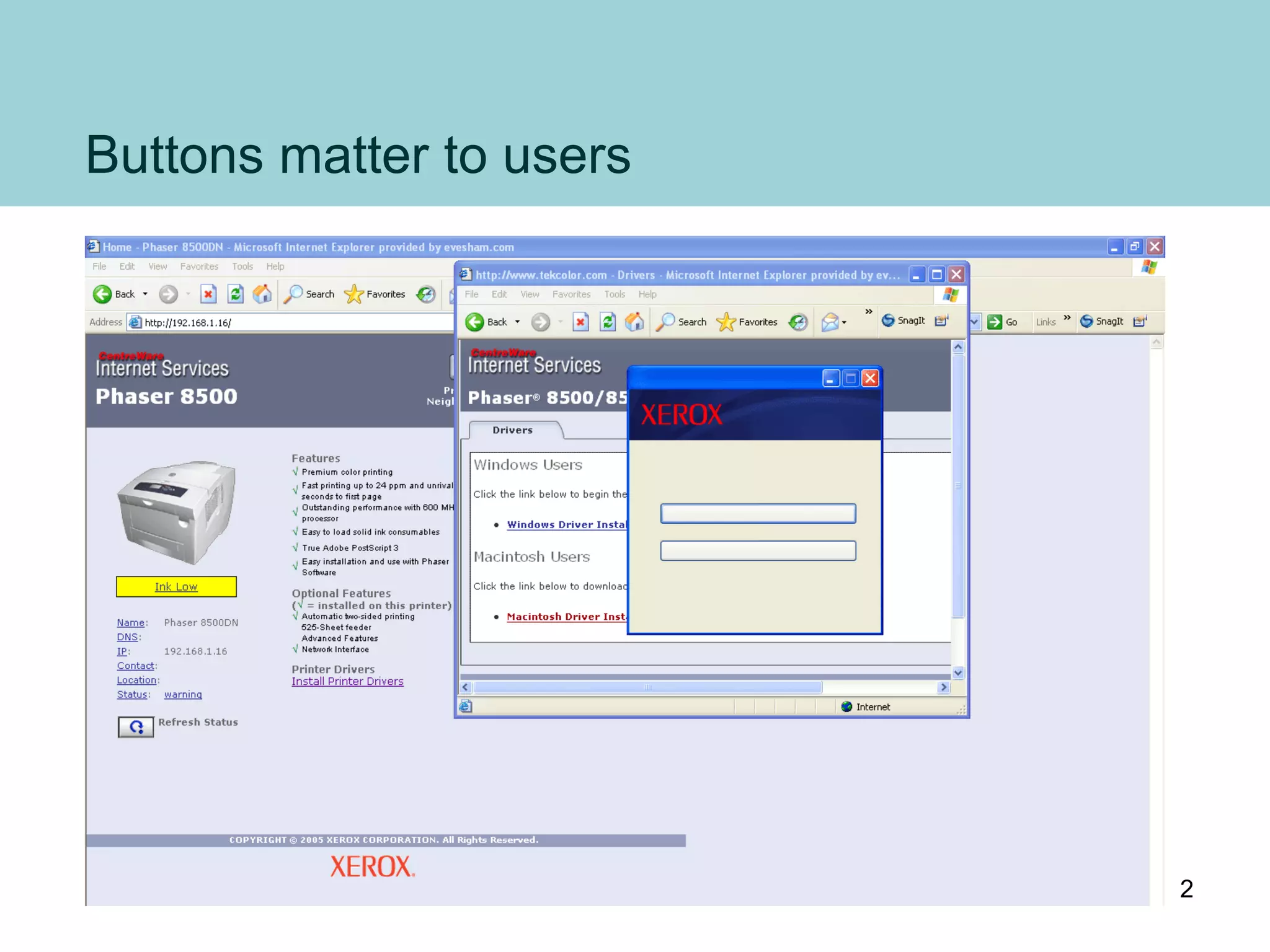
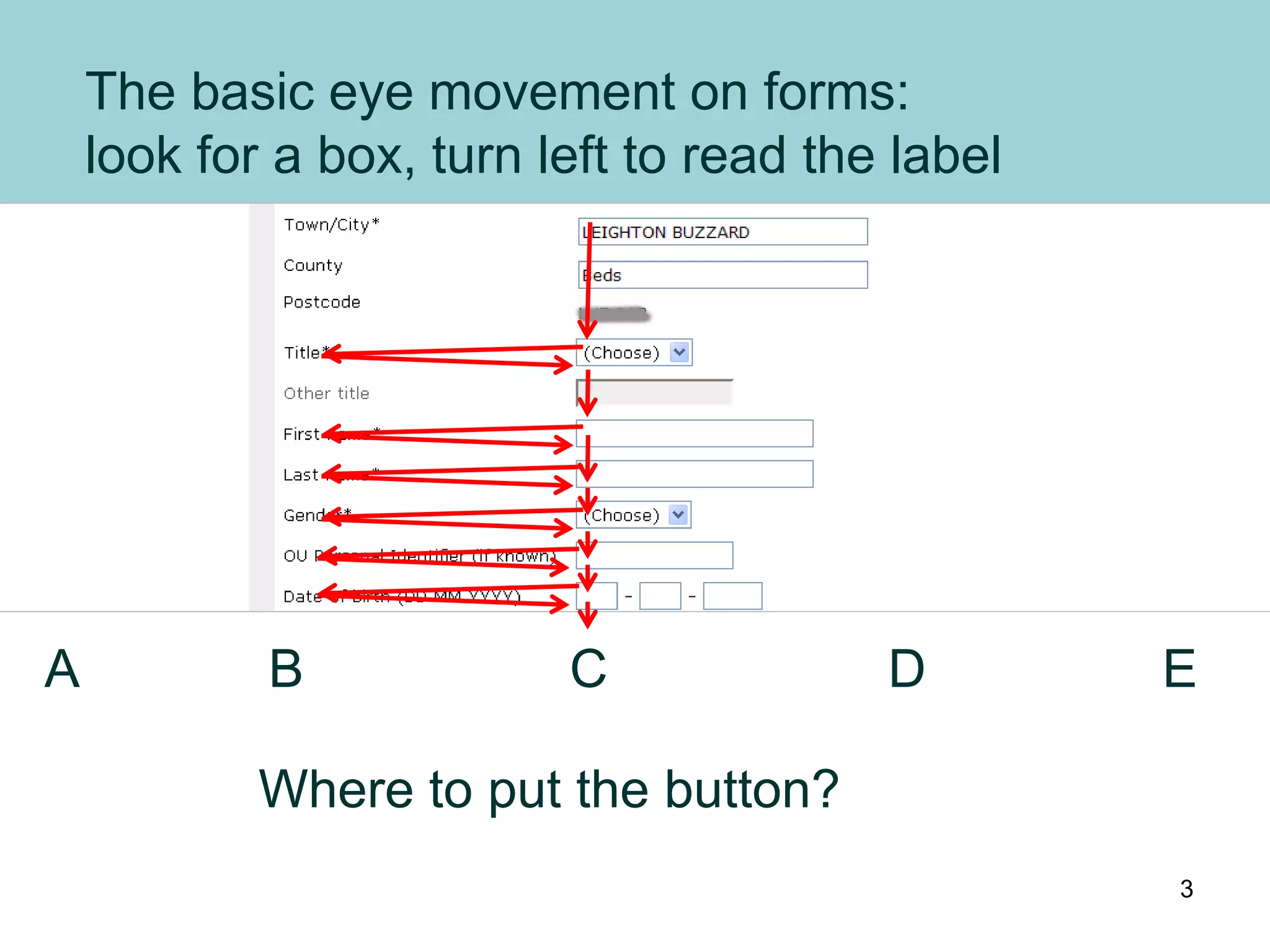
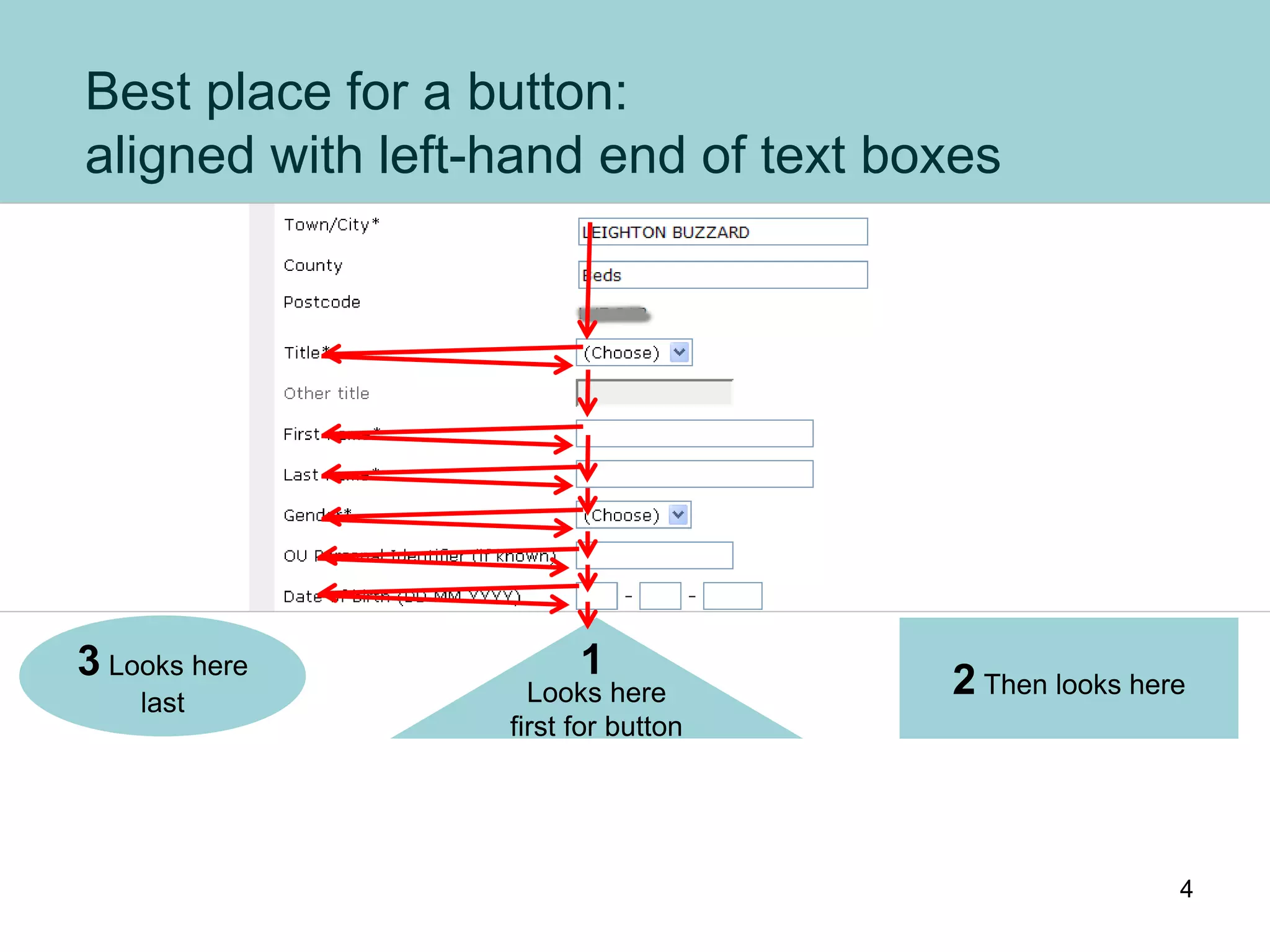
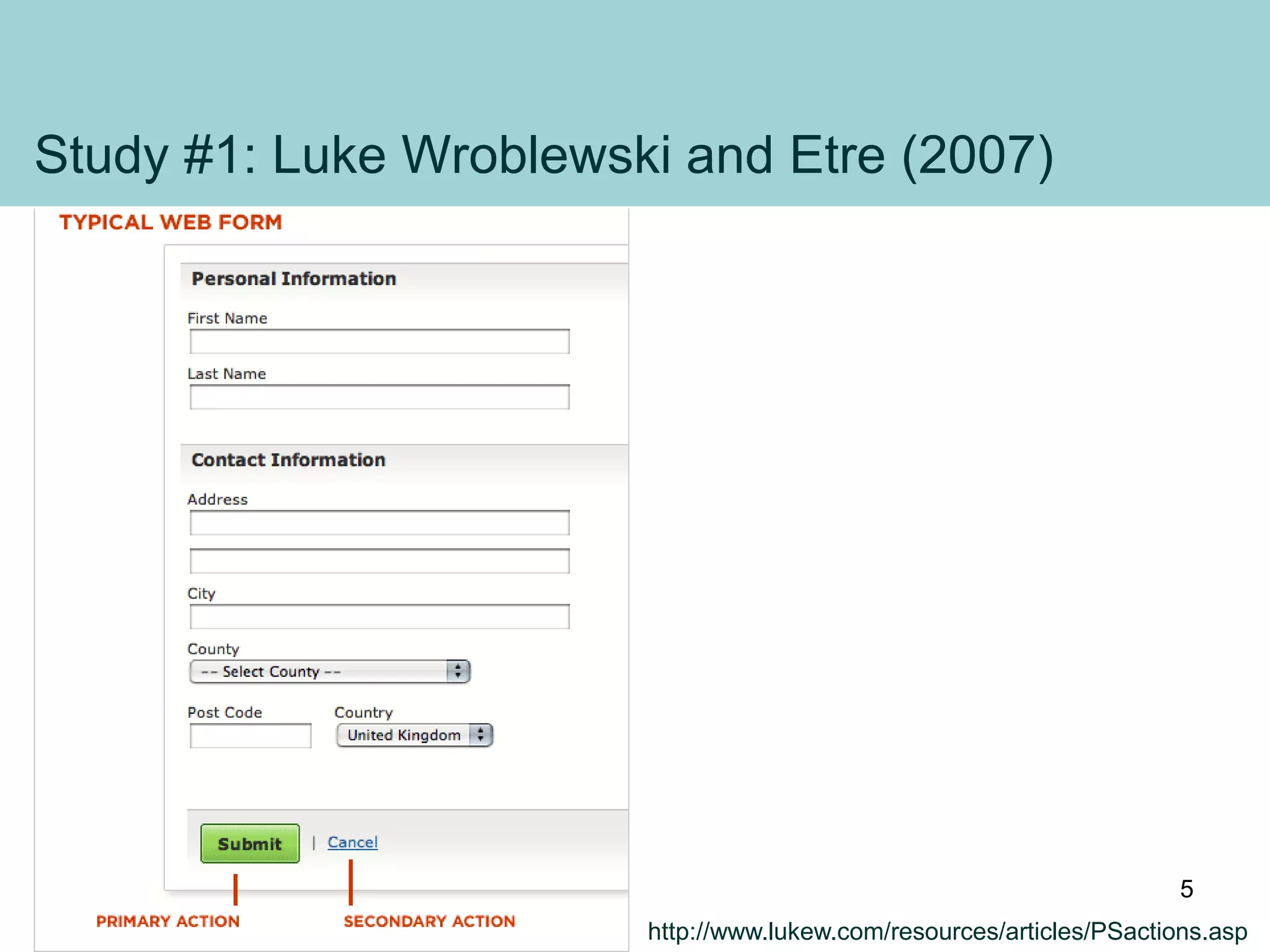
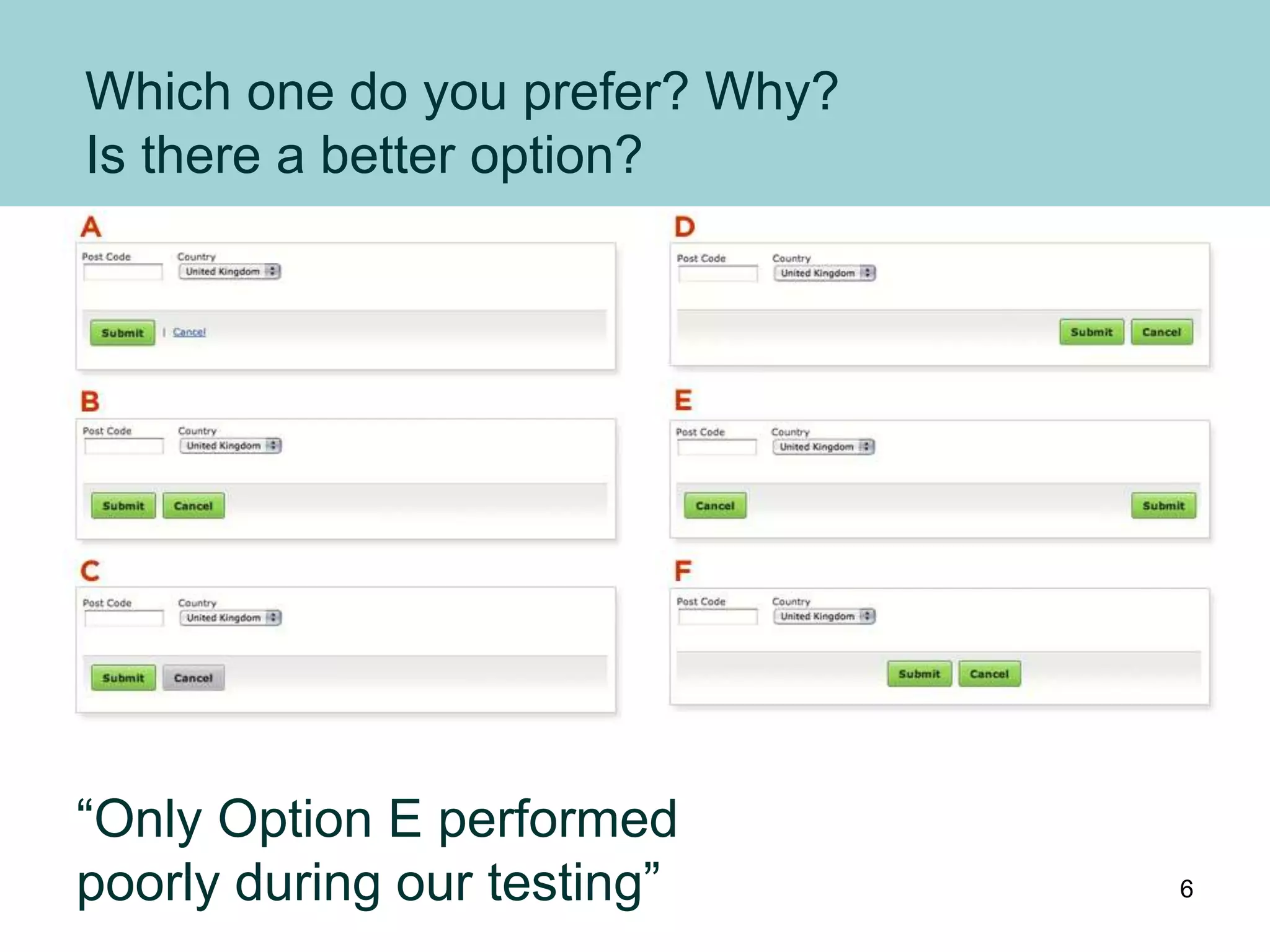
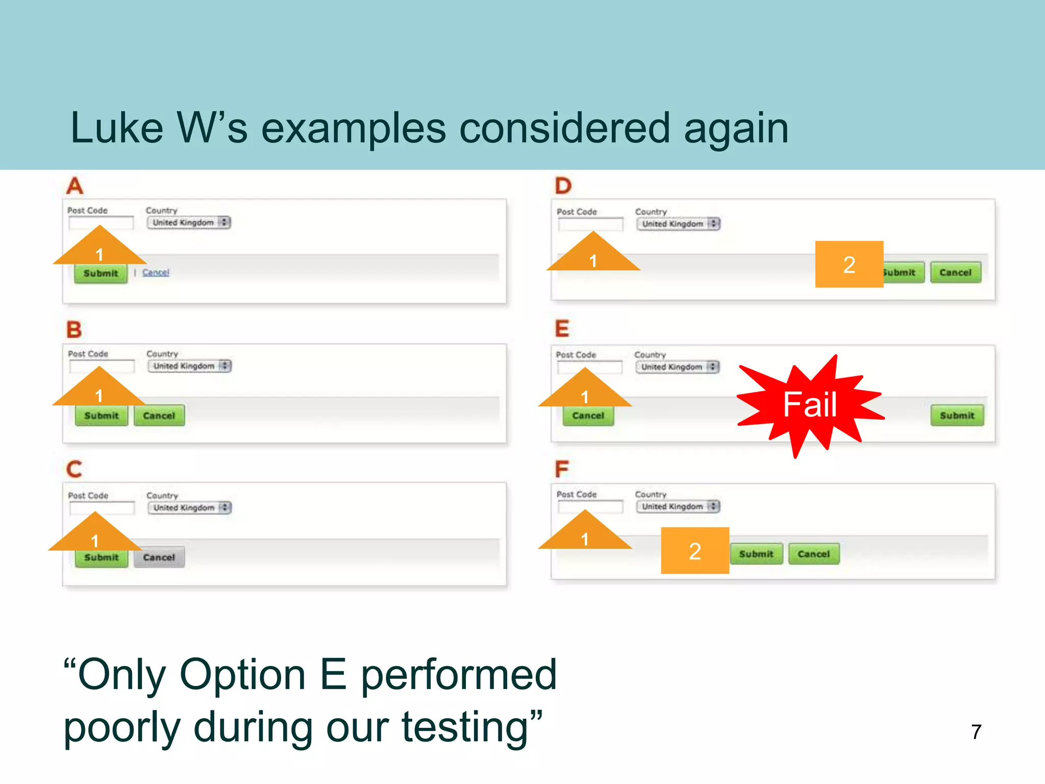
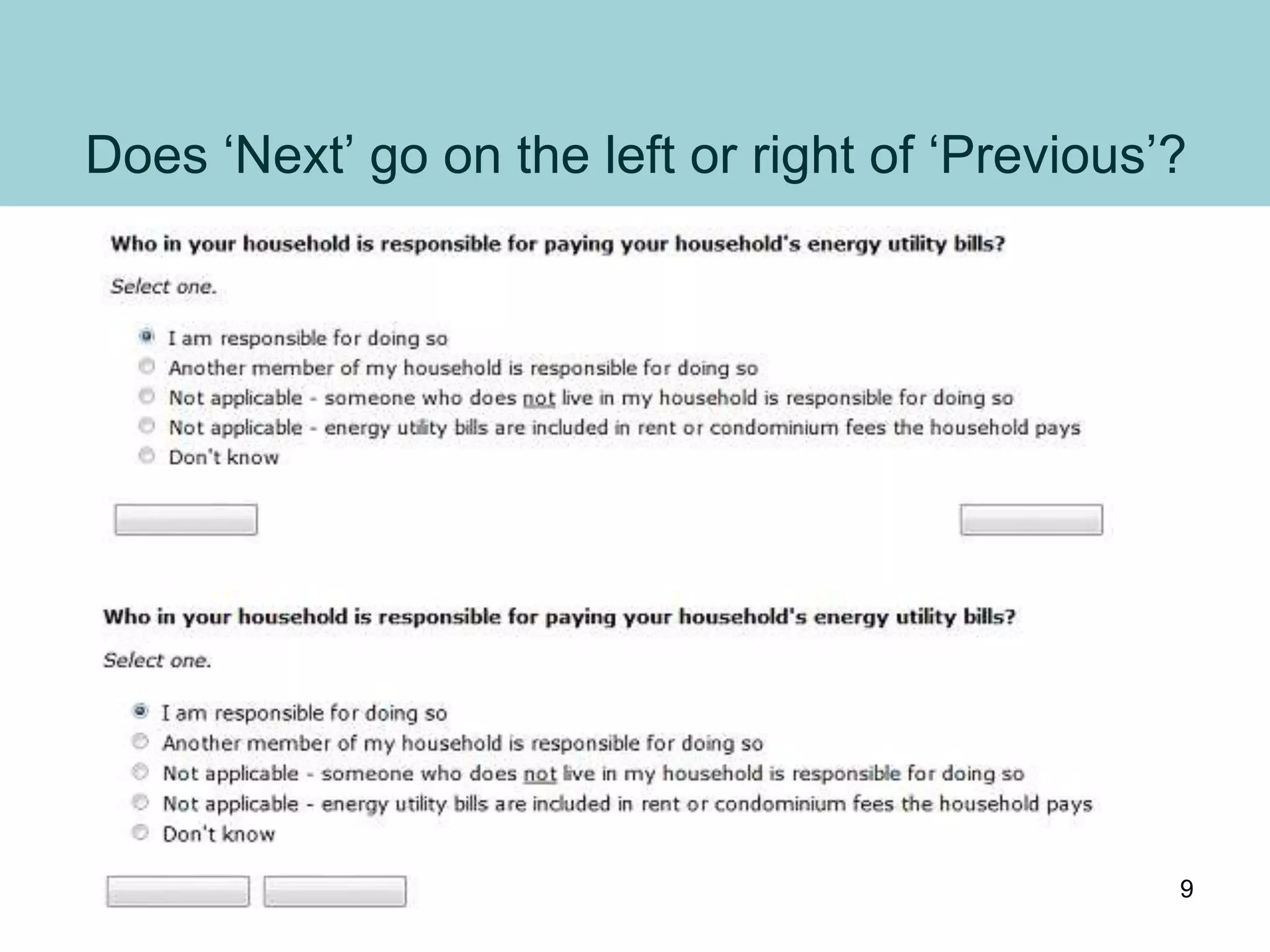
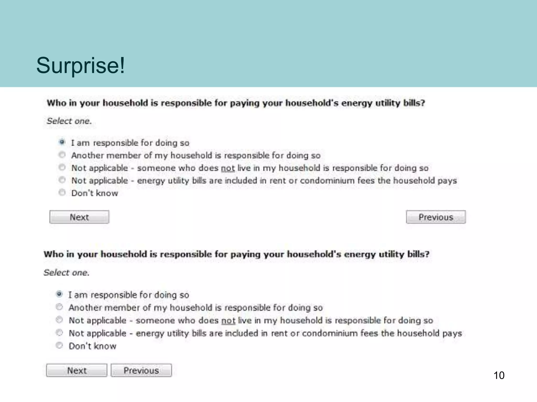
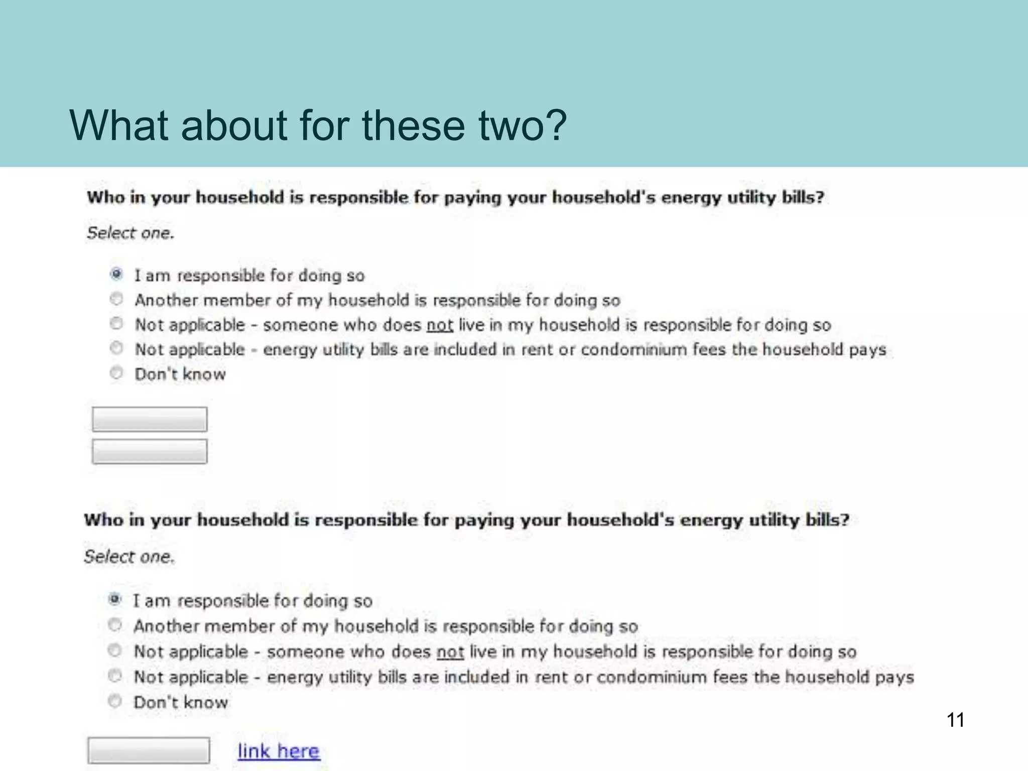
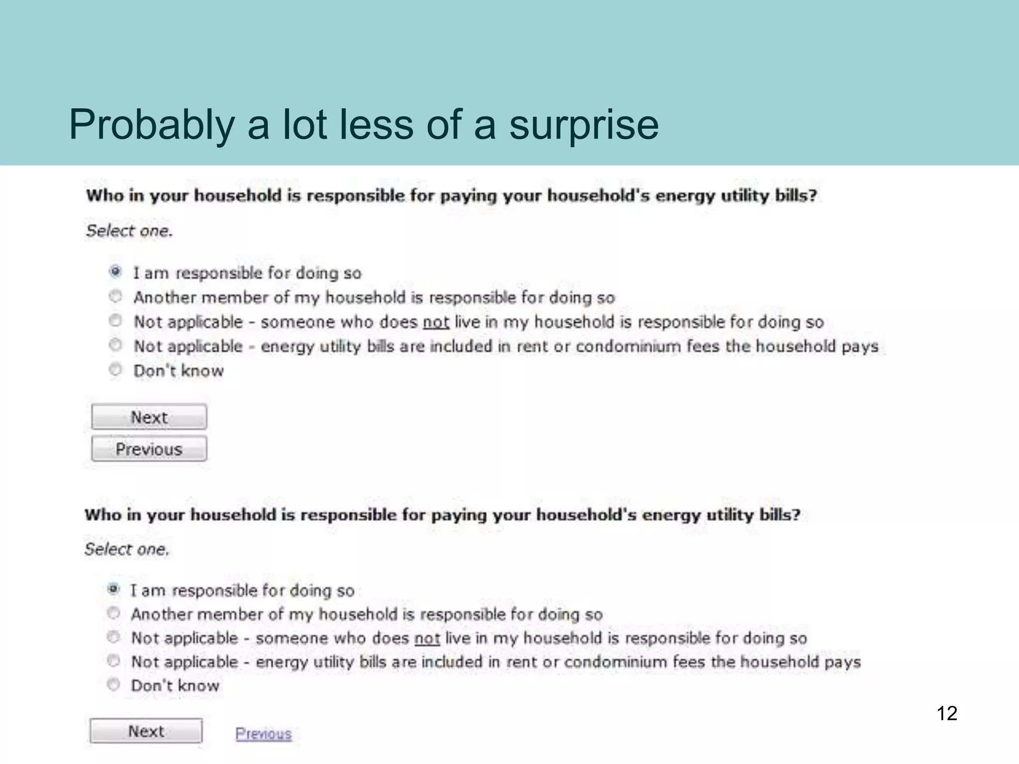
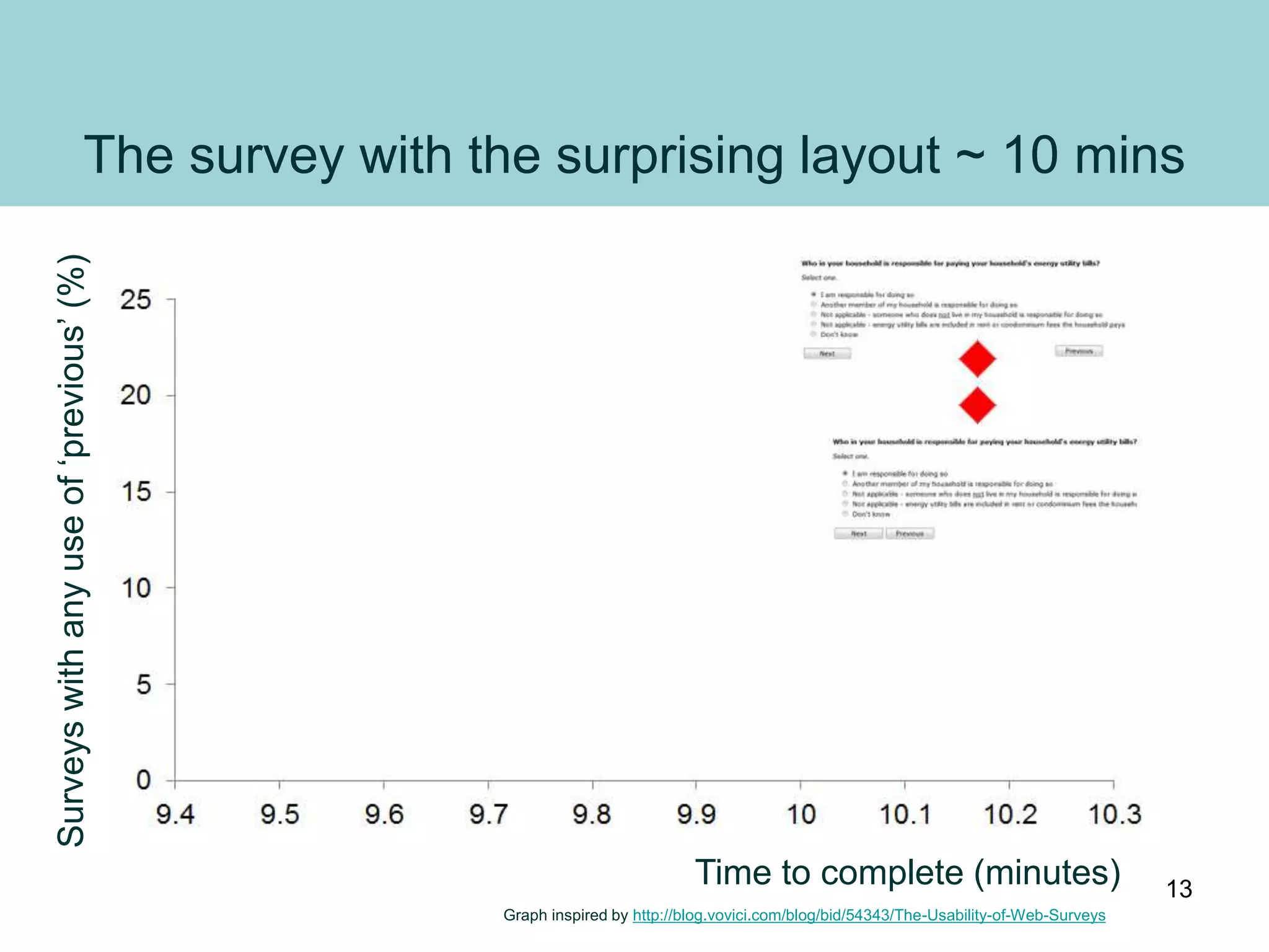
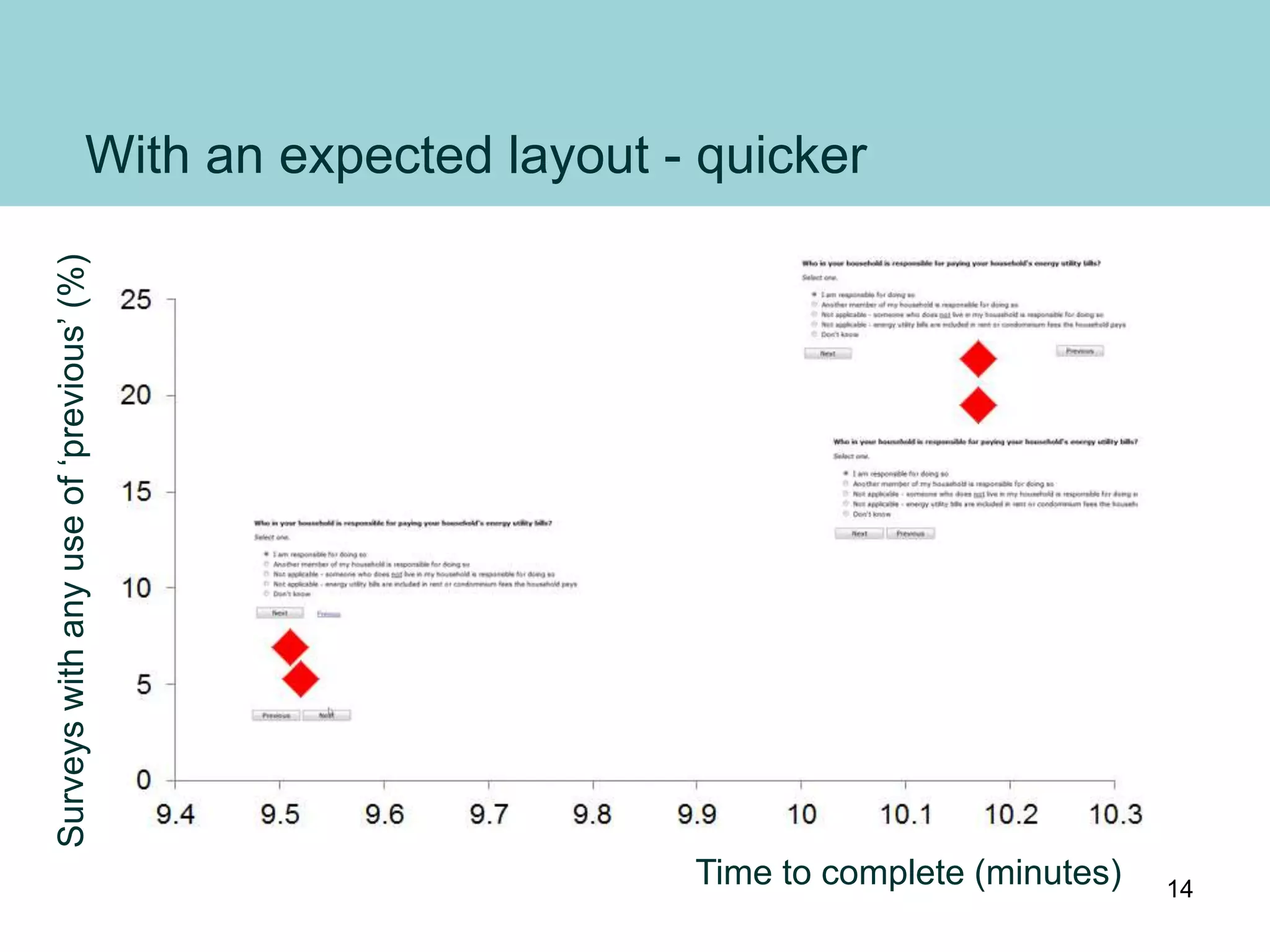
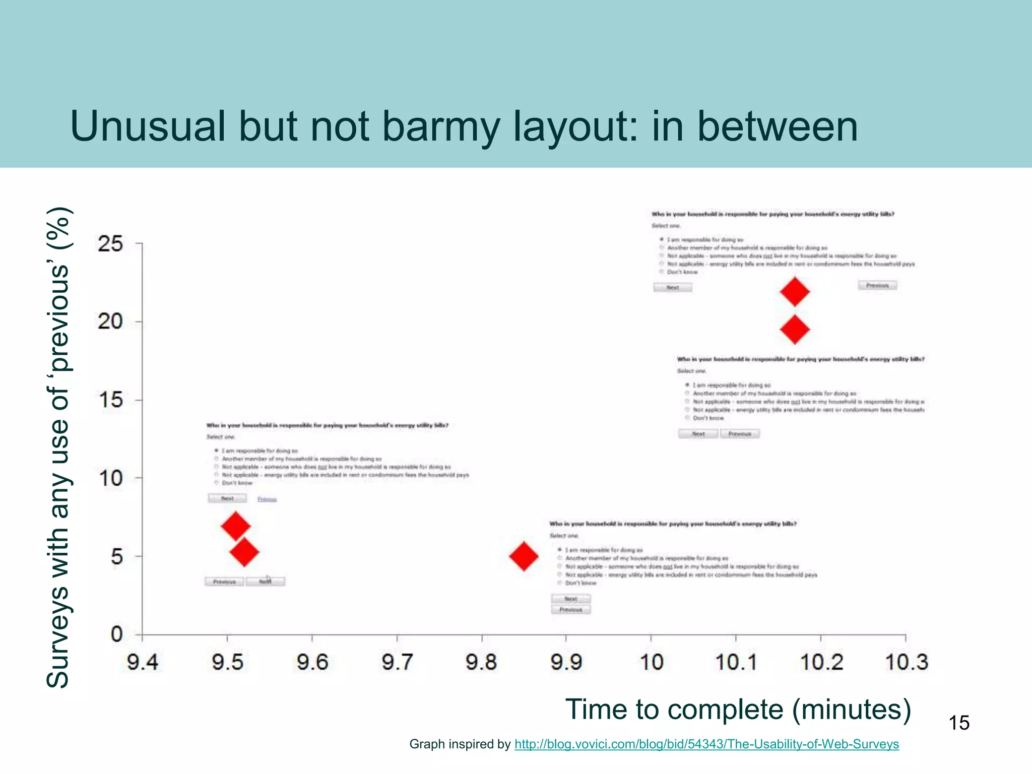
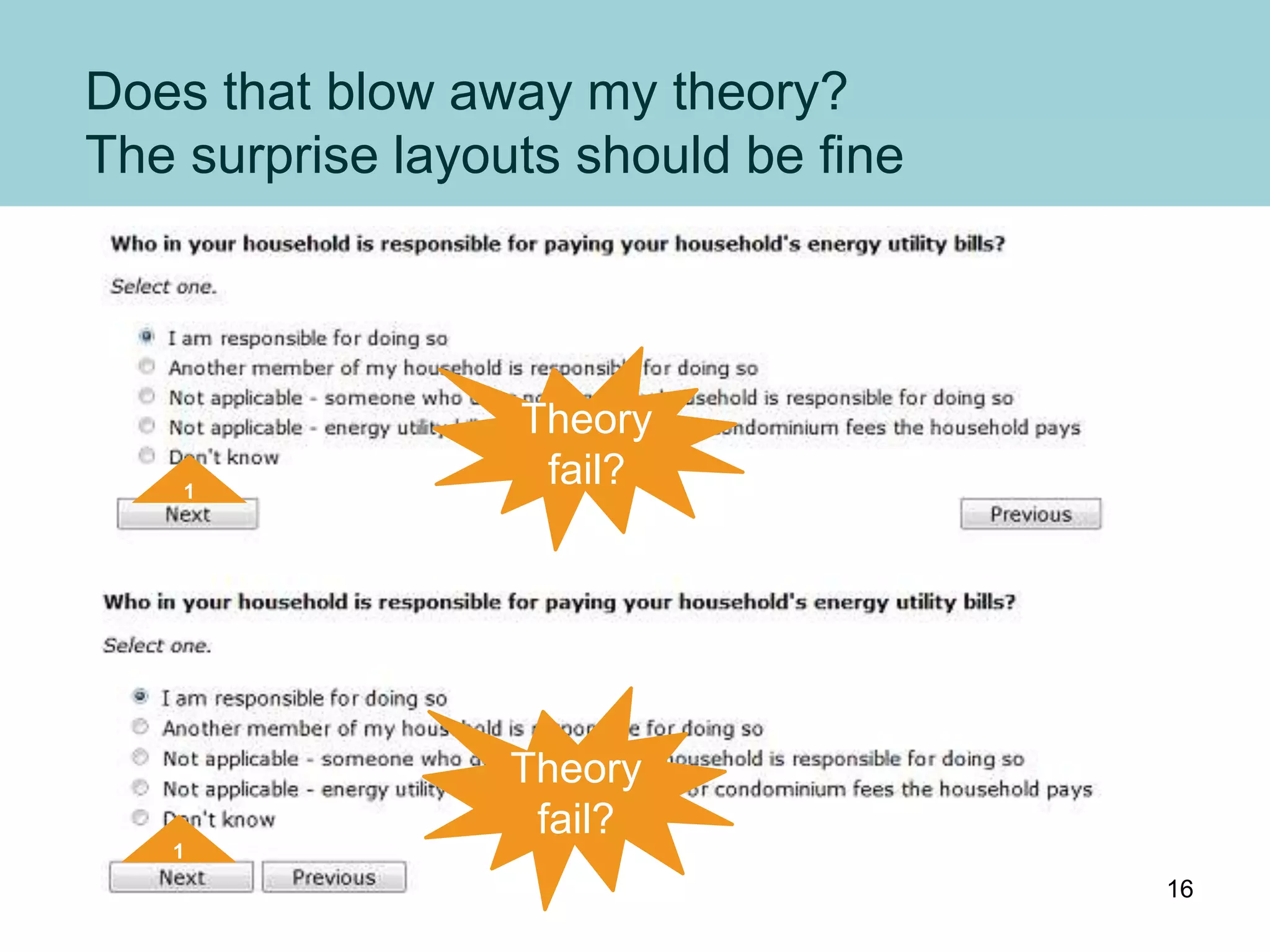
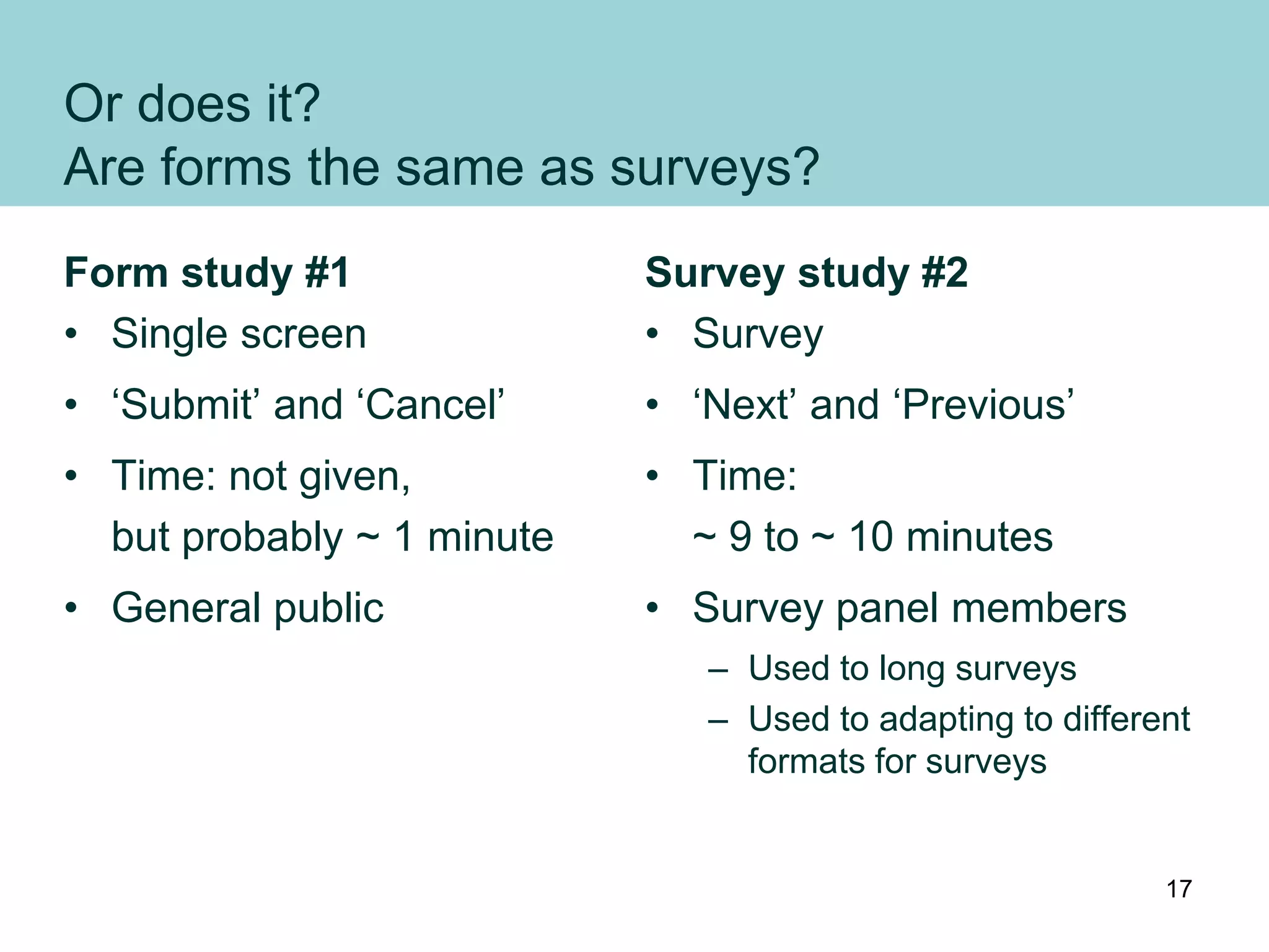
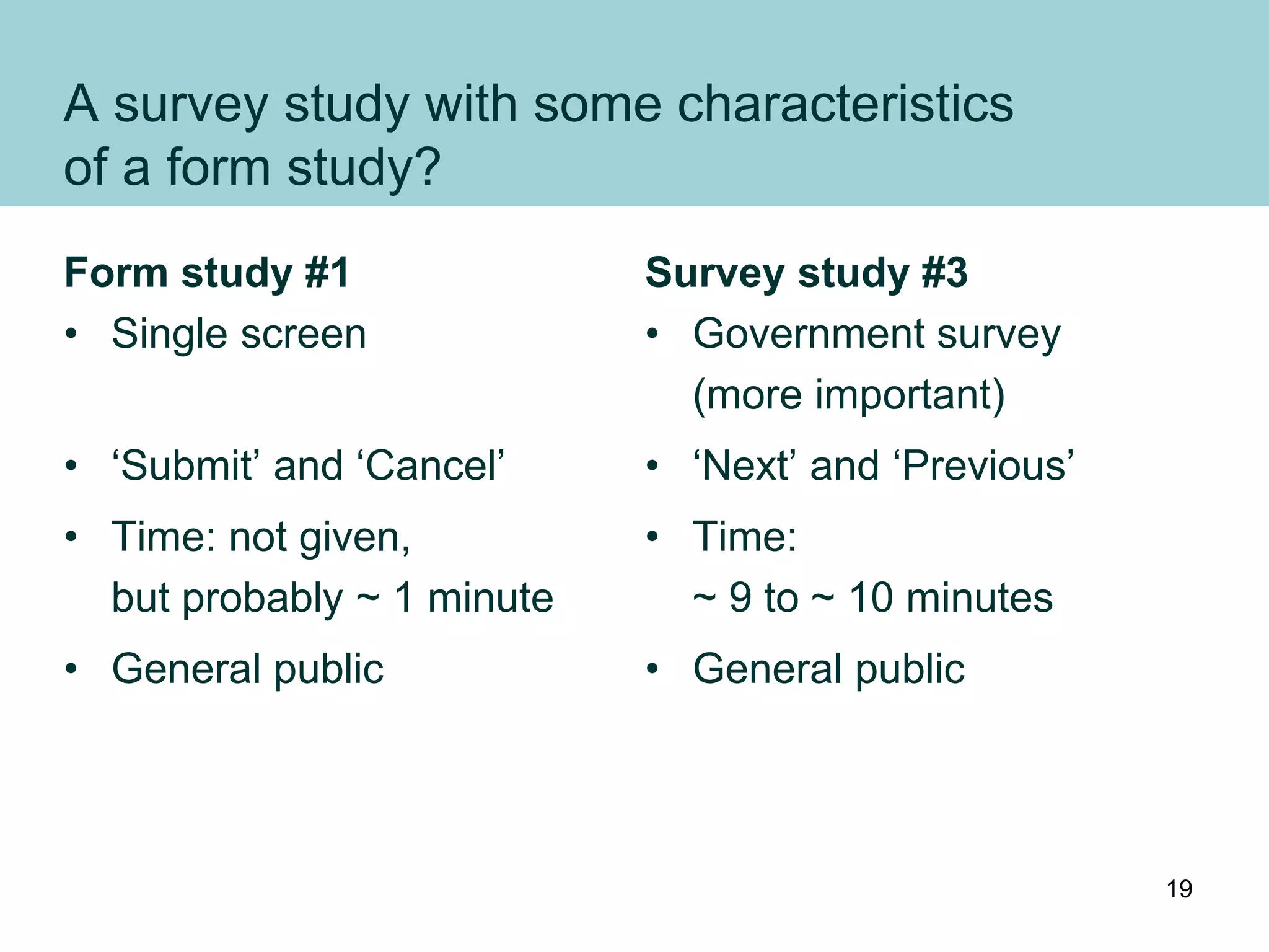
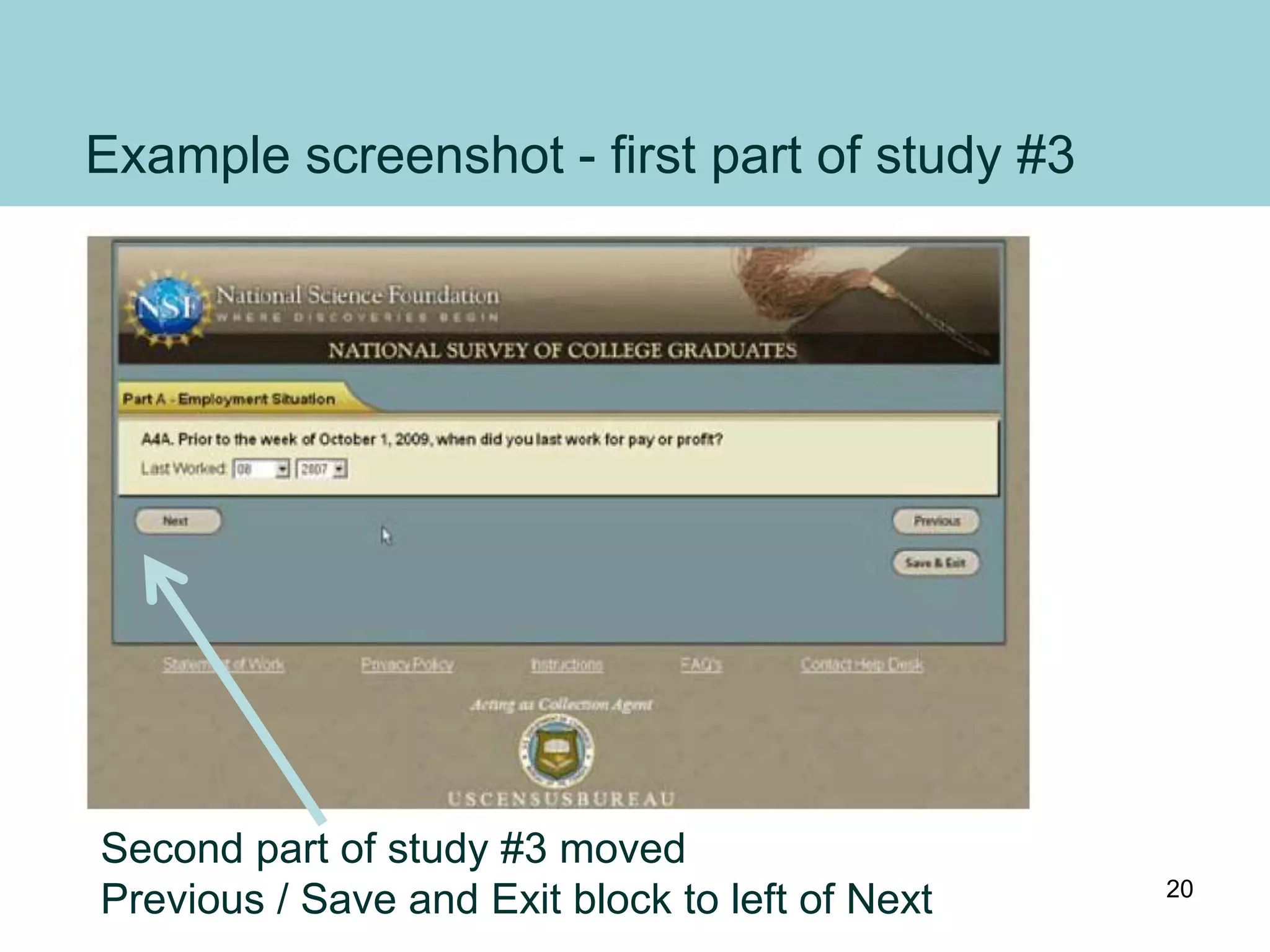
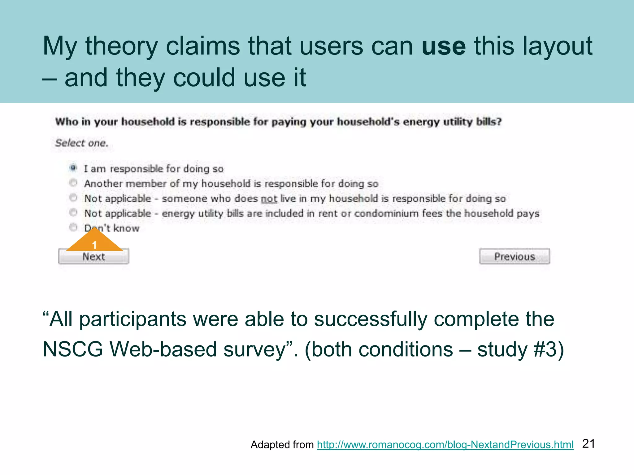
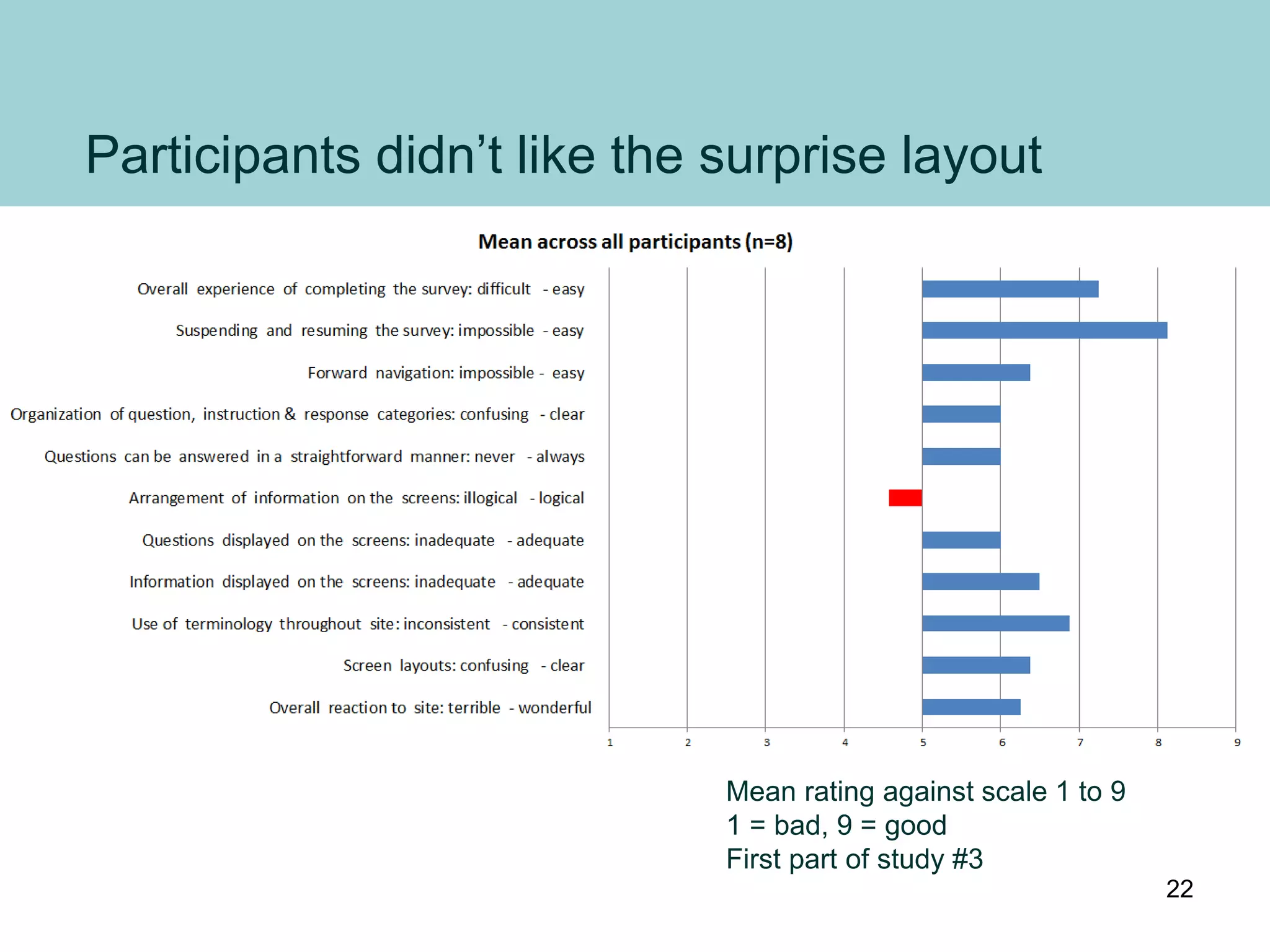
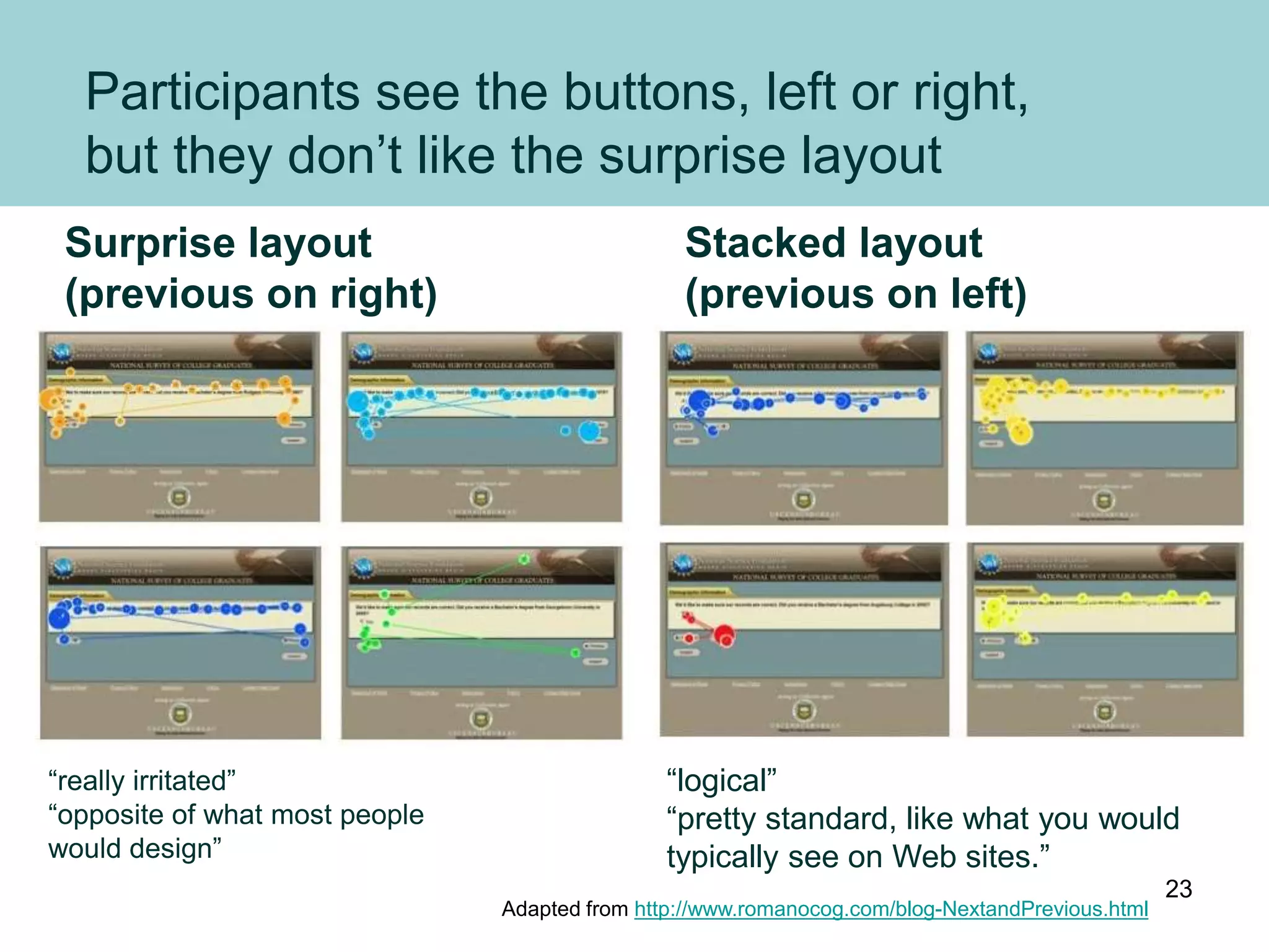
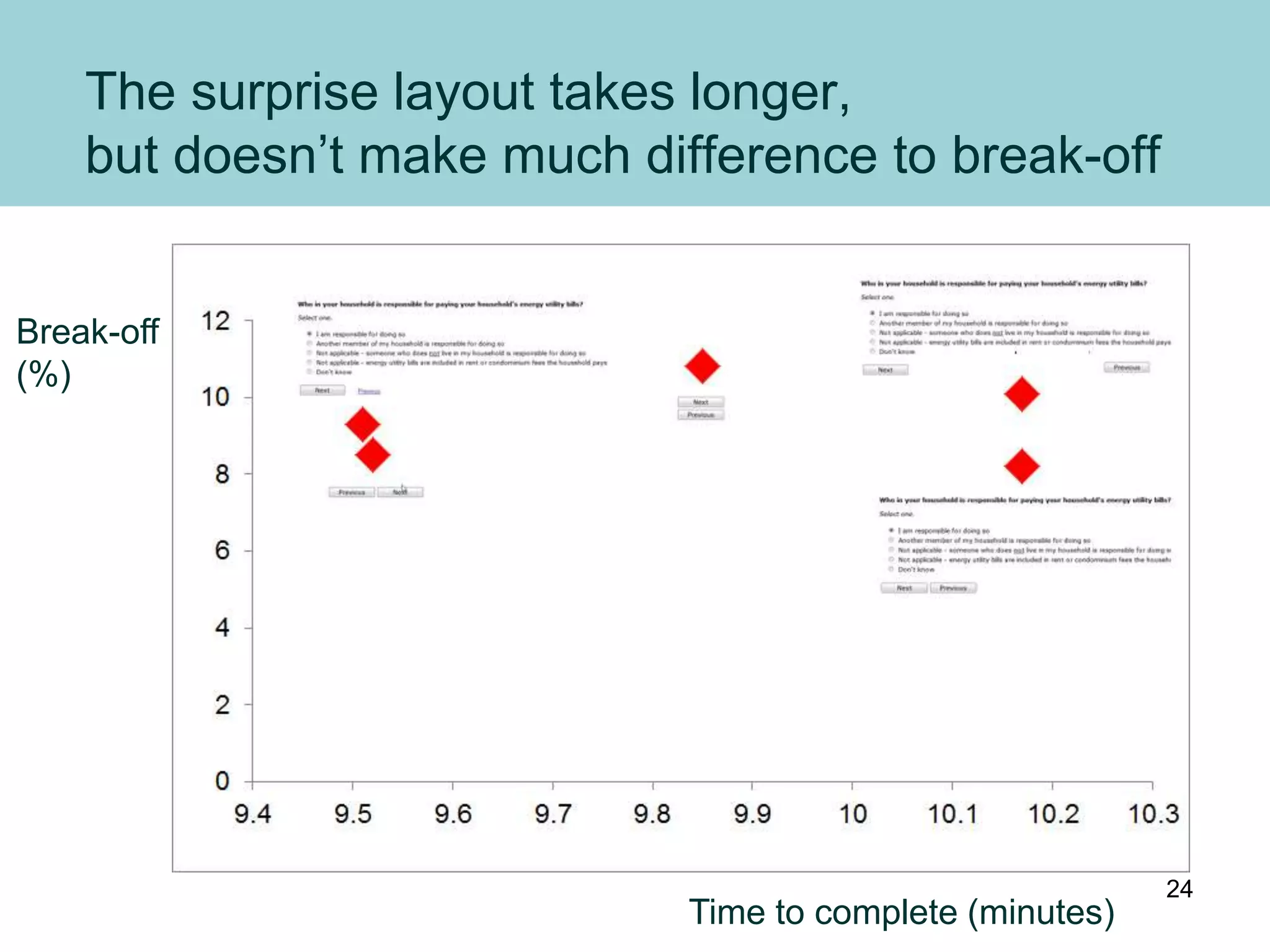
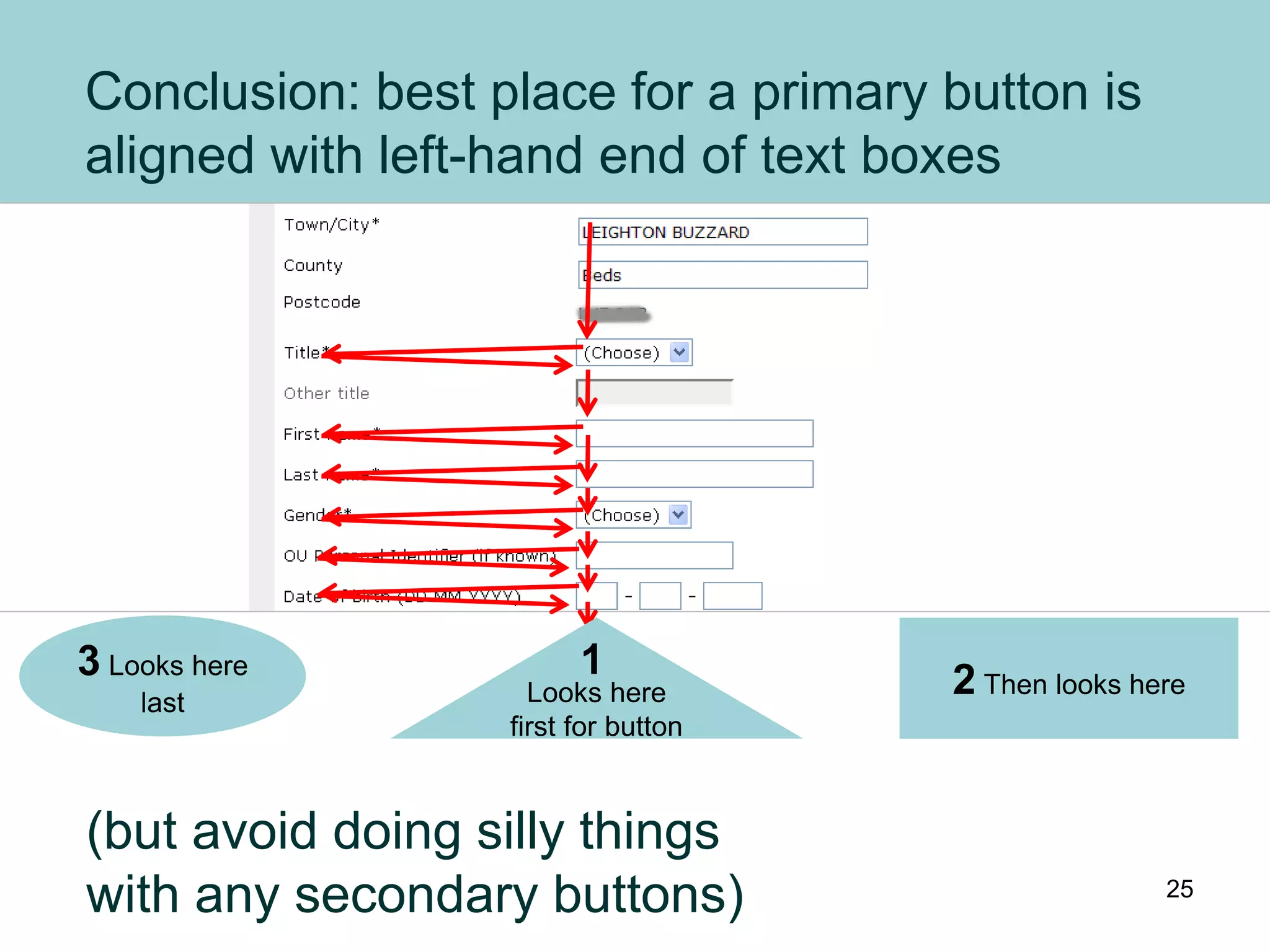

The document summarizes several studies on button placement in forms and surveys. The key findings are: 1) Buttons should be aligned with the left-hand side of text boxes as users' eyes naturally scan left to right. 2) A "surprise" layout with the Previous button on the right performed poorly in tests compared to more standard layouts. 3) While unusual layouts can be completed, they take longer and are less preferred by users compared to expected layouts with Previous on the left of Next. The best practice is to avoid non-standard button placements.


![The Power of StickyNotes [UX Week 2007]](https://cdn.slidesharecdn.com/ss_thumbnails/kruxw2007-powerofstickiesfinal-120618164338-phpapp01-thumbnail.jpg?width=640&height=640&fit=bounds)


![[BROCHURE] Italy Tour Project | @SlideON](https://cdn.slidesharecdn.com/ss_thumbnails/brochure8-251215152319-2805af68-thumbnail.jpg?width=640&height=640&fit=bounds)


