Downloaded 119 times

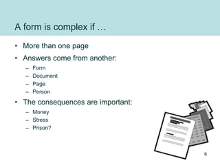

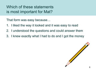
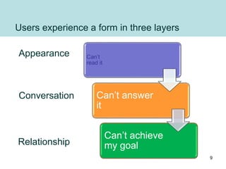
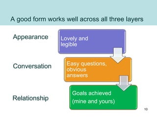

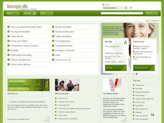

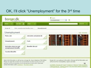
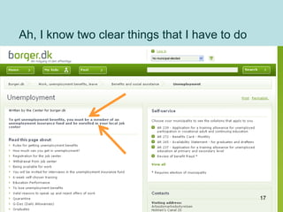
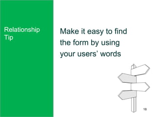

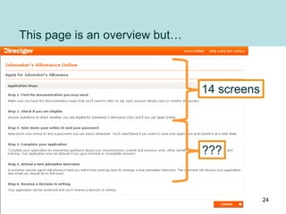
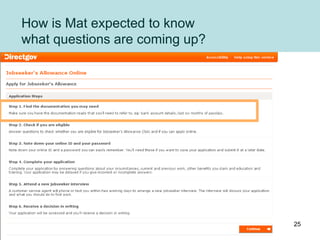
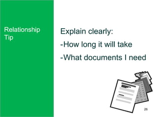
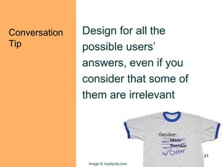
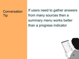
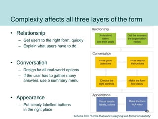
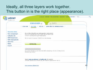
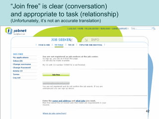

The document provides design tips for creating complex forms that enhance usability, focusing on three layers: appearance, conversation, and relationship. It emphasizes the importance of clarity and user-centric language in form design to ensure users can easily navigate and fulfill their goals. Additionally, it advises on utilizing summary menus for complex forms to facilitate user engagement and decision-making.