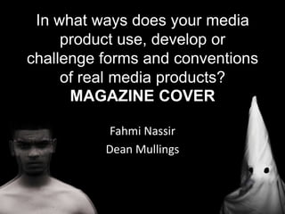
1. In what ways does your media
product use, develop or
challenge forms and conventions
of real media products?
MAGAZINE COVER
Fahmi Nassir
Dean Mullings
2. Practice
Before we made the final draft of our magazine cover, or even started our first one, we
decided to make a sample just to familiarize ourselves with Photoshop and Illustrator
once again. We also wanted to get used to the “Sight and Sound” magazine format.
We noticed at the end of our attempts at this sample that we used the wrong fonts
and we used this as a lesson for our real magazine cover.
3. Background photo
In the making - I
In order to create this effect we simply duplicated the character to make 3 copies of
the same character on top of each other. Then we selected one of the duplicate layers
on the character and shifted them 4 times to the left. We then repeated this process
with the other duplicate layer, except this time we shifted it to the right.
4. Background photo
We made this effect on the characters in the photo to link it to the effect
used in the hanging scene. Instead of showing a 2D image which could
represent feelings that are superficial, we decided to give it this effect to
represent anger that is ready to erupt and the effect is used to represent a
raging, steaming motion so the image doesn’t look so still.
5. Background photo
In the making - II
We done the same effect to the KKK character. The reason why we specifically wanted
this effect is because it resembles tension, anger and violence; these are typical
thriller themes. Whilst including these themes, we had to make sure that we didn’t let
the images look too scary because then it would seem like it’s preparing you for a
horror rather than thriller.
6. Background photo
In the making - III
We then put the KKK character in front of Fahmi on the photo to give off that “you don’t
know who lies beneath the mask” type of feel. It also helps give off an “unknown identity”
look because of the effect we put on these two characters. The black and white effect was
also used to help contrast the two character and give off a “Black vs. White” atmosphere
but in a twisted way because the “White” helps the “Black” defeat itself.
7. Cover text and images
In the making - IV
First of all, with putting together our magazine cover we had to take care of all the
compulsory aspects. Seeming as our magazine is a “Sight and Sound” cover, we had to
make sure that the “Sight and Sound” logo and the “BFI” stamp were not covered by any
other part of the magazine as that is typical “Sight and Sound” conventions.
8. Cover text and images
In the making - V
Many “Sight and Sound” magazines have a “EVERY NEW FILM REVIEWED” stamp logo on
the mid-left section of the cover, so we chose to follow these conventions and include that
as well.
9. Cover text and images
In the making - VI
This is the magazine cover after we included text. “Sight & Sound” use text on their
magazine covers to give the audience a brief idea of the main stories/content included in
the magazine. We also had to make sure that the heading font was ‘Arial’ and the
description font was ‘Times New Roman’ as this is the house style that “Sight & Sound”
follow.
10. Cover text and images
In the making - VII
We then added in our film title to the bottom
of the magazine. We decided to keep the font
that we use in our other media products that
involve our title, because it kept to our house
style. To get this font we searched through a
website that allows ‘free for personal use’
access to certain fonts. This particular font was
called ‘Credit River’. We chose this because we
felt that it complimented our title really well
with the bold letters and the shape of them. It
helped give off a war type feel to the title and
made it look more fierce and outstanding.