Dominant Image                  Strapline                                      Kicker                                                       Colour Palette
The dominant image in the       The strapline informs the reader of who the    The hook for the article could be either of two things.
                                article is about by making the writing extra                                                                The colours used
spread is of the lead                                                          First the words ‘WORLD EXCLUSIVE’ which would
                                bold to stand out. It offers a promise of                                                                   in the image are
singer, Gerard Way,                                                            excite a reader, regardless if they liked the band or not.
performing in a recording       exclusive information about the new album      Also, the band name ‘MY CHEMICAL ROMANCE’                    mostly dark, using
studio. This supports the       which the magazine witnessed the creation      may draw attention as their readership mainly like their     the imagery of the
topic of the article that       of. This draws in the reader to the article    music and would be interested in article because of the      band being “dark”
they were working on new        and encourages them to listening.              subject.                                                     with the red
material. The lack of                                                                                                                       standing out the
colour in the images                                                                                                                        most on the
reflects the bands                                                                                                                          spread.
stereotypical image and
                                                                                                                                            Overall
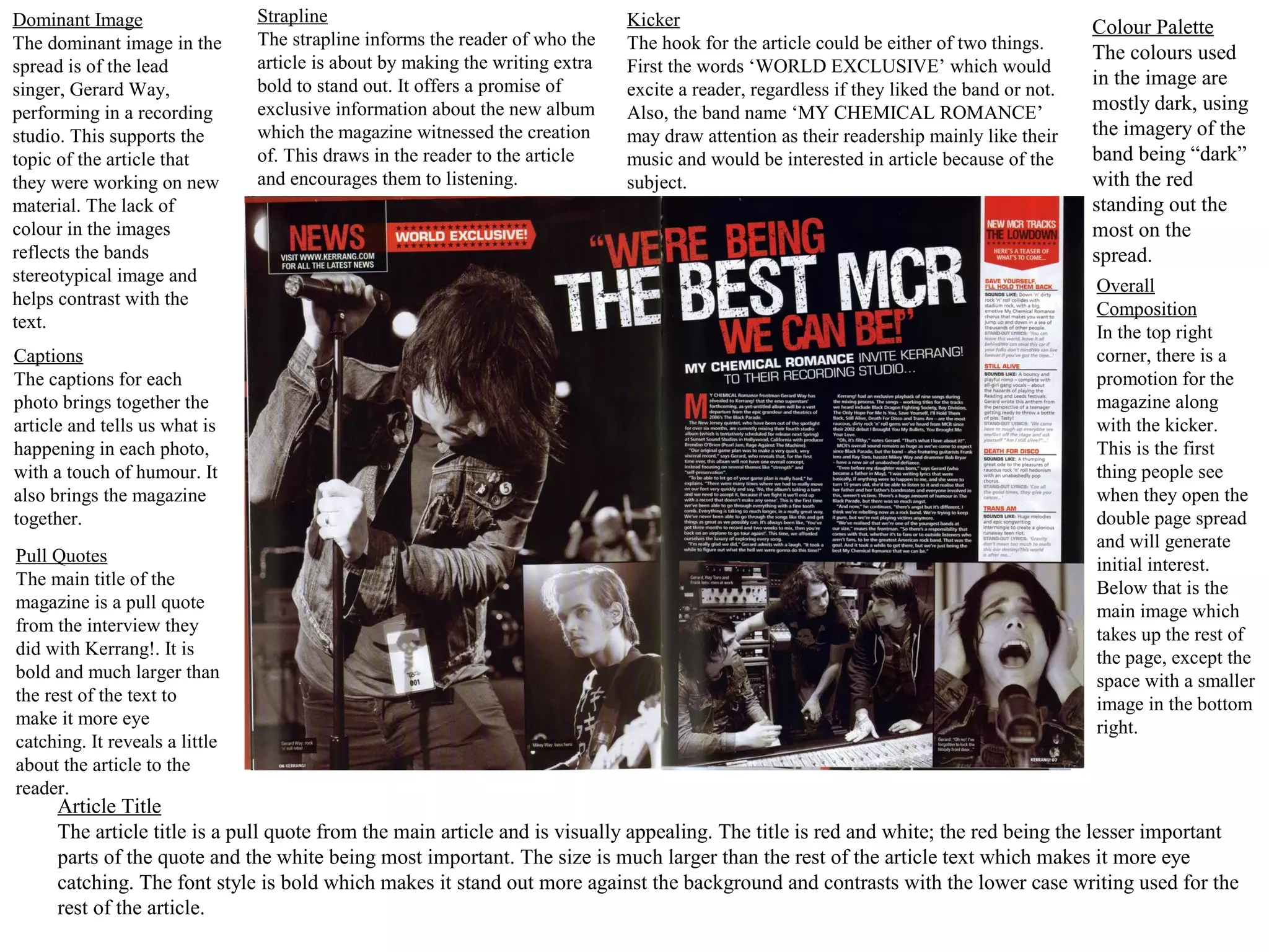
helps contrast with the
                                                                                                                                            Composition
text.
                                                                                                                                            In the top right
Captions                                                                                                                                    corner, there is a
The captions for each                                                                                                                       promotion for the
photo brings together the                                                                                                                   magazine along
article and tells us what is                                                                                                                with the kicker.
happening in each photo,                                                                                                                    This is the first
with a touch of humour. It                                                                                                                  thing people see
also brings the magazine                                                                                                                    when they open the
together.                                                                                                                                   double page spread
                                                                                                                                            and will generate
Pull Quotes                                                                                                                                 initial interest.
The main title of the                                                                                                                       Below that is the
magazine is a pull quote                                                                                                                    main image which
from the interview they                                                                                                                     takes up the rest of
did with Kerrang!. It is                                                                                                                    the page, except the
bold and much larger than                                                                                                                   space with a smaller
the rest of the text to                                                                                                                     image in the bottom
make it more eye                                                                                                                            right.
catching. It reveals a little
about the article to the
reader.
      Article Title
      The article title is a pull quote from the main article and is visually appealing. The title is red and white; the red being the lesser important
      parts of the quote and the white being most important. The size is much larger than the rest of the article text which makes it more eye
      catching. The font style is bold which makes it stand out more against the background and contrasts with the lower case writing used for the
      rest of the article.
Dominant Image                  Overall Composition                                                                                 Colour Palette
The dominant image in           On the first page the entire page is an image of the subject with a small part left blank at the    The colours used
the spread is of the            bottom for the magazine logo and page numbers with a web address. In the top left corner of         the article are plain
subject of the article,         the other page there is a large letter ‘S’ and a paragraph taking up the rest of the left side of   black and white
Lana Del Rey. The               the page. On the right there is two more paragraphs, the bottom using a larger letter ‘A’ as a      with parts of it
image used takes up a           separator for the two paragraphs.                                                                   being red and blue,
full page and draws the                                                                                                             similar to the
attention of the reader.                                                                                                            photo’s colour
The image uses blue and                                                                                                             palette.
red contrasting colours
to make it eye catching                                                                                                             Kicker
and visually appealing.                                                                                                             The first thing
                                                                                                                                    people would
Captions                                                                                                                            notice about the
The image doesn’t have                                                                                                              article is the giant
a caption, but it doesn’t                                                                                                           letter which is eye
need one as it is obvious                                                                                                           catching. It also
who they are                                                                                                                        has the name of
interviewing as they state                                                                                                          the subject in the
it on the next page.                                                                                                                top right corner, in
                                                                                                                                    larger writing.
Pull Quotes
There are no pull quotes                                                                                                            Font Choice
used in the magazine but                                                                                                            The font is the
they use some quotes in a                                                                                                           same throughout
larger paragraph as an                                                                                                              and is easy to
introduction to the article.                                                                                                        read. They use
                                                                                                                                    various different
                                                                                                                                    text styles (Italics
Article Title                                                                                                                       and Bold) to
The article does not have                                                                                                           emphasise certain
a title but uses an                                                                                                                 quotes or points
introductory paragraph to                                                                                                           made in the
give an overview of the                                                                                                             article.
article and larger letters to
introduce the start of the
article.
Dominant Image              Kicker
The dominant image is a     The kicker would
photograph       of   the   be the photo
subject taking up the       taking up an entire
entire of the left page,    page or the giant
leaving only the right      ‘L’ which presents
page for the article.       the only colour in
                            the article.
Captions
The article /image has no   Font Choice
caption but it is made      The font mainly
clear who the article is    stays the same
about in the top right      throughout the
corner      where    they   article, however
include her name in a       the size changes
large font.                 sometimes to
                            emphasize the
Pull Quotes
                            change of topic.
There are no pull quotes.
                            Overall
Article Title               Composition
                            The entire left page
There is no article title
                            is taken up by the
but they do use an intro    only image, which
blurb to introduce the      would catch the
article.                    readers      attention.
                            The subject name is
Colour Palette              in the top right
Most of the colours used    corner     and      the
are black and white,        article spread over 3
with the image been         columns with 2
edited to match the         larger letters to
colours used. The only      show a change in
other colour used is red    the theme of the
                            article. Overlaying
which is the main colour
                            the entire article is a
of the magazine.
                            red ‘L’ which stands
                            out against the rest
                            of the article.

DPS deconstruction

  • 1.
    Dominant Image Strapline Kicker Colour Palette The dominant image in the The strapline informs the reader of who the The hook for the article could be either of two things. article is about by making the writing extra The colours used spread is of the lead First the words ‘WORLD EXCLUSIVE’ which would bold to stand out. It offers a promise of in the image are singer, Gerard Way, excite a reader, regardless if they liked the band or not. performing in a recording exclusive information about the new album Also, the band name ‘MY CHEMICAL ROMANCE’ mostly dark, using studio. This supports the which the magazine witnessed the creation may draw attention as their readership mainly like their the imagery of the topic of the article that of. This draws in the reader to the article music and would be interested in article because of the band being “dark” they were working on new and encourages them to listening. subject. with the red material. The lack of standing out the colour in the images most on the reflects the bands spread. stereotypical image and Overall helps contrast with the Composition text. In the top right Captions corner, there is a The captions for each promotion for the photo brings together the magazine along article and tells us what is with the kicker. happening in each photo, This is the first with a touch of humour. It thing people see also brings the magazine when they open the together. double page spread and will generate Pull Quotes initial interest. The main title of the Below that is the magazine is a pull quote main image which from the interview they takes up the rest of did with Kerrang!. It is the page, except the bold and much larger than space with a smaller the rest of the text to image in the bottom make it more eye right. catching. It reveals a little about the article to the reader. Article Title The article title is a pull quote from the main article and is visually appealing. The title is red and white; the red being the lesser important parts of the quote and the white being most important. The size is much larger than the rest of the article text which makes it more eye catching. The font style is bold which makes it stand out more against the background and contrasts with the lower case writing used for the rest of the article.
  • 2.
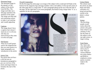
    Dominant Image Overall Composition Colour Palette The dominant image in On the first page the entire page is an image of the subject with a small part left blank at the The colours used the spread is of the bottom for the magazine logo and page numbers with a web address. In the top left corner of the article are plain subject of the article, the other page there is a large letter ‘S’ and a paragraph taking up the rest of the left side of black and white Lana Del Rey. The the page. On the right there is two more paragraphs, the bottom using a larger letter ‘A’ as a with parts of it image used takes up a separator for the two paragraphs. being red and blue, full page and draws the similar to the attention of the reader. photo’s colour The image uses blue and palette. red contrasting colours to make it eye catching Kicker and visually appealing. The first thing people would Captions notice about the The image doesn’t have article is the giant a caption, but it doesn’t letter which is eye need one as it is obvious catching. It also who they are has the name of interviewing as they state the subject in the it on the next page. top right corner, in larger writing. Pull Quotes There are no pull quotes Font Choice used in the magazine but The font is the they use some quotes in a same throughout larger paragraph as an and is easy to introduction to the article. read. They use various different text styles (Italics Article Title and Bold) to The article does not have emphasise certain a title but uses an quotes or points introductory paragraph to made in the give an overview of the article. article and larger letters to introduce the start of the article.
  • 3.
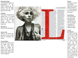
    Dominant Image Kicker The dominant image is a The kicker would photograph of the be the photo subject taking up the taking up an entire entire of the left page, page or the giant leaving only the right ‘L’ which presents page for the article. the only colour in the article. Captions The article /image has no Font Choice caption but it is made The font mainly clear who the article is stays the same about in the top right throughout the corner where they article, however include her name in a the size changes large font. sometimes to emphasize the Pull Quotes change of topic. There are no pull quotes. Overall Article Title Composition The entire left page There is no article title is taken up by the but they do use an intro only image, which blurb to introduce the would catch the article. readers attention. The subject name is Colour Palette in the top right Most of the colours used corner and the are black and white, article spread over 3 with the image been columns with 2 edited to match the larger letters to colours used. The only show a change in other colour used is red the theme of the article. Overlaying which is the main colour the entire article is a of the magazine. red ‘L’ which stands out against the rest of the article.