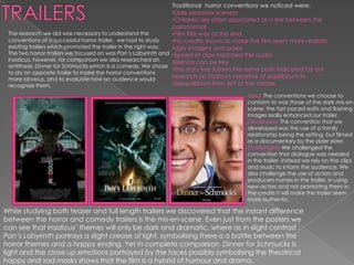
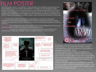
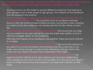
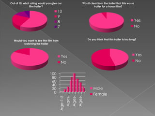
Kerry McGranaghan
And
Hayley Banks
Traditional horror conventions we noticed were:
                                                                •Dark desolate scenery
                                                                •Children are often associated as a link between the
                                                                paranormal
 The research we did was necessary to understand the            •Film title was at the end
 conventions of a successful horror trailer, we had to study    •No credits shown to make the film seem more realistic
 existing trailers which promoted the trailer in the right way. •Ugly imagery and props
 The two horror trailers we focused on was Pan’s Labyrinth and •Speed of clips matched the audio
 Insidious, however, for comparison we also researched an       •Silence can be key
 antithesis; Dinner for Schmucks which is a comedy. We chose
                                                                •The story line follows the same path indicated by our
 to do an opposite trailer to make the horror conventions
 more obvious, and to evaluate how an audience would
                                                                research on Todrov;s narrative of equilibrium to
 recognize them.                                                disequilibrium then left at the climax.

                                                                                        Used: The conventions we choose to
                                                                                        conform to was those of the dark mis-en-
                                                                                        scene, the fast paced edits and flashing
                                                                                        images really enhanced our trailer.
                                                                                        Developed: The convention that we
                                                                                        developed was the use of a family
                                                                                        relationship being the setting, but filmed
                                                                                        as a documentary by the older sister.
                                                                                        Challenged: We challenged the
                                                                                        convention that dialogue was needed
                                                                                        in the trailer, instead we rely on the clips
                                                                                        and music to inform the audience. We
                                                                                        also challenge the use of actors and
                                                                                        producers names in the trailer, in using
                                                                                        new actors and not promoting them in
                                                                                        the credits it will make the trailer seem
                                                                                        more authentic.

While studying both teaser and full length trailers we discovered that the instant difference
between the horror and comedy trailers is the mis-en-scene. Even just from the posters we
can see that Insidious’ themes will only be dark and dramatic, where as in slight contrast
Pan’s Labyrinth portrays a slight crease of light, symbolising there is a battle between the
horror themes and a happy ending. Yet in complete comparison Dinner for Schmucks is
light and the close up emotions portrayed by the faces possibly symbolising the theatrical
happy and sad masks shows that the film is a hybrid of humour and drama.
Similarities: The similarities between these to
                                                magazines is the importance of layout, they
                                                both include what other articles are inside, clear
                                                information and typography and the iconic
                                                photo from the film.

                                                Differences: The contrast of colours,;
                                                ENTERTAINMENT is obviously a lighter and
                                                humours magazine represented by its block
                                                fonts and “sunny day” colouring. Where as
                                                FANGORIA uses gothic typography and dark
                                                outlines to represent that it is a specific genre of
                                                magazine. The main difference we believe has
                                                a huge impact on the magazine is the
                                                importance of the films name, The Hangover
                                                is considerably smaller than Insidious which Our magazine cover is presented through
                                                create a completely different effect.            EMPIRE, we chose EMPIRE because it is the most
                                                                                                successful film magazine around and therefore
                                                                                                our film will gather a lot of attention. We chose to
Used: After looking at dozens of magazine                                                       edit the title by mirroring as a reflection to
covers we decided to use the traditional                                                        symbolise the link with the film and the demonic
positioning of Title at the top, combined                                                       possession through mirrors, we also gave EMPIRE
with large image, and lesser information at                                                     a stain glass shiny effect to enhance the link of
the bottom. We chose to conform to this                                                         mirrors.
because it is the easiest format for a viewer                                                   We made sure that the use of layers was
to comprehend because it is linear.                                                             effective and complimented the cover, eg. We
Developed: We developed on the                                                                  did not cover the main title only the reflection
separation of the typography such as                                                            but the title of the film takes priority over the
FANGORIA demonstrates that there is other                                                       photography,
films being advertised in the 35mm wheel.                                                       We kept the colour scheme as only 4
Challenge:d We challenged however the                                                           colours, red, white, yellow and black. This is
                                                                                                because it makes specific elements of the cover
use of photography, instead of just one
                                                                                                standout such as the red is what the audience in
image we explored the use of combining
                                                                                                drawn to first and then they notice the less
two, we found this effective for the
                                                                                                important information . This colour scheme is also
audience to understand the link between                                                         connected with horror trailers.
the girl and the mirror.                                                                        We were also sure to include the legal
                                                                                                requirements that must be visible on a magazine
                                                                                                such as the date and price.
The use of a film poster is to advertise to a percentage of the audience that perhaps may
not be able to access the media advertisements, so posters can be arranges in public
places for the world to see. The Insidious poster is very interesting, especially with the use of
location and typography. The darkened shirt makes it easy for the text to be read and the
positions of the upside-down title suggests evil and destruction are going to be elements of
the film. There is also reference to pathetic fallacy which enhances the tension of the poster.

Used: We decided that like most posters we were going to conform by having the
protagonist as the centre of the image. We also took from the Insidious poster to include
ourselves as producers so that the audience can have something else to judge what genre
of film it is.
Developed: We developed the use of also using a child as the protagonist but facing away
from the camera, we think this creates anonymity and suspense.
Challenged: However we challenged the use of only one carefully set up picture, but
instead used a multitude of images to give an insight of what is to some in the film.


                                                                                       Our poster is relevant to our film because it is another
                                                                                       level of effective advertisement that also contains
                                                                                       information the audience needs such as the date it is
                                                                                       released and the BBFC rating.
                                                                                       The title is bold and demonstrates the difference
                                                                                       between light and dark but also the reflection in the
                                                                                       mirror which is why the white half of Anna is backwards.
                                                                                       Static as the background is considered to be the sign of
                                                                                       the paranormal and this thought is enhanced by the
                                                                                       heart monitor line.
                                                                                       We also included a slogan but we made sure that the
                                                                                       text was smaller and less demanding then “ANNA” as to
                                                                                       not take the point of focus away, we included a slogan
                                                                                       to tick in the audiences mind.
How effective is the combination of
your main products and ancillary
texts?
The media industry is very competitive, so the importance of “branding” a
production such as the films name or slogan means they can legally copyright
it: ©. By copywriting your work it makes it illegal for another party to copy any
part of your work, eg:                                                 These companies
                                                                                               are branded by
How they can be                                                                                there logos, which
created.                                                                                       attracts a wide
Our main task is represented by our ancillary texts( poster and magazine cover)                audience
effectively by the connections between each of them. Although each piece is suitable           because it
for the format it is in attempted to keep the focus of similarities especially in the title:   represents their
ANNA. What we found was effective was that an audience was able to recognize that              standard.
the trailer and the poster was linked just by the use of typography, colour schemes and
grainy backgrounds. This is important when advertising to keep consistency so that the
audience does not get confused.

                                                 We made sure that in each media
                                                 product we created we had to keep
                                                 the title of the film very similar, the
                                                 name will be remembered for the
                                                 backwards reflective lettering and
                                                 the colour scheme of black, white
                                                 and red. We also tried to incorporate
                                                 the heart beat line in both titles ,
                                                 however we changed the
                                                 background on the poster because it
                                                 created a better effect then the
                                                 animation we used in the trailer,
                                                 however the similarities are still
                                                 obvious.
We surveyed 10 people after watching our film trailer and these were some of
the results-(the people were kept anonymous to keep confidentially)

   We have shown our film trailer to several different audiences that belong to
    both genders and a wide range of age groups. The majority of the feedback
    that we received was positive.
   “the film trailer was very well put together and I could definitely see that this
    was a trailer for a horror film”. This quotation from an audience member
    shows us that we have included traditional horror conventions when creating
    our trailer so that the audience can clearly see that this film will be a horror
    film.
   “I liked the fact that this film looked really realistic”. We found that our trailer
    was successful as we were aiming to make the trailer look realistic so that it
    will have a bigger affect on the audience.
   Although the majority of our feedback was positive, there was some criticism
    to consider.
   “the trailer could have included more characters”. We found this criticism to
    be useful to us as we have learnt that showing only two characters in our
    trailer may not be enough to make it look interesting, and also that in the
    future we may need to include more characters in the trailer.
   “the trailer was good but it was a bit too long to keep my attention”. We
    again found this criticism to be very useful as we have now realised that
    many people do not want to watch a long trailer, so in the future we need to
    keep the trailer short so that the audience can keep their attention on the
    trailer.
Out of 10, what rating would you give our                                Was it clear from the trailer that this was a
               film trailer?                                                       trailer for a horror film?

                                     10
                                     9
                                     8                                                                                   Yes
                                     7                                                                                   No


  Would you want to see the film from                                        Do you think that this trailer is too long?
         watching the trailer


                                          Yes                                                                            Yes
                                          No                                                                             No


                               100
                                80
                                60
                                40
                                20                                                Male
                                 0                                                Female
                                                  Ages-…
                                                           Ages-…
                                                                    Ages-…
                                        Age-1-5
How did you use new technologies
in the construction and
research, planning and evaluation
stage?
Final Cut Pro was our main use of editing
software, we found it so much easier this year to
work with it because we had all of last years
experiences, we found practically no problems in
using it which meant we finished editing a lot
faster.
Text Edit was the software we used to create
our titles, we experimented a lot in Text Edit
because there was such a vast amount of
possibilities, however we found it easy to use
and in the end decided that a simple form of
text with a few layers of movement and
texture would be most effective.

EVALUATION

  • 2.
  • 3.
    Traditional horror conventionswe noticed were: •Dark desolate scenery •Children are often associated as a link between the paranormal The research we did was necessary to understand the •Film title was at the end conventions of a successful horror trailer, we had to study •No credits shown to make the film seem more realistic existing trailers which promoted the trailer in the right way. •Ugly imagery and props The two horror trailers we focused on was Pan’s Labyrinth and •Speed of clips matched the audio Insidious, however, for comparison we also researched an •Silence can be key antithesis; Dinner for Schmucks which is a comedy. We chose •The story line follows the same path indicated by our to do an opposite trailer to make the horror conventions more obvious, and to evaluate how an audience would research on Todrov;s narrative of equilibrium to recognize them. disequilibrium then left at the climax. Used: The conventions we choose to conform to was those of the dark mis-en- scene, the fast paced edits and flashing images really enhanced our trailer. Developed: The convention that we developed was the use of a family relationship being the setting, but filmed as a documentary by the older sister. Challenged: We challenged the convention that dialogue was needed in the trailer, instead we rely on the clips and music to inform the audience. We also challenge the use of actors and producers names in the trailer, in using new actors and not promoting them in the credits it will make the trailer seem more authentic. While studying both teaser and full length trailers we discovered that the instant difference between the horror and comedy trailers is the mis-en-scene. Even just from the posters we can see that Insidious’ themes will only be dark and dramatic, where as in slight contrast Pan’s Labyrinth portrays a slight crease of light, symbolising there is a battle between the horror themes and a happy ending. Yet in complete comparison Dinner for Schmucks is light and the close up emotions portrayed by the faces possibly symbolising the theatrical happy and sad masks shows that the film is a hybrid of humour and drama.
  • 4.
    Similarities: The similaritiesbetween these to magazines is the importance of layout, they both include what other articles are inside, clear information and typography and the iconic photo from the film. Differences: The contrast of colours,; ENTERTAINMENT is obviously a lighter and humours magazine represented by its block fonts and “sunny day” colouring. Where as FANGORIA uses gothic typography and dark outlines to represent that it is a specific genre of magazine. The main difference we believe has a huge impact on the magazine is the importance of the films name, The Hangover is considerably smaller than Insidious which Our magazine cover is presented through create a completely different effect. EMPIRE, we chose EMPIRE because it is the most successful film magazine around and therefore our film will gather a lot of attention. We chose to Used: After looking at dozens of magazine edit the title by mirroring as a reflection to covers we decided to use the traditional symbolise the link with the film and the demonic positioning of Title at the top, combined possession through mirrors, we also gave EMPIRE with large image, and lesser information at a stain glass shiny effect to enhance the link of the bottom. We chose to conform to this mirrors. because it is the easiest format for a viewer We made sure that the use of layers was to comprehend because it is linear. effective and complimented the cover, eg. We Developed: We developed on the did not cover the main title only the reflection separation of the typography such as but the title of the film takes priority over the FANGORIA demonstrates that there is other photography, films being advertised in the 35mm wheel. We kept the colour scheme as only 4 Challenge:d We challenged however the colours, red, white, yellow and black. This is because it makes specific elements of the cover use of photography, instead of just one standout such as the red is what the audience in image we explored the use of combining drawn to first and then they notice the less two, we found this effective for the important information . This colour scheme is also audience to understand the link between connected with horror trailers. the girl and the mirror. We were also sure to include the legal requirements that must be visible on a magazine such as the date and price.
  • 5.
    The use ofa film poster is to advertise to a percentage of the audience that perhaps may not be able to access the media advertisements, so posters can be arranges in public places for the world to see. The Insidious poster is very interesting, especially with the use of location and typography. The darkened shirt makes it easy for the text to be read and the positions of the upside-down title suggests evil and destruction are going to be elements of the film. There is also reference to pathetic fallacy which enhances the tension of the poster. Used: We decided that like most posters we were going to conform by having the protagonist as the centre of the image. We also took from the Insidious poster to include ourselves as producers so that the audience can have something else to judge what genre of film it is. Developed: We developed the use of also using a child as the protagonist but facing away from the camera, we think this creates anonymity and suspense. Challenged: However we challenged the use of only one carefully set up picture, but instead used a multitude of images to give an insight of what is to some in the film. Our poster is relevant to our film because it is another level of effective advertisement that also contains information the audience needs such as the date it is released and the BBFC rating. The title is bold and demonstrates the difference between light and dark but also the reflection in the mirror which is why the white half of Anna is backwards. Static as the background is considered to be the sign of the paranormal and this thought is enhanced by the heart monitor line. We also included a slogan but we made sure that the text was smaller and less demanding then “ANNA” as to not take the point of focus away, we included a slogan to tick in the audiences mind.
  • 6.
    How effective isthe combination of your main products and ancillary texts?
  • 7.
    The media industryis very competitive, so the importance of “branding” a production such as the films name or slogan means they can legally copyright it: ©. By copywriting your work it makes it illegal for another party to copy any part of your work, eg: These companies are branded by How they can be there logos, which created. attracts a wide Our main task is represented by our ancillary texts( poster and magazine cover) audience effectively by the connections between each of them. Although each piece is suitable because it for the format it is in attempted to keep the focus of similarities especially in the title: represents their ANNA. What we found was effective was that an audience was able to recognize that standard. the trailer and the poster was linked just by the use of typography, colour schemes and grainy backgrounds. This is important when advertising to keep consistency so that the audience does not get confused. We made sure that in each media product we created we had to keep the title of the film very similar, the name will be remembered for the backwards reflective lettering and the colour scheme of black, white and red. We also tried to incorporate the heart beat line in both titles , however we changed the background on the poster because it created a better effect then the animation we used in the trailer, however the similarities are still obvious.
  • 9.
    We surveyed 10people after watching our film trailer and these were some of the results-(the people were kept anonymous to keep confidentially)  We have shown our film trailer to several different audiences that belong to both genders and a wide range of age groups. The majority of the feedback that we received was positive.  “the film trailer was very well put together and I could definitely see that this was a trailer for a horror film”. This quotation from an audience member shows us that we have included traditional horror conventions when creating our trailer so that the audience can clearly see that this film will be a horror film.  “I liked the fact that this film looked really realistic”. We found that our trailer was successful as we were aiming to make the trailer look realistic so that it will have a bigger affect on the audience.  Although the majority of our feedback was positive, there was some criticism to consider.  “the trailer could have included more characters”. We found this criticism to be useful to us as we have learnt that showing only two characters in our trailer may not be enough to make it look interesting, and also that in the future we may need to include more characters in the trailer.  “the trailer was good but it was a bit too long to keep my attention”. We again found this criticism to be very useful as we have now realised that many people do not want to watch a long trailer, so in the future we need to keep the trailer short so that the audience can keep their attention on the trailer.
  • 10.
    Out of 10,what rating would you give our Was it clear from the trailer that this was a film trailer? trailer for a horror film? 10 9 8 Yes 7 No Would you want to see the film from Do you think that this trailer is too long? watching the trailer Yes Yes No No 100 80 60 40 20 Male 0 Female Ages-… Ages-… Ages-… Age-1-5
  • 11.
    How did youuse new technologies in the construction and research, planning and evaluation stage?
  • 12.
    Final Cut Prowas our main use of editing software, we found it so much easier this year to work with it because we had all of last years experiences, we found practically no problems in using it which meant we finished editing a lot faster.
  • 13.
    Text Edit wasthe software we used to create our titles, we experimented a lot in Text Edit because there was such a vast amount of possibilities, however we found it easy to use and in the end decided that a simple form of text with a few layers of movement and texture would be most effective.