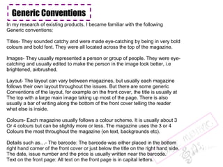
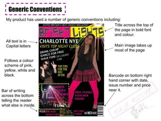
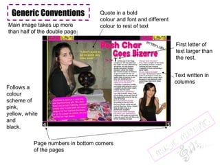
EVALUATION
Generic Conventions In my research of existing products, I became familiar with the following  Generic conventions:  Titles- They sounded catchy and were made eye-catching by being in very bold colours and bold font. They were all located across the top of the magazine. Images- They usually represented a person or group of people. They were eye- catching and usually edited to make the person in the image look better, i.e brightened, airbrushed. Layout- The layout can vary between magazines, but usually each magazine follows their own layout throughout the issues. But there are some generic Conventions of the layout, for example on the front cover, the title is usually at The top with a large main image taking up most of the page. There is also usually a bar of writing along the bottom of the front cover telling the reader what else is inside. Colours- Each magazine usually follows a colour scheme. It is usually about 3 Or 4 colours but can be slightly more or less. The magazine uses the 3 or 4 Colours the most throughout the magazine (on text, backgrounds etc).  Details such as…- The barcode: The barcode was either placed in the bottom right hand corner of the front cover or just below the title on the right hand side. The date, issue number and the price is usually written near the barcode.  Text on the front page: All text on the front page is in capital letters.
Generic Conventions My product has used a number of generic conventions including: Barcode on bottom right hand corner with date, issue number and price  near it. Bar of writing across the bottom telling the reader what else is inside. Title across the top of the page in bold font and colour. Main image takes up most of the page All text is in Capital letters Follows a colour scheme of pink, yellow, white and black.
Generic Conventions Follows a colour scheme of pink, yellow, white and black. Page number in bottom corner of page Big page numbers and text about what is on the pages  Large  eye-catching edited images with page numbers across them. Date at the top Generic Conventions Generic Conventions Generic Conventions Generic Conventions Generic Conventions
Generic Conventions Follows a colour scheme of pink, yellow, white and black. Main image takes up more than half of the double page Quote in a bold colour and font and different colour to rest of text First letter of text larger than the rest. Page numbers in bottom corners of the pages Text written in  columns
When I researched about audiences for my magazine, I came across Burton’s theory. I looked into his theory and wrote about it on my blog.  One of the social groups I found was Age groups.  I wrote this on my blog:  “ Age group: Different age groups have different aims and interests, stereotypically.  So when designing our magazine, we need to put this into account”   I found out from interviews and questionnaires that younger age groups (teenagers) liked more bright and bold colours and fonts etc and older age groups preferred more subtle colours and fonts (adults of 30+).  The younger people also prefer slang language to be used or short and snappy words whereas the older people prefer long articles and more formal words.  As my magazine was aimed at the younger generation, I aimed to use what the  younger people prefer. So therefore I have used bright colours and fonts in my  magazine. I even took this one step further and incorporated the word ‘bright’ in my title as I thought this would catch even more attention. The bright colours also matched the theme of my magazine as it was a ‘dance music’ theme and dance music is usually played in clubs where there are bright colours. The magazine also appealed to the younger audience because of the images. The images were of young people around the age of the target audience. This attracts more attention to the product from the younger generation because they will not want to particularly look at pictures of people 30 years older than them etc. Who would be the audience for your media product?
Another social group I focused on was Nation. I wrote this on my blog:  Nation: The Country a group comes from and its style. Most western societies follow  common ideals, such as work hard to achieve your aims. Cultural Imperialism refers to the influence of American Media values on the world, e.g. beautiful= slim and sexy.  My magazine followed a western society theme because of the Country we live in. If it did not follow this, it would probably not attract much attention as it would not make much sense to readers. For example, in a western society, if you go out clubbing you usually drink alcohol and dance so if I did not include alcohol and dancing when  talking about clubbing, the readers would find it strange and possibly lose interest. My magazine also follows the American Media values slightly because the images I  have used are of slim models and are highly edited.  Another way I made sure my magazine fit in with the western society was using fonts that looked ‘modern’. For example, the title of the magazine has a disco ball pattern on it and the other fonts used do not look ‘handwritten’ but computerised. Having the fonts look computerised show that the magazine was probably produced in a  modern western society and so is aimed at the western society. Who would be the audience for your media product?
Representation The girl in my magazine (Charlotte) is represented as a  workaholic. This is because of the words used to describe her, for example ‘goody two shoes’. This shows what readers think about people who work a lot of the time. I wanted to try and change that stereotype by making the workaholic go a bit wild and do things that most people do, like go clubbing.  I showed this through the headlines, images and the interview.  The large image on the double page spread shows the strongest message in my opinion. This is because it shows the girl in her work clothes but with sunglasses on and leaning on a disco ball. This shows that she is at work but is thinking about going out for a change which is therefore breaking the stereotype of  workaholics only thinking about work. Representation Representation
What kind of media institution may distribute my product? A small independent company would be the most suitable to distribute my magazine because a lot of the content in it is about places in England, so would not be very  helpful to people in America, for example. I found a local distributor that is based in Croydon which would be suitable to  distribute my magazine. It is a distributor of magazines and newspapers, distributing to supermarkets and individual retailers.

Evaluation

  • 1.
  • 2.
    Generic Conventions Inmy research of existing products, I became familiar with the following Generic conventions: Titles- They sounded catchy and were made eye-catching by being in very bold colours and bold font. They were all located across the top of the magazine. Images- They usually represented a person or group of people. They were eye- catching and usually edited to make the person in the image look better, i.e brightened, airbrushed. Layout- The layout can vary between magazines, but usually each magazine follows their own layout throughout the issues. But there are some generic Conventions of the layout, for example on the front cover, the title is usually at The top with a large main image taking up most of the page. There is also usually a bar of writing along the bottom of the front cover telling the reader what else is inside. Colours- Each magazine usually follows a colour scheme. It is usually about 3 Or 4 colours but can be slightly more or less. The magazine uses the 3 or 4 Colours the most throughout the magazine (on text, backgrounds etc). Details such as…- The barcode: The barcode was either placed in the bottom right hand corner of the front cover or just below the title on the right hand side. The date, issue number and the price is usually written near the barcode. Text on the front page: All text on the front page is in capital letters.
  • 3.
    Generic Conventions Myproduct has used a number of generic conventions including: Barcode on bottom right hand corner with date, issue number and price near it. Bar of writing across the bottom telling the reader what else is inside. Title across the top of the page in bold font and colour. Main image takes up most of the page All text is in Capital letters Follows a colour scheme of pink, yellow, white and black.
  • 4.
    Generic Conventions Followsa colour scheme of pink, yellow, white and black. Page number in bottom corner of page Big page numbers and text about what is on the pages Large eye-catching edited images with page numbers across them. Date at the top Generic Conventions Generic Conventions Generic Conventions Generic Conventions Generic Conventions
  • 5.
    Generic Conventions Followsa colour scheme of pink, yellow, white and black. Main image takes up more than half of the double page Quote in a bold colour and font and different colour to rest of text First letter of text larger than the rest. Page numbers in bottom corners of the pages Text written in columns
  • 6.
    When I researchedabout audiences for my magazine, I came across Burton’s theory. I looked into his theory and wrote about it on my blog. One of the social groups I found was Age groups. I wrote this on my blog: “ Age group: Different age groups have different aims and interests, stereotypically. So when designing our magazine, we need to put this into account” I found out from interviews and questionnaires that younger age groups (teenagers) liked more bright and bold colours and fonts etc and older age groups preferred more subtle colours and fonts (adults of 30+). The younger people also prefer slang language to be used or short and snappy words whereas the older people prefer long articles and more formal words. As my magazine was aimed at the younger generation, I aimed to use what the younger people prefer. So therefore I have used bright colours and fonts in my magazine. I even took this one step further and incorporated the word ‘bright’ in my title as I thought this would catch even more attention. The bright colours also matched the theme of my magazine as it was a ‘dance music’ theme and dance music is usually played in clubs where there are bright colours. The magazine also appealed to the younger audience because of the images. The images were of young people around the age of the target audience. This attracts more attention to the product from the younger generation because they will not want to particularly look at pictures of people 30 years older than them etc. Who would be the audience for your media product?
  • 7.
    Another social groupI focused on was Nation. I wrote this on my blog: Nation: The Country a group comes from and its style. Most western societies follow common ideals, such as work hard to achieve your aims. Cultural Imperialism refers to the influence of American Media values on the world, e.g. beautiful= slim and sexy.  My magazine followed a western society theme because of the Country we live in. If it did not follow this, it would probably not attract much attention as it would not make much sense to readers. For example, in a western society, if you go out clubbing you usually drink alcohol and dance so if I did not include alcohol and dancing when talking about clubbing, the readers would find it strange and possibly lose interest. My magazine also follows the American Media values slightly because the images I have used are of slim models and are highly edited. Another way I made sure my magazine fit in with the western society was using fonts that looked ‘modern’. For example, the title of the magazine has a disco ball pattern on it and the other fonts used do not look ‘handwritten’ but computerised. Having the fonts look computerised show that the magazine was probably produced in a modern western society and so is aimed at the western society. Who would be the audience for your media product?
  • 8.
    Representation The girlin my magazine (Charlotte) is represented as a workaholic. This is because of the words used to describe her, for example ‘goody two shoes’. This shows what readers think about people who work a lot of the time. I wanted to try and change that stereotype by making the workaholic go a bit wild and do things that most people do, like go clubbing. I showed this through the headlines, images and the interview. The large image on the double page spread shows the strongest message in my opinion. This is because it shows the girl in her work clothes but with sunglasses on and leaning on a disco ball. This shows that she is at work but is thinking about going out for a change which is therefore breaking the stereotype of workaholics only thinking about work. Representation Representation
  • 9.
    What kind ofmedia institution may distribute my product? A small independent company would be the most suitable to distribute my magazine because a lot of the content in it is about places in England, so would not be very helpful to people in America, for example. I found a local distributor that is based in Croydon which would be suitable to distribute my magazine. It is a distributor of magazines and newspapers, distributing to supermarkets and individual retailers.