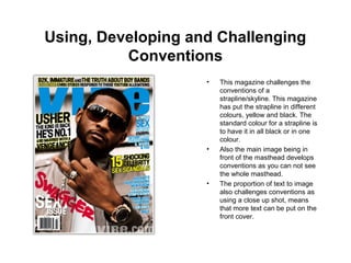
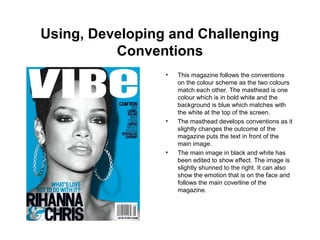
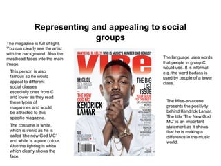
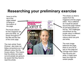
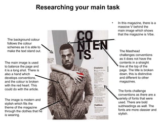
AS MEDIA
AS UNIT G321
FOUNDATION PORTFOLIO IN MEDIA
RESEARCH AND PLANNING
Candidate Name
Candidate Number
Centre Name
Centre Number
Tadi Mutenga
4300
The Leigh Academy
YOUR ASSESSMENT MATERIALS
Copy and paste these e-stickers onto your
work when instructed to do so by your
teacher.
Using Developing and Challenging
Conventions
• A magazine can either use, develop or challenge the
typical conventions
• Use of Follow:
The conventions used are expected to follow the typical patterns of most
magazine designs.
• Develop:
Conventions are changed slightly to create a different outcome or impact
for the audience.
• Challenge:
The conventions are different from the typical magazine designs we see.
The layout, use of words and/or image has been changed.
Using, Developing and Challenging
Conventions
• This magazine challenges the
conventions of a
strapline/skyline. This magazine
has put the strapline in different
colours, yellow and black. The
standard colour for a strapline is
to have it in all black or in one
colour.
• Also the main image being in
front of the masthead develops
conventions as you can not see
the whole masthead.
• The proportion of text to image
also challenges conventions as
using a close up shot, means
that more text can be put on the
front cover.
Using, Developing and Challenging
Conventions
• This magazine follows the conventions
on the colour scheme as the two colours
match each other. The masthead is one
colour which is in bold white and the
background is blue which matches with
the white at the top of the screen.
• The masthead develops conventions as it
slightly changes the outcome of the
magazine puts the text in front of the
main image.
• The main image in black and white has
been edited to show effect. The image is
slightly shunned to the right. It can also
show the emotion that is on the face and
follows the main coverline of the
magazine.
Representing and appealing to social
groups
The magazine is full of light.
You can clearly see the artist
with the background. Also the
masthead fades into the main
image.
The costume is white,
which is ironic as he is
called ‘the new God MC’
and white is a pure colour.
Also the lighting is white
which clearly shows the
face.
The language uses words
that people in group C
would use. It is informal
e.g. the word badass is
used by people of a lower
class.
The Mise-en-scene
presents the positivity
behind Kendrick Lamar.
The title ‘The New God
MC’ is an important
statement as it shows
that he is making a
difference in the music
world.
This person is also
famous so he would
appeal to different
social classes
especially ones from C
and lower as they read
these types of
magazines and would
be attracted to this
specific magazine.
Social Groups by Occupation
Group A:
This group consists of:
•Bankers
•Lawyers
•Doctors
•Surgeons
•Scientist
People in this group often
live in expensive houses
and have a busy lifestyle.
They own expensive cars
and are very wealthy. Into
current affairs and hardly
use social media, watch
films or listen to music.
Group B:
•Teachers
•Middle Management
•Fairly Paid Professionals
People in this group have
a mortgage and are fairly
wealthy. They can afford
recognised high street
brands e.g. House of
Fraser. They go on holiday
once or twice a year.
Spend time looking at
current affairs especially
politics.
Group C1:
•Junior Management
•Bank Clerks
•Nurses
•‘White collar’
professionals
People in this group live in
a low mortgage property
and receive government
benefits e.g. working tax
credits. They own a car
per household and go on
holiday once a year. Read
the daily mail and the
Mirror. Listen to casual
music.
Social Groups by Occupation
Group C2:
•Electricians
•Plumbers
•Carpenters
•Blue collar professions
People in this group live in
rented property and
mostly receive
government benefits. They
own a car which is also a
work vehicle. Buy food
from local stores and shop
for discounted brands.
Spend their leisure on
local and regional
holidays.
Group D:
Manuals workers such as:
•Drivers
•Post Sorters
•Warehouse Pickers
People in this group live
on a very tight budget.
They love in rented
properties provided by
local housing agencies.
They shop at discount
shops like Lidl, Aldi and
Primark. They travel on
public transport. Also shop
online for bargains.
Group E:
•Students
•Unemployed
•Pensioners
People in this group largely
love on state welfare and
benefits. They have no
spending habits as they do
not have a specific income
flow. Shop for bargain and
discounted food or clothes.
Have no preference of
what fashion or brand they
shop for. Spend a lot of
time watching TV. Read
free media e.g. Metro and
Telegraph.
Researching your preliminary exercise
This shows us what to
expect from the
magazine and the pages
within. This is different
as it would be placed
around the page instead
of just being placed on
the top. This challenges
conventions as the
purple colour is different
to the main house
colours which are pink
and white.
The house colours
for this magazine are
pink and white, as
shown throughout
the title and the rest
of the cover page.
Issue is at the
top of the
page instead
of being on
the bottom of
the page.
The main image
balances the page,
there is not a lot of
text on this page but
it brings more colour
than the pink and
white. It might have
been too bright for
certain people.
The main article ‘Exam
Choices’, also does not
follow conventions as it is a
different colour the the
house colours. This means
that the article can stand
out and people are going to
be aware that they have to
read this article.
Researching your preliminary exercise
With this
magazine, this
develops
conventions as
there is no real
house colours
due to the
different colours
on the magazine.
The masthead is
white to contrast
with the
background, so you
are able to see the
title of the
magazine.
Three coverlines are there
but they are the same size
so we are not sure which
challenges conventions as
usually coverlines are
spread around the page
and come in different
sizes, but this one comes
has coverlines, one after
another and they are all
different colours as well.
Puffs are located
at the top of the
magazine, which
is in a different
colour to the rest
of the magazine.
The main coverline is to deal with
stress, and they highlighted the
teenage stress to show that it is
the main story in the magazine.
Issue and Price are
right under the
masthead in small
writing so that are
hard to see.
Researching your preliminary exercise
The house colours for
this particular magazine
is blue and black. This
is shown throughout the
front cover and
contents page.
The main image is
challenges
conventions as is fills
the whole front cover
instead of stopping at
the intended skyline. It
also balances the text,
since the front cover is
a bit text heavy on this
magazine.
The contents
page has a
house colour of
blue and black
which fits with the
white
background.
The text under the
sub headings
make it the page
look better as it is
not all blue and
white. It makes the
text easier to read.
The pictures helps the contents
page look more balanced. Since
the page is a bit text heavy, the
collection of pictures makes the
page look better.
The skyline is at the bottom of the
page instead of at the top which
challenges conventions. The skyline
leaves a bigger impact on the
magazine when it is at the bottom.
The price and issue is at the top of the front
cover above the title. This follows conventions as
the price and issue is either found at the top of
the page or at the bottom of the page.
How do magazines attract and address the
audience?
• Magazines can attract their audiences using many different methods.
The main thing that attracts a certain audience is the Masthead and
Main Image. If the person that is in the main image interests a person
walking past then they would obviously pick it up. Also the masthead of
the magazine would have to attract the person to come and watch it.
• Also having a colour scheme could make a massive impact on
attracting a certain colours. Big vibrant colours like pink and yellow,
would attract young women while males would go for more grey and
blue colours. The neutral colours that attract both males and females
are red, white and black.
• Another thing to impress people walking past are the coverlines and the
house styles as well. The coverlines will have to be based on the type
of magazine that is being used.
Which media institution might distribute
music magazines and why?
There are a few media institutions that distribute music magazines:
•IPC Media
•Bauer Media
•Development Hell
The media institution that I would want to distribute my music
magazine is Bauer Media as it is known for having many music
magazines which includes Kerrang!, Pop and Q. This can make my
music magazine more popular and it would be noticed as well. Also
my magazine is different to the ones that Bauer Media create which
are mainly pop and rock, the magazine I want to create is a rap
magazine which can create a new target market for this media
institutions.
Which types of technologies and processes
might be used to constructing magazines?
• Physical Technology
• This is where things are used to capture scenes. For example, photographical
cameras can create pictures using photographic film. A studio is a room where a
photographer or artist works. Photo-shoots can be done in a studio.
• Digital Technology
• Computer hardware is the collection of physical parts of a computer system. It
includes the computer case, monitor, keyboard and mouse.
• Software
• Certain software is used for magazines to edit and make the magazine better.
Programs like Photoshop are useful to create pictures and also edit pictures that
were created. Professional photographers use this software.
• Printing
• When printing the magazine, we will be using printers which will be able to
process the magazine. A range of printing processes will be used including
lithography and flexography.
Which forms and conventions will be used
in my design and why?
• Skyline – This is at the top of the page which will challenge conventions
as there will be different colours in the banner.
• Masthead – This will also be on the page just under the skyline showing
the name of the magazine.
• Main Image- This will be the focus of the magazine and it will be related
to the main article in the magazine.
• Puffs – There will be a few puffs on my magazine to give out more
information about what is happening in the music world.
• Coverline – There will be information about the other articles in the
magazine that people might be interested in reading.
• Main Coverline – The main coverline will be the information about the
main article of the magazine and will be the one of the first articles that
people will read.
• Price and Issue – This will be located at the bottom of the magazine
front cover.
Researching your main task
The Issue of the
magazine is mentioned
as well, this one being
released in
January/February 2009.
In this magazine contents page,
there is a skyline which is different
as the language used is more
‘urban’ considering it says ‘In The
Mix’. This could suggest that this
magazine in a bit different, and
more modern.
The skyline also
challenges conventions
as the text is different and
the colour is different
compared to the rest of
the page.
The main image
follows conventions
is a long shot to
show most of the
body. The image
could be a long shot
on purpose to show
the group name on
his jeans which is ‘G
Unit’, this could be a
way to advertise the
brand.
The text on the contents
follows conventions as it is a
standard font and font size as
well. The text also follows the
colour scheme that was put in
place. The page numbers are
red so they can stand out
more.
The main image
balances the text.
Since there is so
much text, there is a
lot of space, so the
image is enlarged to
make the page look
more natural.
The background is a plain white colour to
follow conventions, it also follows the
colour scheme as it needs to make the
words stand out otherwise it would be
difficult to read.
Researching your main task
• In this magazine, there is a
massive V behind the
main image which shows
that the magazine is Vibe.
The Masthead
challenges conventions
as it does not have the
contents in a straight
line at the top of the
page. The title is broken
down, this is distinctive
and different to other
magazines.
The background colour
follows the colour
schemes as it is able to
make the text stand out.
The fonts challenge
conventions as there are a
variety of fonts that were
used. There are bold
subheadings as well. The
fonts are more classier and
stylish.
The main image is used
to balance the page and
it is a long shot. There is
also a hand which
develops conventions,
and the colour is broken
with the red heart. This
could do with the article.
The image is modern and
stylish which fits the
theme of the magazine
through the clothes that he
is wearing.
Researching your main task
This double page
spread challenges
conventions in the
way that there are
two red lines
across the double
page spread, this
usually does not
happen on a
double page
spread.
The Main Coverline
develops
conventions as it is
a quote, not a
general title. The
title is a quote from
the interview. This is
to make the
magazine more
modern.
The colour scheme
of the double page is
based on what he is
wearing, these are
the house colours for
this page.
This also has a
main image on one
whole page to
balance out the
page. This makes
the page look
better and more
evenly matched. This magazine is not as text heavy as a normal
magazine, it is more spaced out and interview
form which develops conventions compared to
the normal text heavy articles.
Researching your main task
The layout for this
magazine is very
simple. They have a
simple colour scheme
and they have
balanced the text with
the main image.
The image is Wiz Khalifa with smoke coming out
of his mouth. This relates to the masthead which
is ‘how high’. Wiz Khalifa smokes weed which is
a common theme in his songs as well. The ‘how
high’ statement can also relate to how high can
Wiz Khalifa go in the music industry.
The colour scheme is
white. But there is
black and yellow text
as well which relates
to his song that he
created.
The mix of text
could show that
the parts
highlighted in
yellow is
important as it is
rarely highlighted
in yellow.

AS Unit G321 Research and Planning Presentation 1st Version

  • 1.
    AS MEDIA AS UNITG321 FOUNDATION PORTFOLIO IN MEDIA RESEARCH AND PLANNING Candidate Name Candidate Number Centre Name Centre Number Tadi Mutenga 4300 The Leigh Academy
  • 2.
    YOUR ASSESSMENT MATERIALS Copyand paste these e-stickers onto your work when instructed to do so by your teacher.
  • 3.
    Using Developing andChallenging Conventions • A magazine can either use, develop or challenge the typical conventions • Use of Follow: The conventions used are expected to follow the typical patterns of most magazine designs. • Develop: Conventions are changed slightly to create a different outcome or impact for the audience. • Challenge: The conventions are different from the typical magazine designs we see. The layout, use of words and/or image has been changed.
  • 4.
    Using, Developing andChallenging Conventions • This magazine challenges the conventions of a strapline/skyline. This magazine has put the strapline in different colours, yellow and black. The standard colour for a strapline is to have it in all black or in one colour. • Also the main image being in front of the masthead develops conventions as you can not see the whole masthead. • The proportion of text to image also challenges conventions as using a close up shot, means that more text can be put on the front cover.
  • 5.
    Using, Developing andChallenging Conventions • This magazine follows the conventions on the colour scheme as the two colours match each other. The masthead is one colour which is in bold white and the background is blue which matches with the white at the top of the screen. • The masthead develops conventions as it slightly changes the outcome of the magazine puts the text in front of the main image. • The main image in black and white has been edited to show effect. The image is slightly shunned to the right. It can also show the emotion that is on the face and follows the main coverline of the magazine.
  • 6.
    Representing and appealingto social groups The magazine is full of light. You can clearly see the artist with the background. Also the masthead fades into the main image. The costume is white, which is ironic as he is called ‘the new God MC’ and white is a pure colour. Also the lighting is white which clearly shows the face. The language uses words that people in group C would use. It is informal e.g. the word badass is used by people of a lower class. The Mise-en-scene presents the positivity behind Kendrick Lamar. The title ‘The New God MC’ is an important statement as it shows that he is making a difference in the music world. This person is also famous so he would appeal to different social classes especially ones from C and lower as they read these types of magazines and would be attracted to this specific magazine.
  • 7.
    Social Groups byOccupation Group A: This group consists of: •Bankers •Lawyers •Doctors •Surgeons •Scientist People in this group often live in expensive houses and have a busy lifestyle. They own expensive cars and are very wealthy. Into current affairs and hardly use social media, watch films or listen to music. Group B: •Teachers •Middle Management •Fairly Paid Professionals People in this group have a mortgage and are fairly wealthy. They can afford recognised high street brands e.g. House of Fraser. They go on holiday once or twice a year. Spend time looking at current affairs especially politics. Group C1: •Junior Management •Bank Clerks •Nurses •‘White collar’ professionals People in this group live in a low mortgage property and receive government benefits e.g. working tax credits. They own a car per household and go on holiday once a year. Read the daily mail and the Mirror. Listen to casual music.
  • 8.
    Social Groups byOccupation Group C2: •Electricians •Plumbers •Carpenters •Blue collar professions People in this group live in rented property and mostly receive government benefits. They own a car which is also a work vehicle. Buy food from local stores and shop for discounted brands. Spend their leisure on local and regional holidays. Group D: Manuals workers such as: •Drivers •Post Sorters •Warehouse Pickers People in this group live on a very tight budget. They love in rented properties provided by local housing agencies. They shop at discount shops like Lidl, Aldi and Primark. They travel on public transport. Also shop online for bargains. Group E: •Students •Unemployed •Pensioners People in this group largely love on state welfare and benefits. They have no spending habits as they do not have a specific income flow. Shop for bargain and discounted food or clothes. Have no preference of what fashion or brand they shop for. Spend a lot of time watching TV. Read free media e.g. Metro and Telegraph.
  • 9.
    Researching your preliminaryexercise This shows us what to expect from the magazine and the pages within. This is different as it would be placed around the page instead of just being placed on the top. This challenges conventions as the purple colour is different to the main house colours which are pink and white. The house colours for this magazine are pink and white, as shown throughout the title and the rest of the cover page. Issue is at the top of the page instead of being on the bottom of the page. The main image balances the page, there is not a lot of text on this page but it brings more colour than the pink and white. It might have been too bright for certain people. The main article ‘Exam Choices’, also does not follow conventions as it is a different colour the the house colours. This means that the article can stand out and people are going to be aware that they have to read this article.
  • 10.
    Researching your preliminaryexercise With this magazine, this develops conventions as there is no real house colours due to the different colours on the magazine. The masthead is white to contrast with the background, so you are able to see the title of the magazine. Three coverlines are there but they are the same size so we are not sure which challenges conventions as usually coverlines are spread around the page and come in different sizes, but this one comes has coverlines, one after another and they are all different colours as well. Puffs are located at the top of the magazine, which is in a different colour to the rest of the magazine. The main coverline is to deal with stress, and they highlighted the teenage stress to show that it is the main story in the magazine. Issue and Price are right under the masthead in small writing so that are hard to see.
  • 11.
    Researching your preliminaryexercise The house colours for this particular magazine is blue and black. This is shown throughout the front cover and contents page. The main image is challenges conventions as is fills the whole front cover instead of stopping at the intended skyline. It also balances the text, since the front cover is a bit text heavy on this magazine. The contents page has a house colour of blue and black which fits with the white background. The text under the sub headings make it the page look better as it is not all blue and white. It makes the text easier to read. The pictures helps the contents page look more balanced. Since the page is a bit text heavy, the collection of pictures makes the page look better. The skyline is at the bottom of the page instead of at the top which challenges conventions. The skyline leaves a bigger impact on the magazine when it is at the bottom. The price and issue is at the top of the front cover above the title. This follows conventions as the price and issue is either found at the top of the page or at the bottom of the page.
  • 12.
    How do magazinesattract and address the audience? • Magazines can attract their audiences using many different methods. The main thing that attracts a certain audience is the Masthead and Main Image. If the person that is in the main image interests a person walking past then they would obviously pick it up. Also the masthead of the magazine would have to attract the person to come and watch it. • Also having a colour scheme could make a massive impact on attracting a certain colours. Big vibrant colours like pink and yellow, would attract young women while males would go for more grey and blue colours. The neutral colours that attract both males and females are red, white and black. • Another thing to impress people walking past are the coverlines and the house styles as well. The coverlines will have to be based on the type of magazine that is being used.
  • 13.
    Which media institutionmight distribute music magazines and why? There are a few media institutions that distribute music magazines: •IPC Media •Bauer Media •Development Hell The media institution that I would want to distribute my music magazine is Bauer Media as it is known for having many music magazines which includes Kerrang!, Pop and Q. This can make my music magazine more popular and it would be noticed as well. Also my magazine is different to the ones that Bauer Media create which are mainly pop and rock, the magazine I want to create is a rap magazine which can create a new target market for this media institutions.
  • 14.
    Which types oftechnologies and processes might be used to constructing magazines? • Physical Technology • This is where things are used to capture scenes. For example, photographical cameras can create pictures using photographic film. A studio is a room where a photographer or artist works. Photo-shoots can be done in a studio. • Digital Technology • Computer hardware is the collection of physical parts of a computer system. It includes the computer case, monitor, keyboard and mouse. • Software • Certain software is used for magazines to edit and make the magazine better. Programs like Photoshop are useful to create pictures and also edit pictures that were created. Professional photographers use this software. • Printing • When printing the magazine, we will be using printers which will be able to process the magazine. A range of printing processes will be used including lithography and flexography.
  • 15.
    Which forms andconventions will be used in my design and why? • Skyline – This is at the top of the page which will challenge conventions as there will be different colours in the banner. • Masthead – This will also be on the page just under the skyline showing the name of the magazine. • Main Image- This will be the focus of the magazine and it will be related to the main article in the magazine. • Puffs – There will be a few puffs on my magazine to give out more information about what is happening in the music world. • Coverline – There will be information about the other articles in the magazine that people might be interested in reading. • Main Coverline – The main coverline will be the information about the main article of the magazine and will be the one of the first articles that people will read. • Price and Issue – This will be located at the bottom of the magazine front cover.
  • 16.
    Researching your maintask The Issue of the magazine is mentioned as well, this one being released in January/February 2009. In this magazine contents page, there is a skyline which is different as the language used is more ‘urban’ considering it says ‘In The Mix’. This could suggest that this magazine in a bit different, and more modern. The skyline also challenges conventions as the text is different and the colour is different compared to the rest of the page. The main image follows conventions is a long shot to show most of the body. The image could be a long shot on purpose to show the group name on his jeans which is ‘G Unit’, this could be a way to advertise the brand. The text on the contents follows conventions as it is a standard font and font size as well. The text also follows the colour scheme that was put in place. The page numbers are red so they can stand out more. The main image balances the text. Since there is so much text, there is a lot of space, so the image is enlarged to make the page look more natural. The background is a plain white colour to follow conventions, it also follows the colour scheme as it needs to make the words stand out otherwise it would be difficult to read.
  • 17.
    Researching your maintask • In this magazine, there is a massive V behind the main image which shows that the magazine is Vibe. The Masthead challenges conventions as it does not have the contents in a straight line at the top of the page. The title is broken down, this is distinctive and different to other magazines. The background colour follows the colour schemes as it is able to make the text stand out. The fonts challenge conventions as there are a variety of fonts that were used. There are bold subheadings as well. The fonts are more classier and stylish. The main image is used to balance the page and it is a long shot. There is also a hand which develops conventions, and the colour is broken with the red heart. This could do with the article. The image is modern and stylish which fits the theme of the magazine through the clothes that he is wearing.
  • 18.
    Researching your maintask This double page spread challenges conventions in the way that there are two red lines across the double page spread, this usually does not happen on a double page spread. The Main Coverline develops conventions as it is a quote, not a general title. The title is a quote from the interview. This is to make the magazine more modern. The colour scheme of the double page is based on what he is wearing, these are the house colours for this page. This also has a main image on one whole page to balance out the page. This makes the page look better and more evenly matched. This magazine is not as text heavy as a normal magazine, it is more spaced out and interview form which develops conventions compared to the normal text heavy articles.
  • 19.
    Researching your maintask The layout for this magazine is very simple. They have a simple colour scheme and they have balanced the text with the main image. The image is Wiz Khalifa with smoke coming out of his mouth. This relates to the masthead which is ‘how high’. Wiz Khalifa smokes weed which is a common theme in his songs as well. The ‘how high’ statement can also relate to how high can Wiz Khalifa go in the music industry. The colour scheme is white. But there is black and yellow text as well which relates to his song that he created. The mix of text could show that the parts highlighted in yellow is important as it is rarely highlighted in yellow.