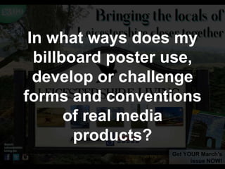
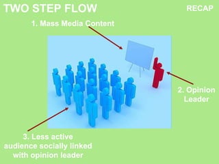
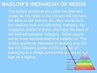
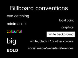
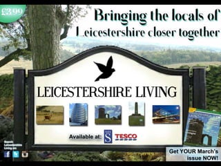
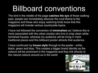
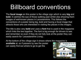
This document discusses conventions used in billboard advertising and how the author's billboard poster for a regional magazine both follows and challenges some conventions. It follows conventions by using an eye-catching focal image, bold colors and fonts, and including ordering/location information. However, it challenges conventions by not being minimalistic like typical urban billboards and by advertising a magazine for a rural audience in an urban setting, where the target audience would be mismatched. The document provides analysis of how different audiences might interact with the billboard and magazine based on concepts like two-step flow of communication and Maslow's hierarchy of needs.
