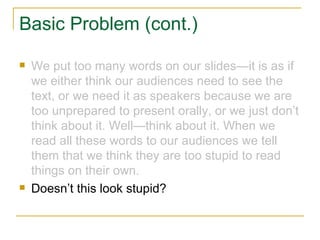
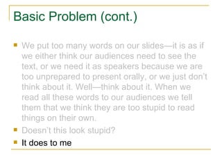
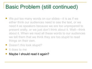
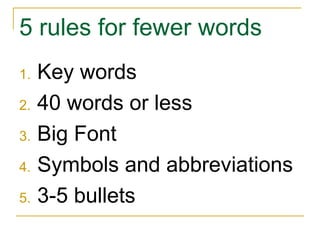
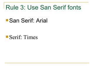
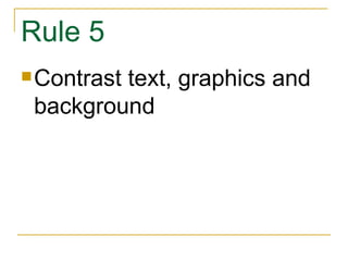
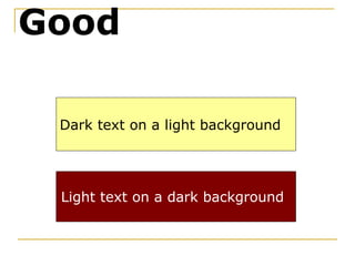
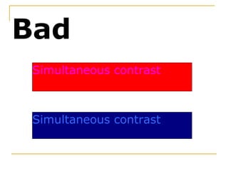
Basic Slide Design  Adapted from  Save our Slides  by William Earnest
Buy the Book! Earnest, W (2007). Save our Slides. Dubuque, IA: Kendall-Hunt
Guiding Principle: Slides are a visual medium, not a textual medium
Rule 1: Pick a good template or theme
Good Template Characteristics Light background color (dark backgrounds acceptable if VERY dark)
Good Template Characteristics Uniform background color
Good Template Characteristics Complementary design elements
Good Template Characteristics No blue backgrounds!
Bad Template Characteristics Medium colored backgrounds
Bad Template Characteristics Backgrounds that shift color
Bad Template Characteristics Distracting design elements
Templates to avoid: Blue Diagonal
Templates to avoid: Whirlpool
Templates to avoid: High Voltage
Templates to avoid: Marble
Templates to avoid: Ribbons
Templates to avoid: Topo
Acceptable Templates: Bold Stripes
Acceptable Templates: Straightedge
Acceptable Templates: Eclipse
Acceptable Templates: Network
Acceptable Templates: Echo
Acceptable Templates: Edge Which is what this is
When are dark backgrounds acceptable? Very brightly lit rooms Screen has lights shining on it Need to use a color scheme that requires a dark background
One Acceptable Dark Background: Refined
Rule 2 Limit the number of words
Basic Principle PowerPoint is not a word processor
Basic Problem We put too many words on our slides—it is as if we either think our audiences need to see the text, or we need it as speakers because we are too unprepared to present orally, or we just don’t think about it. Well—think about it. When we read all these words to our audiences we tell them that we think they are too stupid to read things on their own.
Basic Problem (cont.) We put too many words on our slides—it is as if we either think our audiences need to see the text, or we need it as speakers because we are too unprepared to present orally, or we just don’t think about it. Well—think about it. When we read all these words to our audiences we tell them that we think they are too stupid to read things on their own. Doesn’t this look stupid?
Basic Problem (cont.) We put too many words on our slides—it is as if we either think our audiences need to see the text, or we need it as speakers because we are too unprepared to present orally, or we just don’t think about it. Well—think about it. When we read all these words to our audiences we tell them that we think they are too stupid to read things on their own. Doesn’t this look stupid? It does to me
Basic Problem (still continued) We put too many words on our slides—it is as if we either think our audiences need to see the text, or we need it as speakers because we are too unprepared to present orally, or we just don’t think about it. Well—think about it. When we read all these words to our audiences we tell them that we think they are too stupid to read things on their own. Doesn’t this look stupid? It does to me Maybe I should read it again?
Remember:  VISUAL MEDIUM
What if highway signs were designed like PowerPoint? Directions to the nearest towns: Measured in miles Including the exit number With directional indicators St. Peter 12 miles The exit will be on the left Le Sueur 28 miles The exit will be on the right
Instead of like highway signs? St. Peter  12 Le Sueur  28 Jordan  45 Shakopee  54
Exit
5 rules for fewer words Key words 40 words or less Big Font Symbols and abbreviations 3-5 bullets
Rule 3: Use San Serif fonts San Serif: Arial Serif: Times
Rule 4:  Treat Graphics with care Most packaged clip art is BAD
So what is good? Look on the Office website for better stuff: http://office.microsoft.com/en-us/clipart/default.aspx Use pictures rather than clipart
Images matter
Where to get pictures? Try Everystock http://www.everystockphoto.com/ Warning: ADULT CONTENT (That means naked people)
And sometimes naked dolls
Rule 5 Contrast text, graphics and background
Dark text on a light background Light text on a dark background Good
Simultaneous contrast Simultaneous contrast Bad
The end?
Go forth and multiply

Basic Slide Design