Download to read offline

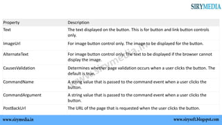

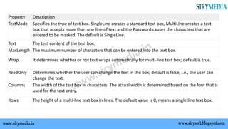


The document summarizes various basic controls available in ASP.NET such as button controls, text boxes, labels, check boxes, radio buttons, list controls, hyperlink controls, and image controls. It describes the purpose and basic syntax of each control and their commonly used properties. Key controls covered include buttons, textboxes, labels, checkboxes, radio buttons, dropdown lists, listboxes, bulleted lists, hyperlinks and images. It provides details on adding and managing items for list-based controls.