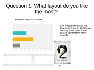
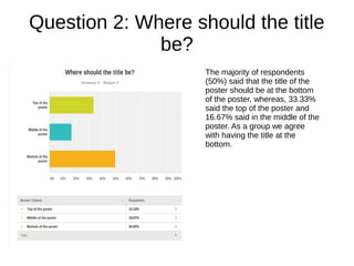
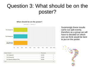
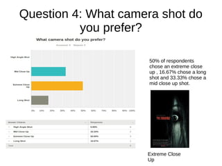
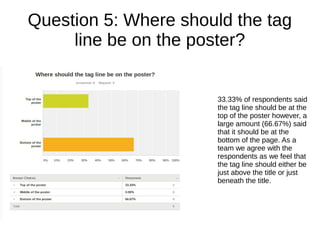
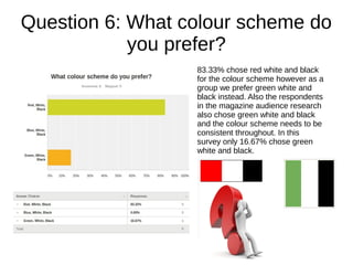
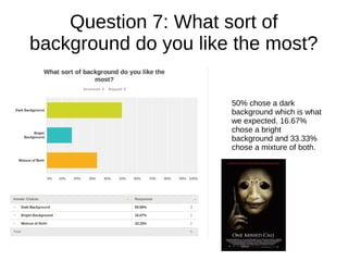
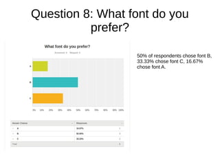
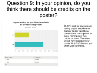
Audience Research: Poster
Question 1: What layout do you like
the most?
50% of respondents said that
they prefer layout C, 33.33% said
that they prefer layout B and
16.67% said that they prefer
layout D.
C
Question 2: Where should the title
be?
The majority of respondents
(50%) said that the title of the
poster should be at the bottom
of the poster, whereas, 33.33%
said the top of the poster and
16.67% said in the middle of the
poster. As a group we agree
with having the title at the
bottom.
Question 3: What should be on the
poster?
Surprisingly these results
came out split evenly,
therefore as a group we will
have to decided on which
one we think would be best
to put on the poster.
Question 4: What camera shot do
you prefer?
50% of respondents
chose an extreme close
up , 16.67% chose a long
shot and 33.33% chose a
mid close up shot.
Extreme Close
Up
Question 5: Where should the tag
line be on the poster?
33.33% of respondents said
the tag line should be at the
top of the poster however, a
large amount (66.67%) said
that it should be at the
bottom of the page. As a
team we agree with the
respondents as we feel that
the tag line should either be
just above the title or just
beneath the title.
Question 6: What colour scheme do
you prefer?
83.33% chose red white and black
for the colour scheme however as a
group we prefer green white and
black instead. Also the respondents
in the magazine audience research
also chose green white and black
and the colour scheme needs to be
consistent throughout. In this
survey only 16.67% chose green
white and black.
Question 7: What sort of
background do you like the most?
50% chose a dark
background which is what
we expected. 16.67%
chose a bright
background and 33.33%
chose a mixture of both.
Question 8: What font do you
prefer?
50% of respondents chose font B,
33.33% chose font C, 16.67%
chose font A.
Question 9: In your opinion, do you
think there should be credits on the
poster?
66.67% said no however not
having credits would mean
that our poster won't be a
conventional horror poster as
every horror poster has
credits on them. Therefore,
we will have credits on our
poster. Only 33.33% said yes
which was surprising.
Question 10: Do you have any
further suggestions/improvements?
No one had any further
suggestions/ improvements.

Audience Research:Poster

  • 1.
  • 2.
    Question 1: Whatlayout do you like the most? 50% of respondents said that they prefer layout C, 33.33% said that they prefer layout B and 16.67% said that they prefer layout D. C
  • 3.
    Question 2: Whereshould the title be? The majority of respondents (50%) said that the title of the poster should be at the bottom of the poster, whereas, 33.33% said the top of the poster and 16.67% said in the middle of the poster. As a group we agree with having the title at the bottom.
  • 4.
    Question 3: Whatshould be on the poster? Surprisingly these results came out split evenly, therefore as a group we will have to decided on which one we think would be best to put on the poster.
  • 5.
    Question 4: Whatcamera shot do you prefer? 50% of respondents chose an extreme close up , 16.67% chose a long shot and 33.33% chose a mid close up shot. Extreme Close Up
  • 6.
    Question 5: Whereshould the tag line be on the poster? 33.33% of respondents said the tag line should be at the top of the poster however, a large amount (66.67%) said that it should be at the bottom of the page. As a team we agree with the respondents as we feel that the tag line should either be just above the title or just beneath the title.
  • 7.
    Question 6: Whatcolour scheme do you prefer? 83.33% chose red white and black for the colour scheme however as a group we prefer green white and black instead. Also the respondents in the magazine audience research also chose green white and black and the colour scheme needs to be consistent throughout. In this survey only 16.67% chose green white and black.
  • 8.
    Question 7: Whatsort of background do you like the most? 50% chose a dark background which is what we expected. 16.67% chose a bright background and 33.33% chose a mixture of both.
  • 9.
    Question 8: Whatfont do you prefer? 50% of respondents chose font B, 33.33% chose font C, 16.67% chose font A.
  • 10.
    Question 9: Inyour opinion, do you think there should be credits on the poster? 66.67% said no however not having credits would mean that our poster won't be a conventional horror poster as every horror poster has credits on them. Therefore, we will have credits on our poster. Only 33.33% said yes which was surprising.
  • 11.
    Question 10: Doyou have any further suggestions/improvements? No one had any further suggestions/ improvements.