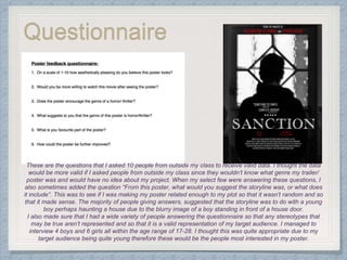
Poster
feedback
Questionnaire
These are the questions that I asked 10 people from outside my class to receive valid data. I thought the data
would be more valid if I asked people from outside my class since they wouldn’t know what genre my trailer/
poster was and would have no idea about my project. When my select few were answering these questions, I
also sometimes added the question “From this poster, what would you suggest the storyline was, or what does
it include”. This was to see if I was making my poster related enough to my plot so that it wasn’t random and so
that it made sense. The majority of people giving answers, suggested that the storyline was to do with a young
boy perhaps haunting a house due to the blurry image of a boy standing in front of a house door.
I also made sure that I had a wide variety of people answering the questionnaire so that any stereotypes that
may be true aren’t represented and so that it is a valid representation of my target audience. I managed to
interview 4 boys and 6 girls all within the age range of 17-28. I thought this was quite appropriate due to my
target audience being quite young therefore these would be the people most interested in my poster.
10%
20%
40%
30%
On a scale of 1-10, how
aesthetically pleasing is
this poster
7 8 9 10
Overall, none of my participants chose
the a number below 7 meaning that
my poster was quite successful in
being appealing. The majority of
people chose 9 out of 10, stressing
the success rate.
80%
20%
Would you be more willing to
watch this movie after seeing
the poster?
Yes No
Most of my the answers said ‘yes’ however, 2 people I
asked this question to said no and one was female with
the other being male. I asked the reason why, the
female said that she didn’t enjoy horror movies and the
poster put her quite on edge which was a joyful answer
to me. The boy said that it was quite a generic poster
so he wouldn’t have seeing the movie ‘on the top of his
list’.
Does the poster encourage
the genre of horror/ thriller
and what suggests that?
All of my participants agreed that the poster
suggested the genre to them. When asking
them what particularly suggested this, most
of them said that way the lighting is so slow
and barely anything is clear. Some answers
were:
• The photo is blurry and dark therefore it is
unsure what is going on and gives the
essence of an unknown horror
• The layout is similar to other horror movie
posters therefore it is recognisable (this
achieved success since it shows that the
audience is unconsciously aware of the
conventions of a horror movie poster and
this helps them to recognise other horror
genre’s)
• The fonts aren’t warm and welcoming,
they give an eery edge to the whole
poster.
• The quote highlights the horror genre
What is your favourite part
of the poster and how could
it be improved?
Many people had different parts of the
posters and some gave explanations as to
why they liked that part, some responses
included:
• The font of the writing makes the poster
look more structured and frightening due
to the boldness
• The image perfectly captures the story
line since it includes 2 main features of
the movie
• The whole poster is in black and white
except for the red writing which captures
the viewer’s eyes as they walk past.
The last question asked was how the
poster could be improved. The only
response I got from this question was that
the quote was off centred when everything
else was in the centre. I wanted to keep the
quote off centred since it added edge to the
poster and made the viewer feel

Poster feedback

  • 1.
  • 2.
    Questionnaire These are thequestions that I asked 10 people from outside my class to receive valid data. I thought the data would be more valid if I asked people from outside my class since they wouldn’t know what genre my trailer/ poster was and would have no idea about my project. When my select few were answering these questions, I also sometimes added the question “From this poster, what would you suggest the storyline was, or what does it include”. This was to see if I was making my poster related enough to my plot so that it wasn’t random and so that it made sense. The majority of people giving answers, suggested that the storyline was to do with a young boy perhaps haunting a house due to the blurry image of a boy standing in front of a house door. I also made sure that I had a wide variety of people answering the questionnaire so that any stereotypes that may be true aren’t represented and so that it is a valid representation of my target audience. I managed to interview 4 boys and 6 girls all within the age range of 17-28. I thought this was quite appropriate due to my target audience being quite young therefore these would be the people most interested in my poster.
  • 3.
    10% 20% 40% 30% On a scaleof 1-10, how aesthetically pleasing is this poster 7 8 9 10 Overall, none of my participants chose the a number below 7 meaning that my poster was quite successful in being appealing. The majority of people chose 9 out of 10, stressing the success rate. 80% 20% Would you be more willing to watch this movie after seeing the poster? Yes No Most of my the answers said ‘yes’ however, 2 people I asked this question to said no and one was female with the other being male. I asked the reason why, the female said that she didn’t enjoy horror movies and the poster put her quite on edge which was a joyful answer to me. The boy said that it was quite a generic poster so he wouldn’t have seeing the movie ‘on the top of his list’.
  • 4.
    Does the posterencourage the genre of horror/ thriller and what suggests that? All of my participants agreed that the poster suggested the genre to them. When asking them what particularly suggested this, most of them said that way the lighting is so slow and barely anything is clear. Some answers were: • The photo is blurry and dark therefore it is unsure what is going on and gives the essence of an unknown horror • The layout is similar to other horror movie posters therefore it is recognisable (this achieved success since it shows that the audience is unconsciously aware of the conventions of a horror movie poster and this helps them to recognise other horror genre’s) • The fonts aren’t warm and welcoming, they give an eery edge to the whole poster. • The quote highlights the horror genre What is your favourite part of the poster and how could it be improved? Many people had different parts of the posters and some gave explanations as to why they liked that part, some responses included: • The font of the writing makes the poster look more structured and frightening due to the boldness • The image perfectly captures the story line since it includes 2 main features of the movie • The whole poster is in black and white except for the red writing which captures the viewer’s eyes as they walk past. The last question asked was how the poster could be improved. The only response I got from this question was that the quote was off centred when everything else was in the centre. I wanted to keep the quote off centred since it added edge to the poster and made the viewer feel