The respondent learned several things from audience feedback on their survey:
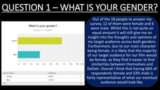
1) The majority (66%) of respondents were female, which aligns with the film's target demographic as the main character is female.
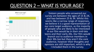
2) Most respondents were between 15-24 years old, fitting the core target audience of teens and young adults.
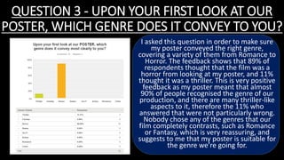
3) The poster and magazine cover successfully conveyed that the film was a horror/thriller genre, with 89% and 100% accuracy respectively.
4) Test audiences rated the poster and magazine cover highly, with both scoring an average of 8.5/10 or higher for quality and effectively communicating the horror genre.