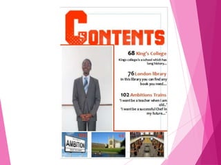
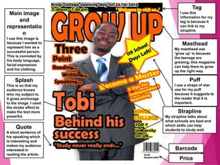
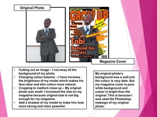
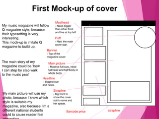
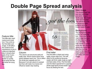
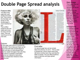
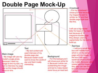
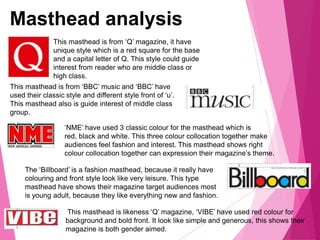
The document provides instructions for creating a mock front cover and contents page layout for a school or college magazine using Photoshop. It discusses producing a front cover featuring a medium close-up student photograph along with appropriately formatted text and masthead. It also mentions demonstrating skills in Photoshop by creating a mock contents page layout.
The document contains a target audience survey and results from a student conducting research for a proposed student magazine. The survey included questions about interests, study habits, and preferences for a magazine. Most respondents were female and wanted the magazine to be free, published weekly, and include both educational and entertaining content. The student concluded the magazine should provide helpful guidance but also lighter content to engage readers. Pictures and design elements were included to appeal to both genders and incorporate popular topics and subjects.
This document contains information about a student's media project to create the front page of a music magazine. It includes sections on audience research, where the student conducted a survey and analyzed the results to determine their target audience is mainly males aged 13-16 interested in music and fashion. It also includes mockups of the magazine's front page with typical elements like the masthead, center image, and contents listing. The student analyzed conventions for magazine covers and researched competitors to define their target audience as passionate music fans aged 20-25 interested in genres like pop and indie music.
This document summarizes a magazine aimed at teenagers aged 12-15. The magazine focuses on pop music and uses bright colors and block fonts to appeal to its target audience. It includes free gifts, fun stories and interviews to attract readers. While more expensive than some competitors, the free gifts make the magazine appealing to its young demographic. The magazine represents teenagers by featuring a popular girl pop band on the cover and using pink and youthful language throughout.
The document provides details about a proposed music magazine pitch, including:
- The magazine will focus on pop and dance music genres based on survey results.
- It will be published monthly and offer subscriptions to encourage repeat purchases.
- The target readership will be females aged 16-20 who enjoy music and spending £3-£8 per month on it.
- The proposed title is "Unleashed" to grab attention, and the magazine will have a colorful yet sophisticated design.
- Content will include interviews, gossip and humor while also developing readers' vocabulary.
- The cover price of £4 aims to position it as a higher-end product and make it desirable to different audiences
We love pop is a monthly music magazine targeted at teenage girls aged 13-18. It focuses on pop music artists and includes interviews, fun facts, games and posters related to popular singers and bands. The magazine uses bright colors, informal language and humor to appeal to its young readership. It retails for £3.99 per issue and is published by Egmont monthly, with a circulation of around 115,000 copies.
The questionnaire results show that the target audience for the magazine is teenage girls aged 16. Most respondents would prefer a magazine published monthly with features like interviews and articles inside. Beyonce and Katy Perry were the most popular artists cited. For the cover, most would prefer a colorful design with one main image and the use of colors like blue, pink and purple associated with pop music. Posters would be a popular free gift to include.
The questionnaire results showed that most respondents were female, aged 16, and their favorite pop singers were Beyonce and Katy Perry. Most would pay £2 or more for a magazine and prefer it be released monthly. Respondents would associate words like "loud", "popular", and "happy" with pop music and prefer magazines with interviews, photos of favorite artists, and free posters. This information will help design a magazine targeted towards teen girls interested in pop music.
My audience are Indie music fans aged 16 years old from working and middle class backgrounds. They enjoy reading interviews and have a chance to win prizes in a magazine priced between £2-£3. The magazine covers all aspects of Indie music through sophisticated colours and balanced text and images to appeal to a wide readership.
- The document summarizes the results of a survey about music magazine preferences.
- The survey found that most respondents were males between 16-20 years old who would pay $1.50-$2 for a magazine.
- Respondents indicated that a powerful main image was most important for the magazine cover.
- Most respondents preferred a magazine about the rap genre called "Roc-O-Way".
- The survey results will help inform the design and content of the magazine.
The document provides details on creating a school magazine, including proposed elements for the front cover and contents page. Key elements discussed include:
- The target audience of 16-19 year olds currently attending or considering the school.
- Proposed cover lines like "How to get the best A level results" and interior articles on exam tips and past graduation.
- Technical considerations like a close-up photo of a student studying at the main image and props showing academic work.
- Sample front cover and contents page layouts including a student photo, page numbers, and contact information.
The document describes the results of audience feedback the author received for a hip-hop magazine they created called "Amplify". The feedback was obtained through a questionnaire given to 20 people aged 16 to 24. Most said the colorful masthead and relatable articles caught their attention. Many felt the topics were current and competitions could be an incentive to read. Respondents generally thought the magazine successfully represented and appealed to its target 16-24 year old demographic. Some suggested including more images and text in future issues.
The document outlines the results of a questionnaire given to 20 people to conduct audience research for a pop magazine. Most respondents were aged 13-18 and female. One Direction and 5 Seconds of Summer were the most popular artists. Ed Sheeran, Sam Smith and One Direction were named as top favorite artists. Respondents associated pop music most with being happy and gossip. They preferred bright colors like pink, yellow and red for the magazine and wanted to see cover stories and Q&As. This research will help the creator design an appealing magazine for their target audience of teenage girls by including favored artists, genres and design elements.
1. The document summarizes the results of a questionnaire about music magazine preferences conducted with a target audience aged 12-19.
2. The analysis found that the target audience preferred bright colors like red, pink and yellow for the magazine and wanted to read about popular artists like One Direction and Justin Bieber.
3. Additionally, the majority of respondents were interested in pop and hip hop music genres and wanted to see a female celebrity on the magazine cover.
The document outlines a pitch for a new music magazine. It will target females aged 15-18 and focus on pop and dance music genres. The magazine will be published monthly at a cover price of £4 to target a higher-income audience. It will have a fun, upbeat style but with more sophisticated language and design to distinguish it from other pop magazines. The goal is to create a high-quality product that appeals to music fans while also developing their vocabulary.
Through creating a school magazine and music magazine, the author learned many important lessons about magazine design and production. Some key things learned were: choosing models that face the camera to engage readers; using proper layout, formatting, and editing to make the magazine look polished; matching fonts, colors and stories to the target audience; and improving overall quality through higher quality photography and design. The progression from the school magazine helped the author understand what is needed to create an effective magazine that would appeal to readers.
Through creating a school magazine and music magazine, the author learned many important lessons about magazine design and production. Some key things learned were: choosing models that face the camera to engage readers; using proper layout, formatting, and editing; researching conventions like cover photos and mastheads; and selecting fonts, colors and stories that tie together professionally. Overall, the author gained valuable experience applying these techniques to make the music magazine higher quality and more professionally designed than the preliminary school magazine.
The document contains the results of a survey conducted to help determine the key aspects of a music magazine targeted towards 16-30 year olds interested in rock and metal music. The survey results showed that Bring Me The Horizon was the most popular artist, posters and competitions for concert tickets would attract buyers, and names like "Scream" or "Loud" could work for the magazine title. Colors like black, red and grey were most associated with the genre. The document analyzes these findings to help guide decisions around the magazine's content, style, and pricing to best appeal to the target audience.
1) The document discusses the results of a questionnaire evaluating interest in a proposed pop/indie rock music magazine. It analyzes responses to questions about appealing magazine features, preferred artists to feature, and preferences around images vs. text.
2) Some open-ended questions did not receive definitive answers, and only a small portion of respondents currently purchase music magazines, indicating other sources may be more popular.
3) The key findings will still inform the creation of the magazine, which will focus on pop/indie rock content for the target 16-18 year old audience, and incorporate preferred visual elements, artists, and balanced images and text.
The document summarizes audience feedback from a survey about a music magazine called "Addiction". The feedback was overall positive, with respondents saying:
1) The magazine was well-structured and could compete with other magazines like NME. However, some said the cover lines were too cluttered.
2) The magazine successfully conveyed an indie/rock genre through elements like color scheme, fonts, and bands featured.
3) The magazine effectively targeted and linked to its intended indie audience by representing their styles and interests.
The document analyzes each question in detail to identify ways to improve the magazine based on the feedback.
The document discusses determining the target audience for a pop music magazine. It analyzes existing magazines' reader profiles which are mostly male, aged 15-24, college graduates, and with average household income of $212k. Existing reader profiles and audience feedback questions informed the creation of a reader profile portraying interests in digital products, social media, popular artists, and high street clothing brands. Demographic research showed choosing audience band C1 would allow budget for popular artists while still appealing to a sizeable market. The target age group was set at 16-19 based on insight into that age and existing media targeting them.
The document summarizes the results of a survey conducted to help plan a new music magazine. Key findings include:
- The majority of respondents were women, indicating the magazine should have female-focused content and design.
- Respondents were mostly college students, allowing for a mix of formal and informal language as well as deeper topics.
- The magazine should be published annually to match how often readers buy music magazines.
- The front cover should feature current popular artists to grab readers' attention.
- The magazine should focus on indie pop but include some other similar genres like k-pop.
- Readers are willing to pay $16 on average, allowing for premium content and possible inclusions like free
This document provides details on the planning and design process for two proposed hip hop music magazines titled "Rhythm" and "Beat". It includes initial mind maps for each magazine covering color schemes, target audiences, and content. Font styles and mood boards are presented for consideration. Hand drawn drafts show potential front cover and double page spread layouts incorporating elements like mastheads, images, interviews, and social media icons. The target audience for both magazines is identified as 15-20 year olds. Key details like monthly release schedule, 99p price point, and A4 size are outlined. Color schemes of red/white/black and white/yellow/grey are selected for "Rhythm" and "Beat" respectively.
Dokumen ini membahas tiga bentuk komunikasi yaitu komunikasi vertikal antara atasan dan bawahan secara timbal balik, komunikasi horisontal antara karyawan secara tidak formal, dan komunikasi diagonal atau silang antara orang dengan kedudukan dan bagian yang berbeda.
What Have You Learnt About Technologies From Theguestabb5703
The document discusses what technologies the author learned about from constructing a product. They had little prior experience with Blogger but found it similar to Facebook. While somewhat familiar with Photoshop from a school project, constructing the magazine greatly increased the author's Photoshop skills, teaching them to use tools like the magic wand and blending options. They also uploaded PowerPoint presentations to Slideshare for their blog evaluations.
The document discusses an upcoming location shoot. Details are sparse, providing only the basic information that a location shoot is being planned or will take place. No other context is given about the topic, purpose, or subject of the location shoot.
The document summarizes key elements of magazine contents pages. It describes logos, mastheads, images, and subheadings used to organize content and draw reader attention. Main images showcase artists to promote stories within. Mastheads and logos use large, bold text and colors to ensure recognition. Subheadings and indexes help readers navigate content easily. Certain design elements, like warning colors on subscriptions, aim to highlight specific sections. Overall the contents pages are organized to attract readers and allow them to find topics of interest.
This document summarizes the ways in which the media product "DETAINEE 238" uses, develops, and challenges conventions of real media. It discusses how the film uses conventions from "The Road to Guantanamo Bay" to depict the detainment of innocent Muslim men. It also challenges conventions by having an open narrative rather than a happy ending. Props like orange suits borrowed from Amnesty International were used to make the audience feel emotionally invested. The poster and trailer were also developed using conventions from "The Road to Guantanamo Bay" but added elements like a focus on the detainee's children to build more tension and emotion.
George Clooney was honored at the 26th annual Carousel of Hope Gala for his philanthropic work. A host of celebrities attended the event, which raises money for diabetes research. Clooney kept close to his girlfriend Stacy Keibler throughout the evening. In his acceptance speech for the Brass Ring Award, Clooney said that while you can't make people do the right thing, you can make it harder for them to do the wrong thing. Neil Diamond concluded the gala by singing to attendees in the aisles and coercing Clooney to join him in singing "Sweet Caroline".
The document summarizes a double-page magazine spread about Lady Gaga. A large black and white photo of Lady Gaga takes up one whole page to emphasize that she is the focus of the article. On the opposite page, text about Lady Gaga is placed next to her photo so it is clear the story is about her. Additional photos and design elements like colored text, quotes, and section headers are used to attract readers and provide more information about Lady Gaga and her music.
Dokumen ini berisi silabus mata kuliah Sistem Informasi Akuntansi 2 yang mencakup 12 pertemuan dengan materi seperti teknik dokumentasi data flow diagram, sistem manajemen database, siklus bisnis bank, ERP, dan auditing sistem informasi. Metode perkuliahan terdiri dari UTS, UAS berupa tugas lapangan dokumentasi sistem, presentasi kelompok, blogging, dan latihan. Nilai akhir ditentukan dari berbagai mekanisme perkuliahan tersebut
Showcasing a few pages of the re-design. The previous design was cluttered, had over 70% of the content below the fold and was inconsistently laid out.
Likuidasi adalah proses pembubaran perusahaan yang meliputi pelunasan utang, penjualan aset, dan pembagian sisa dana kepada para sekutu berdasarkan kontribusi modal masing-masing. Terdapat beberapa kemungkinan hasil likuidasi seperti sekutu yang modalnya negatif akibat kerugian yang harus ditutup dengan utang atau setoran tunai. Jika dana likuidasi tidak cukup untuk melunasi utang, sekutu yang modal
We took photos at various locations near our school like Hanham, Kingswood, St George and St Werburghs to create an urban feel for our photos. The photos were inspired by the music video for Maverick Sabre's song "Look what I've done to you."
This document outlines the target readership, format and style, themes and features, potential advertisers, and editorial team for a proposed music magazine. The target readership is 16-22 year olds interested in music and charts. The magazine will be full color A4 size featuring artist interviews, charts, and graphics to appeal to younger readers. It will maintain consistent branding and include advertisements from music and teen-focused companies. The editorial team will be experienced in engaging younger audiences through their writing and knowledge of music trends.
Dokumen tersebut membahas perubahan ketentuan PSAK 65 tentang Laporan Keuangan Konsolidasian sesuai dengan IFRS 10 mengenai definisi pengendalian, persyaratan akuntansi laporan keuangan konsolidasian, penentuan kepentingan nonpengendali, dan pedoman penentuan kehilangan pengendalian atas entitas anak."
Sosialisasi program pengentasan kemiskinan di Kabupaten Banyuwangi dilaksanakan pada 8 Mei 2009. Acara tersebut dihadiri oleh kepala desa, camat, LSM, dan dinas terkait untuk membahas strategi pengentasan kemiskinan, termasuk pedoman pelaksanaan program di tingkat desa. Sosialisasi kepada masyarakat desa telah dilakukan di beberapa desa, sedangkan jadwal sosialisasi di desa-desa lain masih d
The opening sequence uses mise-en-scene and editing to establish conventions of the horror genre. Various shots introduce characters surrounded by candles in a dark room filled with religious and family images, creating an ominous and gloomy atmosphere. Within the first 40 seconds, the editor introduces each character individually to show their emotions and worry as tensions rise during a family meal, hinting at isolation and lack of true connection between some of the characters. Overall, the shots, lighting, and editing aim to set an unsettling and tense tone typical of horror films through visual and character details.
The document discusses how the magazine cover and content were designed to attract a teenage girl audience. Girly colors like pink, yellow and white were used. Images of popular bands and a teenage girl on the cover were intended to draw interest. Offering the magazine at a low price of £1 made it affordable. Including a coupon for music festival tickets and sections on fashion and social media would appeal to teenage interests. Consistent colors, fonts and layouts throughout were meant to create a cohesive style and easy reading experience for the target demographic.
Dokumen ini membahas pengelompokan pos-pos neraca, laba/rugi, dan administrasi bank serta hubungan antara pos-pos neraca dan laba/rugi. Pos-pos neraca meliputi harta, hutang, modal dan cadangan, sedangkan pos-pos laba/rugi terdiri dari pendapatan, biaya, dan saldo laba/rugi. Harta bank sama dengan jumlah hutang bank, modal dan cadangan, serta saldo laba/rugi.
The aims of the paper are to study the financial performance between the independent finance companies and the
integrated finance companies over the period 2001-2011.
The Sians Final Magazine is a student-run publication at Sians University. It covers campus news, sports, arts and entertainment in the local community. Recent articles discuss the new science building opening, profile on the women's soccer team making it to the finals, and a review of the latest play performed at the campus theater.
This document summarizes a magazine aimed at teenagers aged 12-15. The magazine focuses on pop music and uses bright colors and block fonts to appeal to its target audience. It includes free gifts, fun stories and interviews to attract readers. While more expensive than some competitors, the free gifts make the higher price worthwhile for teenage readers. The magazine represents its target audience through its use of a stereotypical British girl pop band on the cover and language at a young reader's level.
The document provides details about the initial pitch for a proposed pop music magazine called "Retune". It outlines that the target audience will be females aged 16-21 from socioeconomic classes D and E. It proposes features like interviews with pop artists, new music releases and reviews. Potential mastheads are discussed and it is noted that most people voted for the name "Retune". Font faces, pricing, concepts, color schemes, unique selling points and potential story ideas are also outlined. Locations and models between ages 16-21 are proposed for photography. Marketing strategies discussed include social media, billboards, posters and a possible TV advert. The magazine will be distributed through major publishers or independently online and in stores.
The document provides details on the production schedule for creating a music magazine, including research tasks to be completed over 8 weeks. Week 1 involves creating and distributing a questionnaire to understand the target audience. Week 2 focuses on researching other music magazine audiences. Weeks 3-6 involve analyzing magazine covers, contents pages, spreads, and mastheads for inspiration. Week 7 includes taking photos for the magazine pages. Week 8 is for finalizing the magazine pages and providing an explanation of the work.
From the questionnaire responses, the assistant learns:
1) The target audience for the music magazine is 12-16 year-old females who enjoy pop music.
2) Respondents described pop music as exciting, happy, upbeat and colorful but not sexy or meaningful.
3) Bright colors would be most expected for the magazine and cover images are very important to attract readers.
4) Typical magazine content like photos of pop artists, clothing, and makeup would be preferred along with some interviews.
The document discusses a media product - a music magazine created by the author. It summarizes the key conventions used in the magazine design including bright colors, large photos, and bold fonts. It analyzes the target audience as mainly young white females interested in pop music. The intended distribution partner is identified as IPC due to their affordable magazines and space for a new music title. The target demographic is outlined as mainly female, white, aged 16-25 from socioeconomic class C1-C2.
The student created a magazine aimed at both male and female readers aged 16-25. Key elements included bright colors, photos of smiling models using direct address, and bold fonts for headlines and story descriptions. Conducting a survey helped determine popular music genres and stories of interest. Distribution through IPC was chosen for the magazine's style and affordability. Attracting readers involved eye-catching designs and language/content appropriate for the target age range. Learning new technologies like Photoshop and InDesign was a challenge but important for creating the magazine.
Hannah created a music magazine called "Tonic" aimed at students aged 15-20. She based the magazine's design on aspects of existing magazines like NME but made some changes. For example, she used a less busy front cover style than NME and featured unsigned rather than mainstream acts. Hannah learned skills like using Photoshop and InDesign to design the magazine professionally. Through the process, she gained an understanding of challenges in the magazine industry and improving her technical skills.
Hannah created a music magazine called "Tonic" aimed at students aged 15-20. She based the magazine's design on aspects of existing magazines like NME but made some changes. For the cover, she used a style similar to NME but featured an unknown artist. Inside, she combined elements from NME and Q magazine, using three columns and focusing on articles rather than categories. Hannah challenged conventions by arranging images and text differently on a double page spread for better readability. Through her magazine, she aims to represent her target audience of students and introduce them to up-and-coming artists.
The document contains a research questionnaire about magazine reading habits and preferences. It asks respondents about their gender and magazine reading behaviors like type, frequency, and time spent. It also contains graphs showing the results of the questions, with the highest interests being in sport, music, fashion, and TV/film magazines. The document analyzes the results and concludes the target audience will be male and female students ages 16-18, as the questionnaire found most read those types of magazines and don't spend long reading each issue.
This media product represents 8-13 year olds, who are typically fans of pop music. While the primary target audience is females of this age group, care has been taken to also appeal to males through layout, color scheme, and content. The price point is affordable for this young demographic. Content both in the magazine and online focuses on popular artists and gossip to keep readers engaged. Images depict artists in a positive light to serve as role models. Language uses simple words that are easy for readers to understand. The goal is to represent this social group in an inclusive way and not alienate any potential readers.
My magazine challenges conventions of other music magazines by using bright colors in the masthead and cover lines instead of advertisements. It represents teenagers aged 16-19 by featuring artists that appeal to this audience and portray them in a positive light. The magazine would be distributed by Rewind Creative Media as they promote similar UK artists and have successfully targeted the same audience in the past.
The document provides details on the proposed "POP" music magazine, including:
- The name "POP" was chosen as it represents the genre instantly and is short like other popular music magazines.
- The mission is to give readers first-hand information on their favorite artists with no gimmicks, allowing readers to feel connected to pop stars.
- Interviews were found to be the most wanted feature. The magazine will focus on the pop/chart music genre and target older teenagers.
- It will be published monthly at £3.99 generally or £2.99 for students, released on the 1st of each month.
- The magazine aims to have a sophisticated style while still
The document evaluates the student's coursework creating a music magazine. The student created a blog to document research, and used Photoshop to make a front cover, contents page, and double page spread. The pieces followed conventions of pop magazines to attract their target audience of teenage girls. Through the project, the student improved their skills with blogging, Photoshop, and photography to effectively represent the pop genre.
The magazine targets teenagers aged 16 and older of both genders. Females are prominently featured through photographs using high key lighting to create a friendly feel. Red lipstick is used to attract males by connoting pleasure and lust. Neutral colors like grey, white and red appeal to both genders. The front cover model uses direct eye contact to draw in readers and is placed in the strong fallow area per the Gutenberg design principle to attract male readers. The contents page features like "The Parklife Weekender" and rhetorical questions attract both genders, while the "Hot or Not?" section aims to make males read through pages to reach it. A pull quote intrigues females about a discussed lifestyle.
- The target audience for the magazine is teenagers aged 13-18, who are mostly female.
- The magazine will focus on indie music genre and include interviews, music recommendations, and up-and-coming artists.
- The magazine design will take inspiration from Q Magazine, with a simple cover focusing on a detailed central image and few subheadings.
- Key parts will be the main interview and music recommendations, released monthly for £2.50.
- Images will include a mix of professional and live performance photos. The magazine may include free gifts to promote sales.
The document contains the reflections of a student named Giacomo Pisa on primary research conducted through questionnaires for a school project on designing a hip hop magazine. The research covered topics like the target demographics, preferred content, pricing, and design elements. Key findings included that the target audience is primarily males ages 15-19, the magazine should be priced at £3 and released monthly, and feature artists like Drake, Kanye West, and Eminem. Free festival tickets emerged as the most popular potential prize promotion.
Kate Carmichael created a magazine targeted at young girls ages 11-15. She did research and found the target audience was 87% female. This influenced her magazine design - she used pastel colors, images of teen models, and content she thought would appeal to younger girls and boys. To evaluate her magazine, Kate asked people questions. Responses showed the bright colors and models attracted attention and matched the genre. While the content and designs looked professional, the evaluators were not the target audience and would not buy the magazine. Kate annotated her magazine to explain design choices like colors, language, costumes, and photography locations used.
Similar to Media Coursework Research Planning (20)
Revolutionizing the Digital Landscape: Web Development Companies in Indiaamrsoftec1
Discover unparalleled creativity and technical prowess with India's leading web development companies. From custom solutions to e-commerce platforms, harness the expertise of skilled developers at competitive prices. Transform your digital presence, enhance the user experience, and propel your business to new heights with innovative solutions tailored to your needs, all from the heart of India's tech industry.
PDF SubmissionDigital Marketing Institute in NoidaPoojaSaini954651
https://www.safalta.com/online-digital-marketing/advance-digital-marketing-training-in-noidaTop Digital Marketing Institute in Noida: Boost Your Career Fast
[3:29 am, 30/05/2024] +91 83818 43552: Safalta Digital Marketing Institute in Noida also provides advanced classes for individuals seeking to develop their expertise and skills in this field. These classes, led by industry experts with vast experience, focus on specific aspects of digital marketing such as advanced SEO strategies, sophisticated content creation techniques, and data-driven analytics.
EASY TUTORIAL OF HOW TO USE CAPCUT BY: FEBLESS HERNANEFebless Hernane
CapCut is an easy-to-use video editing app perfect for beginners. To start, download and open CapCut on your phone. Tap "New Project" and select the videos or photos you want to edit. You can trim clips by dragging the edges, add text by tapping "Text," and include music by selecting "Audio." Enhance your video with filters and effects from the "Effects" menu. When you're happy with your video, tap the export button to save and share it. CapCut makes video editing simple and fun for everyone!
Technoblade The Legacy of a Minecraft Legend.Techno Merch
Technoblade, born Alex on June 1, 1999, was a legendary Minecraft YouTuber known for his sharp wit and exceptional PvP skills. Starting his channel in 2013, he gained nearly 11 million subscribers. His private battle with metastatic sarcoma ended in June 2022, but his enduring legacy continues to inspire millions.
International Upcycling Research Network advisory board meeting 4Kyungeun Sung
Slides used for the International Upcycling Research Network advisory board 4 (last one). The project is based at De Montfort University in Leicester, UK, and funded by the Arts and Humanities Research Council.
Explore the essential graphic design tools and software that can elevate your creative projects. Discover industry favorites and innovative solutions for stunning design results.
Connect Conference 2022: Passive House - Economic and Environmental Solution...TE Studio
Passive House: The Economic and Environmental Solution for Sustainable Real Estate. Lecture by Tim Eian of TE Studio Passive House Design in November 2022 in Minneapolis.
- The Built Environment
- Let's imagine the perfect building
- The Passive House standard
- Why Passive House targets
- Clean Energy Plans?!
- How does Passive House compare and fit in?
- The business case for Passive House real estate
- Tools to quantify the value of Passive House
- What can I do?
- Resources
Maximize Your Content with Beautiful Assets : Content & Asset for Landing Page pmgdscunsri
Figma is a cloud-based design tool widely used by designers for prototyping, UI/UX design, and real-time collaboration. With features such as precision pen tools, grid system, and reusable components, Figma makes it easy for teams to work together on design projects. Its flexibility and accessibility make Figma a top choice in the digital age.
Practical eLearning Makeovers for EveryoneBianca Woods
Welcome to Practical eLearning Makeovers for Everyone. In this presentation, we’ll take a look at a bunch of easy-to-use visual design tips and tricks. And we’ll do this by using them to spruce up some eLearning screens that are in dire need of a new look.
2. Using Photoshop and an image manipulation
program, produce the front page of a new
school or college magazine, featuring a
photograph of a student in medium close-up
plus some appropriately laid-out text and a
masthead. Additionally I must produce a
Photoshop mock-up of the layout of the
contents page to demonstrate their grasp of the
program.
3. 1. How old are you?
How old are you? 16
17
18
2. Are you male or female?
Are you male or female? Male
Female
3. What is your interest things?
What is your interest things? Music
Shopping
Reading
TV&Firm
Game
Other (please specify)
4. How many time you spend for study when you out school?
How many time you spend for study when you out school? 0-1
1-2
2-3
4-5
Other (please specify)
5. When you feel tired, how you refresh yourself?
When you feel tired, how you refresh yourself? Go out with friend
Listen music
Watch TV&Film
Play computer games
Other (please specify)
6. What is make you work hard in college?
What is make you work hard in college? Universtiy
Good life on future
Around self every one has work hard
Other (please specify)
7. Would you think hard study can change your future life?
Would you think hard study can change your future life? Yes
No
Maybe
Other (please specify)
8. Would you buy a school magazine?
Would you buy a school magazine? Always
Sometime
Never
Other (please specify)
This is a questionnaire for teenager who are
between 16 to 18 years old. I want this
questionnaire to make communication from me
to them. Because I want know what they real
think and how is their real life. This
questionnaire doesn’t need writing name down,
so they will answer as their real think.
When this questionnaire feedback, I will know a
lot of information from them and understand
how to make they feel interesting and which
things they will be happy to enjoy.
Lastly I can use these feedback to start made
my magazine, because I already know what are
their interest things.
5. Who is your target audience? Is it all sixth formers or a specific group?
My target audience is going to the males of 16 years old teenager who are still learning in sixth form. Of this people
who are really want get good job and go to university in their future. They are spending time for learning when they
after school, so I think they maybe will like to read something of learning method’s magazine.
What are their interests?
Of my result shows a lot of people are choose TV is their main interesting and lowest people are feeling reading is
interesting. I will make an article base of TV programme, because the students they are feel that is main interesting
so I want use TV to make them want to buy this magazine.
What magazines do they buy? How often?
They are sometime to buy the school magazine and no one is always to buy the school magazine, this shows they
don’t like to spending money to buy lot magazine. So I make an article which is they feel really interesting. The
article will always have different story at every week or every month. This is because 16 people always like the fresh
things and news. If the magazine always talking about the something, they will don’t buy that magazine anymore. So
I need give the difference story and news to make them like it and can’t leave it than will increases the number of
people always buy the school magazine.
What socio-economic group are they?
They are students because they only 16 years old, so they are E level group of socio – economic. They will interesting
about which job can make lot money and not to hard. Because they are students, they never have work before so
they may want have a easy job and also have nice wages.
6.
7. Tag
I use this
information for my
tag is because it
can link to my
strapline.
Masthead
My masthead use
‘grow up’ is because
the teenage are
growing, this magazine
can help them to grow
up the right way.
Main image
and
representatio
n
I use this image is
because I wanted to
represent him as a
successful person.
This is connoted by
his body language,
facial expression
and his clothing.
Splash
This is so that my
audience knows
who my subject is.
It gives anchorage
to the image. I used
the stroke effect to
make the text more
powerful.
Quote
A short sentence of
his speaking which
is interesting and
makes my audience
interested in
reading the article.
Barcode
Price
Strapline
My strapline talks about
what schools are best and
which skills can help
students to study well.
Puff
I use a shape of star
use for my puff
because it suggests to
the reader that it is
important.
8. Original Photo
Magazine Cover
My original photo’s
background was a wall and
the colour is very dark. But
my magazine cover is pure
white background and
colour is bright than the
original. This is because I
was used the Photoshop
redesign of my original
photo.
• Cutting out an image – I cut away all the
background of my photo.
• Changing colour balance – I have increase
the brightness of my model which makes his
face clear and skin colour more natural.
• Cropping to medium close up – My original
photo was small, I increased the size on my
magazine because original size is not big
enough for my magazine.
• Add a shadow of my model to make him look
more strong and more powerful.
9. Evaluation
Photoshop skills: I have find difficult of clone stamp for using
Photoshop because was difficult to find same colour on some
image. I was make mistake of moving layers around because some
time the layers became mixed. I have improved this by making my
magazine.
Magazine Cover: My magazine was doing well but other people
said I have to use colour which is for the teenager because my
magazine cover's front colour is too child.
My front colour and style was not fit my magazine’s theme because
my magazine theme is about study, but my front style was too child
so it is not fit my theme. People says my magazine model was
wearing a grey colour coat and my front colour is too bright which is
orange and yellow. So I can improve the front colour next time to
make sure it fit my model clothes colour.
Research: My research was shows 16 years old young people and
who are the male as most than I made my magazine theme is about
16s young males. This is a reason of I choose a boy to be my
model.
11. My Target Audience
My magazine will be aimed at music magazine and the audience will be
face to young females who are age 16 years old to 19 years old. Also
these young females should most have job and the percentage of
ABC1 which is 75%.
I have analysed magazine of Q, which is a really famous music
magazine. Most young people they like to buy Q magazine is because
they always have interesting news and always let people surprise.
My audience will be similar to theirs and I also want my magazine have
own style. I will choose the similar colour style to Q for my masthead
and strapline.
My audience might buy the 'Smash hits' because as my questionnaire
feedback shows have many people choose Q magazine also have lot
people they are choose 'Smash hits'. The 'Smash hits' also have many
difference news and which is make younger girls feel interesting.
My audience might interest of hip hop music style. Because as my
questionnaire feedback shows have 80% people choose hip hop style
for their loves music style.
My questionnaire result was shown what is the audience like and what
style news they may love
12. QUESTIONAIRARE
This is a questionnaire for teenager who are between 15 to 21 years old. I want this
questionnaire to make communication from me to them. Because I want know what
type of music they love to listen and which singer they most love.
When this questionnaire feedback, I will know a lot of information from them and
understand how to make they feel interesting and which things they will be happy to
enjoy. Also it can help me to design my music magazine because I can follow their
answer to build my cover page and my story type.
Lastly I can use these feedback to start made my magazine, because I already know
what are their interest things.
13. Results and explanation
0 2 4 6 8 10
15
16
17
18
19
20
21
Age of Respondents
0 2 4 6
Mojo
Top of pops
Q
We love pop magazine
NME
Smash hits
Magazine type
0 2 4 6 8 10
Music CD
Star's photo
MP3
Star's figurine
Tickets
Gift type
0 5 10
Listen music
Watch TV
Play game
Reading
Browse Internet
Hobby
0 5 10 15
Classical
Rock
Blues
Jazz
Hip HOP
Type of music
0 2 4 6 8 10
Rihanna
Eminem
Miley Cyrus
Luke Bryan
Bruno Mars
Favourites
8.5 9 9.5 10 10.5
Main image
Cover line
Mast head
Which part feel most
interest
This results shows my target audiences is reader who are around
16 and 17 years old teenagers and most of them like to read
‘Smash hits’ and ‘Q’ magazine, this is help me to planning my
magazine style need more like one of that two popular magazine. I
find out their hobby and they are all love to listen music and watch
TV, this is help me when I planning my magazine I can find the
content which is they loved. The important information is I find out
from the results which is they are most like Hip-Hop music, this
influence my magazine’s theme.
14. NME Audience
Analysis
Have 73% males and 27% females love to read ‘NME’. This figures shows
‘NME’ audience are most of males. People who love to read ‘NME’ have
average age which is around 25 years old. This shows that ‘NME’ audience is
young men who around 25 years old.
People who love to buy the ‘NME’ have 73% in ABC1 group. This means that
the ‘NME’ are most for rich people or people who have high level to read. Also
the NME magazine have 26% reader who are students. NME’s readership is
411,000, which means have 411,000 people love to buy and read ‘NME’.
Have 80% of ‘NME’s readers feel the music are important part of life. This
means they can feel interest from the music and from the ‘NME’. The NME
magazine audience is younger people who are between 16-24's years old and
people who want know a lot of new bands and share this news with their
friends. This magazine is for people who like indie and rock music.
15. Q Audience
Analysis
Have 68.3% males love to read ‘Q’ magazine and 31.7% female love to read. This shows there
audience which is most males. The age range shows people who’s age between 15 years old
to 24 years old are mostly love to read ‘Q’. This means that this magazine is audience to
young people.
Have 70% reader at ABC1 group, this means mostly high group people which are rich people
love to buy this magazine.
Q’s souls readership is 69%. They have 377,000 people who only read ‘Q’. Q's audiences is
younger and has more affluent than any others musical monthly. Have 97%readers rate Q as
a quality magazine. Has information shows it outperforms competitors on measure such as
best interview, writing and awards winning photography.
The Q magazine reader is a passionate music fan and they has high disposable income to
spend on they self alone. This means that they have independent money can spend for buy
the Q magazine. Also is highly savvy to digital technology and they are keen social networker
and uses online services to enhance his social life. For example they may used Facebook to
read many of Q magazine's review from other reader. This social network can help reader has
good understand about the Q magazine. Though a hugely passionate music fan, this is not to
the detriment of their other interests which is film, gaming, sport, TV and comedy.
17. NME Magazine
Cover Analysis
The ‘NME’ magazine has 73% reader are males and they all
around 25 years old. This means that ‘NME’ magazine audience
most is young males. On this magazine cover, Rihanna looks
really fantasy and magic because a bird which is have full body
of blue diamond sit on her left shoulder. The bird colour is same
as Rihanna’s make up. This will let she looks more different and
mystery. Because in the human world never have diamond
bird, so a diamond bird is sitting on her shoulder is like this bird
is surrender to her. She also shows music world is never the
same, its same like myth world. In music world you never get
bored and never have same news. This links to NME’s audience
because they always love indie music which means they do
want every thing be same and bored. They want novel news and
unique style news.
She have a really thick make up which means very colourful. She
used azure and bright pink for her eye shadow. This is because
that bird which is sitting on her shoulder have navy diamond cover
full body. She used same colour with bird’s for eye shadow
because this will shows they are from same world.
This magazine has used pink front written ‘RIHANNA’ for strapline
which is same as the masthead. Her lips also is pink colour can
link to strapline to make whole image very coordination. She
wearing a pure black T-shirt, if use other front for strapline will
broke this image’s sense of harmony. Also because in this
magazine cover front only used three colour which is pink, white
and black. The strapline is use her name as big front is because
she is most famous singers, people who loved music all know who
are she and they want to thorough understand she. When reader
see her name as big for strapline will increase their interest of this
magazine.
19. First Mock-up of cover
My music magazine will follow
Q magazine style, because
their typesetting is very
interesting.
This mock-up is imitate Q
magazine to build up.
Masthead
- Need bigger
than other front
and live at top left
Puff
- Next the main
cover star.
Main picture
- Mast be full size, need
full head and half body or
whole body.
Strapline
- Big front to
show the cover
star's name and
her speak.
Headline
- biggest star
and news.
Barcode price
Banner
- Top of the
magazine cover
strapline
My main picture will use my
photo, because I know which
style is suitable my
magazine, also because I’m a
different national students
could to cause reader feel
The main story of my
magazine could be ‘how
I can step by step walk
to the music peal’
20. Second Mock-up of cover
Masthead
Puff
QuoteQuote
Strapline
Strapline
Barcode price
Main image
Splash
For this mock-up, I
didn’t imitate Q
magazine.
The cover star I will chose
students who are look like
very fashion and excellent
learning.
For this magazine main
story I will write about ‘ How
she can let fashion, pretty
and clever as one’. This
story will influence reader
to feel interesting because
nobody do not want oneself
be successful.
21. Q Contents analysis Main image
The main image has
enlarge part of picture.
This will give visual
impact because this
image is interesting
and mystery. Reader
will feel really curious
and be excited.
Title
- The contents title
look very formal. Its
have used their
masthead in front and
as same size as black
block of ‘CONTENTS’
to make title is clear
and easier. The overall
effect to title to build up
its formal.
Page number
- The page number all
used red texts box and
white number
inside, this is link to the
name of magazine ‘Q’.
Its help the magazine
stand out, easier and
clear to readers.
This magazine ‘Q’
target audiences is
people who are really
open minded and
enjoy music. Its aimed
at women around 18-
25 years old.
The contents page is clear
and simplistic, this contents
page is ‘Q’ classic style
which is always clear and
simple.
22. NME Contents analysis
Title
- The contents title of
this ‘NME’ is shock
reader’s eye and
remind them name of
this magazine. Also
‘THIS WEEK’ is
influences reader’s
mind because people
who are love music
and they always want
know latest news.
Main cover line
- This main cover line
have used different
articles to build more clear
and easier for readers.
The magazine have
used as same colour
as black bold for all
text. This is good
because reader will
easy to find out what
they want.
This magazine’s
graphic features is
different compare with
‘Q’, this is used which
appeal to the target
audiences and give
this magazine a more
fashion, also it give
youthful feel to
audiences.
Main picture
- This magazine have
choses a image which
is of two men. The
magazine look ancient
but not missing fashion
element. When reader
see this image will
cause them to feel
curious because it
really different.
23. Contents Page Mock-Up
Title
- ‘Melody CONTENTS’ for
my magazine contents page
title. This is because I want
my magazine is imitate ‘Q’
and their contents page style
is very formal also it get
most audiences high
comment.
Main page
- My main page will chose a
enlarge image. Because the
enlarge image can shock
reader’s feel to stand out
also it easier for reader to
see.
Features
- My ‘Features’ will follow
‘Q’ magazine raw in top right
which is under the title. This
is because that will more
clear and easier for reader
to find out.
Second image
Page number
and contents
24. Double Page Spread analysis
Main image
This double page has
use very big image
and which is up a
whole page also touch
to the second page.
This will let the mise
en sense as really
powerful which is
impact reader’s eyes.
Background
The background used
a ‘USA’ as really big
font. This is link to the
main image because
the that lady is sitting
on a USA flag. This is
help reader to quickly
know who are she and
where she come from.
Also this font has
touch to the second
page because it need
symmetry with main
image.
First letter
The first letter is black and using
really unique style font. This will
affect to the audience because
reader will think really nicely as sight
and feel noble of this. The first letter
use this black special font is upgrade
whole page level and let reader can
focus as reading the text.
Column
The column are structured well and
really neat. Which means there have
space between each one. This is effect
the whole text upgrade and fun.
Because if not use column to spread
text than will make it so bored and
influence reader stop reading.
Feature tittle
The tittle also used
mature and novel
font. This is link to
the first letter and
image. It will effect
the audience first
impressions of she is
noble and dignified.
Also it shows what
style of her music.
This could help
reader to quickly
know what she like
and what her song
like.
25. Double Page Spread analysis
Main image
The image takes up
to whole page
because use big full
image can
outstanding Lady
Gaga ‘s strange
style. Audience who
love Lady Gaga is
because she always
take the unusual
route. This image
can effect readers
very excite.
Background
The background are
used pure white
because reader will
more focus as the
texts. Because Lady
Gaga is really
mystery and she is
like a mysterious
cave, people want
thorough walk into
her world. The white
back ground can give
reader enough zone
to focus on text. Also
they used big red ‘L’
to cover second
page next by her
photo. This is effect
reader to excitement.
First letter
On second page has use two simple
black font which is ‘S’ and ‘L’. This is used
to spread text. Which means when they
talk about another topic they used big first
letter to spread. This can effect audience
easy to read text and clear spread
information.
Column
On this page used column to spread the
whole texts. This is because if give up full
page of text will make people fatigue to
reader and also no many people have
patient to reader full page of text. But they
used column to spread it could effect
audience can relaxed to read which
means increase their interest to finish
read this text.
Feature tittle
The tittle of this
page also used
simple and small
font. This is link to
the first letter and
shows on this
double page is
more important at
text.
This is effect
audience who are
really want know
her story and her
news. They just
need focus on the
main text.
26. Double Page Mock-Up Crosshead
- For my crosshead I
chose put here because
my magazine want to
similar as ‘Q’ and their
double page style look
like this.
I will use a big capital
letter for base of my main
text because of ‘Q’
magazine double page
they always used big
capital letter for the text to
build up.
Background
- For the background I
will chose pure white for
it. Because it white can
outstanding the image
and text to make reader
more focus on read text.
Text
- My text content will
used interview of my
double page star.
Because reader could
want to know the world of
star and feel it really
interesting.
Main image
- My image will use my
model’s single photo.
Because I need my
image to link my text, my
text is interview my page
star so the image should
focus on she.
Text box
- I will put a small text
box with middle front
which is on the same
page with my image, in
the box I will use a
sentence which is from
my model. Because when
reader see the image
they also can see that
text will increase their
interest.
27. Masthead analysis
This masthead is from ‘Q’ magazine, it have
unique style which is a red square for the base
and a capital letter of Q. This style could guide
interest from reader who are middle class or
high class.
This masthead is from ‘BBC’ music and ‘BBC’ have
used their classic style and different style front of ‘u’.
This masthead also is guide interest of middle class
group.
‘NME’ have used 3 classic colour for the masthead which is
red, black and white. This three colour collocation together make
audiences feel fashion and interest. This masthead shows right
colour collocation together can expression their magazine’s theme.
The ‘Billboard’ is a fashion masthead, because it really have
colouring and front style look like very leisure. This type
masthead have shows their magazine target audiences most
is young adult, because they like everything new and fashion.
This masthead is likeness ‘Q’ magazine, ‘VIBE’ have used red colour for
background and bold front. It look like simple and generous, this shows their
magazine is both gender aimed.
28. Planning Masthead
I chose my masthead like this because it look like the
‘Q’ magazine and my music magazine theme is pop
music. I think this masthead can expression the pop
music’s feeling which is tenderness and quiet also
fashion.
Melody
I chose my masthead (Aharoni) like this because its bold and clear, it
can make easier for read to see. A pop music always lead people’s mind
to high level, this means that pop music is head of fashion and I chose
this style of my masthead because they look like simple and generous.
Melody
I chose my masthead like this because it look like very official. Pop
music is different between other types music, it always lead listener’s
mood. My masthead use this official front is because it simple and
easier for reader to understand what style of my music magazine.
Melody
I chose my masthead like this because it look like very fashion, it have
different style compare with others. Pop music have a lot of different
form, it could be official, could be tenderness also could cheerful. This
masthead can arouse reader’s enthusiasm and enjoy my magazine.
29. Strapline analysis
Main strapline
-This magazine have use
big front of cover star’s
name for main strapline.
Because when reader see
the cover star could want to
know something about
she, so if use her name for
main masthead and add her
speak will increase reader’s
interest.
Second strapline
- This magazine have
used three strapline to
build their style, it easy
for reader to find theme of
this magazine. Because
when reader see the
cover page, they will not
careful to read all small
detail. But this cover page
have used form of
strapline to shows their
story in the cover page to
make reader easy to
understand also lead
whole page more
powerful.
Third strapline
- This strapline used
puff to collocation with
it, different form with
other strapline to
prominent the magazine
theme.
30. Strapline Plan
I will chose this strapline for my magazine cover
page, because it look like more interesting and not boring.
When reader see this on the cover page, it will cause their
interest because it different with other normal strapline.
LXUAN
‘I’m not a genius, I keep trying…
IN THE MUSIC WORLD
I ACHIEVE MY DREAM...”
I will chose this strapline style for my main
strapline, because it use biggest front to shows
name of cover star. Also it look like simple and
generous, when reader see the strapline like
this will easier for them to understand what this
magazine main detail and will feel interesting.
I will chose this strapline style for my magazine cover
because it look like very 3D and it build up the feeling.
This is easier for reader to find the important content of
my magazine. Also this strapline will impact reader’s feel
and build whole magazine more powerful.
31. Process of my images
These images is the initial idea for my magazine
cover, contents page and double page. When I process
my magazine I find out which images are most suitable my
magazine theme. The final image that is one of these
shown.
32. Magazine cover page
Here are some images which is I took before and shows on last page. I think these image is
suitable my magazine theme also it can build my magazine have most professional.
I have chose this image is
because she wearing formal
and with glasses. It can
cause my magazine have
stand out and build tension
of formal. The only thins I
need to do is use Photoshop
to remove the background
and enlarge the image.
I have chose this image as
final for my magazine cover.
Because this image have
mixed which is formal and
cute. A music magazine
could have protean, this
means that it need as same
time have formal element
and fashion. So I chose this
image for my final cover
page, it will make my
magazine more professional.