SlideShare a Scribd company logo
1 of 4
As we can see the colour red at the top
shows passion and that ‘50 Cent’ has love
for his job. The page numbers are all written
in red different from the rest of the article.
The tattoos on his body convey that the
magazine is to do with hip-hop. ’50 Cent’
represents ‘G Unit’ which he purposely did
to attract the readers because ’50 Cent’ is
well-known in the music industry. The black
could represent power which means that ’50
Cent’ could be in power. The mid-shot of the
artist tells us that he is very important in the
music industry. The background is all white
which contrasts to the black font and the
black clothing that he is wearing. In the
image the artist is looking in to camera
which shows that he wants the audience’s
attention.
The content is written in bold capital font in
white which stands out against the grey
background. The contents page of this
magazine looks a bit dark and dull. This
could be aimed at a dull and boring target
audience. However despite the dullness of
the page the grey dull colours match the
clothing of the artist which gives it a good
effect. Also the style of the masthead is
attractive because of the way that it is laid
out. For instance, the way ‘CONTENTS
PAGE’ is written gives the magazine
contents page a fun vibe. The picture used
on the page looks kind of sexual. It could
also mean that it is aimed at the audience
that likes these kinds of things. I think that
the long shot is used to give the sense of
attractiveness that is mentioned. This gives
a full view of the subject’s body language
and structure.
The image draws attention to the page
numbers, features and helps the reader
directly to the page and easily find what
their looking for. The image of the
artist/singer ‘Plies’ shows that he is
wealthy and has a lot of money by the
way that he is showing off his diamond
bracelets and necklaces along with his
teeth grills and tattoos. This is mostly
focused on the Hip-Hop genre. The text is
easy to read and the sub-headings are
used to navigate the reader to the
different sections of the magazine. In this
magazine the contents is divided in to
two sections, Features and Fashion and
are in bold white letters to make it stand
out. The page numbers are also on the
left rather than the right, while the sub
dividers are in bold white capitals.
The central image takes up the majority
of the page and the contents themselves
are at the bottom left hand corner and
split in to three sections. The title
‘contents’ is written is written in bold on
the left hand corner of the page however
is not the centre of attention. The
magazine has concentrated on the main
artists included in the issue because of
the picture. The background is plain
white not to distract from the main focus.
The two outfits that these women are
wearing are simple with no bright or
contrasting colours, but are clearly
feminine. Down the left hand side of the
screen is a simple list of what’s inside the
magazine. The list is clearly laid out so
that it makes it easier for the reader to
understand. The font choice is simple,
bold and striking, all to attract the
reader’s attention.

More Related Content

What's hot

Contents page overview 1
Contents page overview 1Contents page overview 1
Contents page overview 1TriciaBrown354
 
Contents page overview 1
Contents page overview 1Contents page overview 1
Contents page overview 1TriciaBrown354
 
Rsearch - Detailed Analysis
Rsearch - Detailed Analysis Rsearch - Detailed Analysis
Rsearch - Detailed Analysis LukeHarris01
 
Magazine cover analyse
Magazine cover analyseMagazine cover analyse
Magazine cover analysealexclare
 
Presentation3 b q1
Presentation3 b q1 Presentation3 b q1
Presentation3 b q1 chwh
 
Formal proposal
Formal proposalFormal proposal
Formal proposalasmediaf12
 
Presentation1[1]
Presentation1[1]Presentation1[1]
Presentation1[1]Domelar
 
Formal proposal
Formal proposalFormal proposal
Formal proposalasmediaf12
 
Conventions of music magazine front covers
Conventions of music magazine front coversConventions of music magazine front covers
Conventions of music magazine front coversEmre BektaŞ
 
First question presentation
First question presentationFirst question presentation
First question presentationEugeneBongo
 
Double page spread overview
Double page spread overviewDouble page spread overview
Double page spread overviewjemmalaurenxx
 
Magazine analysis
Magazine analysisMagazine analysis
Magazine analysisKyusHolder
 

What's hot (15)

Contents page overview 1
Contents page overview 1Contents page overview 1
Contents page overview 1
 
Contents page overview 1
Contents page overview 1Contents page overview 1
Contents page overview 1
 
Rsearch - Detailed Analysis
Rsearch - Detailed Analysis Rsearch - Detailed Analysis
Rsearch - Detailed Analysis
 
Contents
ContentsContents
Contents
 
Magazine cover analyse
Magazine cover analyseMagazine cover analyse
Magazine cover analyse
 
Presentation3 b q1
Presentation3 b q1 Presentation3 b q1
Presentation3 b q1
 
Formal proposal
Formal proposalFormal proposal
Formal proposal
 
Presentation1[1]
Presentation1[1]Presentation1[1]
Presentation1[1]
 
Q1 as
Q1 asQ1 as
Q1 as
 
Formal proposal
Formal proposalFormal proposal
Formal proposal
 
Conventions of music magazine front covers
Conventions of music magazine front coversConventions of music magazine front covers
Conventions of music magazine front covers
 
First question presentation
First question presentationFirst question presentation
First question presentation
 
Media as Draft
Media as DraftMedia as Draft
Media as Draft
 
Double page spread overview
Double page spread overviewDouble page spread overview
Double page spread overview
 
Magazine analysis
Magazine analysisMagazine analysis
Magazine analysis
 

Similar to Contents

Textual analysis 1
Textual analysis 1Textual analysis 1
Textual analysis 1demi050787
 
Magazine Analysis
Magazine AnalysisMagazine Analysis
Magazine Analysisitsdoublem
 
Double Page Spread Analysis XXL
Double Page Spread Analysis XXLDouble Page Spread Analysis XXL
Double Page Spread Analysis XXLguest774dc26f
 
Double Page Spread
Double Page SpreadDouble Page Spread
Double Page Spreadguest8722d5
 
Double Page Spread Analysis XXL
Double Page Spread Analysis XXLDouble Page Spread Analysis XXL
Double Page Spread Analysis XXLguestdd36d8f
 
Double Page Spread Analysis XXL
Double Page Spread Analysis XXLDouble Page Spread Analysis XXL
Double Page Spread Analysis XXLguest640b1a
 
Double Page Spread Analysis XXL
Double Page Spread Analysis XXLDouble Page Spread Analysis XXL
Double Page Spread Analysis XXLguestdd36d8f
 
Double Page Spread Analysis XXL
Double Page Spread Analysis XXLDouble Page Spread Analysis XXL
Double Page Spread Analysis XXLguestdd36d8f
 
Double Page Spread Analysis XXL
Double Page Spread Analysis XXLDouble Page Spread Analysis XXL
Double Page Spread Analysis XXLguestdd36d8f
 
Industry analysis
Industry analysisIndustry analysis
Industry analysisdammyalaka
 
Music and school Magazine analysis
Music and school Magazine analysisMusic and school Magazine analysis
Music and school Magazine analysishalimashalim
 
Media front cover analysis
Media front cover analysisMedia front cover analysis
Media front cover analysisurvisha38
 
Product Research
Product ResearchProduct Research
Product Researchbossmanb
 
Mojo magazine analysis
Mojo magazine analysisMojo magazine analysis
Mojo magazine analysisLittlePainter
 
Contents Page Analysis
Contents Page Analysis Contents Page Analysis
Contents Page Analysis Shauna-Mullen
 
Contents page nme (sept 2009) analysis (2)
Contents page nme (sept 2009) analysis (2)Contents page nme (sept 2009) analysis (2)
Contents page nme (sept 2009) analysis (2)Holly Redmond
 
Media portfolio
Media portfolioMedia portfolio
Media portfolio1sokol
 
Media portfolio
Media portfolioMedia portfolio
Media portfolio1sokol
 

Similar to Contents (20)

Textual analysis 1
Textual analysis 1Textual analysis 1
Textual analysis 1
 
Magazine Analysis
Magazine AnalysisMagazine Analysis
Magazine Analysis
 
Double Page Spread Analysis XXL
Double Page Spread Analysis XXLDouble Page Spread Analysis XXL
Double Page Spread Analysis XXL
 
Double Page Spread
Double Page SpreadDouble Page Spread
Double Page Spread
 
Double Page Spread Analysis XXL
Double Page Spread Analysis XXLDouble Page Spread Analysis XXL
Double Page Spread Analysis XXL
 
Double Page Spread Analysis XXL
Double Page Spread Analysis XXLDouble Page Spread Analysis XXL
Double Page Spread Analysis XXL
 
Double Page Spread Analysis XXL
Double Page Spread Analysis XXLDouble Page Spread Analysis XXL
Double Page Spread Analysis XXL
 
Double Page Spread Analysis XXL
Double Page Spread Analysis XXLDouble Page Spread Analysis XXL
Double Page Spread Analysis XXL
 
Double Page Spread Analysis XXL
Double Page Spread Analysis XXLDouble Page Spread Analysis XXL
Double Page Spread Analysis XXL
 
Media pres
Media presMedia pres
Media pres
 
Industry analysis
Industry analysisIndustry analysis
Industry analysis
 
Music and school Magazine analysis
Music and school Magazine analysisMusic and school Magazine analysis
Music and school Magazine analysis
 
Media front cover analysis
Media front cover analysisMedia front cover analysis
Media front cover analysis
 
Product Research
Product ResearchProduct Research
Product Research
 
Mojo magazine analysis
Mojo magazine analysisMojo magazine analysis
Mojo magazine analysis
 
As 21
As 21As 21
As 21
 
Contents Page Analysis
Contents Page Analysis Contents Page Analysis
Contents Page Analysis
 
Contents page nme (sept 2009) analysis (2)
Contents page nme (sept 2009) analysis (2)Contents page nme (sept 2009) analysis (2)
Contents page nme (sept 2009) analysis (2)
 
Media portfolio
Media portfolioMedia portfolio
Media portfolio
 
Media portfolio
Media portfolioMedia portfolio
Media portfolio
 

Contents

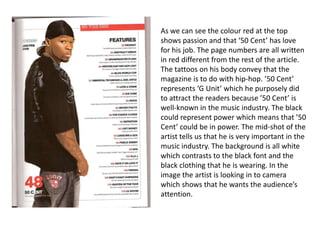
  • 1. As we can see the colour red at the top shows passion and that ‘50 Cent’ has love for his job. The page numbers are all written in red different from the rest of the article. The tattoos on his body convey that the magazine is to do with hip-hop. ’50 Cent’ represents ‘G Unit’ which he purposely did to attract the readers because ’50 Cent’ is well-known in the music industry. The black could represent power which means that ’50 Cent’ could be in power. The mid-shot of the artist tells us that he is very important in the music industry. The background is all white which contrasts to the black font and the black clothing that he is wearing. In the image the artist is looking in to camera which shows that he wants the audience’s attention.
  • 2. The content is written in bold capital font in white which stands out against the grey background. The contents page of this magazine looks a bit dark and dull. This could be aimed at a dull and boring target audience. However despite the dullness of the page the grey dull colours match the clothing of the artist which gives it a good effect. Also the style of the masthead is attractive because of the way that it is laid out. For instance, the way ‘CONTENTS PAGE’ is written gives the magazine contents page a fun vibe. The picture used on the page looks kind of sexual. It could also mean that it is aimed at the audience that likes these kinds of things. I think that the long shot is used to give the sense of attractiveness that is mentioned. This gives a full view of the subject’s body language and structure.
  • 3. The image draws attention to the page numbers, features and helps the reader directly to the page and easily find what their looking for. The image of the artist/singer ‘Plies’ shows that he is wealthy and has a lot of money by the way that he is showing off his diamond bracelets and necklaces along with his teeth grills and tattoos. This is mostly focused on the Hip-Hop genre. The text is easy to read and the sub-headings are used to navigate the reader to the different sections of the magazine. In this magazine the contents is divided in to two sections, Features and Fashion and are in bold white letters to make it stand out. The page numbers are also on the left rather than the right, while the sub dividers are in bold white capitals.
  • 4. The central image takes up the majority of the page and the contents themselves are at the bottom left hand corner and split in to three sections. The title ‘contents’ is written is written in bold on the left hand corner of the page however is not the centre of attention. The magazine has concentrated on the main artists included in the issue because of the picture. The background is plain white not to distract from the main focus. The two outfits that these women are wearing are simple with no bright or contrasting colours, but are clearly feminine. Down the left hand side of the screen is a simple list of what’s inside the magazine. The list is clearly laid out so that it makes it easier for the reader to understand. The font choice is simple, bold and striking, all to attract the reader’s attention.