‘film poster analysis’
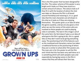
This is the film poster that has been designed for
this film. The colour scheme of this poster is very
bright and it looks as if they have stuck to a
certain amount of colours. The colours look as if
they fit in with the location of where the shot
was taken at. Because the film is all based
around friendship and restoring it, it is a good
idea that the main characters are all shown in
this shot as it looks as if they are enjoying
themselves. This poster gives us an idea of what
the genre could be, and we are also given a hint
when we see the names of the actors who are
involved as these people are used to playing
roles in comedies. The text in this image is all of
the same font, the font doesn’t give us an idea of
what genre the film is going to be, this is a good
idea as they don’t want to be giving everything
away. The positioning of all of the features such
as the masthead and characters names has taken
a traditional format as the positioning of where
they are is similar to what other film posters are.
The main aim is for this poster to sell the film
and I think that this has been very well done as it
is something which will catch peoples eyes and
especially by having big names in the film it
means that they will attract their fans too.
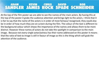
At the top of the film poster we are able to see the names of the main actors. By having this at
the top of the poster it grabs the audience attention and brings light to the actors. I think that it
is fair to say that the name of the actors is in order of most famous/ recognised, they could also
be in order of how much they are on screen during the film. The colour of the text is different to
the background colour which shows the importance of the names and allows them to be more
distinct. However these names of actors do not take the spotlight in comparison to the main
image. Because not every single actor/actress has their name addressed on this poster it means
that the ratio of text to image is still in favour of image as this is the thing which will grab the
attention of the audience.
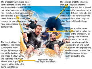
The characters which are closer      The location that the image is
to the camera are the ones that      shot is in the place that the
are the main characters and the      funniest part of the film is filmed
ones who have a more dominant        in. By having the main image at a
role, the characters have ALL        water park it shows the audience
been clothed in clothing that will   that it is suitable for even adults
make them stand out and allow        to have fun in as even they can
them to be more bold when they       relive their childhood all over
have been merged into the            again.
background.
                                           Here we are able to see
                                           the enjoyment on all of the
                                           faces of the characters, by
                                           including all of the main
                                           characters in this shot it
The text that is at the                    shows us who we will be
bottom of the image                        expected to sit and watch
sums up the main                           in the film. The expressions
image. By having some                      on their faces show us that
text at the bottom of                      this film is going to be a
the image it allows us as                  really enjoyable one.
the audience to have an
idea of what is going to
happen without the plot
being spoilt for us.
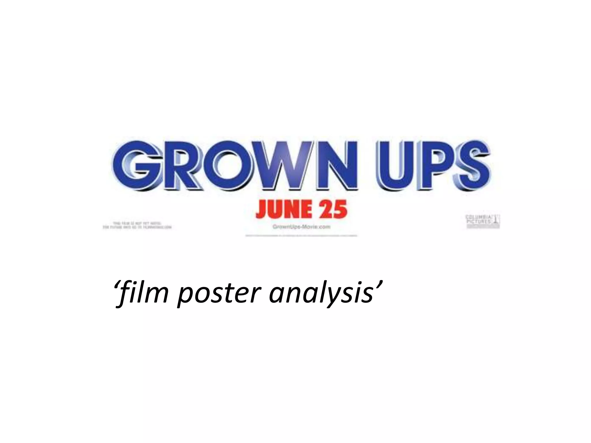
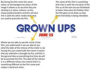
By having the film name the same                     The name of this film is something
colour as the background colour of the               that links in with the narrative of the
image it allows us to see that they are              film as at the start we see flashbacks
sticking to a colour scheme, as this                 of when they were all children then
shows professionalism and this will also             the film goes on to show us how
link in with the other media texts that              there friendship is being rekindled.
are used to promote the film.


Where we are able to see the name of the
film, just underneath it we are able to see
what the date of the release of the trailer is, by
having this just underneath the name it means
that our attention is brought to this, and this is
the general idea as everything that they do will
be to promote the film. The date of the release
is in a different colour, this means that it is
something different to the film name and
makes it stand out more.

Grown ups film poster analysis

  • 1.
  • 2.
    This is thefilm poster that has been designed for this film. The colour scheme of this poster is very bright and it looks as if they have stuck to a certain amount of colours. The colours look as if they fit in with the location of where the shot was taken at. Because the film is all based around friendship and restoring it, it is a good idea that the main characters are all shown in this shot as it looks as if they are enjoying themselves. This poster gives us an idea of what the genre could be, and we are also given a hint when we see the names of the actors who are involved as these people are used to playing roles in comedies. The text in this image is all of the same font, the font doesn’t give us an idea of what genre the film is going to be, this is a good idea as they don’t want to be giving everything away. The positioning of all of the features such as the masthead and characters names has taken a traditional format as the positioning of where they are is similar to what other film posters are. The main aim is for this poster to sell the film and I think that this has been very well done as it is something which will catch peoples eyes and especially by having big names in the film it means that they will attract their fans too.
  • 3.
    At the topof the film poster we are able to see the names of the main actors. By having this at the top of the poster it grabs the audience attention and brings light to the actors. I think that it is fair to say that the name of the actors is in order of most famous/ recognised, they could also be in order of how much they are on screen during the film. The colour of the text is different to the background colour which shows the importance of the names and allows them to be more distinct. However these names of actors do not take the spotlight in comparison to the main image. Because not every single actor/actress has their name addressed on this poster it means that the ratio of text to image is still in favour of image as this is the thing which will grab the attention of the audience.
  • 4.
    The characters whichare closer The location that the image is to the camera are the ones that shot is in the place that the are the main characters and the funniest part of the film is filmed ones who have a more dominant in. By having the main image at a role, the characters have ALL water park it shows the audience been clothed in clothing that will that it is suitable for even adults make them stand out and allow to have fun in as even they can them to be more bold when they relive their childhood all over have been merged into the again. background. Here we are able to see the enjoyment on all of the faces of the characters, by including all of the main characters in this shot it The text that is at the shows us who we will be bottom of the image expected to sit and watch sums up the main in the film. The expressions image. By having some on their faces show us that text at the bottom of this film is going to be a the image it allows us as really enjoyable one. the audience to have an idea of what is going to happen without the plot being spoilt for us.
  • 5.
    By having thefilm name the same The name of this film is something colour as the background colour of the that links in with the narrative of the image it allows us to see that they are film as at the start we see flashbacks sticking to a colour scheme, as this of when they were all children then shows professionalism and this will also the film goes on to show us how link in with the other media texts that there friendship is being rekindled. are used to promote the film. Where we are able to see the name of the film, just underneath it we are able to see what the date of the release of the trailer is, by having this just underneath the name it means that our attention is brought to this, and this is the general idea as everything that they do will be to promote the film. The date of the release is in a different colour, this means that it is something different to the film name and makes it stand out more.