Download to read offline

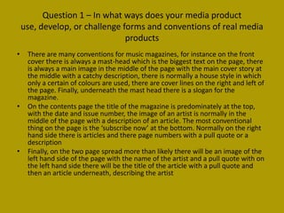
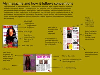
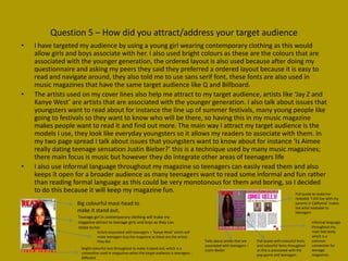
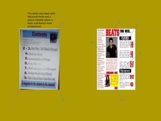

The document discusses the progression of the student's skills and magazine design from their preliminary task to the main construction. In the preliminary task, the magazine design was very basic with few colors, images, and cover lines. For the main construction, the student learned from their first attempt and significantly improved the design. The main construction follows conventions of music magazines, uses edited images, varied colors, and fonts from online sources. The student feels they have learned important skills that allowed them to create a more professional magazine design for their target audience of teenagers.


