This document analyzes the design elements of a media digipack for the film "Shifty."
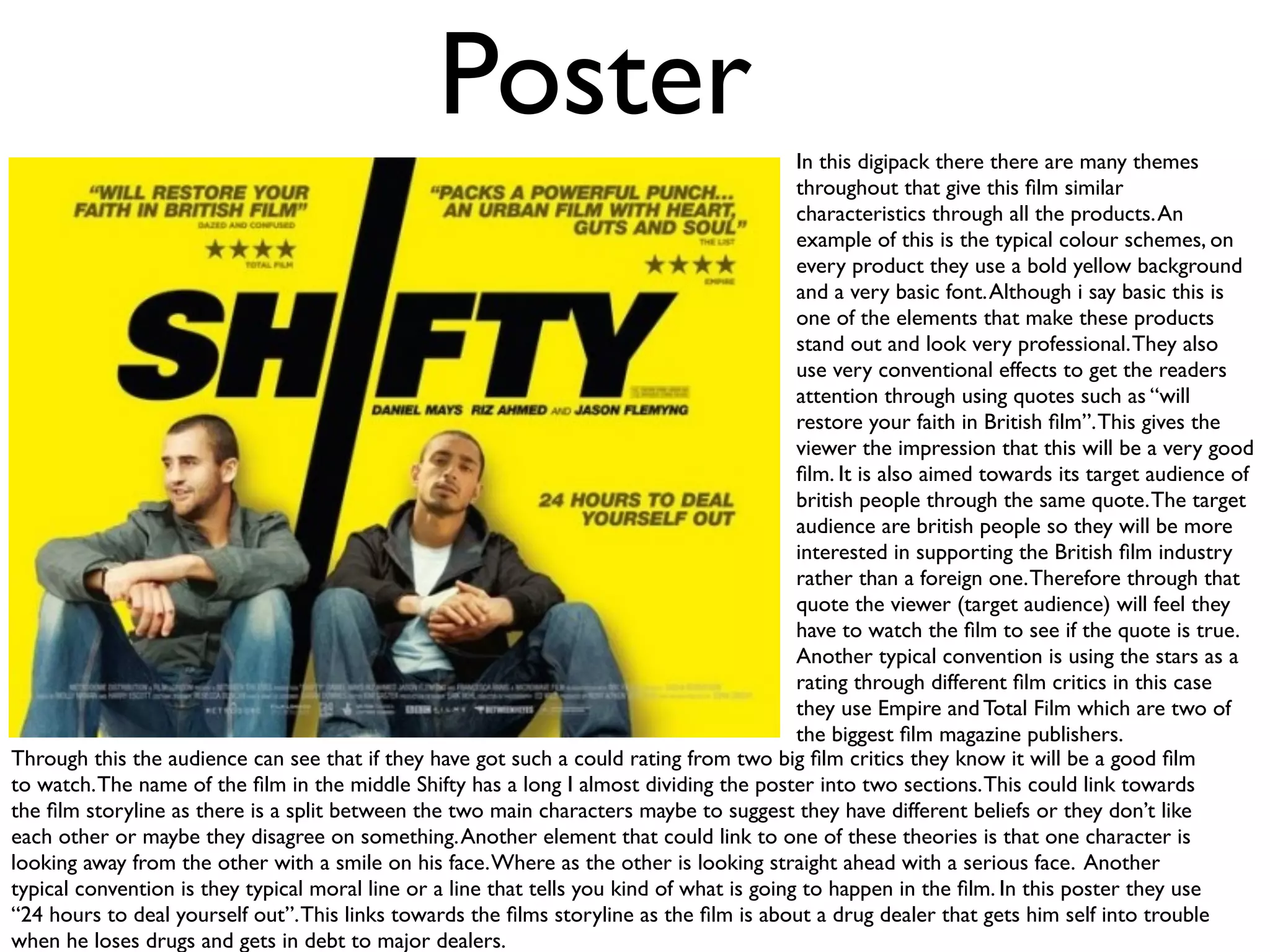
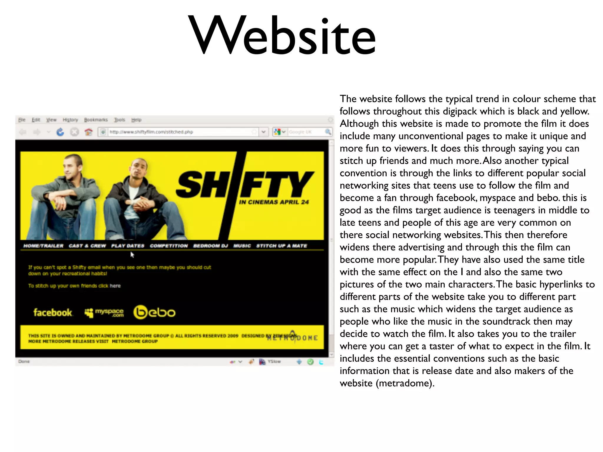
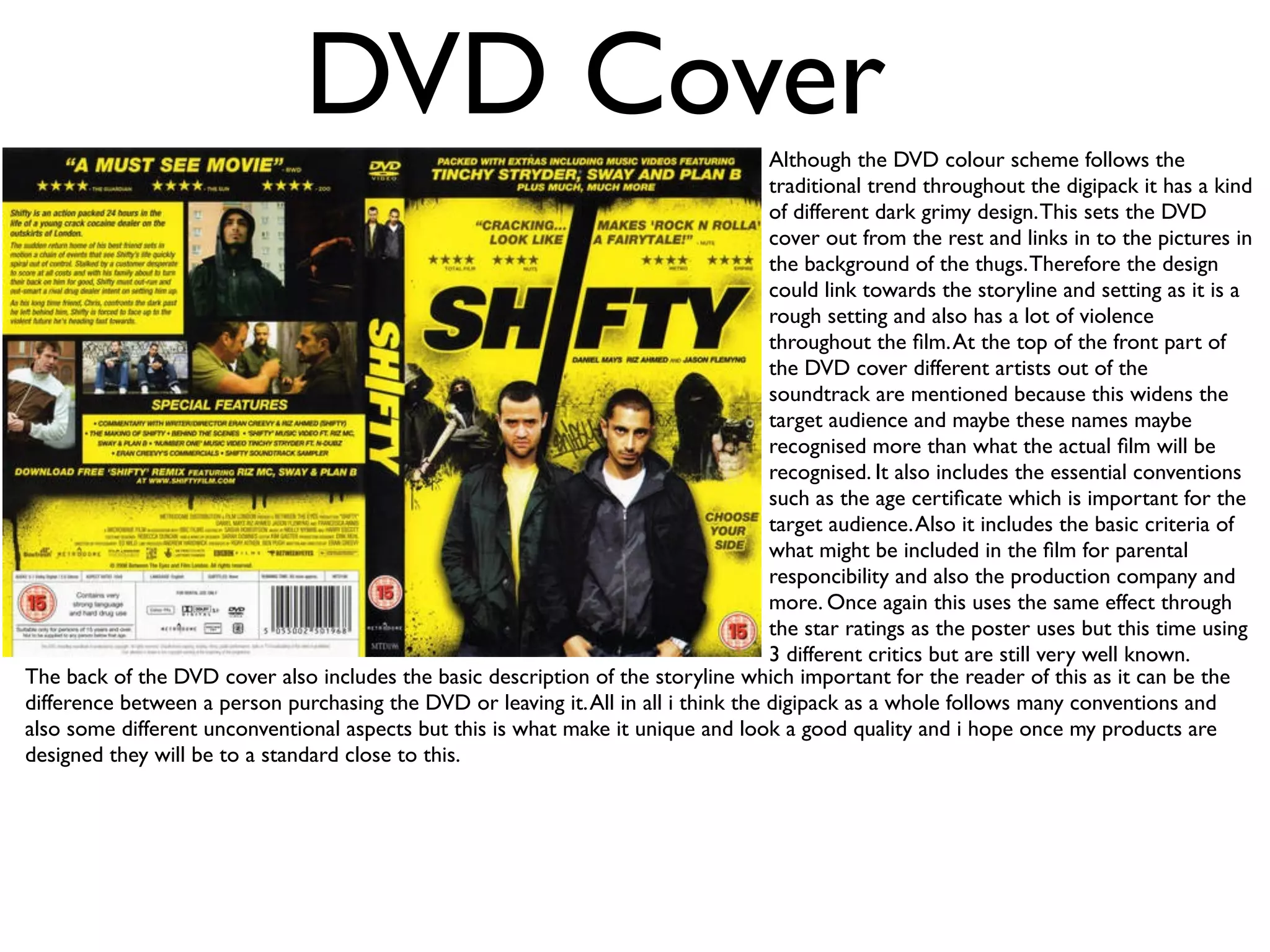
The digipack consistently uses a bold yellow and black color scheme across the poster, website, and DVD cover. It also employs common conventions like featuring the stars and ratings. However, it makes the materials unique by including unconventional elements and tying design features to the film's plot, like how the poster seems to divide the characters.
Overall, the digipack effectively promotes the film while standing out through small deviations from standards. It aims to attract its target teenage audience by integrating social media links and popular music artists into the marketing materials.


![In what ways does your media products use[1]](https://cdn.slidesharecdn.com/ss_thumbnails/inwhatwaysdoesyourmediaproductsuse1-120424142354-phpapp02-thumbnail.jpg?width=640&height=640&fit=bounds)


