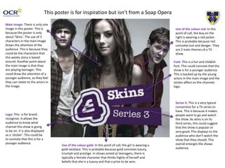
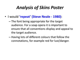
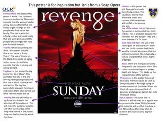
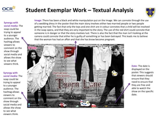
Soap Opera Genre – 
Ancillary Product 
Analysis 
OCR Media Studies – A2 Level 
Unit G324: Advanced Portfolio 
Name: Hannah Hughes 
Candidate Number: 4067 
Center Name: St. Andrew’s Catholic School 
Center Number: 64135
Image: This image has be manipulated in several ways. This includes a red tint being put on the image. This 
connotes death and danger, and suggests that something big is going to happen. The image also has a sharp 
and grainy feel, which could be from the Vignette style put on the image. The Vignette gives the image black 
edges and draws the attention into the main part of the poster. 
The image is of ‘Lucy’ looking to the right with a suspicious looking facial expression. This connotes that 
something bad if either going to happen to her or she is going to do something bad. This draws in the attention 
of the reader in and makes them want to watch ‘EastEnders’ so they can find out why she looks suspicious. 
Synergy with social media: The soap could be trying to 
appeal to a younger audience. The hashtag allows viewers 
to comment on the show through social media and allows 
the show to see what viewers think. 
Institution Logo: This is for brand recognize. It allows the 
audience to know what channel this show is going to be 
on. It is also displayed in very small font. This could 
connote that the institute is very well known and don’t 
need to big themselves up. 
Tagline: This tagline 
draws in the attention 
of the reader. This is 
because the words 
‘Walford will be 
changed. Forever’ 
suggest that 
something that has 
never happened on 
‘EastEnders’ before 
will happen. This 
makes people want to 
watch the show, so 
that they can find out 
what will happen.
Analysis of EastEnders Poster 
• I would ‘repeat’ (Steve Neale - 1980): 
– The tagline being very simple font. This ensures 
that it doesn’t draw away from the main image, 
which is the most important part of the poster. 
– Having someone not look directly at the camera. 
This gives the impression that they have done 
something bad or are guilty of something. 
– The Vignette style round the edge of the poster. 
This adds emphasis on the main image and draws 
in the attention from the viewer.
Image: There has been a fiery or burning manipulation on the image. 
From this we can denote that there will be a fire on Hollyoaks. We can 
connote that the people in the poster may be killed or injured in this fire. 
Or they could be the people who started the fire. All together this image 
connotes that these characters lives will be affected by the fire. The fact 
that none of them are looking into the camera could connote that they 
are all guilty of something. This leads me to believe that the fire isn’t an 
accident. In this image you can also see that the eyes are the only part 
that hasn’t been manipulated. This could connote that the eyes are 
important to this story, maybe the characters all saw something that 
they shouldn’t have. 
Tagline: The tagline denotes that 
Hollyoaks will change forever. This 
could connote that characters are 
going to be leaving the show 
through the fire. The use of the 
specific date could connote that 
they want viewers to watch all 
week but especially Fridays 
episode. Institution 
Logo: This is 
for brand 
recognize. It 
allows the 
audience to 
know what 
channel this 
show is going 
to be on. It is 
also displayed 
in a very big 
font. This could 
connote that 
the institute is 
very well 
known and the 
show want to 
show off that 
they are on that 
instituted 
channel. 
Date: The 
date is 
displayed on 
the poster. 
This suggests 
that viewers 
should ensure 
that they 
need to 
ensure that 
they are free 
and able to 
watch the 
show on the 
specific date.
Analysis of Hollyoaks Poster 
• I would ‘repeat’ (Steve Neale - 1980): 
– The use of manipulation on the image. This really 
draws the viewer in, and will entice them to watch to 
show. 
– The big brand logo. This ensures that all viewers know 
what channel the show will be on. This will also 
ensure that more people come and watch the show. 
– The specific date of the show. My soap opera will be a 
new soap and I could put the date that my soap opera 
first airs on the poster.
This poster is for inspiration but isn’t from a Soap Opera 
Main image: There is only one 
image in this poster. This is 
because the poster is only 
about ‘Skins’. The use of 3 
characters in the main image 
draws the attention of the 
audience. This is because they 
could be the characters that 
this weeks story is based 
around. Another point about 
the main image is that they 
are playing teenager. This 
could draw the attention of a 
younger audience, as they feel 
they can relate to the actors in 
the image. 
Logo: This is for brand 
recognize. It allows the 
audience to know what 
channel this show is going 
to be on. It is also displayed 
as a ‘sticker’. This could be 
to connote that this is for a 
younger audience. 
Use of the colour red: In this 
point of call, the boy on the 
right is wearing a red jacket. 
This is probable because red 
connotes lust and danger. They 
are 2 main themes of a TV 
show. 
Font: This is a fun and childish 
font. This could connote that the 
show is for a younger audience. 
This is backed up by the young 
actors in the main image and the 
sticker affect on the channels 
logo. 
Series 3: This is a very typical 
convention for a TV series to 
have. This is because it makes 
people want to go and watch 
the show. As skins is on its 
third series, this could suggest 
that the show is popular or 
very good. This displays to the 
audience who don’t watch the 
show that they should. This 
overall enlarges the shows 
audience. 
Use of the colour gold: In this point of call, the girl is wearing a 
gold necklace. This is probable because gold connotes luxury, 
triumph and prestige. In shows aimed at teenagers, there is 
typically a female character that thinks highly of herself and 
beliefs that she is a luxury and that a prize to be won.
Analysis of Skins Poster 
• I would ‘repeat’ (Steve Neale - 1980): 
– The font being appropriate for the target 
audience. For a soap opera it is important to 
ensure that all conventions display and appeal to 
the target audience. 
– Having lots of different colours that follow the 
connotations, for example red for lust/danger.
Infinity: In this poster the 
g of Revenge is actually 
the infinity symbol. This 
could be a theme from 
within the show, and 
connote that the women 
will not fail or let anyone 
else win. 
Use of the colour red: In this poster, 
the women is surrounded by a thick 
red sky. This is probable because red 
connotes lust and danger. They are 2 
main themes of a TV show. 
This poster is for inspiration but isn’t from a Soap Opera 
Font is white: The text on this 
poster is white. This connotes 
innocents and purity. This could 
connote that the women has be 
wrong done and feels that she 
needs to get revenge on the 
people who hurt her or her 
family. This ties in with the 
infinity symbol and could imply 
that she wont give up until the 
people who wronged her have 
paid for what they did. 
Sunday: The use of Sunday in 
big fonts is to draw in the 
attention of the audience. This 
will make the audience what to 
see what’s on Sunday. Once 
they have looked at the poster 
they may feel inclined to watch 
the show. 
Gold Skin and Hair: The use of the 
colour gold on the characters body 
and hair could connote that she is 
wealthy. It could also mean that she 
will be triumphant. She is typically a 
female character that thinks highly 
of herself. 
Black: There are many reasons why 
they would use the colour black. This 
colours connotes elegance, power, 
death and danger. This backs up the 
characteristics of the actress. 
Thorns: When researching this 
show I discovered that the 
characters name is ‘Emily 
Thorn’. The use of thorns on 
the black dress could be a play 
on her name. It could also 
connote that she is strong and 
willing to fight. 
Tag Line: In this poster the tag 
line is ‘Her Next Move’. This 
connotes that she is the one 
seeking revenge on people and 
that she is about to attack her 
next victim. The tag line 
successfully draws in the viewer 
and makes them what to find out 
what her next move will be. 
Premieres: In this poster the use of 
the word Premiere could be seen as 
the producers of Revenge trying to 
make an event of the show. When you 
think of a premiere you think of 
glamour and elegance (which ties in to 
the black dress). 
ABC Channel: The use of the TV 
channel it will be aired on is a good way 
to promote the show. This is because 
the audience will see that the show is 
on ABC and can then may what to 
watch it because it is on a popular 
channel.
Analysis of Revenge Poster 
• I would ‘repeat’ (Steve Neale - 1980): 
– Use of the TV channel on the poster. This could 
add brand recognition because people will 
recognise the channel and may want to watch the 
show. 
– Having lots of different colours that follow the 
connotations. E.g. red for lust/danger
Student Exemplar Work – Textual Analysis 
Image: There has been a black and white manipulation put on the image. We can connote through the use 
of a wedding dress in the poster that the main story involves either two married people or two people 
getting married. The fact that only the toys and one shirt are in colour connotes that a child will be involved 
in the soap opera, and that they are very important to the story. The use of the red shirt could connote that 
someone is in danger or that the story involves lust. There is also the fact that the man isn’t looking at the 
camera could connote that either he is guilty of something or has been betrayed. This leads me to believe 
that the woman has had an affair and that she has know become pregnant. 
Synergy with 
social media: The 
soap could be 
trying to appeal 
to a younger 
audience. The 
hashtag allows 
viewers to 
comment on the 
show through 
social media and 
allows the show 
to see what 
viewers think. 
Synergy with 
social media: The 
soap could be 
trying to appeal 
to a younger 
audience. The 
hashtag allows 
viewers to 
comment on the 
show through 
social media and 
allows the show 
to see what 
viewers think. 
Date: The date is 
displayed on the 
poster. This suggests 
that viewers should 
ensure that they 
need to ensure that 
they are free and 
able to watch the 
show on the specific 
date.
Task 
YOU MUST analyse – in a separate PowerPoint and using an adapted version of the title slide 
– the codes & conventions of: 
and 
and X1 student exemplar 
YOU SHOULD comment on the connotations behind EACH of the main conventions 
highlighted – for example: 
• Tagline – What are the meanings (connotations) behind the colour red? 
• Point of Call information - What are the meanings (connotations) behind the verbal 
codes in this convention? 
Finally, YOU MUST then conclude your analysis with a reflective statement (x1 slide) where 
you comment on what you intend to ‘repeat’ (Steve Neale) in your own Ancillary Product 
Poster and WHY

Ancillary product poster - analysis task

  • 1.
    Soap Opera Genre– Ancillary Product Analysis OCR Media Studies – A2 Level Unit G324: Advanced Portfolio Name: Hannah Hughes Candidate Number: 4067 Center Name: St. Andrew’s Catholic School Center Number: 64135
  • 2.
    Image: This imagehas be manipulated in several ways. This includes a red tint being put on the image. This connotes death and danger, and suggests that something big is going to happen. The image also has a sharp and grainy feel, which could be from the Vignette style put on the image. The Vignette gives the image black edges and draws the attention into the main part of the poster. The image is of ‘Lucy’ looking to the right with a suspicious looking facial expression. This connotes that something bad if either going to happen to her or she is going to do something bad. This draws in the attention of the reader in and makes them want to watch ‘EastEnders’ so they can find out why she looks suspicious. Synergy with social media: The soap could be trying to appeal to a younger audience. The hashtag allows viewers to comment on the show through social media and allows the show to see what viewers think. Institution Logo: This is for brand recognize. It allows the audience to know what channel this show is going to be on. It is also displayed in very small font. This could connote that the institute is very well known and don’t need to big themselves up. Tagline: This tagline draws in the attention of the reader. This is because the words ‘Walford will be changed. Forever’ suggest that something that has never happened on ‘EastEnders’ before will happen. This makes people want to watch the show, so that they can find out what will happen.
  • 3.
    Analysis of EastEndersPoster • I would ‘repeat’ (Steve Neale - 1980): – The tagline being very simple font. This ensures that it doesn’t draw away from the main image, which is the most important part of the poster. – Having someone not look directly at the camera. This gives the impression that they have done something bad or are guilty of something. – The Vignette style round the edge of the poster. This adds emphasis on the main image and draws in the attention from the viewer.
  • 4.
    Image: There hasbeen a fiery or burning manipulation on the image. From this we can denote that there will be a fire on Hollyoaks. We can connote that the people in the poster may be killed or injured in this fire. Or they could be the people who started the fire. All together this image connotes that these characters lives will be affected by the fire. The fact that none of them are looking into the camera could connote that they are all guilty of something. This leads me to believe that the fire isn’t an accident. In this image you can also see that the eyes are the only part that hasn’t been manipulated. This could connote that the eyes are important to this story, maybe the characters all saw something that they shouldn’t have. Tagline: The tagline denotes that Hollyoaks will change forever. This could connote that characters are going to be leaving the show through the fire. The use of the specific date could connote that they want viewers to watch all week but especially Fridays episode. Institution Logo: This is for brand recognize. It allows the audience to know what channel this show is going to be on. It is also displayed in a very big font. This could connote that the institute is very well known and the show want to show off that they are on that instituted channel. Date: The date is displayed on the poster. This suggests that viewers should ensure that they need to ensure that they are free and able to watch the show on the specific date.
  • 5.
    Analysis of HollyoaksPoster • I would ‘repeat’ (Steve Neale - 1980): – The use of manipulation on the image. This really draws the viewer in, and will entice them to watch to show. – The big brand logo. This ensures that all viewers know what channel the show will be on. This will also ensure that more people come and watch the show. – The specific date of the show. My soap opera will be a new soap and I could put the date that my soap opera first airs on the poster.
  • 6.
    This poster isfor inspiration but isn’t from a Soap Opera Main image: There is only one image in this poster. This is because the poster is only about ‘Skins’. The use of 3 characters in the main image draws the attention of the audience. This is because they could be the characters that this weeks story is based around. Another point about the main image is that they are playing teenager. This could draw the attention of a younger audience, as they feel they can relate to the actors in the image. Logo: This is for brand recognize. It allows the audience to know what channel this show is going to be on. It is also displayed as a ‘sticker’. This could be to connote that this is for a younger audience. Use of the colour red: In this point of call, the boy on the right is wearing a red jacket. This is probable because red connotes lust and danger. They are 2 main themes of a TV show. Font: This is a fun and childish font. This could connote that the show is for a younger audience. This is backed up by the young actors in the main image and the sticker affect on the channels logo. Series 3: This is a very typical convention for a TV series to have. This is because it makes people want to go and watch the show. As skins is on its third series, this could suggest that the show is popular or very good. This displays to the audience who don’t watch the show that they should. This overall enlarges the shows audience. Use of the colour gold: In this point of call, the girl is wearing a gold necklace. This is probable because gold connotes luxury, triumph and prestige. In shows aimed at teenagers, there is typically a female character that thinks highly of herself and beliefs that she is a luxury and that a prize to be won.
  • 7.
    Analysis of SkinsPoster • I would ‘repeat’ (Steve Neale - 1980): – The font being appropriate for the target audience. For a soap opera it is important to ensure that all conventions display and appeal to the target audience. – Having lots of different colours that follow the connotations, for example red for lust/danger.
  • 8.
    Infinity: In thisposter the g of Revenge is actually the infinity symbol. This could be a theme from within the show, and connote that the women will not fail or let anyone else win. Use of the colour red: In this poster, the women is surrounded by a thick red sky. This is probable because red connotes lust and danger. They are 2 main themes of a TV show. This poster is for inspiration but isn’t from a Soap Opera Font is white: The text on this poster is white. This connotes innocents and purity. This could connote that the women has be wrong done and feels that she needs to get revenge on the people who hurt her or her family. This ties in with the infinity symbol and could imply that she wont give up until the people who wronged her have paid for what they did. Sunday: The use of Sunday in big fonts is to draw in the attention of the audience. This will make the audience what to see what’s on Sunday. Once they have looked at the poster they may feel inclined to watch the show. Gold Skin and Hair: The use of the colour gold on the characters body and hair could connote that she is wealthy. It could also mean that she will be triumphant. She is typically a female character that thinks highly of herself. Black: There are many reasons why they would use the colour black. This colours connotes elegance, power, death and danger. This backs up the characteristics of the actress. Thorns: When researching this show I discovered that the characters name is ‘Emily Thorn’. The use of thorns on the black dress could be a play on her name. It could also connote that she is strong and willing to fight. Tag Line: In this poster the tag line is ‘Her Next Move’. This connotes that she is the one seeking revenge on people and that she is about to attack her next victim. The tag line successfully draws in the viewer and makes them what to find out what her next move will be. Premieres: In this poster the use of the word Premiere could be seen as the producers of Revenge trying to make an event of the show. When you think of a premiere you think of glamour and elegance (which ties in to the black dress). ABC Channel: The use of the TV channel it will be aired on is a good way to promote the show. This is because the audience will see that the show is on ABC and can then may what to watch it because it is on a popular channel.
  • 9.
    Analysis of RevengePoster • I would ‘repeat’ (Steve Neale - 1980): – Use of the TV channel on the poster. This could add brand recognition because people will recognise the channel and may want to watch the show. – Having lots of different colours that follow the connotations. E.g. red for lust/danger
  • 10.
    Student Exemplar Work– Textual Analysis Image: There has been a black and white manipulation put on the image. We can connote through the use of a wedding dress in the poster that the main story involves either two married people or two people getting married. The fact that only the toys and one shirt are in colour connotes that a child will be involved in the soap opera, and that they are very important to the story. The use of the red shirt could connote that someone is in danger or that the story involves lust. There is also the fact that the man isn’t looking at the camera could connote that either he is guilty of something or has been betrayed. This leads me to believe that the woman has had an affair and that she has know become pregnant. Synergy with social media: The soap could be trying to appeal to a younger audience. The hashtag allows viewers to comment on the show through social media and allows the show to see what viewers think. Synergy with social media: The soap could be trying to appeal to a younger audience. The hashtag allows viewers to comment on the show through social media and allows the show to see what viewers think. Date: The date is displayed on the poster. This suggests that viewers should ensure that they need to ensure that they are free and able to watch the show on the specific date.
  • 11.
    Task YOU MUSTanalyse – in a separate PowerPoint and using an adapted version of the title slide – the codes & conventions of: and and X1 student exemplar YOU SHOULD comment on the connotations behind EACH of the main conventions highlighted – for example: • Tagline – What are the meanings (connotations) behind the colour red? • Point of Call information - What are the meanings (connotations) behind the verbal codes in this convention? Finally, YOU MUST then conclude your analysis with a reflective statement (x1 slide) where you comment on what you intend to ‘repeat’ (Steve Neale) in your own Ancillary Product Poster and WHY