↑Top Model (Kolkata) Call Girls Sonagachi ⟟ 8250192130 ⟟ High Class Call Girl...
Ed sheeran
1. Music magazine Album Adverts.
Ed Sheeran ‘Plus’
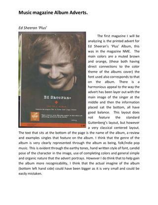
The first magazine I will be
analyzing is the printed advert for
Ed Sheeran’s ‘Plus’ Album, this
was in the magazine NME. The
main colors are a muted brown
and orange, (these both having
direct connections to the color
theme of the albums cover) the
font used also corresponds to that
on the album. There is a
harmonious appeal to the way the
advert has been layer out with the
main image of the singer at the
middle and then the information
placed sat the bottom, all have
good balance. This layout does
not feature the standard
Guttenberg’s layout, but however
a very classical centered layout.
The text that sits at the bottom of the page is the name of the album, a review
and examples singles that feature on the album. I think that the genre of the
album is very clearly represented through the album as being, folk/indie pop
music. This is evident through the earthy tones, hand written style of font, candid
pose of the character in the image, use of completing colors and general simple
and organic nature that the advert portrays. However I do think that to help gain
the album more recognisability, I think that the actual imagine of the album
(bottom left hand side) could have been bigger as it is very small and could be
easily mistaken.