Ancillaries
Planning: The evolution of the images
The Front Cover
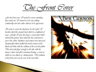
For the front cover, I needed to create something
that stands out, I wanted it to be very striking
aesthetically and also rather abstract in its appearance.

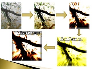
In order to create the final piece (to the right), I
heavily edited the original (next slide) in a multitude of
ways. Firstly I gave the image a zoom effect which
distorted the picture, then edited the hue/saturation to
give it the colour, brightness and contrast were increased
dramatically which enabled the harsh contrast of the
black and white with the addition of the red and yellow.
The end result plays strongly to the title, with the
image’s colour and effect connoting burning, a scene in
which we can almost see ‘disintegration’. The evolution
of the front cover can be seen on the next slide:
The Back Cover
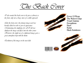
I also wanted the back cover to be just as abstract as
the front, only not as busy, more of a subtle approach.

Like the front cover, the primary image used was
heavily edited in order to give its appearance.
Maintaining the simplicity of it, all I did was
duplicate the image and flip it into the other corner.
However, the simple use of a duplicated image gave a
great atmosphere kept with the theme.

Evolution of the image on the next slide:
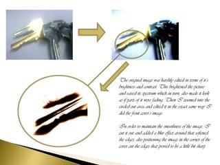
The original image was harshly edited in terms of it’s
brightness and contrast. This brightened the picture
and raised its spectrum which in turn, also made it look
as if parts of it were fading. Then I zoomed into the
circled out area and edited it in the exact same way I
did the front cover’s image.

In order to maintain the smoothness of the image, I
cut it out and added a blur effect around that softened
the edges, also positioning the image in the corner of the
cover cut the edges that proved to be a little bit sharp.
The Poster
The poster had to follow the colour scheme of the actual
album itself, though I did multiple versions before
finally settling on this piece. Again, the original image
was edited in the same way both the front and back
covers were, excluding the zoom effect.

The original and additional versions are on the other
slide...
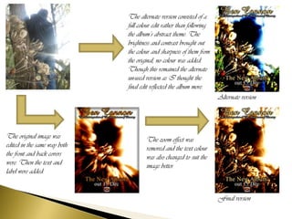
The alternate version consisted of a
                              full colour edit rather than following
                              the album’s abstract theme. The
                              brightness and contrast brought out
                              the colour and sharpness of them from
                              the original, no colour was added.
                              Though this remained the alternate
                              un-used version as I thought the
                              final edit reflected the album more.
                                                                       Alternate version


The original image was                The zoom effect was
edited in the same way both           removed and the text colour
the front and back covers             was also changed to suit the
were. Then the text and               image better.
label were added.


                                                                       Final version
Inside the cd case
The inside of the case had to also maintain the imagery as shown on the front and back cover, as too with the poster. So,
for the whole inside, I used 1 image, though edited it in different ways.
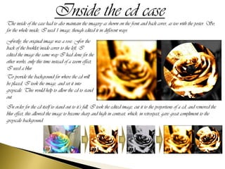
Firstly, the original image was a rose. For the
back of the booklet/inside cover to the left, I
edited the image the same way I had done for the
other works, only this time instead of a zoom effect,
I used a blur.
To provide the background for where the cd will
be placed, I took the image, and set it into
greyscale. This would help to allow the cd to stand
out.
In order for the cd itself to stand out to it’s full, I took the edited image, cut it to the proportions of a cd, and removed the
blur effect, this allowed the image to become sharp and high in contrast, which, in retrospect, gave great compliment to the
greyscale background.

Ancillaries planning & Evolution

  • 1.
  • 2.
    The Front Cover Forthe front cover, I needed to create something that stands out, I wanted it to be very striking aesthetically and also rather abstract in its appearance. In order to create the final piece (to the right), I heavily edited the original (next slide) in a multitude of ways. Firstly I gave the image a zoom effect which distorted the picture, then edited the hue/saturation to give it the colour, brightness and contrast were increased dramatically which enabled the harsh contrast of the black and white with the addition of the red and yellow. The end result plays strongly to the title, with the image’s colour and effect connoting burning, a scene in which we can almost see ‘disintegration’. The evolution of the front cover can be seen on the next slide:
  • 4.
    The Back Cover Ialso wanted the back cover to be just as abstract as the front, only not as busy, more of a subtle approach. Like the front cover, the primary image used was heavily edited in order to give its appearance. Maintaining the simplicity of it, all I did was duplicate the image and flip it into the other corner. However, the simple use of a duplicated image gave a great atmosphere kept with the theme. Evolution of the image on the next slide:
  • 5.
    The original imagewas harshly edited in terms of it’s brightness and contrast. This brightened the picture and raised its spectrum which in turn, also made it look as if parts of it were fading. Then I zoomed into the circled out area and edited it in the exact same way I did the front cover’s image. In order to maintain the smoothness of the image, I cut it out and added a blur effect around that softened the edges, also positioning the image in the corner of the cover cut the edges that proved to be a little bit sharp.
  • 6.
    The Poster The posterhad to follow the colour scheme of the actual album itself, though I did multiple versions before finally settling on this piece. Again, the original image was edited in the same way both the front and back covers were, excluding the zoom effect. The original and additional versions are on the other slide...
  • 7.
    The alternate versionconsisted of a full colour edit rather than following the album’s abstract theme. The brightness and contrast brought out the colour and sharpness of them from the original, no colour was added. Though this remained the alternate un-used version as I thought the final edit reflected the album more. Alternate version The original image was The zoom effect was edited in the same way both removed and the text colour the front and back covers was also changed to suit the were. Then the text and image better. label were added. Final version
  • 8.
    Inside the cdcase The inside of the case had to also maintain the imagery as shown on the front and back cover, as too with the poster. So, for the whole inside, I used 1 image, though edited it in different ways. Firstly, the original image was a rose. For the back of the booklet/inside cover to the left, I edited the image the same way I had done for the other works, only this time instead of a zoom effect, I used a blur. To provide the background for where the cd will be placed, I took the image, and set it into greyscale. This would help to allow the cd to stand out. In order for the cd itself to stand out to it’s full, I took the edited image, cut it to the proportions of a cd, and removed the blur effect, this allowed the image to become sharp and high in contrast, which, in retrospect, gave great compliment to the greyscale background.