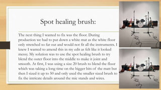
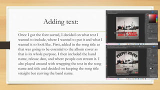
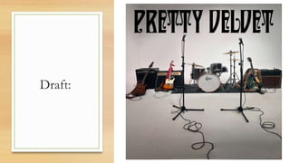
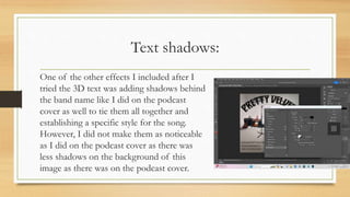
Digital print-
Album cover:
Stretching and cropping background:
The first thing I did when I uploaded my background
was crop the dimensions into a square as that is what
typical album cover are that you find on streaming
platforms. I then used to the stretching tool to see
whether it would add some dimension to my
background. I don’t think it made the effect that I was
looking for when I stretched the 4 corners. However, it
did allow my picture to fit the square shape I was
looking for.
Spot healing brush:
The next thing I wanted to fix was the floor. During
production we had to put down a white mat as the white floor
only stretched so far out and would not fit all the instruments. I
knew I wanted to amend this in my edit as felt like it looked
messy. My solution was to use the spot healing brush to try
blend the outer floor into the middle to make it joint and
smooth. At first, I was using a size 20 brush to blend the floor
which was taking a long time on the bigger bits of the matt but
then I sized it up to 50 and only used the smaller sized brush to
fix the intricate details around the mic stands and wires.
Rough cut- eraser tool:
While using the spot healing brush before I
found I could size up the brush I tried to use the
eraser tool to see if it was more efficient and
easier to use however, I did not work as it just
left the background plain white. I tried it in
multiple spots on the floor however it made it
look patchier, so I went back to using the spot
healing brush where I found a solution to my
brush size problem.
Fonts:
When I was happy with my blending of the floor, I started
to think about what I wanted my text to say and how I
wanted it to look. I already had the bands font ’Sultan Café’
for their band name however I wanted a different font for
the song name ’Dirty Soul’. I looked at the royalty free fonts
on ‘DaFont’ and found 2 different fonts that looked good
in the samples. I downloaded them onto my computer and
tried both in Premiere and I decided ‘Strong Attraction’ was
the better one and used it for my song title and my other
text other then the band name.
Adding text:
Once I got the font sorted, I decided on what text I
wanted to include, where I wanted to put it and what I
wanted it to look like. First, added in the song title as
that was going to be essential to the album cover as
that is its whole purpose. I then included the band
name, release date, and where people can stream it. I
also played around with wrapping the text in the song
name and title and decided on keeping the song title
straight but curving the band name.
Draft:
Rough cut- 3D text:
I then tried to change the song title into 3D to try
and make the song title pop and stand out from the
rest of the background, but I thought that instead
of standing out it looked out of place especially
with the red colouring too, so I tried it with a few
different other colours as well, but I did not like
any, so I went back to the normal text and did a
few more effects such as different fonts and
wrapping instead.
Text shadows:
One of the other effects I included after I
tried the 3D text was adding shadows behind
the band name like I did on the podcast
cover as well to tie them all together and
establishing a specific style for the song.
However, I did not make them as noticeable
as I did on the podcast cover as there was
less shadows on the background of this
image as there was on the podcast cover.
Colouring text:
After, I was happy with how the cover was looking
however I wanted to include colours that related to each
band member that only big fans of the band would
realise was there. Following through with this idea I took
colours for their instruments, Daniels bandana and Lees
leopard print coat and originally put them into different
letters of the band title however after I got some
feedback, I changed it to each line of the text as I felt
like this made the titles stand out while also drawing
attention to the different colours.
Rough cut- Filters:
When I was happy with the text, I just started
looking around photoshop for other tools I
could use to enhance and make my album cover
better. I had a look at adjustment layers and
filters I could add and tried many different kinds
such as the sunset, black and white and the older
looking version however I did not keep any
because it made my cover look too dark or loose
the colours, I had added to them.
Verbal feedback:
Before I made the final touches for my cover I asked feedback from a
couple of my friends, Ruby and Mack. From Ruby she liked
everything, but she advised me to change the colouring of each band
members colour from the band title to the lines of text along the
bottom. I tried this out and I loved the way it looked as changing it
made the song and band title pop out amount the rest of the writing.
Mack also really liked my album cover but advised me to try out some
of the adjustment layers and filters. However, when I tried them out
and showed him the result, we collectively agreed to leave them out as
it changed the look of the album cover completely and that was not
what I was going for.
Google form feedback:
• Text is a little busy- there is a
lot of it- might be better to
simplify it down to something
like Dirty Souls in larger font
then new single 02/02/24
underneath
• Potentially make the
instruments stand out more
(vibrant or highlighted)
Feedback response:
I knew I wanted feedback, so I made a google form, so I could get an
outsider's perspective on any improvements I could make. I decided to
only make changes to my black and white version as I felt like it had the
most potential to look better and not clash with other colours.
My first recommended improvement was to make a simpler version of
my cover as the text could be seen as too much and only keep essential
information, so I kept the release date, band name and song name. I also
later included the logos of places you can stream the song from to add a
little more on the side.
My next recommended improvement was to make the instruments stand
out. I played around with the tools trying out different instruments like
the guitars and the drums, but I didn’t like the way it looked on any of
them, so I decided to scrap the recommendation.
Original:
New version:
Rough cut- Adding vibrancy:
Following my feedback, I tried to add some vibrancy around the outside
of the instruments. I tried doing this by using the quick selection tool and
changing the mode and adjustments. Once I had selected the quick
selection tool then selected the 3rd one along with the little star, I could
start circling the instruments to start adding effects to them. I then went
into mode or adjustments to look at the options I could change I too. I
started with the guitars on the left-hand side and played around with the
modes and adjustments, but none made a big difference, and
I didn’t think they looked very good. I then tried with the
drum kit, but I had the same outcome, so I decided to leave
my simplified version as it was.

Album covers.pptx.......................

  • 1.
  • 2.
    Stretching and croppingbackground: The first thing I did when I uploaded my background was crop the dimensions into a square as that is what typical album cover are that you find on streaming platforms. I then used to the stretching tool to see whether it would add some dimension to my background. I don’t think it made the effect that I was looking for when I stretched the 4 corners. However, it did allow my picture to fit the square shape I was looking for.
  • 3.
    Spot healing brush: Thenext thing I wanted to fix was the floor. During production we had to put down a white mat as the white floor only stretched so far out and would not fit all the instruments. I knew I wanted to amend this in my edit as felt like it looked messy. My solution was to use the spot healing brush to try blend the outer floor into the middle to make it joint and smooth. At first, I was using a size 20 brush to blend the floor which was taking a long time on the bigger bits of the matt but then I sized it up to 50 and only used the smaller sized brush to fix the intricate details around the mic stands and wires.
  • 4.
    Rough cut- erasertool: While using the spot healing brush before I found I could size up the brush I tried to use the eraser tool to see if it was more efficient and easier to use however, I did not work as it just left the background plain white. I tried it in multiple spots on the floor however it made it look patchier, so I went back to using the spot healing brush where I found a solution to my brush size problem.
  • 5.
    Fonts: When I washappy with my blending of the floor, I started to think about what I wanted my text to say and how I wanted it to look. I already had the bands font ’Sultan Café’ for their band name however I wanted a different font for the song name ’Dirty Soul’. I looked at the royalty free fonts on ‘DaFont’ and found 2 different fonts that looked good in the samples. I downloaded them onto my computer and tried both in Premiere and I decided ‘Strong Attraction’ was the better one and used it for my song title and my other text other then the band name.
  • 6.
    Adding text: Once Igot the font sorted, I decided on what text I wanted to include, where I wanted to put it and what I wanted it to look like. First, added in the song title as that was going to be essential to the album cover as that is its whole purpose. I then included the band name, release date, and where people can stream it. I also played around with wrapping the text in the song name and title and decided on keeping the song title straight but curving the band name.
  • 7.
  • 8.
    Rough cut- 3Dtext: I then tried to change the song title into 3D to try and make the song title pop and stand out from the rest of the background, but I thought that instead of standing out it looked out of place especially with the red colouring too, so I tried it with a few different other colours as well, but I did not like any, so I went back to the normal text and did a few more effects such as different fonts and wrapping instead.
  • 9.
    Text shadows: One ofthe other effects I included after I tried the 3D text was adding shadows behind the band name like I did on the podcast cover as well to tie them all together and establishing a specific style for the song. However, I did not make them as noticeable as I did on the podcast cover as there was less shadows on the background of this image as there was on the podcast cover.
  • 10.
    Colouring text: After, Iwas happy with how the cover was looking however I wanted to include colours that related to each band member that only big fans of the band would realise was there. Following through with this idea I took colours for their instruments, Daniels bandana and Lees leopard print coat and originally put them into different letters of the band title however after I got some feedback, I changed it to each line of the text as I felt like this made the titles stand out while also drawing attention to the different colours.
  • 11.
    Rough cut- Filters: WhenI was happy with the text, I just started looking around photoshop for other tools I could use to enhance and make my album cover better. I had a look at adjustment layers and filters I could add and tried many different kinds such as the sunset, black and white and the older looking version however I did not keep any because it made my cover look too dark or loose the colours, I had added to them.
  • 12.
    Verbal feedback: Before Imade the final touches for my cover I asked feedback from a couple of my friends, Ruby and Mack. From Ruby she liked everything, but she advised me to change the colouring of each band members colour from the band title to the lines of text along the bottom. I tried this out and I loved the way it looked as changing it made the song and band title pop out amount the rest of the writing. Mack also really liked my album cover but advised me to try out some of the adjustment layers and filters. However, when I tried them out and showed him the result, we collectively agreed to leave them out as it changed the look of the album cover completely and that was not what I was going for.
  • 13.
    Google form feedback: •Text is a little busy- there is a lot of it- might be better to simplify it down to something like Dirty Souls in larger font then new single 02/02/24 underneath • Potentially make the instruments stand out more (vibrant or highlighted)
  • 14.
    Feedback response: I knewI wanted feedback, so I made a google form, so I could get an outsider's perspective on any improvements I could make. I decided to only make changes to my black and white version as I felt like it had the most potential to look better and not clash with other colours. My first recommended improvement was to make a simpler version of my cover as the text could be seen as too much and only keep essential information, so I kept the release date, band name and song name. I also later included the logos of places you can stream the song from to add a little more on the side. My next recommended improvement was to make the instruments stand out. I played around with the tools trying out different instruments like the guitars and the drums, but I didn’t like the way it looked on any of them, so I decided to scrap the recommendation. Original: New version:
  • 15.
    Rough cut- Addingvibrancy: Following my feedback, I tried to add some vibrancy around the outside of the instruments. I tried doing this by using the quick selection tool and changing the mode and adjustments. Once I had selected the quick selection tool then selected the 3rd one along with the little star, I could start circling the instruments to start adding effects to them. I then went into mode or adjustments to look at the options I could change I too. I started with the guitars on the left-hand side and played around with the modes and adjustments, but none made a big difference, and I didn’t think they looked very good. I then tried with the drum kit, but I had the same outcome, so I decided to leave my simplified version as it was.