The second spread features an article about Nicki Minaj. It uses a bold pink headline that matches her lipstick color and an abstract central photo of Minaj making direct eye contact. The text is divided into various
ANALYSIS OF ARTICLES-DOUBLE PAGE SPREAD 1 NME
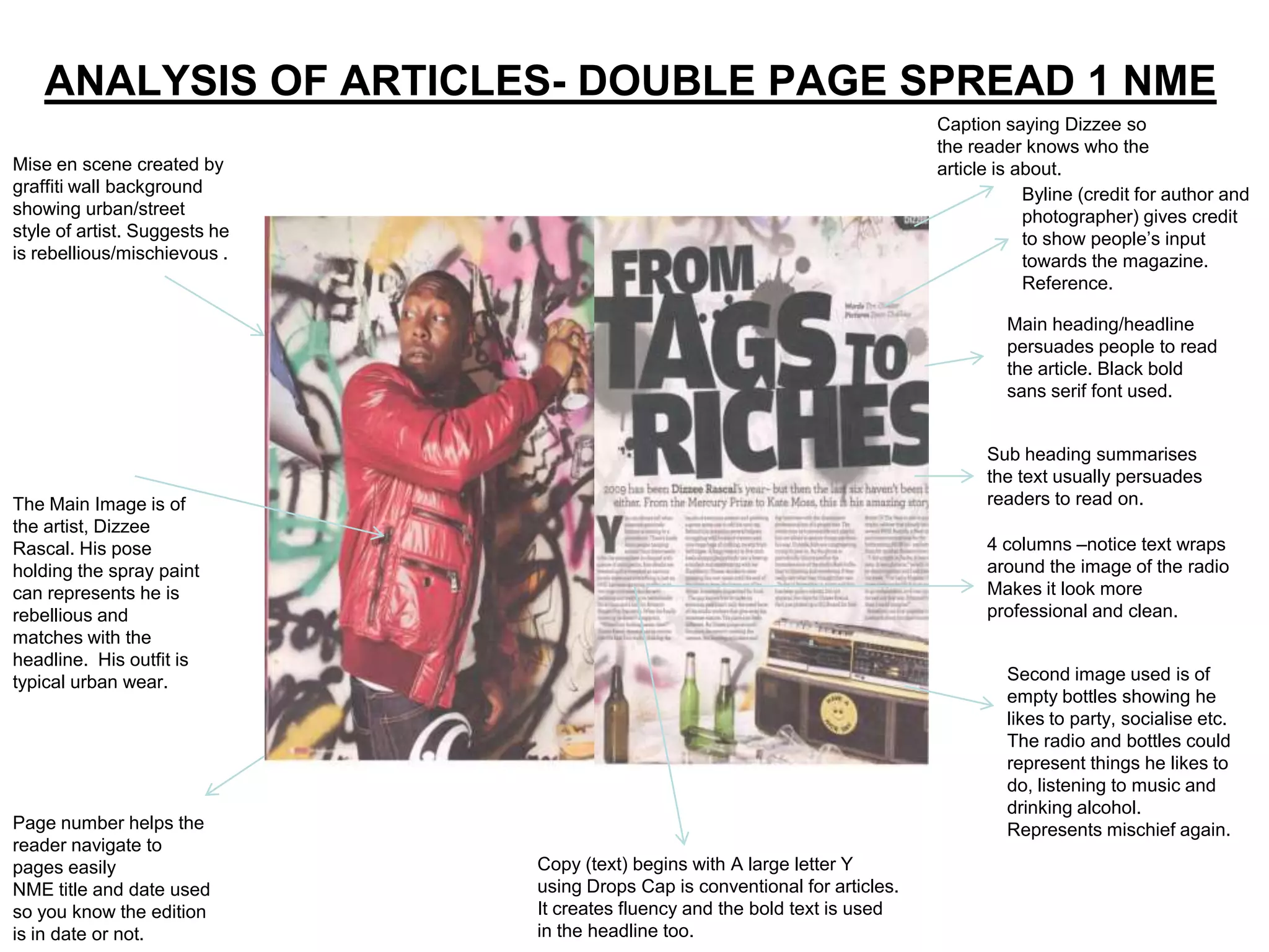
Caption saying Dizzee so
the reader knows who the
Mise en scene created by article is about.
graffiti wall background Byline (credit for author and
showing urban/street photographer) gives credit
style of artist. Suggests he to show people’s input
is rebellious/mischievous . towards the magazine.
Reference.
Main heading/headline
persuades people to read
the article. Black bold
sans serif font used.
Sub heading summarises
the text usually persuades
The Main Image is of readers to read on.
the artist, Dizzee
Rascal. His pose 4 columns –notice text wraps
holding the spray paint around the image of the radio
can represents he is Makes it look more
rebellious and professional and clean.
matches with the
headline. His outfit is
typical urban wear. Second image used is of
empty bottles showing he
likes to party, socialise etc.
The radio and bottles could
represent things he likes to
do, listening to music and
drinking alcohol.
Page number helps the Represents mischief again.
reader navigate to
pages easily Copy (text) begins with A large letter Y
NME title and date used using Drops Cap is conventional for articles.
so you know the edition It creates fluency and the bold text is used
is in date or not. in the headline too.
2.
Analysis of
written article
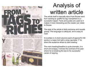
The article itself is basically about how Dizzee went
from wanting to ‘graffiti his tag’ everywhere to a
successful rapper. Facts and quotes are used so it
makes it more interesting and the reader can relate
to Dizzee.
The style of the article is fairly exclusive and reveals
gossip. The language is colloquial, and is easy to
read.
It is written in 4 short columns each of approx75-100
words in a basic font with a drop cap letter ‘Y’ to
direct the audience where to start reading.
The main heading/headline is quite dramatic, it is
short and snappy. It shows the contrast of his past
where he is breaking the law to his successful
career of rapping.
3.
ANALYSIS OF ARTICLES-
DOUBLE PAGE SPREAD 2
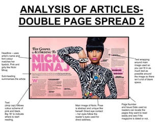
Headline – uses
artist’s name and
font colour Text wrapping
matches her around main
lipstick. Pink and image used so
girly like Nicki you can fit in as
Minaj. much text as
possible around
Sub-heading the image so there
summarises the article isn’t a lot of blank
space.
Text
(drop cap) follows Main Image of Nicki. Pose Page Number
colour scheme of is abstract and unique like and Issue Date used so
pink and black. herself. Direct eye contact readers can locate the
Big ‘W’ to indicate – her eyes follow the pages they want to read
where to start reader’s eyes used for easily and see if the
reading. direct address. magazine is dated or not.
4.
Analysis of writtenarticle 2
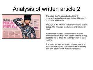
The article itself is basically about the 10
commandments of our saviour. Listing 10 things to
do to have a better life.
The style of the article is fairly exclusive and reveals
gossip. The language is colloquial, and is easy to
read.
It is written in 5 short columns of various sizes
around the main image with a basic font with a drop
cap letter ‘W’ to direct the audience where to start
reading.
The main heading/headline is quite dramatic, it is
short and snappy and uses the artists name in big
bold pink letters, which matches her lipstick.


![Task 1, 2, 3 Analysing Music Magazine Pages [G321]](https://cdn.slidesharecdn.com/ss_thumbnails/task12and3magazienanalysis-130226080556-phpapp02-thumbnail.jpg?width=640&height=640&fit=bounds)


