Download to read offline


![90 Chapter 3 Data Description
Then, for example, the 65th percentile for a set of grouped data would be computed
using the formula
To determine L, fp, and cfb, begin with the lowest interval and find the first interval
for which the cumulative relative frequency exceeds .65. This interval would con-
tain the 65th percentile.
EXAMPLE 3.8
Refer to the tick data of Table 3.8. Compute the 90th percentile.
Solution Because the eighth interval is the first interval for which the cumulative
relative frequency exceeds .90, we have
L ⫽ 33.75
n ⫽ 100
cfb ⫽ 82
f90 ⫽ 11
w ⫽ 2.5
Thus, the 90th percentile is
This means that 90% of the cows have 35 or fewer attached ticks and 10% of the
cows have 36 or more attached ticks.
The second measure of variability, the interquartile range, is now defined. A
slightly different definition of the interquartile range is given along with the boxplot
(Section 3.6).
P90 ⫽ 33.75 ⫹
2.5
11
[.9(100) ⫺ 82] ⫽ 35.57
P ⫽ L ⫹
w
fp
(.65n ⫺ cfb)
DEFINITION 3.6 The interquartile range (IQR) of a set of measurements is defined to be the
difference between the upper and lower quartiles; that is,
IQR ⫽ 75th percentile ⫺ 25th percentile
interquartile range
The interquartile range, although more sensitive to data pileup about the midpoint
than the range, is still not sufficient for our purposes. In fact, the IQR can be very
misleading when the data set is highly concentrated about the median. For exam-
ple, suppose we have a sample consisting of 10 data values:
20, 50, 50, 50, 50, 50, 50, 50, 50, 80
The mean, median, lower quartile, and upper quartile would all equal 50. Thus,
IQR equals 50 ⫺ 50 ⫽ 0. This is very misleading because a measure of variability
equal to 0 should indicate that the data consist of n identical values, which is not the
case in our example. The IQR ignores the extremes in the data set completely. In
fact, the IQR only measures the distance needed to cover the middle 50% of the
data values and, hence, totally ignores the spread in the lower and upper 25% of
the data. In summary, the IQR does not provide a lot of useful information about
the variability of a single set of measurements, but it can be quite useful when](https://image.slidesharecdn.com/anintroductiontostatisticalmethodsanddataanalysis-230807180345-6fffebdf/85/An-Introduction-to-Statistical-Methods-and-Data-Analysis-pdf-109-320.jpg)


![3.4 Describing Data on a Single Variable: Measures of Central Tendency
Basic 3.15 Compute the mean, median, and mode for the following data:
55 85 90 50 110 115 75 85 8 23
70 65 50 60 90 90 55 70 5 31
Basic 3.16 Refer to the data in Exercise 3.15 with the measurements 110 and 115 replaced by 345 and
467. Recompute the mean, median, and mode. Discuss the impact of these extreme measure-
ments on the three measures of central tendency.
Basic 3.17 Refer to the data in Exercise 3.15 and 3.16. Compute a 10% trimmed mean for both
data sets—that is, the original and the one with the two extreme values. Do the extreme values
affect the 10% trimmed mean? Would a 5% trimmed mean be affected by the two extreme
values?
Basic 3.18 Determine the mean, median, and mode for the data presented in the following frequency
table.
Class Interval Frequency
2.0 – 4.9 5
5.0 –7.9 13
8.0 –10.9 16
11.0 –13.9 9
14.0 –16.9 4
17.0 –19.9 2
20.0 –22.9 2
Engin. 3.19 A study of the reliability of buses [“Large sample simultaneous confidence intervals for
the multinominal probabilities on transformations of the cell frequencies,” Technometrics
(1980) 22:588] examined the reliability of 191 buses. The distance traveled (in 1,000s of miles)
prior to the first major motor failure was classified into intervals. A modified form of the table
follows.
Distance Traveled
(1,000 miles) Frequency
0 –20.0 6
20.1– 40.0 11
40.1–60.0 16
60.1–100.0 59
100.1–120.0 46
120.1–140.0 33
140.1–160.0 16
160.1–200.0 4
a. Sketch the relative frequency histogram for the distance data and describe its shape.
b. Estimate the mode, median, and mean for the distance traveled by the 191 buses.
c. What does the relationship among the three measures of center indicate about the
shape of the histogram for these data?
d. Which of the three measures would you recommend as the most appropriate repre-
sentative of the distance traveled by one of the 191 buses? Explain your answer.
Med. 3.20 In a study of 1,329 American men reported in American Statistician [(1974) 28:115–122]
the men were classified by serum cholesterol and blood pressure. The group of 408 men who had
122 Chapter 3 Data Description](https://image.slidesharecdn.com/anintroductiontostatisticalmethodsanddataanalysis-230807180345-6fffebdf/85/An-Introduction-to-Statistical-Methods-and-Data-Analysis-pdf-141-320.jpg)
![3.10 Exercises 123
blood pressure readings less than 127 mm Hg were then classified according to their serum
cholesterol level.
Serum Cholesterol
(mg/100cc) Frequency
0.0 –199.9 119
200.0 –219.9 88
220.0 –259.9 127
greater than 259 74
a. Estimate the mode, median, and mean for the serum cholesterol readings (if possible).
b. Which of the three summary statistics is more informative concerning a typical serum
cholesterol level for the group of men? Explain your answer.
Env. 3.21 The ratio of DDE (related to DDT) to PCB concentrations in bird eggs has been shown
to have had a number of biological implications. The ratio is used as an indication of the move-
ment of contamination through the food chain. The paper “The ratio of DDE to PCB concentra-
tions in Great Lakes herring gull eggs and its use in interpreting contaminants data’’ [Journal
of Great Lakes Research (1998) 24(1):12–31] reports the following ratios for eggs collected at
13 study sites from the five Great Lakes. The eggs were collected from both terrestrial- and
aquatic-feeding birds.
DDE to PCB Ratio
Terrestrial Feeders 76.50 6.03 3.51 9.96 4.24 7.74 9.54 41.70 1.84 2.50 1.54
Aquatic Feeders 0.27 0.61 0.54 0.14 0.63 0.23 0.56 0.48 0.16 0.18
a. Compute the mean and median for the 21 ratios, ignoring the type of feeder.
b. Compute the mean and median separately for each type of feeder.
c. Using your results from parts (a) and (b), comment on the relative sensitivity of the
mean and median to extreme values in a data set.
d. Which measure, mean or median, would you recommend as the most appropriate
measure of the DDE to PCB level for both types of feeders? Explain your answer.
Med. 3.22 A study of the survival times, in days, of skin grafts on burn patients was examined in
Woolson and Lachenbruch [Biometrika (1980) 67:597–606]. Two of the patients left the study
prior to the failure of their grafts. The survival time for these individuals is some number greater
than the reported value.
Survival time (days): 37, 19, 57*, 93, 16, 22, 20, 18, 63, 29, 60*
(The “*’’ indicates that the patient left the study prior to failure of the graft; values given are for
the day the patient left the study.)
a. Calculate the measures of center (if possible) for the 11 patients.
b. If the survival times of the two patients who left the study were obtained, how would
these new values change the values of the summary statistics calculated in (a)?
Engin. 3.23 Astudyofthereliabilityofdieselengineswasconductedon14engines.Theengineswererun
in a test laboratory. The time (in days) until the engine failed is given here. The study was terminated
after 300 days. For those engines that did not fail during the study period, an asterisk is placed by the
number 300. Thus, for these engines, the time to failure is some value greater than 300.
Failure time (days): 130, 67, 300*, 234, 90, 256, 87, 120, 201, 178, 300*, 106, 289, 74
a. Calculate the measures of center for the 14 engines.
b. What are the implications of computing the measures of center when some of the
exact failure times are not known?](https://image.slidesharecdn.com/anintroductiontostatisticalmethodsanddataanalysis-230807180345-6fffebdf/85/An-Introduction-to-Statistical-Methods-and-Data-Analysis-pdf-142-320.jpg)
![Gov. 3.24 Effective tax rates (per $100) on residential property for three groups of large cities,
ranked by residential property tax rate, are shown in the following table.
Group 1 Rate Group 2 Rate Group 3 Rate
Detroit, MI 4.10 Burlington, VT 1.76 Little Rock, AR 1.02
Milwaukee, WI 3.69 Manchester, NH 1.71 Albuquerque, NM 1.01
Newark, NJ 3.20 Fargo, ND 1.62 Denver, CO .94
Portland, OR 3.10 Portland ME 1.57 Las Vegas, NV .88
Des Moines, IA 2.97 Indianapolis, IN 1.57 Oklahoma City, OK .81
Baltimore, MD 2.64 Wilmington, DE 1.56 Casper, WY .70
Sioux Falls, IA 2.47 Bridgeport, CT 1.55 Birmingham, AL .70
Providence, RI 2.39 Chicago, IL 1.55 Phoenix, AZ .68
Philadelphia, PA 2.38 Houston, TX 1.53 Los Angeles, CA .64
Omaha, NE 2.29 Atlanta, GA 1.50 Honolulu, HI .59
Source: Government of the District of Columbia, Department of Finance and Revenue, Tax Rates and Tax
Burdens in the District of Columbia: A Nationwide Comparison, annual.
a. Compute the mean, median, and mode separately for the three groups.
b. Compute the mean, median, and mode for the complete set of 30 measurements.
c. What measure or measures best summarize the center of these distributions?
Explain.
3.25 Refer to Exercise 3.24. Average the three group means, the three group medians,
and the three group modes, and compare your results to those of part (b). Comment on
your findings.
3.5 Describing Data on a Single Variable: Measures of Variability
Engin. 3.26 Pushing economy and wheelchair-propulsion technique were examined for eight
wheelchair racers on a motorized treadmill in a paper by Goosey and Campbell [Adapted
Physical Activity Quarterly (1998) 15:36 –50]. The eight racers had the following years of racing
experience:
Racing experience (years): 6, 3, 10, 4, 4, 2, 4, 7
a. Verify that the mean years’ experience is 5 years. Does this value appear to ade-
quately represent the center of the data set?
b. Verify that
c. Calculate the sample variance and standard deviation for the experience data.
How would you interpret the value of the standard deviation relative to the
sample mean?
3.27 In the study described in Exercise 3.26, the researchers also recorded the ages of the eight
racers.
Age (years): 39, 38, 31, 26, 18, 36, 20, 31
a. Calculate the sample standard deviation of the eight racers’ ages.
b. Why would you expect the standard deviation of the racers’ ages to be larger than the
standard deviation of their years of experience?
Engin. 3.28 For the data in Exercise 3.26,
a. Calculate the coefficient of variation (CV) for both the racer’s age and their years of
experience. Are the two CVs relatively the same? Compare their relative sizes to the
relative sizes of their standard deviations.
b. Estimate the standard deviations for both the racer’s age and their years of experience
by dividing the ranges by 4. How close are these estimates to the standard deviations
calculated in Exercise 3.27?
ai(y ⫺ y)2
⫽ ai(y ⫺ 5)2
⫽ 46.
124 Chapter 3 Data Description](https://image.slidesharecdn.com/anintroductiontostatisticalmethodsanddataanalysis-230807180345-6fffebdf/85/An-Introduction-to-Statistical-Methods-and-Data-Analysis-pdf-143-320.jpg)
![3.10 Exercises 125
Med. 3.29 The treatment times (in minutes) for patients at a health clinic are as follows:
21 20 31 24 15 21 24 18 33 8
26 17 27 29 24 14 29 41 15 11
13 28 22 16 12 15 11 16 18 17
29 16 24 21 19 7 16 12 45 24
21 12 10 13 20 35 32 22 12 10
Construct the quantile plot for the treatment times for the patients at the health clinic.
a. Find the 25th percentile for the treatment times and interpret this value.
b. The health clinic advertises that 90% of all its patients have a treatment time of
40 minutes or less. Do the data support this claim?
Env. 3.30 To assist in estimating the amount of lumber in a tract of timber, an owner decided to
count the number of trees with diameters exceeding 12 inches in randomly selected 50 ⫻ 50-foot
squares. Seventy 50 ⫻ 50 squares were randomly selected from the tract and the number of trees
(with diameters in excess of 12 inches) were counted for each. The data are as follows:
7 8 6 4 9 11 9 9 9 10
9 8 11 5 8 5 8 8 7 8
3 5 8 7 10 7 8 9 8 11
10 8 9 8 9 9 7 8 13 8
9 6 7 9 9 7 9 5 6 5
6 9 8 8 4 4 7 7 8 9
10 2 7 10 8 10 6 7 7 8
a. Construct a relative frequency histogram to describe these data.
b. Calculate the sample mean as an estimate of m, the mean number of timber trees
with diameter exceeding 12 inches for all 50 ⫻ 50 squares in the tract.
c. Calculate s for the data. Construct the intervals .
Count the percentages of squares falling in each of the three intervals, and
compare these percentages with the corresponding percentages given by the
Empirical Rule.
Bus. 3.31 Consumer Reports in its June 1998 issue reports on the typical daily room rate at six luxury
and nine budget hotels. The room rates are given in the following table.
Luxury Hotel $175 $180 $120 $150 $120 $125
Budget Hotel $50 $50 $49 $45 $36 $45 $50 $50 $40
a. Compute the mean and standard deviation of the room rates for both luxury and
budget hotels.
b. Verify that luxury hotels have a more variable room rate than budget hotels.
c. Give a practical reason why the luxury hotels are more variable than the budget hotels.
d. Might another measure of variability be better to compare luxury and budget hotel
rates? Explain.
Env. 3.32 Many marine phanerogam species are highly sensitive to changes in environmental con-
ditions. In the article “Posidonia oceanica: A biological indicator of past and present mercury
contamination in the Mediterranean Sea’’ [Marine Environmental Research, 45:101–111], the
researchers report the mercury concentrations over a period of about 20 years at several locations
in the Mediterranean Sea. Samples of Posidonia oceanica were collected by scuba diving at a
depth of 10 meters. For each site, 45 orthotropic shoots were sampled and the mercury concen-
tration was determined. The average mercury concentration is recorded in the following table for
each of the sampled years.
(y ⫾ s), ( y ⫾ 2s), and ( y ⫾ 3s)
y](https://image.slidesharecdn.com/anintroductiontostatisticalmethodsanddataanalysis-230807180345-6fffebdf/85/An-Introduction-to-Statistical-Methods-and-Data-Analysis-pdf-144-320.jpg)

![3.10 Exercises 127
Bus. 3.35 Consumer Reports in its May 1998 issue provides cost per daily feeding for 28 brands of
dry dog food and 23 brands of canned dog food. Using the Minitab computer program, the side-
by-side boxplot for these data follow.
a. From these graphs, determine the median, lower quartile, and upper quartile for the
daily costs of both dry and canned dog food.
b. Comment on the similarities and differences in the distributions of daily costs for the
two types of dog food.
3.7 Summarizing Data from More Than One Variable: Graphs and Correlation
Soc. 3.36 For the homeownership rates given in Exercise 3.11, construct separate boxplots for the
years 1985, 1996, and 2002.
a. Describe the distributions of homeownership rates for each of the 3 years.
b. Compare the descriptions given in part (a) to the descriptions given in
Exercise 3.11.
Soc. 3.37 Compute the mean, median, and standard deviation for the homeownership rates given in
Exercise 3.11.
a. Compare the mean and median for the 3 years of data. Which value, mean or median,
is most appropriate for these data sets? Explain your answers.
b. Compare the degree of variability in homeownership rates over the 3 years.
Soc. 3.38 For the boxplots constructed for the homeownership rates given in Exercise 3.36, place the
three boxplots on the same set of axes.
a. Use this side-by-side boxplot to discuss changes in the median homeownership rate
over the 3 years.
b. Use this side-by-side boxplot to discuss changes in the variation in these rates over the
3 years.
c. Are there any states that have extremely low homeownership rates?
d. Are there any states that have extremely high homeownership rates?
Soc. 3.39 In the paper “Demographic implications of socioeconomic transition among the tribal
populations of Manipur, India’’ [Human Biology (1998) 70(3): 597–619], the authors describe the
tremendous changes that have taken place in all the tribal populations of Manipur, India, since
the beginning of the twentieth century. The tribal populations of Manipur are in the process of
socioeconomic transition from a traditional subsistence economy to a market-oriented economy.
The following table displays the relation between literacy level and subsistence group for a sam-
ple of 614 married men and women in Manipur, India.
*
*
*
DRY
CAN
0
.5
2.5
3.5
TYPE
COST
3.0
2.0
1.5
1.0
DOG FOOD COSTS BY TYPE OF FOOD](https://image.slidesharecdn.com/anintroductiontostatisticalmethodsanddataanalysis-230807180345-6fffebdf/85/An-Introduction-to-Statistical-Methods-and-Data-Analysis-pdf-146-320.jpg)
![Literacy Level
At Least
Subsistence Group Illiterate Primary Schooling Middle School
Shifting cultivators 114 10 45
Settled agriculturists 76 2 53
Town dwellers 93 13 208
a. Graphically depict the data in the table using a stacked bar graph.
b. Do a percentage comparison based on the row and column totals. What conclusions
do you reach with respect to the relation between literacy and subsistence group?
Engin. 3.40 In the manufacture of soft contact lenses, the power (the strength) of the lens needs to
be very close to the target value. In the paper “An ANOM-type test for variances from normal
populations’’ [Technometrics (1997) 39:274 –283], a comparison of several suppliers is made
relative to the consistency of the power of the lens. The following table contains the deviations
from the target power value of lenses produced using materials from three different suppliers:
Supplier Deviations from Target Power Value
1 189.9 191.9 190.9 183.8 185.5 190.9 192.8 188.4 189.0
2 156.6 158.4 157.7 154.1 152.3 161.5 158.1 150.9 156.9
3 218.6 208.4 187.1 199.5 202.0 211.1 197.6 204.4 206.8
a. Compute the mean and standard deviation for the deviations of each supplier.
b. Plot the sample deviation data.
c. Describe the deviation from specified power for the three suppliers.
d. Which supplier appears to provide material that produces lenses having power closest
to the target value?
Bus. 3.41 The federal government keeps a close watch on money growth versus targets that have been
set for that growth. We list two measures of the money supply in the United States, M2 (private
checking deposits, cash, and some savings) and M3 (M2 plus some investments), which are given
here for 20 consecutive months.
Money Supply Money Supply
(in trillions (in trillions
of dollars) of dollars)
Month M2 M3 Month M2 M3
1 2.25 2.81 11 2.43 3.05
2 2.27 2.84 12 2.42 3.05
3 2.28 2.86 13 2.44 3.08
4 2.29 2.88 14 2.47 3.10
5 2.31 2.90 15 2.49 3.10
6 2.32 2.92 16 2.51 3.13
7 2.35 2.96 17 2.53 3.17
8 2.37 2.99 18 2.53 3.18
9 2.40 3.02 19 2.54 3.19
10 2.42 3.04 20 2.55 3.20
a. Would a scatterplot describe the relation between M2 and M3?
b. Construct a scatterplot. Is there an obvious relation?
3.42 Refer to Exercise 3.41. What other data plot might be used to describe and summarize
these data? Make the plot and interpret your results.
128 Chapter 3 Data Description](https://image.slidesharecdn.com/anintroductiontostatisticalmethodsanddataanalysis-230807180345-6fffebdf/85/An-Introduction-to-Statistical-Methods-and-Data-Analysis-pdf-147-320.jpg)
![3.10 Exercises 129
Supplementary Exercises
Env. 3.43 To control the risk of severe core damage during a commercial nuclear power station
blackout accident, the reliability of the emergency diesel generators to start on demand must be
maintained at a high level. The paper “Empirical Bayes estimation of the reliability of nuclear-
power emergency diesel generators” [Technometrics (1996) 38:11–23] contains data on the failure
history of seven nuclear power plants. The following data are the number of successful demands
between failures for the diesel generators at one of these plants from 1982 to 1988.
28 50 193 55 4 7 147 76 10 0 10 84 0 9 1 0 62
26 15 226 54 46 128 4 105 40 4 273 164 7 55 41 26 6
(Note: The failure of the diesel generator does not necessarily result in damage to the nuclear
core because all nuclear power plants have several emergency diesel generators.)
a. Calculate the mean and median of the successful demands between failures.
b. Which measure appears to best represent the center of the data?
c. Calculate the range and standard deviation, s.
d. Use the range approximation to estimate s. How close is the approximation to the
true value?
e. Construct the intervals
Count the number of demands between failures falling in each of the three intervals.
Convert these numbers to percentages and compare your results to the Empirical Rule.
f. Why do you think the Empirical Rule and your percentages do not match well?
Edu. 3.44 The College of Dentistry at the University of Florida has made a commitment to develop
its entire curriculum around the use of self-paced instructional materials such as videotapes, slide
tapes, and syllabi. It is hoped that each student will proceed at a pace commensurate with his
or her ability and that the instructional staff will have more free time for personal consultation in
student–faculty interaction. One such instructional module was developed and tested on the first
50 students proceeding through the curriculum. The following measurements represent the num-
ber of hours it took these students to complete the required modular material.
16 8 33 21 34 17 12 14 27 6
33 25 16 7 15 18 25 29 19 27
5 12 29 22 14 25 21 17 9 4
12 15 13 11 6 9 26 5 16 5
9 11 5 4 5 23 21 10 17 15
a. Calculate the mode, the median, and the mean for these recorded completion times.
b. Guess the value of s.
c. Compute s by using the shortcut formula and compare your answers to that of part (b).
d. Would you expect the Empirical Rule to describe adequately the variability of these
data? Explain.
Bus. 3.45 The February 1998 issue of Consumer Reports provides data on the price of 24 brands of
paper towels. The prices are given in both cost per roll and cost per sheet because the brands had
varying numbers of sheets per roll.
Brand Price per Roll Number of Sheets per Roll Cost per Sheet
1 1.59 50 .0318
2 0.89 55 .0162
3 0.97 64 .0152
4 1.49 96 .0155
5 1.56 90 .0173
6 0.84 60 .0140
y ⫾ s y ⫾ 2s y ⫾ 3s
(continued)](https://image.slidesharecdn.com/anintroductiontostatisticalmethodsanddataanalysis-230807180345-6fffebdf/85/An-Introduction-to-Statistical-Methods-and-Data-Analysis-pdf-148-320.jpg)
![Brand Price per Roll Number of Sheets per Roll Cost per Sheet
7 0.79 52 .0152
8 0.75 72 .0104
9 0.72 80 .0090
10 0.53 52 .0102
11 0.59 85 .0069
12 0.89 80 .0111
13 0.67 85 .0079
14 0.66 80 .0083
15 0.59 80 .0074
16 0.76 80 .0095
17 0.85 85 .0100
18 0.59 85 .0069
19 0.57 78 .0073
20 1.78 180 .0099
21 1.98 180 .0011
22 0.67 100 .0067
23 0.79 100 .0079
24 0.55 90 .0061
a. Compute the standard deviation for both the price per roll and the price per sheet.
b. Which is more variable, price per roll or price per sheet?
c. In your comparison in part (b), should you use s or CV? Justify your answer.
3.46 Refer to Exercise 3.45. Use a scatterplot to plot the price per roll and number of sheets
per roll.
a. Do the 24 points appear to fall on a straight line?
b. If not, is there any other relation between the two prices?
c. What factors may explain why the ratio of price per roll to number of sheets is not
a constant?
3.47 Construct boxplots for both price per roll and number of sheets per roll. Are there any
“unusual” brands in the data?
Env. 3.48 The paper “Conditional simulation of waste-site performance” [Technometrics (1994) 36:
129–161]discussestheevaluationofapilotfacilityfordemonstratingthesafemanagement,storage,
and disposal of defense-generated, radioactive, transuranic waste. Researchers have determined
that one potential pathway for release of radionuclides is through contaminant transport in ground-
water. Recent focus has been on the analysis of transmissivity, a function of the properties and the
thickness of an aquifer that reflects the rate at which water is transmitted through the aquifer. The
following table contains 41 measurements of transmissivity, T, made at the pilot facility.
9.354 6.302 24.609 10.093 0.939 354.81 15399.27 88.17 1253.43 0.75 312.10
1.94 3.28 1.32 7.68 2.31 16.69 2772.68 0.92 10.75 0.000753
1.08 741.99 3.23 6.45 2.69 3.98 2876.07 12201.13 4273.66 207.06
2.50 2.80 5.05 3.01 462.38 5515.69 118.28 10752.27 956.97 20.43
a. Draw a relative frequency histogram for the 41 values of T.
b. Describe the shape of the histogram.
c. When the relative frequency histogram is highly skewed to the right, the Empirical
Rule may not yield very accurate results. Verify this statement for the data given.
d. Data analysts often find it easier to work with mound-shaped relative frequency his-
tograms. A transformation of the data will sometimes achieve this shape. Replace the
given 41 T values with the logarithm base 10 of the values and reconstruct the relative
frequency histogram. Is the shape more mound-shaped than the original data? Apply
130 Chapter 3 Data Description](https://image.slidesharecdn.com/anintroductiontostatisticalmethodsanddataanalysis-230807180345-6fffebdf/85/An-Introduction-to-Statistical-Methods-and-Data-Analysis-pdf-149-320.jpg)


![Med. 3.70 Refer to the data in Exercise 3.69.
a. Construct a scatterplot of the number of AIDS cases versus the number of tuberculo-
sis cases.
b. Compute the correlation between the number of AIDS cases and the number of
tuberculosis cases.
c. Why do you think there may be a correlation between these two diseases?
Med. 3.71 Refer to the data in Exercise 3.69.
a. Construct a scatterplot of the number of syphilis cases versus the number of
tuberculosis cases.
b. Compute the correlation between the number of syphilis cases and the number of
tuberculosis cases.
c. Why do you think there may be a correlation between these two diseases?
Med. 3.72 Refer to the data in Exercise 3.69.
a. Construct a quantile plot of the number of syphilis cases.
b. From the quantile plot, determine the 90th percentile for the number of syphilis cases.
c. Identify the states having number of syphilis cases that are above the 90th percentile.
Med. 3.73 Refer to the data in Exercise 3.69.
a. Construct a quantile plot of the number of tuberculosis cases.
b. From the quantile plot, determine the 90th percentile for the number of tuberculosis
cases.
c. Identify the states having number of tuberculosis cases that are above the 90th
percentile.
Med. 3.74 Refer to the data in Exercise 3.69.
a. Construct a quantile plot of the number of AIDS cases.
b. From the quantile plot, determine the 90th percentile for the number of AIDS cases.
c. Identify the states having number of AIDS cases that are above the 90th percentile.
Med. 3.75 Refer to the results from Exercises 3.72–3.74.
a. How many states had number of AIDS, tuberculosis, and syphilis cases all above the
90th percentiles?
b. Identify these states and comment on any common elements between the states.
c. How could the U.S. government apply the results from Exercises 3.69–3.75 in making
public health policy?
Med. 3.76 In the article “Viral load and heterosexual transmission of human immunodeficiency virus
type 1” [New England Journal of Medicine (2000) 342:921–929], studied the question of whether
people with high levels of HIV-1 are significantly more likely to transmit HIV to their uninfected
partners. Measurements follow of the amount of HIV-1 RNA levels in the group whose partners
who were initially uninfected became HIV positive during the course of the study: values are
given in units of RNA copies/mL.
79725, 12862, 18022, 76712, 256440, 14013, 46083, 6808, 85781, 1251,
6081, 50397, 11020, 13633 1064, 496433, 25308, 6616, 11210, 13900
a. Determine the mean, median, and standard deviation.
b. Find the 25th, 50th, and 75th percentiles.
c. Plot the data in a boxplot and histogram.
d. Describe the shape of the distribution.
Med. 3.77 In many statistical procedures, it is often advantageous to have a symmetric distribution.
When the data have a histogram that is highly right-skewed, it is often possible to obtain a sym-
metric distribution by taking a transformation of the data. For the data in Exercise 3.76, take the
natural logarithm of the data and answer the following questions.
a. Determine the mean, median, and standard deviation.
b. Find the 25th, 50th, and 75th percentiles.
c. Plot the data in a boxplot and histogram.
d. Did the logarithm transformation result in a somewhat symmetric distribution?
138 Chapter 3 Data Description](https://image.slidesharecdn.com/anintroductiontostatisticalmethodsanddataanalysis-230807180345-6fffebdf/85/An-Introduction-to-Statistical-Methods-and-Data-Analysis-pdf-157-320.jpg)
![3.10 Exercises 139
Env. 3.78 PCBs are a class of chemicals often found near the disposal of electrical devices. PCBs
tend to concentrate in human fat and have been associated with numerous health problems. In
the article “Some other persistent organochlorines in Japanese human adipose tissue” [Environ-
mental Health Perspective, Vol. 108, pp. 599–603], researchers examined the concentrations of
PCB (ng/g) in the fat of a group of adults. They detected the following concentrations:
1800, 1800, 2600, 1300, 520, 3200, 1700, 2500, 560, 930, 2300, 2300, 1700, 720
a. Determine the mean, median, and standard deviation.
b. Find the 25th, 50th, and 75th percentiles.
c. Plot the data in a boxplot.
d. Would it be appropriate to apply the Empirical Rule to these data? Why or why not?
Agr. 3.79 The focal point of an agricultural research study was the relationship between when a crop
is planted and the amount of crop harvested. If a crop is planted too early or too late, farmers may
fail to obtain optimal yield and hence not make a profit. An ideal date for planting is set by the
researchers, and the farmers then record the number of days either before or after the designated
date. In the following data set, D is the number of days from the ideal planting date and Y is the
yield (in bushels per acre) of a wheat crop:
D ⫺19 ⫺18 ⫺15 ⫺12 ⫺9 ⫺6 ⫺4 ⫺3 ⫺1 0
Y 30.7 29.7 44.8 41.4 48.1 42.8 49.9 46.9 46.4 53.5
D 1 3 6 8 12 15 17 19 21 24
Y 55.0 46.9 44.1 50.2 41.0 42.8 36.5 35.8 32.2 23.3
a. Plot the data in a scatterplot.
b. Describe the relationship between the number of days from the optimal planting date
and the wheat yield.
c. Calculate the correlation coefficient between days from optimal planting and yield.
d. Explain why the correlation coefficient is relatively small for this data set.
Con. 3.80 Although an exhaust fan is present in nearly every bathroom, they often are not used due
to the high noise level. This is an unfortunate practice because regular use of the fan results in a
reduction of indoor moisture. Excessive indoor moisture often results in the development of mold
which may lead to adverse health consequences. Consumer Reports in its January 2004 issue
reports on a wide variety of bathroom fans. The following table displays the price (P) in dollars of
the fans and the quality of the fan measured in airflow (AF), cubic feet per minute (cfm).
P 95 115 110 15 20 20 75 150 60 60
AF 60 60 60 55 55 55 85 80 80 75
P 160 125 125 110 130 125 30 60 110 85
AF 90 90 100 110 90 90 90 110 110 60
a. Plot the data in a scatterplot and comment on the relationship between price and
airflow.
b. Compute the correlation coefficient for this data set. Is there a strong or weak rela-
tionship between price and airflow of the fans?
c. Is your conclusion in part (b) consistent with your answer in part (a)?
d. Based on your answers in parts (a) and (b), would it be reasonable to conclude that
higher priced fans generate greater airflow?](https://image.slidesharecdn.com/anintroductiontostatisticalmethodsanddataanalysis-230807180345-6fffebdf/85/An-Introduction-to-Statistical-Methods-and-Data-Analysis-pdf-158-320.jpg)


![4.13 Normal Approximation to the Binomial 193
FIGURE 4.25
Approximating normal
distribution for the binomial
distribution, m ⫽ 500 and
s ⫽ 15.8
f
(
y)
y
460 500
FIGURE 4.26
Normal approximation
to binomial
1 2 3 4 5 6
.05 1.5 2.5 3.5 4.5 5.5 6.5
n = 20
= .30
Referring to Table 1 in the Appendix, we find that the area under the normal curve
to the left of 460 (for z ⫽ ⫺2.53) is .0057. Thus, the probability of observing 460 or
fewer favoring consolidation is approximately .0057.
The normal approximation to the binomial distribution can be unsatisfactory
if . If p, the probability of success, is small, and n, the sam-
ple size, is modest, the actual binomial distribution is seriously skewed to the right.
In such a case, the symmetric normal curve will give an unsatisfactory approxi-
mation. If p is near 1, so n(1 ⫺ p) ⬍ 5, the actual binomial will be skewed to the left,
and again the normal approximation will not be very accurate. The normal approx-
imation, as described, is quite good when np and n(1 ⫺ p) exceed about 20. In the
middle zone, np or n(1 ⫺ p) between 5 and 20, a modification called a continuity
correction makes a substantial contribution to the quality of the approximation.
The point of the continuity correction is that we are using the continuous
normal curve to approximate a discrete binomial distribution. A picture of the
situation is shown in Figure 4.26.
The binomial probability that y ⱕ 5 is the sum of the areas of the rectangle
above 5, 4, 3, 2, 1, and 0. This probability (area) is approximated by the area under the
superimposed normal curve to the left of 5. Thus, the normal approximation ignores
half of the rectangle above 5. The continuity correction simply includes the area
between y ⫽ 5 and y ⫽ 5.5. For the binomial distribution with n ⫽ 20 and p ⫽ .30
(pictured in Figure 4.26), the correction is to take P(y ⱕ 5) as P(y ⱕ 5.5). Instead of
use
The actual binomial probability can be shown to be .4164. The general idea of the
continuity correction is to add or subtract .5 from a binomial value before using
normal probabilities. The best way to determine whether to add or subtract is to
draw a picture like Figure 4.26.
P(y ⱕ 5.5) ⫽ P[z ⱕ (5.5 ⫺ 20(.3))兾120(.3)(.7)] ⫽ P(z ⱕ ⫺.24) ⫽ .4052
P(y ⱕ 5) ⫽ P[z ⱕ (5 ⫺ 20(.3))兾120(.3)(.7)] ⫽ P(z ⱕ ⫺.49) ⫽ .3121
np ⬍ 5 or n(1 ⫺ p) ⬍ 5
continuity correction](https://image.slidesharecdn.com/anintroductiontostatisticalmethodsanddataanalysis-230807180345-6fffebdf/85/An-Introduction-to-Statistical-Methods-and-Data-Analysis-pdf-212-320.jpg)

![4.14 Evaluating Whether or Not a Population Distribution Is Normal 195
the same fashion as the population percentiles, which were defined in Section 4.10.
Thus, the sample quantile Q(u) has at least 100u% of the data values less than Q(u)
andhasatleast100(1 ⫺ u)%ofthedatavaluesgreaterthanQ(u).Forexample,Q(.1)
has at least 10% of the data values less than Q(.1) and has at least 90% of the data val-
ues greater than Q(.1). Q(.5) has at least 50% of the data values less than Q(.5) and
has at least 50% of the data values greater than Q(.5). Finally, Q(.75) has at least 75%
of the data values less than Q(.75) and has at least 25% of the data values greater than
Q(.25). This motivates the following definition for the sample quantiles:
DEFINITION 4.14 Let y(1), y(2), . . . , y(n) be the ordered values from a data set. The [(i ⫺ .5)兾n]th
sample quantile, Q((i ⫺ .5)兾n) is y(i). That is, y(1) ⫽ Q((.5)兾n) is the [(.5)兾n]th
sample quantile, y(2) ⫽ Q((1.5)兾n) is the [(1.5)兾n]th sample quantile, . . . ,
and lastly, y(n) ⫽ Q((n ⫺ .5)兾n] is the [(n ⫺ .5)兾n]th sample quantile.
Suppose we had a sample of n ⫽ 20 observations: y1, y2, . . . , y20. Then,
y(1) ⫽ Q((.5)兾20) ⫽ Q((.025) is the .025th sample quantile,
y(2) ⫽ Q((1.5)兾20) ⫽ Q((.075) is the .075th sample quantile,
y(3) ⫽ Q((2.5)兾20) ⫽ Q((.125) is the .125th sample quantile, . . . , and
y(20) ⫽ Q((19.5)兾20) ⫽ Q((.975) is the .975th sample quantile.
In order to evaluate whether a population distribution is normal, a random sample
of n observations is obtained, the sample quantiles are computed, and these n
quantiles are compared to the corresponding quantiles computed using the con-
jectured population distribution. If the conjectured distribution is the normal
distribution, then we would use the normal tables to obtain the quantiles z(i⫺.5)兾n
for i ⫽ 1, 2, . . . , n. The normal quantiles are obtained from the standard normal
tables, Table 1, for the n values .5兾n, 1.5兾n, . . . , (n ⫺ .5)兾n. For example, if we had
n ⫽ 20 data values, then we would obtain the normal quantiles for .5兾20 ⫽ .025,
1.5兾20 ⫽ .075, 2.5兾20 ⫽ .125, . . . , (20 ⫺ .5)兾20 ⫽ .975. From Table 1, we find that
these quantiles are given by z.025 ⫽ ⫺1.960, z.075 ⫽ ⫺1.440, z.125 ⫽ ⫺1.150, . . . ,
z.975 ⫽ 1.960. The normal quantile plot is obtained by plotting the n pairs of points
If the population from which the sample of n values was randomly selected
has a normal distribution, then the plotted points should fall close to a straight line.
The following example will illustrate these ideas.
EXAMPLE 4.27
It is generally assumed that cholesterol readings in large populations have a normal
distribution. In order to evaluate this conjecture, the cholesterol readings of n ⫽ 20
patients were obtained. These are given in Table 4.12, along with the corresponding
normal quantile values. It is important to note that the cholesterol readings are
given in an ordered fashion from smallest to largest. The smallest cholesterol read-
ing is matched with the smallest normal quantile, the second-smallest cholesterol
reading with the second-smallest quantile, and so on. Obtain the normal quantile
plot for the cholesterol data and assess whether the data were selected from a pop-
ulation having a normal distribution.
(z.5兾n, y(1)); (z1.5兾n, y(2)); (z2.5兾n, y(3)); . . . ; (z(n⫺.5)兾n, y(n)).](https://image.slidesharecdn.com/anintroductiontostatisticalmethodsanddataanalysis-230807180345-6fffebdf/85/An-Introduction-to-Statistical-Methods-and-Data-Analysis-pdf-214-320.jpg)


![4.16 Minitab Instructions 201
PPV greater than 90%. The article describes how the above figure allows for using
Bayes’ Formula in reverse. For example, a hearing board may make the decision
that they would not rule against an athlete unless his or her probability of being a
user was at least 95%. Suppose we have a test having both sensitivity and specificity
of 99%. Then, the prior probability must be at least 50% in order to achieve a PPV
of 95%. This would allow the board to use their knowledge about the prevalence of
drug abuse in the population of athletes to determine if a prevalence of 50% or
larger is realistic.
The authors conclude with the following comments:
Conclusions about the likelihood of testosterone doping require consideration of
three components: specificity and sensitivity of the testing procedure, and the prior
probability of use. As regards the T兾E ratio, anti-doping officials consider only speci-
ficity. The result is a flawed process of inference. Bayes’ rule shows that it is impossible
to draw conclusions about guilt on the basis of specificity alone. Policy-makers in the
athletic federations should follow the lead of medical scientists who use sensitivity,
specificity, and Bayes’ rule in interpreting diagnostic evidence.
4.16 Minitab Instructions
Generating Random Numbers
To generate 1,000 random numbers from the set [0, 1, . . . , 9]:
1. Click on Calc, then Random Data, then Integer.
2. Type the number of rows of data: Generate 20 rows of data.
3. Type the columns in which the data are to be stored: Store in column(s):
c1–c50.
4. Type the first number in the list: Minimum value: 0.
5. Type the last number in the list: Maximum value: 9.
6. Click on OK.
Note that we have generated (20) (50) ⫽ 1,000 random numbers.
FIGURE 4.29
Relationship between
PPV and prior probability
for four different values of
sensitivity. All curves assume
specificity is 99%.
0
0 .2 .4
Prior
PPV
.6 .8 1.0
.2
.4
.6
.8
Sens = 1
Sens = .5
Sens = .1
Sens = .01
1.0](https://image.slidesharecdn.com/anintroductiontostatisticalmethodsanddataanalysis-230807180345-6fffebdf/85/An-Introduction-to-Statistical-Methods-and-Data-Analysis-pdf-220-320.jpg)
![Calculating Binomial Probabilities
To calculate binomial probabilities when n ⫽ 10 and p ⫽ 0.6:
1. Enter the values of x in column c1: 0, 1, 2, 3, 4, 5, 6, 7, 8, 9, 10.
2. Click on Calc, then Probability Distributions, then Binomial.
3. Select either Probability [to compute P(X ⫽ x)] or Cumulative proba-
bility [to compute P(X ⱕ x)].
4. Type the value of n: Number of trials: 10.
5. Type the value of p: Probability of success: 0.6.
6. Click on Input column.
7. Type the column number where values of x are located: C1.
8. Click on Optional storage.
9. Type the column number to store probability: C2.
10. Click on OK.
Calculating Normal Probabilities
To calculate when X is normally distributed with m ⫽ 23 and s ⫽ 5:
1. Click on Calc, then Probability Distributions, then Normal.
2. Click on Cumulative probability.
3. Type the value of m: Mean: 23.
4. Type the value of s: Standard deviation: 5.
5. Click on Input constant.
6. Type the value of x: 18.
7. Click on OK.
Generating Sampling Distribution of –
y
To create the sampling distribution of based on 500 samples of size n ⫽ 16 from
a normal distribution with m ⫽ 60 and s ⫽ 5:
1. Click on Calc, then Random Data, then Normal.
2. Type the number of samples: Generate 500 rows.
3. Type the sample size n in terms of number of columns: Store in
column(s) c1–c16.
4. Type in the value of m: Mean: 60.
5. Type in the value of s: Standard deviation: 5.
6. Click on OK. There are now 500 rows in columns c1–c16, 500 samples
of 16 values each to generate 500 values of .
7. Click on Calc, then Row Statistics, then mean.
8. Type in the location of data: Input Variables c1–c16.
9. Type in the column in which the 500 means will be stored: Store
Results in c17.
10. To obtain the mean of the 500 s, click on Calc, then Column Statistics,
then mean.
11. Type in the location of the 500 means: Input Variables c17.
12. Click on OK.
13. To obtain the standard deviation of the 500 s, click on Calc, then
Column Statistics, then standard deviation.
14. Type in the location of the 500 means: Input Variables c17.
15. Click on OK.
16. To obtain the sampling distribution of , click Graph, then Histogram.
17. Type c17 in the Graph box.
18. Click on OK.
y
y
y
y
y
P(X ⱕ 18)
202 Chapter 4 Probability and Probability Distributions](https://image.slidesharecdn.com/anintroductiontostatisticalmethodsanddataanalysis-230807180345-6fffebdf/85/An-Introduction-to-Statistical-Methods-and-Data-Analysis-pdf-221-320.jpg)

![b. The quality control section of a large chemical manufacturing company has under-
taken an intensive process-validation study. From this study, the QC section claims that
the probability that the shelf life of a newly released batch of chemical will exceed the
minimal time specified is .998.
c. A new blend of coffee is being contemplated for release by the marketing division of a
large corporation. Preliminary marketing survey results indicate that 550 of a random
sample of 1,000 potential users rated this new blend better than a brandname competi-
tor. The probability of this happening is approximately .001, assuming that there is
actually no difference in consumer preference for the two brands.
d. The probability that a customer will receive a package the day after it was sent by a
business using an “overnight” delivery service is .92.
e. The sportscaster in College Station, Texas, states that the probability that the Aggies
will win their football game against the University of Florida is .75.
f. The probability of a nuclear power plant having a meltdown on a given day is .00001.
g. If a customer purchases a single ticket for the Texas lottery, the probability of that
ticket being the winning ticket is 1兾15,890,700.
4.2 A study of the response time for emergency care for heart attack victims in a large U.S. city
reported that there was a 1 in 200 chance of the patient surviving the attack. That is, for a person suf-
fering a heart attack in the city, P(survival) ⫽ 1兾200 ⫽ .05. The low survival rate was attributed to
many factors associated with large cities, such as heavy traffic, misidentification of addresses, and
the use of phones for which the 911 operator could not obtain an address. The study documented the
1兾200 probability based on a study of 20,000 requests for assistance by victims of a heart attack.
a. Provide a relative frequency interpretation of the .05 probability.
b. The .05 was based on the records of 20,000 requests for assistance from heart attack
victims. How many of the 20,000 in the study survived? Explain your answer.
4.3 A casino claims that every pair of dice in use are completely fair. What is the meaning of the
term fair in this context?
4.4 A baseball player is in a deep slump, having failed to obtain a base hit in his previous 20
times at bat. On his 21st time at bat, he hits a game-winning home run and proceeds to declare
that “he was due to obtain a hit.” Explain the meaning of his statement.
4.5 In advocating the safety of flying on commercial airlines, the spokesperson of an airline
stated that the chance of a fatal airplane crash was 1 in 10 million. When asked for an explanation,
the spokesperson stated that you could fly daily for the next 27,000 years (27,000(365) ⫽ 9,855,000
days) before you would experience a fatal crash. Discuss why this statement is misleading.
4.2 Finding the Probability of an Event
Edu. 4.6 Suppose an exam consists of 20 true-or-false questions. A student takes the exam by guessing
the answer to each question. What is the probability that the student correctly answers 15 or more
of the questions? [Hint: Use a simulation approach. Generate a large number (2,000 or more sets)
of 20 single-digit numbers. Each number represents the answer to one of the questions on the
exam, with even digits representing correct answers and odd digits representing wrong answers.
Determine the relative frequency of the sets having 15 or more correct answers.]
Med. 4.7 The example in Section 4.1 considered the reliability of a screening test. Suppose we wanted
to simulate the probability of observing at least 15 positive results and 5 negative results in a set
of 20 results, when the probability of a positive result was claimed to be .75. Use a random num-
ber generator to simulate the running of 20 screening tests.
a. Let a two-digit number represent an individual running of the screening test. Which
numbers represent a positive outcome of the screening test? Which numbers represent
a negative outcome?
b. If we generate 2,000 sets of 20 two-digit numbers, how can the outcomes of this simula-
tion be used to approximate the probability of obtaining at least 15 positive results in
the 20 runnings of the screening test?
4.8 The state consumers affairs office provided the following information on the frequency of
automobile repairs for cars 2 years old or older: 20% of all cars will require repairs once
204 Chapter 4 Probability and Probability Distributions](https://image.slidesharecdn.com/anintroductiontostatisticalmethodsanddataanalysis-230807180345-6fffebdf/85/An-Introduction-to-Statistical-Methods-and-Data-Analysis-pdf-223-320.jpg)


![For a one-tailed test, H0: m ⱕ m0 or H0: m ⱖ m0, the value of b at ma is the prob-
ability that z is less than
This probability is written as
The value of b(ma) is found by looking up the probability corresponding to the
number in Table 1 in the Appendix.
Formulas for b are given here for one- and two-tailed tests. Examples using
these formulas follow.
za ⫺ 冷m0 ⫺ ma|兾s兾1n
b(ma) ⫽ PBz ⬍ za ⫺
冷m0 ⫺ ma 冷
s兾1n
R
za ⫺
冷m0 ⫺ ma 冷
s兾 1n
5.4 A Statistical Test for m 241
Calculation of  for a One-
or Two-Tailed Test about
1. One-tailed test:
PWR(ma) ⫽ 1 ⫺ b(ma)
2. Two-tailed test:
PWR(ma) ⫽ 1 ⫺ b(ma)
b(ma) ⬇ P冢z ⱕ za兾2 ⫺
冷m0 ⫺ ma|
s兾1n 冣
b(ma) ⫽ P冢z ⱕ za ⫺
冷m0 ⫺ ma 冷
s兾1n 冣
EXAMPLE 5.8
Compute b and power for the test in Example 5.7 if the actual mean number of
improperly issued tickets is 395.
Solution The research hypothesis for Example 5.7 was Ha: m ⬎ 380. Using a ⫽ .01
and the computing formula for b with m0 ⫽ 380 and ma ⫽ 395, we have
⫽ P[z ⬍ 2.33 ⫺ 3.01] ⫽ P[z ⬍ ⫺.68]
Referring to Table 1 in the Appendix, the area corresponding to z ⫽ ⫺.68 is .2483.
Hence, b(395) ⫽ .2483 and PWR(395) ⫽ 1 ⫺ .2483 ⫽ .7517.
Previously, when did not fall in the rejection region, we concluded that
there was insufficient evidence to reject H0 because b was unknown. Now when
falls in the acceptance region, we can compute b corresponding to one (or more)
alternative values for m that appear reasonable in light of the experimental setting.
Then provided we are willing to tolerate a probability of falsely accepting the
null hypothesis equal to the computed value of b for the alternative value(s) of
m considered, our decision is to accept the null hypothesis. Thus, in Example 5.8, if
the actual mean number of improperly issued tickets is 395, then there is about a
.25 probability (1 in 4 chance) of accepting the hypothesis that m is less than or
equal to 380 when in fact m equals 395. The city manager would have to analyze the
y
y
b(395) ⫽ PBz ⬍ z.01 ⫺
冷m0 ⫺ ma 冷
s兾 1n
R ⫽ PBz ⬍ 2.33 ⫺
冷380 ⫺ 395冷
35.2兾 150
R](https://image.slidesharecdn.com/anintroductiontostatisticalmethodsanddataanalysis-230807180345-6fffebdf/85/An-Introduction-to-Statistical-Methods-and-Data-Analysis-pdf-260-320.jpg)

![5.4 A Statistical Test for m 243
Solution Using the computational formula for b with m0 ⫽ 33, ma ⫽ 28, and
a ⫽ .05, we have
The area corresponding to z ⫽ ⫺1.88 in Table 1 of the Appendix is .0301. Hence,
b(28) ⫽ .0301 and PWR(28) ⫽ 1 ⫺ .0301 ⫽ .9699
Because b is relatively small, we accept the null hypothesis and conclude that the
antibacterial soap is not more effective than ordinary soap in reducing bacteria
counts.
The manufacturer of the antibacterial soap wants to determine the chance
that the consumer group may have made an error in reaching its conclusions. The
manufacturer wants to compute the probability of a Type II error for a selection of
potential values of m in Ha. This would provide them with an indication of how
likely a Type II error may have occurred when in fact the new soap is considerably
more effective in reducing bacterial counts in comparison to the mean count for
ordinary soap, m ⫽ 33. Repeating the calculations for obtaining b(28), we obtain
the values in Table 5.4.
⫽ P[z ⱕ ⫺1.88]
b(38) ⫽ PBz ⱕ z.05 ⫺
|m0 ⫺ ma|
s兾1n
R ⫽ PBz ⱕ 1.645 ⫺
|33 ⫺ 28|
8.4兾135
R
TABLE 5.4
Probability of Type II error
and power for values
of m in Ha
M 33 32 31 30 29 28 27 26 25
B(M) .9500 .8266 .5935 .3200 .1206 .0301 .0049 .0005 .0000
PWR(M) .0500 .1734 .4065 .6800 .8794 .9699 .9951 .9995 .9999
Figure 5.11 is a plot of the b(m) values in Table 5.4 with a smooth curve
through the points. Note that as the value of m decreases, the probability of Type II
error decreases to 0 and the corresponding power value increases to 1.0. The com-
pany could examine this curve to determine whether the chances of Type II error
are reasonable for values of m in Ha that are important to the company. From
Table 5.4 or Figure 5.11, we observe that b(28) ⫽ .0301, a relatively small number.
Based on the results from Example 5.9, we find that the test statistic does not fall
in the rejection region. The manufacturer has decided that if the true population
FIGURE 5.11
Probability of Type II error
.3
.4
.5
.6
.7
.8
.9
1.0
Probability
of
Type
II
error
.2
.1
0
25 26 27 28 29 30 31 32 33
Mean](https://image.slidesharecdn.com/anintroductiontostatisticalmethodsanddataanalysis-230807180345-6fffebdf/85/An-Introduction-to-Statistical-Methods-and-Data-Analysis-pdf-262-320.jpg)


![Next, we use the 1,000 bootstrap samples generated in Example 5.18, to determine
the number of samples, m, with greater than 1.668. From
the 1,000 values of , we find that m ⫽ 33 of the B ⫽ 1,000 values of exceeded
1.668. Therefore, our p-value ⫽ m兾B ⫽ 33兾1000 ⫽ .033 ⬍ .05 ⫽ a. Therefore, we
conclude that there is sufficient evidence that the mean cotanine level exceeds 75
in the population of children under CPS supervision.
It is interesting to note that if we had used the t distribution with 19 degrees
of freedom to compute the p-value, the result would have produced a different
conclusion. From Table 2 in the Appendix,
p-value ⫽ Pr[t ⱖ 1.668] ⫽ .056 ⬎ .05 ⫽ a
Using the t-tables, we would conclude there is insufficient evidence in the data to
support the contention that the mean cotanine exceeds 75. The small sample size,
n ⫽ 20, and the possibility of non-normal data would make this conclusion suspect.
Minitab Steps for Obtaining Bootstrap Sample
The steps needed to generate the bootstrap samples are relatively straightforward
in most software programs. We will illustrate these steps using the Minitab software.
Suppose we have a random sample of 25 observations from a population. We want
to generate 1,000 bootstrap samples each consisting of 25 randomly selected (with
replacement) data samples from the original 25 data values.
1. Insert the original 25 data values in column C1.
2. Choose Calc → Calculator.
a. Select the expression Mean(C1).
b. Place K1 in the “Store result in variable:” box.
c. Select the expression STDEV(C1).
d. Place K2 in the “Store result in variable:” box.
e. The constants Kl and K2 now contain the mean and standard
deviation of the orginal data.
3. Choose Calc → Random Data rightarrow Sample From Columns.
4. Fill in the menu with the following:
a. Check the box Sample with Replacement.
b. Store 1,000 rows from Column(s) C1.
c. Store samples in: Columns C2.
5. Repeat the above steps by replacing C2 with C3.
6. Continue repeating the above step until 1,000 data values have been
placed in columns C2–C26.
a. The first row of columns, C2–C26, represents Bootstrap Sample # 1,
the second row of columns, C2–C26, represents Bootstrap Sample
# 2, . . . , row 1,000 represents Bootstrap Sample # 1,000.
7. To obtain the mean and standard deviation of each of the 1,000 samples and
store them in columns C27 and C28, respectively, follow the following steps:
a. Choose Calc → Row Statistics, then fill in the menu with
b. Click on Mean.
c. Input variables: C2–C26.
d. Store result in: C27.
e. Choose Calc → Row Statistics, then fill in the menu with
f. Click on Standard Deviation.
g. Input variables: C2–C26.
h. Store result in: C28.
t̂
t̂
⫽
y*
⫺ 105.75
s*
兾120
ˆ
t ⫽
y*
⫺ y
s*
兾1n
264 Chapter 5 Inferences about Population Central Values](https://image.slidesharecdn.com/anintroductiontostatisticalmethodsanddataanalysis-230807180345-6fffebdf/85/An-Introduction-to-Statistical-Methods-and-Data-Analysis-pdf-283-320.jpg)

![Because the confidence limits are computed using the binomial distribution,
which is a discrete distribution, the level of confidence of (ML, MU) will generally
be somewhat larger than the specified 100(1 ⫺ a)%. The exact level of confidence
is given by
Level ⫽ 1 ⫺ 2Pr[Bin(n, .5) ⱕ Ca(2),n]
The following example will demonstrate the construction of the interval.
EXAMPLE 5.20
The sanitation department of a large city wants to investigate ways to reduce the
amount of recyclable materials that are placed in the city’s landfill. By separating
the recyclable material from the remaining garbage, the city could prolong the life of
thelandfillsite.Moreimportant,thenumberoftreesneededtobeharvestedforpaper
products and the aluminum needed for cans could be greatly reduced. From an analy-
sis of recycling records from other cities, it is determined that if the average weekly
amount of recyclable material is more than 5 pounds per household, a commercial
recycling firm could make a profit collecting the material. To determine the feasibility
oftherecyclingplan,arandomsampleof25householdsisselected.Theweeklyweight
of recyclable material (in pounds/week) for each household is given here.
14.2 5.3 2.9 4.2 1.2 4.3 1.1 2.6 6.7 7.8 25.9 43.8 2.7
5.6 7.8 3.9 4.7 6.5 29.5 2.1 34.8 3.6 5.8 4.5 6.7
Determine an appropriate measure of the amount of recyclable waste from a typi-
cal household in the city.
Normal probability plot of recyclable wastes
.999
.99
.95
.80
.50
.20
.05
.01
.001
Probability
20 30
10 40
Recyclable waste
(pounds per week)
0
Boxplot of recyclable wastes
*
*
*
*
45
40
35
30
25
20
15
10
5
0
Recyclable
wastes
(pounds
per
week)
266 Chapter 5 Inferences about Population Central Values
FIGURE 5.22(a)
Boxplot for waste data
FIGURE 5.22(b)
Normal probability plot
for waste data](https://image.slidesharecdn.com/anintroductiontostatisticalmethodsanddataanalysis-230807180345-6fffebdf/85/An-Introduction-to-Statistical-Methods-and-Data-Analysis-pdf-285-320.jpg)
![Solution A boxplot and normal probability of the recyclable waste data (Fig-
ure 5.22(a) and (b)) reveal the extreme right skewness of the data. Thus, the mean
is not an appropriate representation of the typical household’s potential recyclable
material. The sample median and a confidence interval on the population are given
by the following computations. First, we order the data from smallest value to
largest value:
1.1 1.2 2.1 2.6 2.7 2.9 3.6 3.9 4.2 4.3 4.5 4.7 5.3
5.6 5.8 6.5 6.7 6.7 7.8 7.8 14.2 25.9 29.5 34.8 43.8
The number of values in the data set is an odd number, so the sample median is
given by
⫽ y((25⫹1)兾2) ⫽ y(13) ⫽ 5.3
The sample mean is calculated to be ⫽ 9.53. Thus, we have that 20 of the 25
households’ weekly recyclable wastes are less than the sample mean. Note that 12
of the 25 waste values are less and 12 of the 25 are greater than the sample median.
Thus, the sample median is more representative of the typical household’s recycla-
ble waste than is the sample mean. Next we will construct a 95% confidence inter-
val for the population median.
From Table 4 in the Appendix, we find
Ca(2),n ⫽ C.05,25 ⫽ 7
Thus,
L.025 ⫽ C.05,25 ⫹ 1 ⫽ 8
U.025 ⫽ n ⫺ C.05,n ⫽ 25 ⫺ 7 ⫽ 18
The 95% confidence interval for the population median is given by
(ML, MU) ⫽ (y(8), y(18)) ⫽ (3.9, 6.7)
Using the binomial distribution, the exact level of coverage is given by 1 ⫺ 2Pr[Bin
(25, .5) ⱕ 7] ⫽ .957, which is slightly larger than the desired level 95%. Thus, we are
at least 95% confident that the median amount of recyclable waste per household
is between 3.9 and 6.7 pounds per week.
Large-Sample Approximation
When the sample size n is large, we can apply the normal approximation to the bi-
nomial distribution to obtain approximations to Ca(2),n. The approximate value is
given by
Because this approximate value for Ca(2),n is generally not an integer, we set Ca(2),n
to be the largest integer that is less than or equal to the approximate value.
EXAMPLE 5.21
Using the data in Example 5.20, find a 95% confidence interval for the median
using the approximation to Ca(2),n.
Solution We have n ⫽ 25 and a ⫽ .05. Thus, z.05兾2 ⫽ 1.96, and
Ca(2),n ⬇
n
2
⫺ za兾2
A
n
4
⫽
25
2
⫺ 1.96
A
25
4
⫽ 7.6
Ca(2),n ⬇
n
2
⫺ za兾2
A
n
4
y
M̂
5.9 Inferences about the Median 267](https://image.slidesharecdn.com/anintroductiontostatisticalmethodsanddataanalysis-230807180345-6fffebdf/85/An-Introduction-to-Statistical-Methods-and-Data-Analysis-pdf-286-320.jpg)


![After the completion of the test of hypotheses, we need to assess the size of
the difference in the two populations (treatments). That is, we need to obtain a
sample estimate of ⌬ and place a confidence interval on ⌬. We use the Wilcoxon
rank sum statistics to produce the confidence interval for ⌬. First, obtain the M ⫽
n1n2 possible differences in the two data sets: , for i ⫽ 1, . . . , n1 and
j ⫽ 1 . . . , n2. The estimator of ⌬ is the median of these M differences:
Let D(1) ⱕ D(2) ⱕ D(M) denote the ordered values of the M differences, xi ⫺ yj. If
M ⫽ n1n2 is odd, take
If M ⫽ n1n2 is even, take
We obtain a 95% confidence interval for ⌬ using the values from Table 5 in
the Appendix for the Wilcoxon rank sum statistic. Let TU be the a ⫽ .025 one-
tailed value from Table 5 in the Appendix and let
If C.025 is not an integer, take the nearest integer less than or equal to C.025. The ap-
proximate 95% confidence interval for ⌬, (⌬L, ⌬U) is given by
where the and are obtained from the ordered values of all possi-
ble differences in the x’s and y’s.
For large values of n1 and n2, the value of Ca/2 can be approximated using
where za兾2 is the percentile from the standard normal tables. We will illustrate
these procedures in the following example.
EXAMPLE 6.5
Many states are considering lowering the blood-alcohol level at which a driver is
designated as driving under the influence (DUI) of alcohol. An investigator for a
legislative committee designed the following test to study the effect of alcohol on
reaction time. Ten participants consumed a specified amount of alcohol. Another
group of ten participants consumed the same amount of a nonalcoholic drink, a
placebo. The two groups did not know whether they were receiving alcohol or the
placebo. The twenty participants’ average reaction times (in seconds) to a series of
simulated driving situations are reported in Table 6.7. Does it appear that alcohol
consumption increases reaction time?
Ca兾2 ⫽
n1n2
2
⫺ za兾2
A
n1n2(n1 ⫹ n2 ⫹ 1)
12
D(M⫹1⫺C.025)
D(C.025)
∆L ⫽ D(C.025), ∆U ⫽ D(M⫹1⫺C.025)
C.025 ⫽
n1(2n2 ⫹ n1 ⫹ 1)
2
⫹ 1 ⫺ TU
∆
ˆ ⫽
1
2
[D(M兾2) ⫹ D(M兾2⫹1)]
∆
ˆ ⫽ D((M⫹1)兾2)
∆
ˆ ⫽ median[(xi ⫺ yj): i ⫽ 1, . . . , n1; j ⫽ 1, . . . , n2]
xi ⫺ yj
6.3 A Nonparametric Alternative: The Wilcoxon Rank Sum Test 307
TABLE 6.7
Data for Example 6.5
Placebo 0.90 0.37 1.63 0.83 0.95 0.78 0.86 0.61 0.38 1.97
Alcohol 1.46 1.45 1.76 1.44 1.11 3.07 0.98 1.27 2.56 1.32](https://image.slidesharecdn.com/anintroductiontostatisticalmethodsanddataanalysis-230807180345-6fffebdf/85/An-Introduction-to-Statistical-Methods-and-Data-Analysis-pdf-326-320.jpg)


![We would next sort the Ds from smallest to largest. The estimator of
⌬ would be the median of the differences:
To obtain an approximate 95% confidence interval for ⌬ we first need to
obtain
Therefore, our approximate 95% confidence interval for ⌬ is (⫺1.07,
⫺0.28).
d. The output from Minitab is given here.
D(25) ⫽ ⫺1.07 and D(76) ⫽ ⫺0.28
∆
ˆ ⫽
1
2
[D(50) ⫹ D(51)] ⫽
1
2
[(⫺0.61) ⫹ (⫺0.61)] ⫽ ⫺0.61
310 Chapter 6 Inferences Comparing Two Population Central Values
MannÐWhitn ey Confidence Interval and Test
PLACEBO N 10 Median 0.845
ALCOHOL N 10 Median 1.445
Point estimate for ETA1-ETA2 is 0.610
95.5 Percent CI for ETA1-ETA2 is ( 1.080, 0.250)
W 70.0
Test of ETA1 ETA2 vs ETA1 ETA2 is significant at 0.0046
TABLE 6.9 Summary data for Example 6.5 (continued)
y1i y2j Dij y1i y2j Dij y1i y2j Dij y1i y2j Dij y1i y2j Dij
.78 1.46 ⫺.68 .86 1.46 ⫺.60 .61 1.46 ⫺.85 .38 1.46 ⫺1.08 1.97 1.46 .51
.78 1.45 ⫺.67 .86 1.45 ⫺.59 .61 1.45 ⫺.84 .38 1.45 ⫺1.07 1.97 1.45 .52
.78 1.76 ⫺.98 .86 1.76 ⫺.90 .61 1.76 ⫺1.15 .38 1.76 ⫺1.38 1.97 1.76 .21
.78 1.44 ⫺.66 .86 1.44 ⫺.58 .61 1.44 ⫺.83 .38 1.44 ⫺1.06 1.97 1.44 .53
.78 1.11 ⫺.33 .86 1.11 ⫺.25 .61 1.11 ⫺.50 .38 1.11 ⫺.73 1.97 1.11 .86
.78 3.07 ⫺2.29 .86 3.07 ⫺2.21 .61 3.07 ⫺2.46 .38 3.07 ⫺2.69 1.97 3.07 ⫺1.10
.78 .98 ⫺.20 .86 .98 ⫺.12 .61 .98 ⫺.37 .38 .98 ⫺.60 1.97 .98 .99
.78 1.27 ⫺.49 .86 1.27 ⫺.41 .61 1.27 ⫺.66 .38 1.27 ⫺.89 1.97 1.27 .70
.78 2.56 ⫺1.78 .86 2.56 ⫺1.70 .61 2.56 ⫺1.95 .38 2.56 ⫺2.18 1.97 2.56 ⫺.59
.78 1.32 ⫺.54 .86 1.32 ⫺.46 .61 1.32 ⫺.71 .38 1.32 ⫺.94 1.97 1.32 .65
Minitab refers to the test statistic as the Mann-Whitney test. This test is
equivalent to the Wilcoxon test statistic. In fact, the value of the test statistic
W⫽70isidenticaltotheWilcoxonT⫽70.Theoutputprovidesthep-value ⫽
.0046 and a 95.5% confidence interval for ⌬ is given by (⫺1.08, ⫺.25).
Note: This interval is slightly different from the interval computed in
part (c) because Minitab computed a 95.6% confidence interval, whereas,
we computed a 94.8% confidence interval.
When both sample sizes are more than 10, the sampling distribution of T is
approximately normal; this allows us to use a z statistic in place of T when using the
Wilcoxon rank sum test:
The theory behind the Wilcoxon rank sum test requires that the population distri-
butions be continuous, so the probability that any two data values are equal is zero.
Because in most studies we only record data values to a few decimal places, we will
often have ties—that is, observations with the same value. For these situations,
each observation in a set of tied values receives a rank score equal to the average
z ⫽
T ⫺ mT
sT](https://image.slidesharecdn.com/anintroductiontostatisticalmethodsanddataanalysis-230807180345-6fffebdf/85/An-Introduction-to-Statistical-Methods-and-Data-Analysis-pdf-329-320.jpg)


![6.5 A Nonparametric Alternative: The Wilcoxon Signed-Rank Test 321
and (b). The differences appear to not follow a normal distribution and appear to
form two distinct clusters. Thus, we will apply the Wilcoxon signed-rank test to
evaluate the differences in grass yields from brand A and brand B. The null hy-
pothesis is that the distribution of differences is symmetrical about 0 against the al-
ternative that the differences tend to be greater than 0. First we must rank (from
smallest to largest) the absolute values of the n ⫽ 20 ⫺ 1 ⫽ 19 nonzero differences.
These ranks appear in Table 6.17.
FIGURE 6.7 (a)
Boxplot of differences (with
H0 and 95% t confidence
interval for the mean)
y
H0
[ ]
_10 0 10 20 30
Differences
FIGURE 6.7 (b)
Normal probability
plot of differences
–10 0 10 20
.001
.01
.05
.20
.50
.80
.95
.99
.999
Differences
Probability
Rank of Rank of
Absolute Sign of Absolute Sign of
Field Difference Difference Difference Field Difference Difference Difference
1 25.1 15 Positive 11 25.3 17.5 Positive
2 ⫺1.3 1 Negative 12 20.0 8 Positive
3 17.6 7 Positive 13 25.2 16 Positive
4 ⫺1.7 2 Negative 14 ⫺2.6 4 Negative
5 22.0 14 Positive 15 20.1 9 Positive
6 0 None Positive 16 ⫺8.4 6 Negative
7 20.9 13 Positive 17 20.3 10 Positive
8 20.4 11 Positive 18 ⫺7.2 5 Negative
9 ⫺2.1 3 Negative 19 25.3 17.5 Positive
10 26.9 19 Positive 20 20.5 12 Positive
TABLE 6.17
Rankings of
grass yield data](https://image.slidesharecdn.com/anintroductiontostatisticalmethodsanddataanalysis-230807180345-6fffebdf/85/An-Introduction-to-Statistical-Methods-and-Data-Analysis-pdf-340-320.jpg)
![322 Chapter 6 Inferences Comparing Two Population Central Values
The sum of the positive and negative ranks are
T⫺ ⫽ 1 ⫹ 2 ⫹ 3 ⫹ 4 ⫹ 5 ⫹ 6 ⫽ 21
and
T⫹ ⫽ 7 ⫹ 8 ⫹ 9 ⫹ 10 ⫹ 11 ⫹ 12 ⫹ 13 ⫹ 14 ⫹ 15 ⫹ 16 ⫹ 17.5 ⫹ 17.5 ⫹ 19
⫽ 169
Thus, T, the smaller of T⫹ and T⫺, is 21. For a one-sided test with n ⫽ 19 and
a ⫽ .05, we see from Table 6 in the Appendix that we will reject H0 if T is less than
or equal to 53. Thus, we reject H0 and conclude that brand A fertilizer tends to pro-
duce more grass than brand B.
A 95% confidence interval on the median difference in grass production is
obtained by using the methods given in Chapter 5. Because the number of sample
differences is an even number, the estimated median difference is obtained by taking
the average of the 10th and 11th largest differences: D(10) and D(11):
A 95% confidence interval for M is obtained as follows. From Table 4 in the
Appendix with a(2) ⫽ .05, we have Ca(2),20 ⫽ 5. Therefore,
L.025 ⫽ C.05,20 ⫽ 5
and
U.025 ⫽ n ⫺ C.05,20 ⫹ 1 ⫽ 20 ⫺ 5 ⫹ 1 ⫽ 16
The 95% confidence for the median of population of differences is
(ML, MU) ⫽ (D5, D16) ⫽ (⫺1.7, 25.1)
The choice of an appropriate paired-sample test depends on examining
different types of deviations from normality. Because the level of the Wilcoxon
signed-rank does not depend on the population distribution, its level is the same
as the stated value for all symmetric distributions. The level of the paired t test
may be different from its stated value when the population distribution is very non-
normal. Also, we need to examine which test has greater power. We will report a
portion of a simulation study contained in Randles and Wolfe (1979). The popula-
tion distributions considered were normal, uniform (short-tailed), double expo-
nential (moderately heavy-tailed), and Cauchy (very heavy-tailed). Table 6.18
displays the proportion of times in 5,000 replications that the tests rejected H0. The
M̂⫽
1
2
[D(10) ⫹ D(11)] ⫽
1
2
[20.1 ⫹ 20.3] ⫽ 20.2
Double
Distribution Normal Exponential Cauchy Uniform
Shift: 0 .4 .8 0 .4 .8 0 .4 .8 0 .4 .8
n ⫽ 10 t .049 .330 .758 .047 .374 .781 .028 .197 .414 .051 .294 .746
T .050 .315 .741 .048 .412 .804 .049 .332 .623 .049 .277 .681
n ⫽ 15 t .048 .424 .906 .049 .473 .898 .025 .210 .418 .051 .408 .914
T .047 .418 .893 .050 .532 .926 .050 .423 .750 .051 .383 .852
n ⫽ 20 t .048 .546 .967 .044 .571 .955 .026 .214 .433 .049 .522 .971
T .049 .531 .962 .049 .652 .975 .049 .514 .849 .050 .479 .935
TABLE 6.18
Empirical power of paired
t (t) and signed-rank (T)
tests with a ⫽ .05](https://image.slidesharecdn.com/anintroductiontostatisticalmethodsanddataanalysis-230807180345-6fffebdf/85/An-Introduction-to-Statistical-Methods-and-Data-Analysis-pdf-341-320.jpg)


![Env. 6.9 The study of concentrations of atmospheric trace metals in isolated areas of the world has
received considerable attention because of the concern that humans might somehow alter the climate
of the earth by changing the amount and distribution of trace metals in the atmosphere. Consider
a study at the south pole, where at 10 different sampling periods throughout a 2-month period,
10,000 standard cubic meters (scm) of air were obtained and analyzed for metal concentrations.
The results associated with magnesium and europium are listed here. (Note: Magnesium results
are in units of 10⫺9
g/scm; europium results are in units of 10⫺15
g/scm.) Note that s ⬎ for the
magnesium data. Would you expect the data to be normally distributed? Explain.
Sample Size Sample Mean Sample Standard Deviation
Magnesium 10 1.0 2.21
Europium 10 17.0 12.65
6.10 Refer to Exercise 6.9. Could we run a t test comparing the mean metal concentrations for
magnesium and europium? Why or why not?
Env. 6.11 PCBs have been in use since 1929, mainly in the electrical industry, but it was not until the
1960s that they were found to be a major environmental contaminant. In the paper “The ratio of
DDE to PCB concentrations in Great Lakes herring gull eggs and its use in interpreting contam-
inants data” [appearing in the Journal of Great Lakes Research 24 (1): 12–31, 1998], researchers
report on the following study. Thirteen study sites from the five Great Lakes were selected. At
each site, 9 to 13 herring gull eggs were collected randomly each year for several years. Following
collection, the PCB content was determined. The mean PCB content at each site is reported in
the following table for the years 1982 and 1996.
Site
Year 1 2 3 4 5 6 7 8 9 10 11 12 13
1982 61.48 64.47 45.50 59.70 58.81 75.86 71.57 38.06 30.51 39.70 29.78 66.89 63.93
1996 13.99 18.26 11.28 10.02 21.00 17.36 28.20 7.30 12.80 9.41 12.63 16.83 22.74
a. Legislation was passed in the 1970s restricting the production and use of PCBs. Thus,
the active input of PCBs from current local sources has been severely curtailed. Do
the data provide evidence that there has been a significant decrease in the mean PCB
content of herring gull eggs?
b. Estimate the size of the decrease in mean PCB content from 1982 to 1996, using a
95% confidence interval.
c. Evaluate the conditions necessary to validly test hypotheses and construct confidence
intervals using the collected data.
d. Does the independence condition appear to be violated?
y
Two-Sample T-Test and Confidence Interval
Two-sample T for No Newspaper vs Newspaper
N Mean StDev SE Mean
No Newspaper 30 32.0 16.0 2.9
Newspaper 25 40.91 7.48 1.5
95% CI for mu No Newspaper mu Newspaper: ( 15.5, 2.2)
T-Test mu No Newspaper mu Newspaper (vs ) : T 2.70 P 0.0049 DF 42
336 Chapter 6 Inferences Comparing Two Population Central Values](https://image.slidesharecdn.com/anintroductiontostatisticalmethodsanddataanalysis-230807180345-6fffebdf/85/An-Introduction-to-Statistical-Methods-and-Data-Analysis-pdf-355-320.jpg)


![Med. 6.18 The paper “Serum beta-2-microglobulin (SB2M) in patients with multiple myeloma
treated with alpha interferon” [Journal of Medicine (1997) 28:311–318] reports on the influence
of alpha interferon administration in the treatment of patients with multiple myeloma (MM).
Twenty newly diagnosed patients with MM were entered into the study. The researchers ran-
domly assigned the 20 patients into the two groups. Ten patients were treated with both intermit-
tent melphalan and sumiferon (treatment group), whereas the remaining ten patients were
treated only with intermittent melphalan. The SB2M levels were measured before and at days 3,
8, 15, and months 1, 3, and 6 from the start of therapy. The measurement of SB2M was performed
using a radioimmunoassay method. The measurements before treatment are given here:
Treatment Group 2.9 2.7 3.9 2.7 2.1 2.6 2.2 4.2 5.0 0.7
Control Group 3.5 2.5 3.8 8.1 3.6 2.2 5.0 2.9 2.3 2.9
a. Plot the sample data for both groups using boxplots or normal probability plots.
b. Based on your findings in part (a), which procedure appears more appropriate for
comparing the distributions of SB2M?
c. Is there significant evidence that there is a difference in the distribution of SB2M for
the two groups?
d. Discuss the implications of your findings in part (c) on the evaluation of the influence
of alpha interferon.
6.19 The simulation study described in Section 6.3 evaluated the effect of heavy-tailed and
skewed distributions on the level of significance and power of thet test and Wilcoxon rank sum test.
Examine the results displayed in Table 6.13 and then answer the following questions.
a. What has a greater effect, if any, on the level of significance of the t test, skewness or
heavy-tailness?
b. What has a greater effect, if any, on the level of significance of the Wilcoxon rank sum
test, skewness or heavy-tailness?
6.20 Refer to Exercise 6.19.
a. What has a greater effect, if any, on the power of the t test, skewness or heavy-tailness?
b. What has a greater effect, if any, on the power of the Wilcoxon rank sum test, skewness
or heavy-tailness?
Two-Sample T-Test and CI: Treatment, Control
Two-sample T for Treatment vs Control
Difference = mu (Treatment) – mu (Control)
Estimate for difference: –13.7889
95% CI for difference: (–30.2727, 2.6950)
T-Test of difference = 0 (vs not =): T-Value = –1.70 P-Value = 0.098 DF = 34
Both use Pooled StDev = 24.3335
N Mean StDev SE Mean
Treatment
Control
18
18
88.33
102.1
9.06
33.2
2.1
7.8
Two-Sample T-Test and CI: Treatment, Control
Two-sample T for Treatment vs Control
Difference = mu (Treatment) – mu (Control)
Estimate for difference: –13.7889
95% CI for difference: (–30.7657, 3.1880)
T-Test of difference = 0 (vs not =): T-Value = –1.70 P-Value = 0.105 DF = 19
N Mean StDev SE Mean
Treatment
Control
18
18
88.33
102.1
9.06
33.2
2.1
7.8
340 Chapter 6 Inferences Comparing Two Population Central Values](https://image.slidesharecdn.com/anintroductiontostatisticalmethodsanddataanalysis-230807180345-6fffebdf/85/An-Introduction-to-Statistical-Methods-and-Data-Analysis-pdf-359-320.jpg)

![342 Chapter 6 Inferences Comparing Two Population Central Values
Med. 6.27 Suppose you are a participant in a project to study the effectiveness of a new treatment for
high cholesterol. The new treatment will be compared to a current treatment by recording the
change in cholesterol readings over a 10-week treatment period. The effectiveness of the treatment
may depend on the participant’s age, body fat percentage, diet, and general health. The study will
involve at most 30 participants because of cost considerations.
a. Describe how you would conduct the study using independent samples.
b. Describe how you would conduct the study using paired samples.
c. How would you decide which method, paired or independent samples, would be more
efficient in evaluating the change in cholesterol readings?
Med. 6.28 The paper “Effect of long-term blood pressure control on salt sensitivity” [Journal of
Medicine (1997) 28:147–156] describes a study evaluating salt sensitivity (SENS) after a period of
antihypertensive treatment. Ten hypertensive patients (diastolic blood pressure between 90 and
115 mmHg) were studied after at least 18 months on antihypertensive treatment. SENS readings,
which were obtained before and after the patients were placed on an antihypertensive treatment,
are given here:
Patient 1 2 3 4 5 6 7 8 9 10
Before treatment 22.86 7.74 15.49 9.97 1.44 9.39 11.40 1.86 ⫺6.71 6.42
After treatment 6.11 ⫺4.02 8.04 3.29 ⫺0.77 6.99 10.19 2.09 11.40 10.70
a. Is there significant evidence that the mean SENS value decreased after the patient
received antihypertensive treatment?
b. Estimate the size of the change in the mean SENS value.
c. Do the conditions required for using the t procedures appear to be valid for these
data? Justify your answer.
Edu. 6.29 A study was designed to measure the effect of home environment on academic achieve-
ment of 12-year-old students. Because genetic differences may also contribute to academic
achievement, the researcher wanted to control for this factor. Thirty sets of identical twins were
identified who had been adopted prior to their first birthday, with one twin placed in a home in
which academics were emphasized (Academic) and the other twin placed in a home in which
academics were not emphasized (Nonacademic). The final grades (based on 100 points) for the 60
students are given here:
Set of Set of
Twins Academic Nonacademic Twins Academic Nonacademic
1 78 71 16 90 88
2 75 70 17 89 80
3 68 66 18 73 65
4 92 85 19 61 60
5 55 60 20 76 74
6 74 72 21 81 76
7 65 57 22 89 78
8 80 75 23 82 78
9 98 92 24 70 62
10 52 56 25 68 73
11 67 63 26 74 73
12 55 52 27 85 75
13 49 48 28 97 88
14 66 67 29 95 94
15 75 70 30 78 75
a. Use the following computer output to evaluate whether there is a difference in the
mean final grade between the students in an academically oriented home environment
and those in a nonacademically oriented home environment.
b. Estimate the size of the difference in the mean final grades of the students in academic
and nonacademic home environments.](https://image.slidesharecdn.com/anintroductiontostatisticalmethodsanddataanalysis-230807180345-6fffebdf/85/An-Introduction-to-Statistical-Methods-and-Data-Analysis-pdf-361-320.jpg)
![c. Do the conditions for using the t procedures appear to be satisfied for these data?
d. Does it appear that using twins in this study to control for variation in final scores was
effective as compared to taking a random sample of 30 students in both types of home
environments? Justify your answer.
6.5 A Nonparametric Alternative: The Wilcoxon Signed-Rank Test
6.30 Set up the rejection regions of the Wilcoxon signed-rank procedure for testing the following:
a. H0: M ⫽ 0 versus Ha: M 0, with n1 ⫽ 11, n2 ⫽ 14, and a ⫽ .05
b. H0: M ⱕ 0 versus Ha: M ⬎ 0, with n1 ⫽ n2 ⫽ 17, and a ⫽ .01
c. H0: M ⱖ 0 versus Ha: M ⬍ 0, with n1 ⫽ 8, n2 ⫽ 12, and a ⫽ .025
6.31 Consider the data given in Exercise 6.23.
a. Conduct a Wilcoxon signed-rank test of H0: M ⱕ 0 versus Ha: M ⬎ 0 with d ⫽ y1 ⫺ y2.
Use a ⫽ .05.
b. Compare your conclusions here to those given in Exercise 6.23. Does it matter which
test (t or Wilcoxon signed-rank test) is applied to these data?
6.32 Refer to the data of Exercise 6.31.
a. Give the level of significance for your test.
b. Place a 95% confidence interval on the median difference, M.
⫽
.999
.99
.95
.80
.50
.20
.05
.01
.001
–5 0 5 10
Differences
Probability
Boxplot of differences
(with H0 and 95% t confidence interval for the mean)
[ ]
y
H0
–5 5
0 10
Differences
Normal probability plot of differences
Two-Sample T-Test and Confidence Interval
Two-sample T for Academic vs Nonacademic
N Mean StDev SE Mean
Academic 30 75.2 13.3 2.4
Nonacademic 30 71.4 11.4 2.1
95% CI for mu Academic mu Nonacademic: ( 2.6, 10.2)
T-Test mu Academic mu Nonacademic (vs not ): T 1.19 P 0.24 DF 56
Paired T-Test and Confidence Interval
Paired T for Academic Nonacademic
N Mean StDev SE Mean
Academic 30 75.23 13.29 2.43
Nonacademic 30 71.43 11.42 2.09
Difference 30 3.800 4.205 0.768
95% CI for mean difference: (2.230, 5.370)
T-Test of mean difference 0 (vs not 0): T-value 4.95 P-Value 0.000
6.9 Exercises 343](https://image.slidesharecdn.com/anintroductiontostatisticalmethodsanddataanalysis-230807180345-6fffebdf/85/An-Introduction-to-Statistical-Methods-and-Data-Analysis-pdf-362-320.jpg)
![6.33 Use the level and power values for the paired t test and Wilcoxon signed-rank test given in
Table 6.18 to answer the following questions.
a. For small sample sizes, n ⱕ 20, does the actual level of the t test appear to deviate
from the nominal level of a ⫽ .05?
b. Which type of deviations from a normal distribution, skewness or heavy-tailedness,
appears to have the greater affect on the t test?
c. For small sample sizes, n ⱕ 20, does the actual level of the Wilcoxon signed-rank test
appear to deviate from the nominal level of a ⫽ .05?
d. Which type of deviations from a normal distribution, skewness or heavy-tailedness,
appears to have the greater effect on the Wilcoxon signed-rank test?
6.34 Use the level and power values for the paired t test and Wilcoxon signed-rank test given in
Table 6.18 to answer the following questions:
a. Suppose a level .05 test is to be applied to a paired data set that has differences which
are highly skewed to the right. Will the Wilcoxon signed-rank test’s “actual” level or
the paired t test’s actual level be closer to .05? Justify your answer.
b. Suppose a boxplot of the differences in the pairs from a paired data set has many out-
liers, an equal number above and below the median. If a level a ⫽ .05 test is applied
to the differences, will the Wilcoxon signed-rank test’s “actual” level or the paired t
test’s actual level be closer to .05? Justify your answer.
Soc. 6.35 A study was conducted to determine whether automobile repair charges are higher for
female customers than for male customers. Ten auto repair shops were randomly selected
from the telephone book. Two cars of the same age, brand, and engine problem were used
in the study. For each repair shop, the two cars were randomly assigned to a man and
woman participant and then taken to the shop for an estimate of repair cost. The repair
costs (in dollars) are given here.
Repair
Shop 1 2 3 4 5 6 7 8 9 10 11 12 13 14 15 16 17 18 19 20
Female
customers 871 684 795 838 1,033 917 1,047 723 1,179 707 817 846 975 868 1,323 791 1,157 932 1,089 770
Male
customers 792 765 511 520 618 447 548 720 899 788 927 657 851 702 918 528 884 702 839 878
a. Which procedure, t or Wilcoxon, is more appropriate in this situation? Why?
b. Are repair costs generally higher for female customers than for male customers?
Use a ⫽ .05.
344 Chapter 6 Inferences Comparing Two Population Central Values
500
400
300
200
100
0
–100
.001
.01
.05
.20
.50
.80
.95
.99
.999
Probability
Difference
Normal probability plot of differences in cost
[ ]
y
H0
–100 0 100 200 300 400 500
Difference
Boxplot of differences (with H0 and
95% t confidence interval for the mean)](https://image.slidesharecdn.com/anintroductiontostatisticalmethodsanddataanalysis-230807180345-6fffebdf/85/An-Introduction-to-Statistical-Methods-and-Data-Analysis-pdf-363-320.jpg)

![characteristics, drainage, and amount of wind shield were planted with tobacco. Each field was
then divided into two plots of equal area. Fumigant F1 was randomly assigned to one plot in each
field and F2 to the other plot. Fifty plants were randomly selected from each field, 25 from each
plot, and the number of parasites were counted. The data are in the following table.
Field 1 2 3 4 5 6 7 8 9
Fumigant F1 77 40 11 31 28 50 53 26 33
Fumigant F2 76 38 10 29 27 48 51 24 32
a. What are the populations of interest?
b. Do the data provide sufficient evidence to indicate a difference in the mean level of
parasites for the two fumigants? Use a ⫽ .10. Report the p-value for the experimental
data.
c. Estimate the size of the difference in the mean number of parasites between the two
fumigants using a 90% confidence interval.
6.45 Refer to Exercise 6.44. An alternative design of the experiment would involve ran-
domly assigning fumigant F1 to nine of the plots and F2 to the other nine plots, ignoring which
fields the plots were from. What are some of the problems that may occur in using the
alternative design?
Env. 6.46 Following the March 24, 1989, grounding of the tanker Exxon Valdez in Alaska, ap-
proximately 35,500 tons of crude oil were released into Prince William Sound. The paper “The
deep benthos of Prince William Sound, Alaska, 16 months after the Exxon Valdez oil spill”
[Marine Pollution Bulletin (1998), 36:118–130] reports on an evaluation of deep benthic in-
fauna after the spill. Thirteen sites were selected for study. Seven of the sites were within the oil
trajectory and six were outside the oil trajectory. Collection of environmental and biological
data at two depths, 40 m and 100 m, occurred in the period July 1–23, 1990. One of the variables
measured was population abundance (individuals per square meter). The values are given in
the following table.
Within Oil Trajectory Outside Oil Trajectory
Site 1 2 3 4 5 6 7 1 2 3 4 5 6
Depth 40 m 5,124 2,904 3,600 2,880 2,578 4,146 1,048 1,336 394 7,370 6,762 744 1,874
Depth 100 m 3,228 2,032 3,256 3,816 2,438 4,897 1,346 1,676 2,008 2,224 1,234 1,598 2,182
a. After combining the data from the two depths, does there appear to be a difference in
population mean abundance between the sites within and outside the oil trajectory?
Use a ⫽ .05.
b. Estimate the size of the difference in the mean population abundance at the two
types of sites using a 95% confidence interval.
c. What are the required conditions for the techniques used in parts (a) and (b)?
d. Check to see whether the required conditions are satisfied.
6.47 Refer to Exercise 6.46. Answer the following questions using the combined data for both
depths.
a. Use the Wilcoxon rank sum test to assess whether there is a difference in population
abundance between the sites within and outside the oil trajectory. Use a ⫽ .05.
b. What are the required conditions for the techniques used in part (a)?
c. Are the required conditions satisfied?
d. Discuss any differences in the conclusions obtained using the t-procedures and the
Wilcoxon rank sum test.
6.9 Exercises 347](https://image.slidesharecdn.com/anintroductiontostatisticalmethodsanddataanalysis-230807180345-6fffebdf/85/An-Introduction-to-Statistical-Methods-and-Data-Analysis-pdf-366-320.jpg)


![7.4 Tests for Comparing t > 2 Population Variances
In the previous section, we discussed a method for comparing variances from two
normally distributed populations based on taking independent random samples
from the populations. In many situations, we will need to compare more than two
populations. For example, we may want to compare the variability in the level of
nutrients of five different suppliers of a feed supplement or the variability in scores
of the students using SAT preparatory materials from the three major publishers
of those materials. Thus, we need to develop a statistical test that will allow us to
compare population variances. We will consider two procedures. The first
procedure, Hartley’s test, is very simple to apply but has the restriction that the
population distributions must be normally distributed and the sample sizes equal.
The second procedure, Brown-Forsythe-Levene (BFL) test, is more complex in its
computations but does not restrict the population distributions or the sample sizes.
BFL test can be obtained from many of the statistical software packages. For exam-
ple, SAS and Minitab both use BFL test for comparing population variances.
H. O. Hartley (1950) developed the Hartley Fmax test for evaluating the
hypotheses
The Hartley Fmax requires that we have independent random samples of the same
size n from t normally distributed populations. With the exception that we require
n1 ⫽ n2 ⫽ . . . ⫽ nt ⫽ n, the Hartley test is a logical extension of the F test from
the previous section for testing t ⫽ 2 variances. With denoting the sample
variance computed from the ith sample, let ⫽ the smallest of the s and ⫽
the largest of the s. The Hartley test statistic is
The test procedure is summarized here.
Fmax ⫽
s2
max
s2
min
Fmax
s2
i
s2
max
s2
i
s2
min
s2
i
H0 : s2
1 ⫽ s2
2 ⫽ … ⫽ s2
t vs. Ha : s2
i s not all equal
t ⬎ 2
376 Chapter 7 Inferences about Population Variances
Hartley Fmax test
Hartley’s Fmax Test
for Homogeneity of
Population Variances
H0: homogeneity of variances
Ha: Population variances are not all equal
T.S.:
R.R.: For a specified value of , reject H0 if Fmax exceeds the tabulated
F value (Table 12) for specified t, and df2 ⫽ n ⫺ 1, where n is the
common sample size for the t random samples.
Check assumptions and draw conclusions.
a
Fmax ⫽
s2
max
s2
min
s2
1 ⫽ s2
2 ⫽ … ⫽ s2
t
We will illustrate the application of the Hartley test with the following example.
EXAMPLE 7.8
Wludyka and Nelson [Technometrics (1997), 39:274 –285] describe the following
experiment. In the manufacture of soft contact lenses, a monomer is injected into
a plastic frame, the monomer is subjected to ultraviolet light and heated (the time,
temperature, and light intensity are varied), the frame is removed, and the lens is](https://image.slidesharecdn.com/anintroductiontostatisticalmethodsanddataanalysis-230807180345-6fffebdf/85/An-Introduction-to-Statistical-Methods-and-Data-Analysis-pdf-395-320.jpg)

![The Hartley test is quite sensitive to departures from normality. Thus, if
the population distributions we are sampling from have a somewhat nonnormal
distribution but the variances are equal, the will reject H0 and declare the vari-
ances to be unequal. The test is detecting the nonnormality of the population dis-
tributions, not the unequal variances. Thus, when the population distributions are
nonnormal, the is not recommended as a test of homongeneity of variances.
An alternative approach that does not require the populations to have normal
distributions is the Brown-Forsythe-Levene (BFL) test. However, the BFL test
involves considerably more calculation than the Hartley test. Also, when the pop-
ulations have a normal distribution, the Hartley test is more powerful than the
BFL test. Conover, Johnson, and Johnson [Technometrics, (1981), 23:351–361]
conducted a simulation study of a variety of tests of homongeneity of variance, in-
cluding the Hartley and BFL tests. They demonstrated the inflated levels of the
Hartley test when the populations have highly skewed distributions and recom-
mended the BFL test as one of several alternative procedures.
The BFL test involves replacing the jth observation from sample i, yij, with the
random variable , where ỹ is the sample median of the ith sample.
We then compute the BFL test statistic on the zijs.
zij ⫽ ⱍ yij ⫺ y
~
ⱍ
a
Fmax
Fmax
Fmax
378 Chapter 7 Inferences about Population Variances
The BFL Test for
Homogeneity of
Population Variances
H0: homogeneity of variances
Ha: Population variances are not all equal
T.S.:
R.R.: For a specified value of , reject H0 if , where
, and is the upper percentile from
the F distribution, Table 8 in the Appendix.
Check assumptions and draw conclusions.
a
Fa,df1,df2
df2 ⫽ N ⫺ t, N ⫽ a
t
i⫽1 ni
df1 ⫽ t ⫺ 1,
L ⱖ Fa,df1,df2
a
L ⫽
a
t
i⫽1ni (zi. ⫺ z..)2
兾(t ⫺ 1)
a
t
i⫽1 a
ni
j⫽1 (zij ⫺ zi.)2
兾(N ⫺ t)
s2
1 ⫽ s2
2 ⫽ … ⫽ s2
t
We will illustrate the computations for the BFL test in the following example.
However, in most cases, we would recommend using a computer software package
such as SAS or Minitab for conducting the test.
EXAMPLE 7.9
Three different additives that are marketed for increasing the miles per gallon
(mpg) for automobiles were evaluated by a consumer testing agency. Past studies
have shown an average increase of 8% in mpg for economy automobiles after using
the product for 250 miles. The testing agency wants to evaluate the variability
in the increase in mileage over a variety of brands of cars within the economy class.
The agency randomly selected 30 economy cars of similar age, number of miles
on their odometer, and overall condition of the power train to be used in the study.
It then randomly assigned 10 cars to each additive. The percentage increase in mpg
obtained by each car was recorded for a 250-mile test drive. The testing agency
wanted to evaluate whether there was a difference between the three additives with
respect to their variability in the increase in mpg. The data are give here along with
the intermediate calculations needed to compute the BFL’s test statistic.
Solution Using the plots in Figures 7.12(a)–(d), we can observe that the samples
from additive 1 and additive 2 do not appear to be samples from normally distributed](https://image.slidesharecdn.com/anintroductiontostatisticalmethodsanddataanalysis-230807180345-6fffebdf/85/An-Introduction-to-Statistical-Methods-and-Data-Analysis-pdf-397-320.jpg)


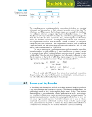


This document provides a table of standard normal curve areas. The table lists z-scores from -5 to 5 in increments of 0.1 on the left side. For each z-score, the corresponding area under the standard normal curve is provided to four decimal places. The areas decrease as the z-scores decrease from 0 to -5 and increase as the z-scores increase from 0 to 5. Below the table, it notes that the areas were computed using the R function pnorm and that the shaded area represents the probability Pr(Z ≤ z).