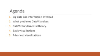
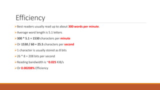
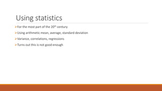
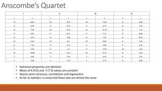
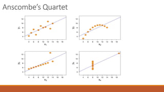
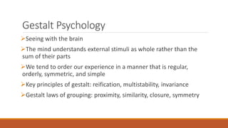
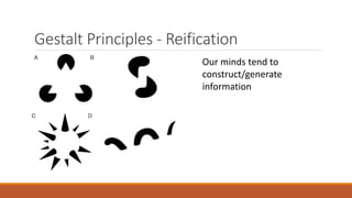
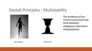
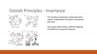
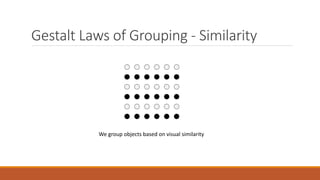
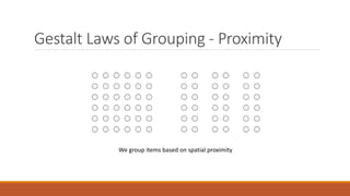
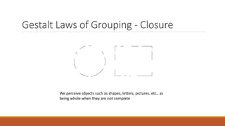
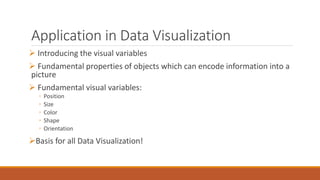
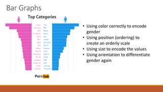
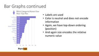
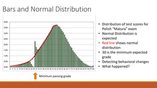
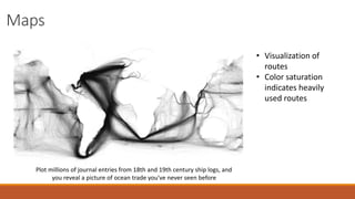
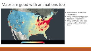
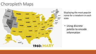
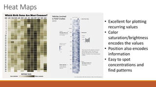
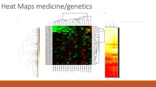
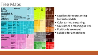
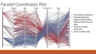
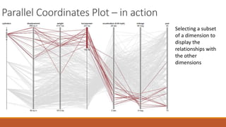
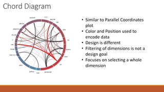
Making sense of data visually: 
A modern look at data 
visualization 
VLADIMIR MILEV 
NEW VENTURE SOFTWARE
Author Bio 
Vladimir Milev 
MCPD Enterprise 
Speaker (Devreach, NTK Slovenia and others) 
DV Evangelist 
Founder at New Venture Software 
@vmilev 
www.linkedin.com/in/vladimirmilev/
http://www.newventuresoftware.com/
Agenda 
1. Big data and information overload 
2. What problems DataViz solves 
3. DataViz fundamental theory 
4. Basic visualizations 
5. Advanced visualizations
Information Overload 
Twitter: 500 million tweets per day 
Facebook: 55 million status updates per day 
Facebook: 900 million interactions per day (comments, likes etc.) 
Reddit:
Proliferation of smart devices 
 We are already living in a world dominated by 
smart devices 
 What is the meaning of this? 
 More connected, data is more accessible 
 Less space for tables and text 
 Must use visual communication
Making Sense of Data 
Increasing amount of data available 
Increasing number of data consumer devices 
Obtaining data no longer a problem 
We have an Information Overload issue 
Quick data analysis is the new problem 
But how quick?
A Picture is worth a 1000 words 
With about 1,000,000 
ganglion cells, the human 
retina would transmit data 
at roughly the rate of an 
Ethernet connection, or 10 
million bits per second.” 
-Vijay Balasubramanian, 
PhD, Professor of Physics at 
U Penn
OK – That’s a lot of 
bandwidth 
BUT ARE WE USING IT EFFICIENTLY?
Efficiency 
Best readers usually read up to about 300 words per minute. 
Average word length is 5.1 letters 
300 * 5.1 = 1530 characters per minute 
Or 1530 / 60 = 25.5 characters per second 
1 character is usually stored as 8 bits 
26 * 8 = 208 bits per second 
Reading bandwidth is ~0.025 KiB/s 
Or 0.00208% Efficiency
So reading clearly isn’t 
the way to go… 
BUT WHAT IS THE SOLUTION?
Using statistics 
For the most part of the 20th century 
Using arithmetic mean, average, standard deviation 
Variance, correlations, regressions 
Turns out this is not good enough
Anscombe’s Quartet 
I II III IV 
x y x y x y x y 
10 8.04 10 9.14 10 7.46 8 6.58 
8 6.95 8 8.14 8 6.77 8 5.76 
13 7.58 13 8.74 13 12.74 8 7.71 
9 8.81 9 8.77 9 7.11 8 8.84 
11 8.33 11 9.26 11 7.81 8 8.47 
14 9.96 14 8.1 14 8.84 8 7.04 
6 7.24 6 6.13 6 6.08 8 5.25 
4 4.26 4 3.1 4 5.39 19 12.5 
12 10.84 12 9.13 12 8.15 8 5.56 
7 4.82 7 7.26 7 6.42 8 7.91 
5 5.68 5 4.74 5 5.73 8 6.89 
• Statistical properties are identical: 
• Mean of X (9.0) and Y (7.5) values are constant 
• Nearly same variances, correlations and regressions 
• As far as statistics is concerned these sets are almost the same
Anscombe’s Quartet
So DataViz is very powerful 
But why does it work so well?
Gestalt Psychology 
Seeing with the brain 
The mind understands external stimuli as whole rather than the 
sum of their parts 
We tend to order our experience in a manner that is regular, 
orderly, symmetric, and simple 
Key principles of gestalt: reification, multistability, invariance 
Gestalt laws of grouping: proximity, similarity, closure, symmetry
Gestalt Principles - Reification 
Our minds tend to 
construct/generate 
information
Gestalt Principles -Multistability 
The tendency of our 
mind to jump back and 
forth between 
ambiguous alternative 
interpretations 
Spinning Girl Rubin Vase
Gestalt Principles - Invariance 
The tendency to perceive simple geometric 
objects independent of rotation, translation, 
and scale 
Also elastic deformations, different lighting, 
and different component features
Gestalt Laws of Grouping - Similarity 
We group objects based on visual similarity
Gestalt Laws of Grouping - Proximity 
We group items based on spatial proximity
Gestalt Laws of Grouping - Closure 
We perceive objects such as shapes, letters, pictures, etc., as 
being whole when they are not complete
Application in Data Visualization 
 Introducing the visual variables 
 Fundamental properties of objects which can encode information into a 
picture 
 Fundamental visual variables: 
◦ Position 
◦ Size 
◦ Color 
◦ Shape 
◦ Orientation 
Basis for all Data Visualization!
Basic/Common Visualizations 
Bar graphs 
Line graphs 
Area charts 
Pie charts
Bar Graphs 
• Using color correctly to encode 
gender 
• Using position (ordering) to 
create an orderly scale 
• Using size to encode the values 
• Using orientation to differentiate 
gender again
Bar Graphs continued 
• Labels are used 
• Color is neutral and does not encode 
information 
• Again, we have top-down ordering 
(position) 
• And again size encodes the relative 
numeric value
Bars and Normal Distribution 
Minimum passing grade 
• Distribution of test scores for 
Polish “Matura” exam 
• Normal Distribution is 
expected 
• Red line shows normal 
distribution 
• 30 is the minimum expected 
grade 
• Detecting behavioral changes 
• What happened?
Line Graphs 
Confirming what we already know – 
paper media is declining rapidly. 
• Shape encodes the value 
• Color is not significant 
• Design goal is to show a 
trend/change
Area Graphs 
Effect of school year on 
Team Fortress 2 players 
School starts 
• Similar to line graph 
• Design goal for area 
charts is emphasize 
on the 
value/quantity, not 
so much on the trend 
• You can see both 
• Color has no 
meaning
Area Graphs continued 
• This time color carries a 
meaning (legend) 
• The graph is also good for 
displaying ratio between series 
of data over time
Pie Charts
Pie Charts 
Golden Rules for Pie Charts 
• Ratio of one piece to the whole 
• Order the values 
• Less than 6 pieces 
• Avoid legends 
• Sum up to 100%
Abusing Pie Charts 
Don’t break the rules!
Maps 
Plot millions of journal entries from 18th and 19th century ship logs, and 
you reveal a picture of ocean trade you've never seen before 
• Visualization of 
routes 
• Color saturation 
indicates heavily 
used routes
Maps are good with animations too 
• Concentration of NO2 from 
2005 to 2011 
• Using both color and position 
to encode concentration 
• Using continuous color scale 
• Adding another dimension - 
time
Choropleth Maps 
Displaying the most popular 
name for a newborn in each 
state 
• Using discrete 
palette to encode 
information
Heat Maps 
• Excellent for plotting 
recurring values 
• Color 
saturation/brightness 
encodes the values 
• Position also encodes 
information 
• Easy to spot 
concentrations and 
find patterns
Heat Maps medicine/genetics
Tree Maps 
• Excellent for representing 
hierarchical data 
• Color carries a meaning 
• Size carries a meaning as well 
• Position is irrelevant 
• Suitable for annotations
Parallel Coordinates Plot 
• Interactive visualization 
• Good at displaying 
relationships between 
different dimensions of 
data 
• Position encodes 
dimension 
• Color encodes scale
Parallel Coordinates Plot – in action 
Selecting a subset 
of a dimension to 
display the 
relationships with 
the other 
dimensions
Chord Diagram 
• Similar to Parallel Coordinates 
plot 
• Color and Position used to 
encode data 
• Design is different 
• Filtering of dimensions is not a 
design goal 
• Focuses on selecting a whole 
dimension
Some resources 
http://www.reddit.com/r/dataisbeautiful/ 
http://blog.visual.ly/ 
http://flowingdata.com/ 
http://eagereyes.org/ 
http://www.perceptualedge.com/blog/
Thank You!

Making sense of data visually: A modern look at datavisualization

  • 1.
    Making sense ofdata visually: A modern look at data visualization VLADIMIR MILEV NEW VENTURE SOFTWARE
  • 2.
    Author Bio VladimirMilev MCPD Enterprise Speaker (Devreach, NTK Slovenia and others) DV Evangelist Founder at New Venture Software @vmilev www.linkedin.com/in/vladimirmilev/
  • 3.
  • 4.
    Agenda 1. Bigdata and information overload 2. What problems DataViz solves 3. DataViz fundamental theory 4. Basic visualizations 5. Advanced visualizations
  • 5.
    Information Overload Twitter:500 million tweets per day Facebook: 55 million status updates per day Facebook: 900 million interactions per day (comments, likes etc.) Reddit:
  • 6.
    Proliferation of smartdevices  We are already living in a world dominated by smart devices  What is the meaning of this?  More connected, data is more accessible  Less space for tables and text  Must use visual communication
  • 7.
    Making Sense ofData Increasing amount of data available Increasing number of data consumer devices Obtaining data no longer a problem We have an Information Overload issue Quick data analysis is the new problem But how quick?
  • 8.
    A Picture isworth a 1000 words With about 1,000,000 ganglion cells, the human retina would transmit data at roughly the rate of an Ethernet connection, or 10 million bits per second.” -Vijay Balasubramanian, PhD, Professor of Physics at U Penn
  • 9.
    OK – That’sa lot of bandwidth BUT ARE WE USING IT EFFICIENTLY?
  • 10.
    Efficiency Best readersusually read up to about 300 words per minute. Average word length is 5.1 letters 300 * 5.1 = 1530 characters per minute Or 1530 / 60 = 25.5 characters per second 1 character is usually stored as 8 bits 26 * 8 = 208 bits per second Reading bandwidth is ~0.025 KiB/s Or 0.00208% Efficiency
  • 11.
    So reading clearlyisn’t the way to go… BUT WHAT IS THE SOLUTION?
  • 12.
    Using statistics Forthe most part of the 20th century Using arithmetic mean, average, standard deviation Variance, correlations, regressions Turns out this is not good enough
  • 13.
    Anscombe’s Quartet III III IV x y x y x y x y 10 8.04 10 9.14 10 7.46 8 6.58 8 6.95 8 8.14 8 6.77 8 5.76 13 7.58 13 8.74 13 12.74 8 7.71 9 8.81 9 8.77 9 7.11 8 8.84 11 8.33 11 9.26 11 7.81 8 8.47 14 9.96 14 8.1 14 8.84 8 7.04 6 7.24 6 6.13 6 6.08 8 5.25 4 4.26 4 3.1 4 5.39 19 12.5 12 10.84 12 9.13 12 8.15 8 5.56 7 4.82 7 7.26 7 6.42 8 7.91 5 5.68 5 4.74 5 5.73 8 6.89 • Statistical properties are identical: • Mean of X (9.0) and Y (7.5) values are constant • Nearly same variances, correlations and regressions • As far as statistics is concerned these sets are almost the same
  • 14.
  • 15.
    So DataViz isvery powerful But why does it work so well?
  • 16.
    Gestalt Psychology Seeingwith the brain The mind understands external stimuli as whole rather than the sum of their parts We tend to order our experience in a manner that is regular, orderly, symmetric, and simple Key principles of gestalt: reification, multistability, invariance Gestalt laws of grouping: proximity, similarity, closure, symmetry
  • 17.
    Gestalt Principles -Reification Our minds tend to construct/generate information
  • 18.
    Gestalt Principles -Multistability The tendency of our mind to jump back and forth between ambiguous alternative interpretations Spinning Girl Rubin Vase
  • 19.
    Gestalt Principles -Invariance The tendency to perceive simple geometric objects independent of rotation, translation, and scale Also elastic deformations, different lighting, and different component features
  • 20.
    Gestalt Laws ofGrouping - Similarity We group objects based on visual similarity
  • 21.
    Gestalt Laws ofGrouping - Proximity We group items based on spatial proximity
  • 22.
    Gestalt Laws ofGrouping - Closure We perceive objects such as shapes, letters, pictures, etc., as being whole when they are not complete
  • 23.
    Application in DataVisualization  Introducing the visual variables  Fundamental properties of objects which can encode information into a picture  Fundamental visual variables: ◦ Position ◦ Size ◦ Color ◦ Shape ◦ Orientation Basis for all Data Visualization!
  • 24.
    Basic/Common Visualizations Bargraphs Line graphs Area charts Pie charts
  • 25.
    Bar Graphs •Using color correctly to encode gender • Using position (ordering) to create an orderly scale • Using size to encode the values • Using orientation to differentiate gender again
  • 26.
    Bar Graphs continued • Labels are used • Color is neutral and does not encode information • Again, we have top-down ordering (position) • And again size encodes the relative numeric value
  • 27.
    Bars and NormalDistribution Minimum passing grade • Distribution of test scores for Polish “Matura” exam • Normal Distribution is expected • Red line shows normal distribution • 30 is the minimum expected grade • Detecting behavioral changes • What happened?
  • 28.
    Line Graphs Confirmingwhat we already know – paper media is declining rapidly. • Shape encodes the value • Color is not significant • Design goal is to show a trend/change
  • 29.
    Area Graphs Effectof school year on Team Fortress 2 players School starts • Similar to line graph • Design goal for area charts is emphasize on the value/quantity, not so much on the trend • You can see both • Color has no meaning
  • 30.
    Area Graphs continued • This time color carries a meaning (legend) • The graph is also good for displaying ratio between series of data over time
  • 31.
  • 32.
    Pie Charts GoldenRules for Pie Charts • Ratio of one piece to the whole • Order the values • Less than 6 pieces • Avoid legends • Sum up to 100%
  • 33.
    Abusing Pie Charts Don’t break the rules!
  • 34.
    Maps Plot millionsof journal entries from 18th and 19th century ship logs, and you reveal a picture of ocean trade you've never seen before • Visualization of routes • Color saturation indicates heavily used routes
  • 35.
    Maps are goodwith animations too • Concentration of NO2 from 2005 to 2011 • Using both color and position to encode concentration • Using continuous color scale • Adding another dimension - time
  • 36.
    Choropleth Maps Displayingthe most popular name for a newborn in each state • Using discrete palette to encode information
  • 37.
    Heat Maps •Excellent for plotting recurring values • Color saturation/brightness encodes the values • Position also encodes information • Easy to spot concentrations and find patterns
  • 38.
  • 39.
    Tree Maps •Excellent for representing hierarchical data • Color carries a meaning • Size carries a meaning as well • Position is irrelevant • Suitable for annotations
  • 40.
    Parallel Coordinates Plot • Interactive visualization • Good at displaying relationships between different dimensions of data • Position encodes dimension • Color encodes scale
  • 41.
    Parallel Coordinates Plot– in action Selecting a subset of a dimension to display the relationships with the other dimensions
  • 42.
    Chord Diagram •Similar to Parallel Coordinates plot • Color and Position used to encode data • Design is different • Filtering of dimensions is not a design goal • Focuses on selecting a whole dimension
  • 43.
    Some resources http://www.reddit.com/r/dataisbeautiful/ http://blog.visual.ly/ http://flowingdata.com/ http://eagereyes.org/ http://www.perceptualedge.com/blog/
  • 44.