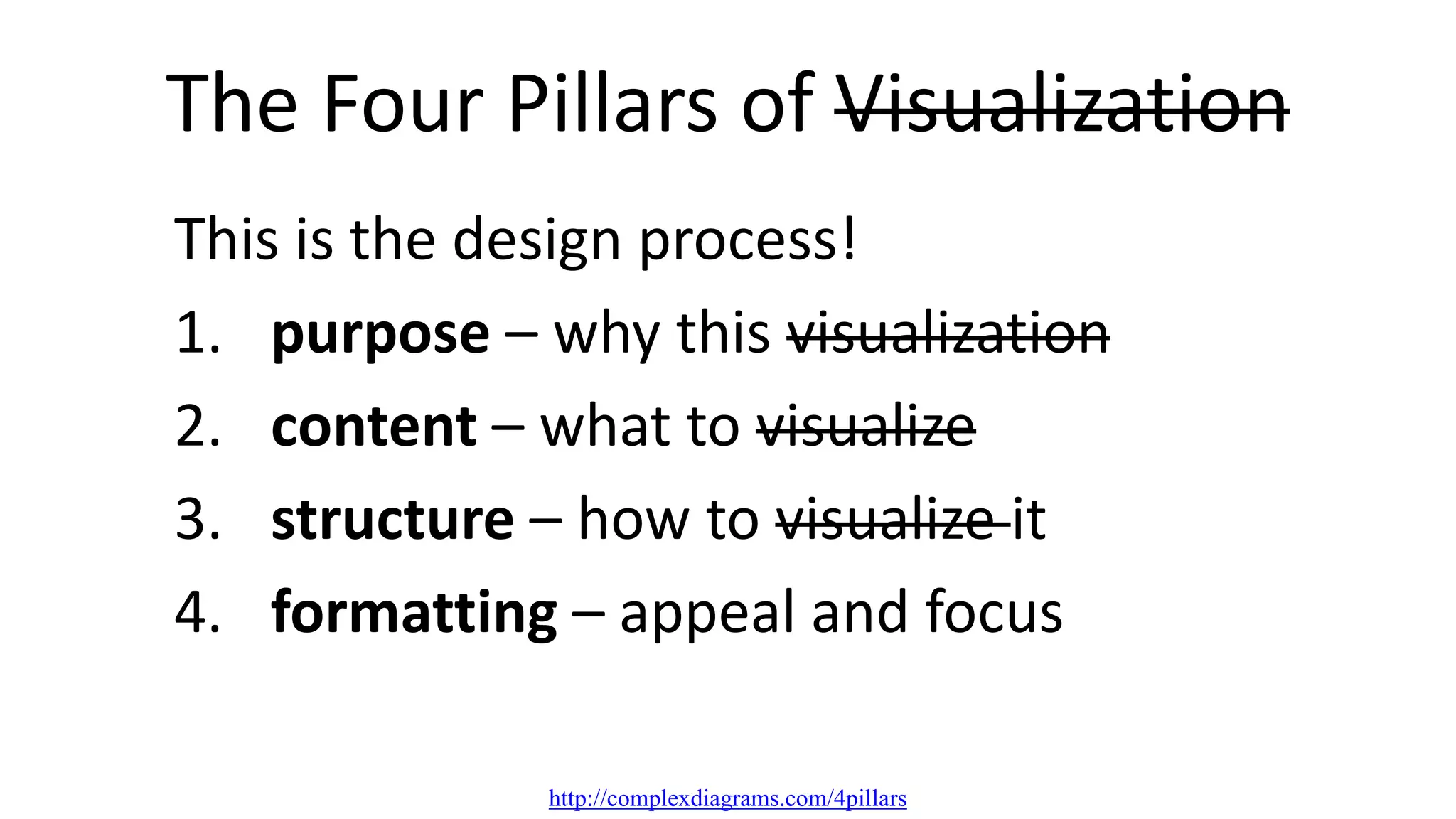
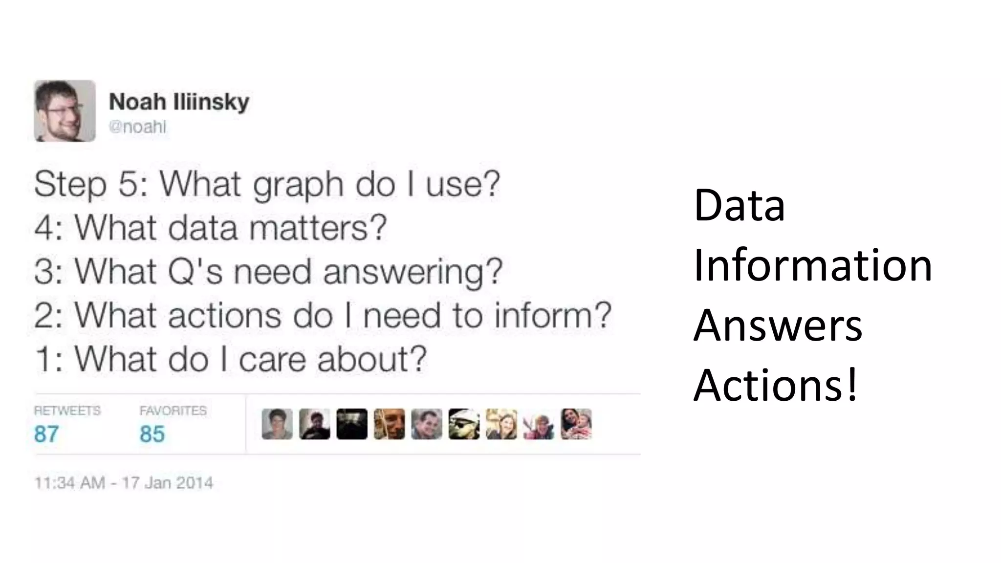
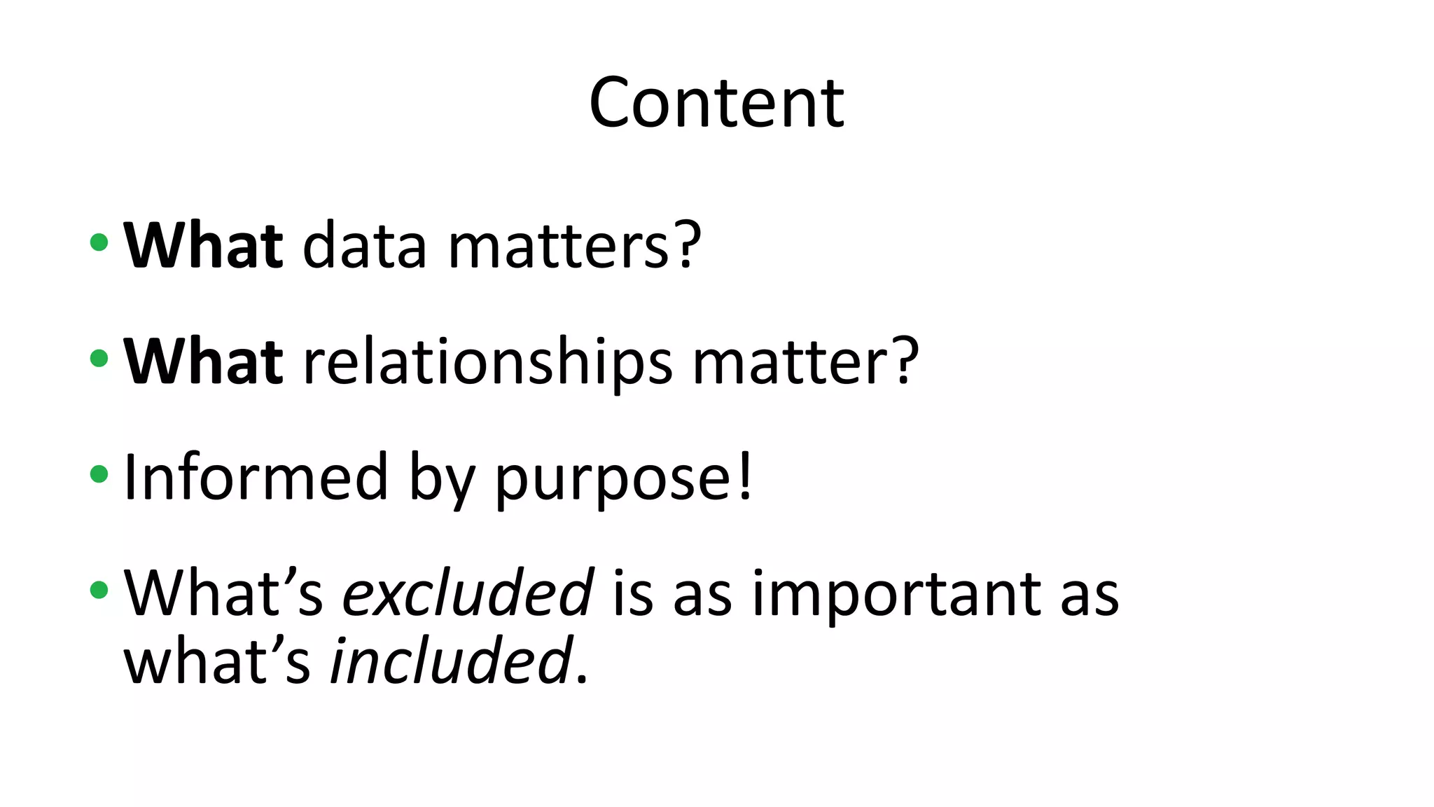
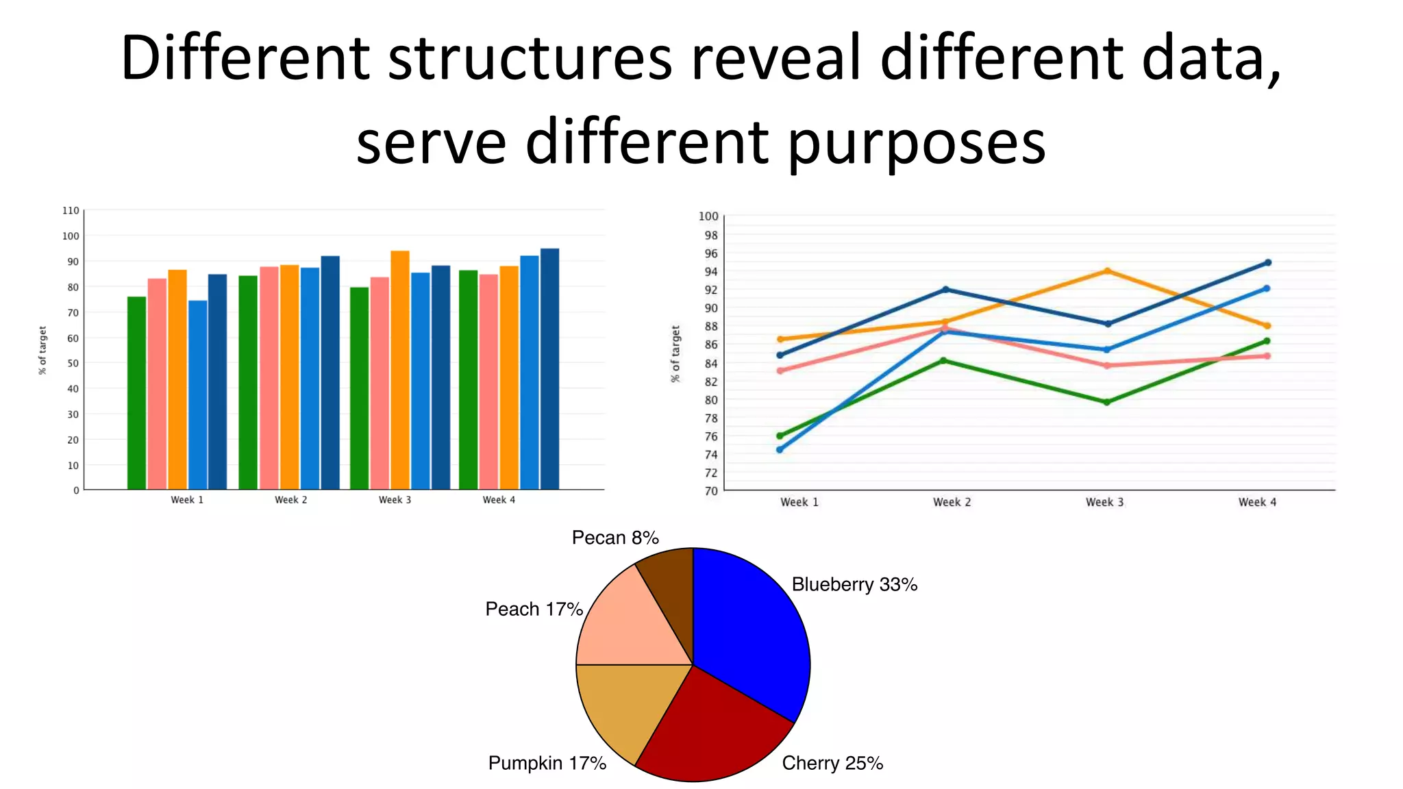
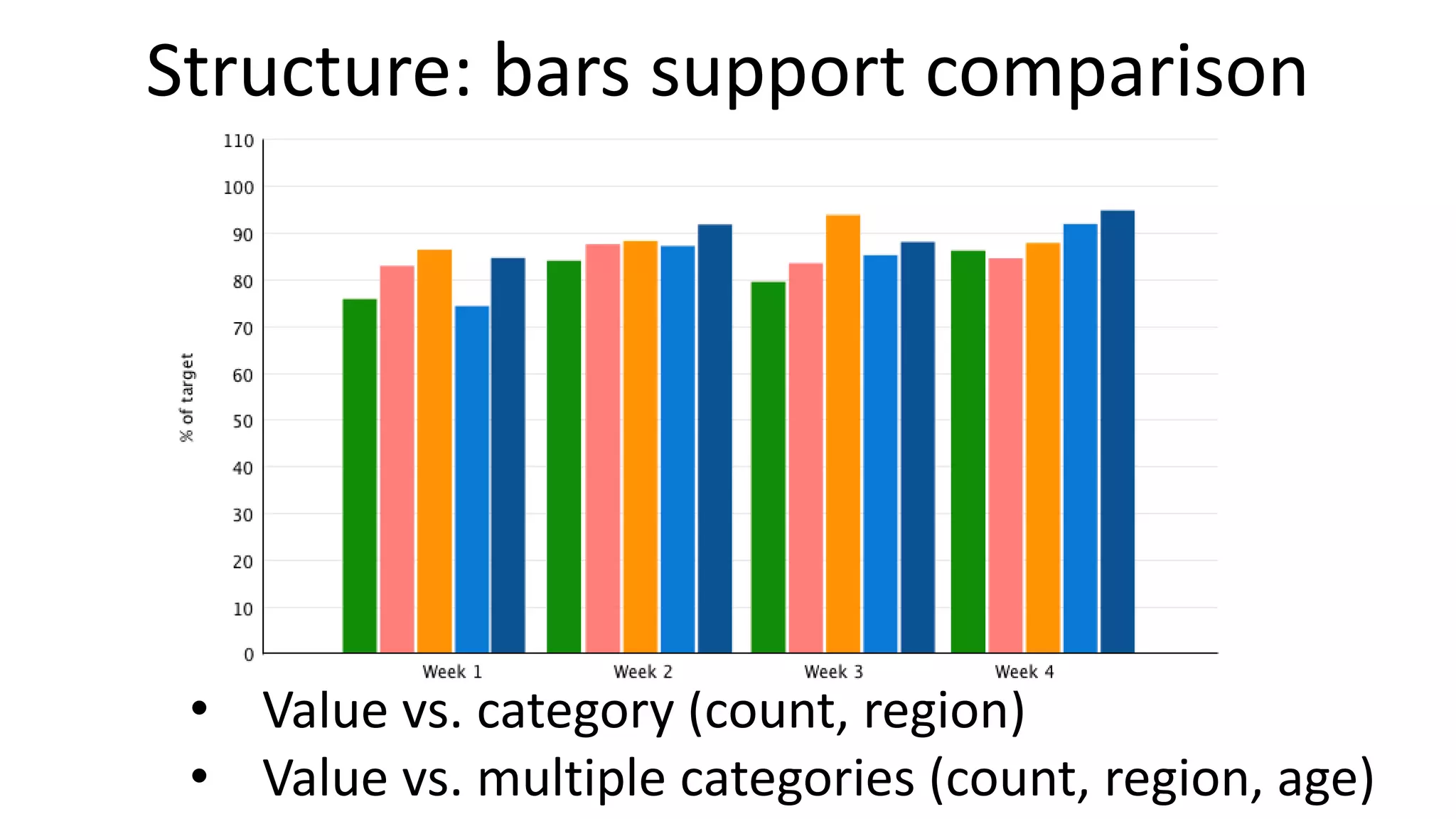
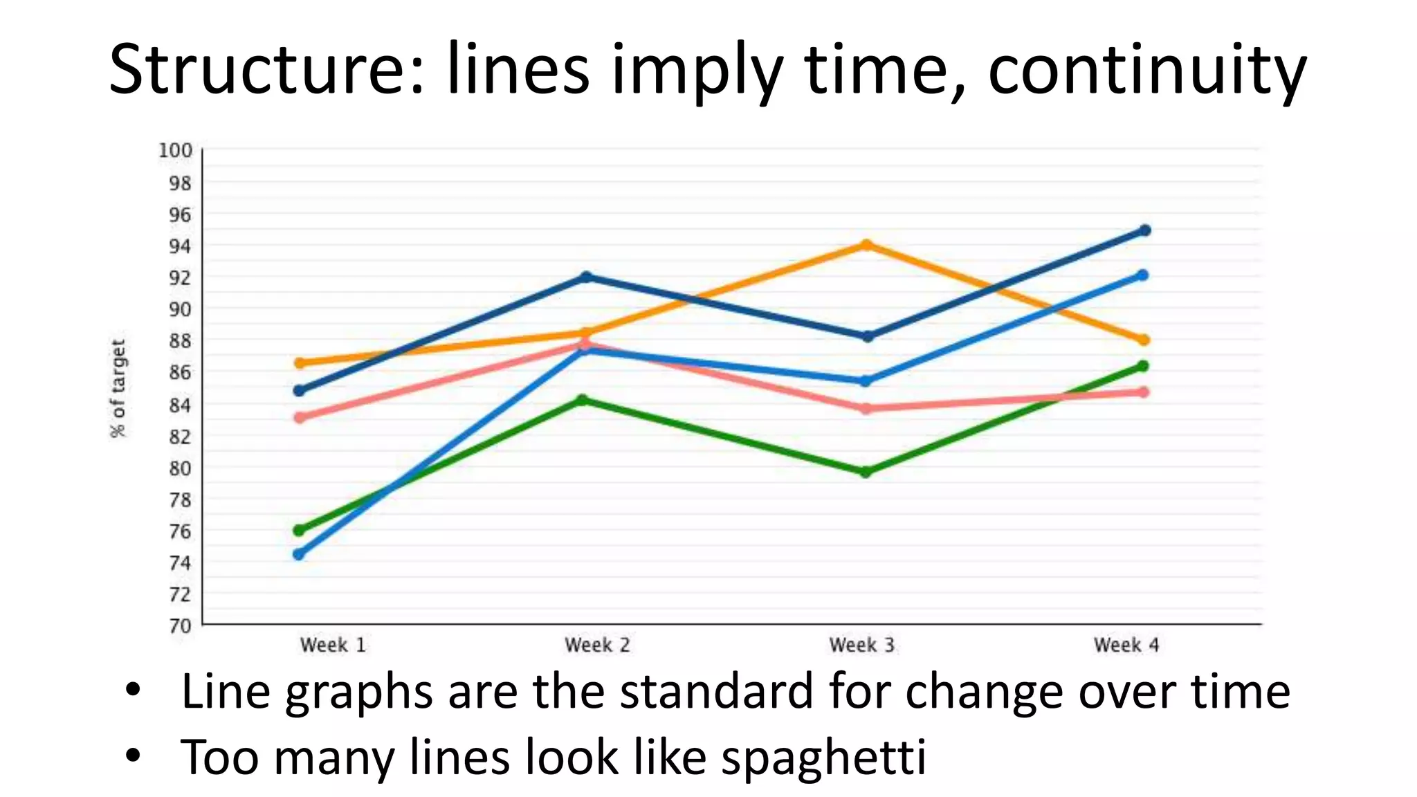
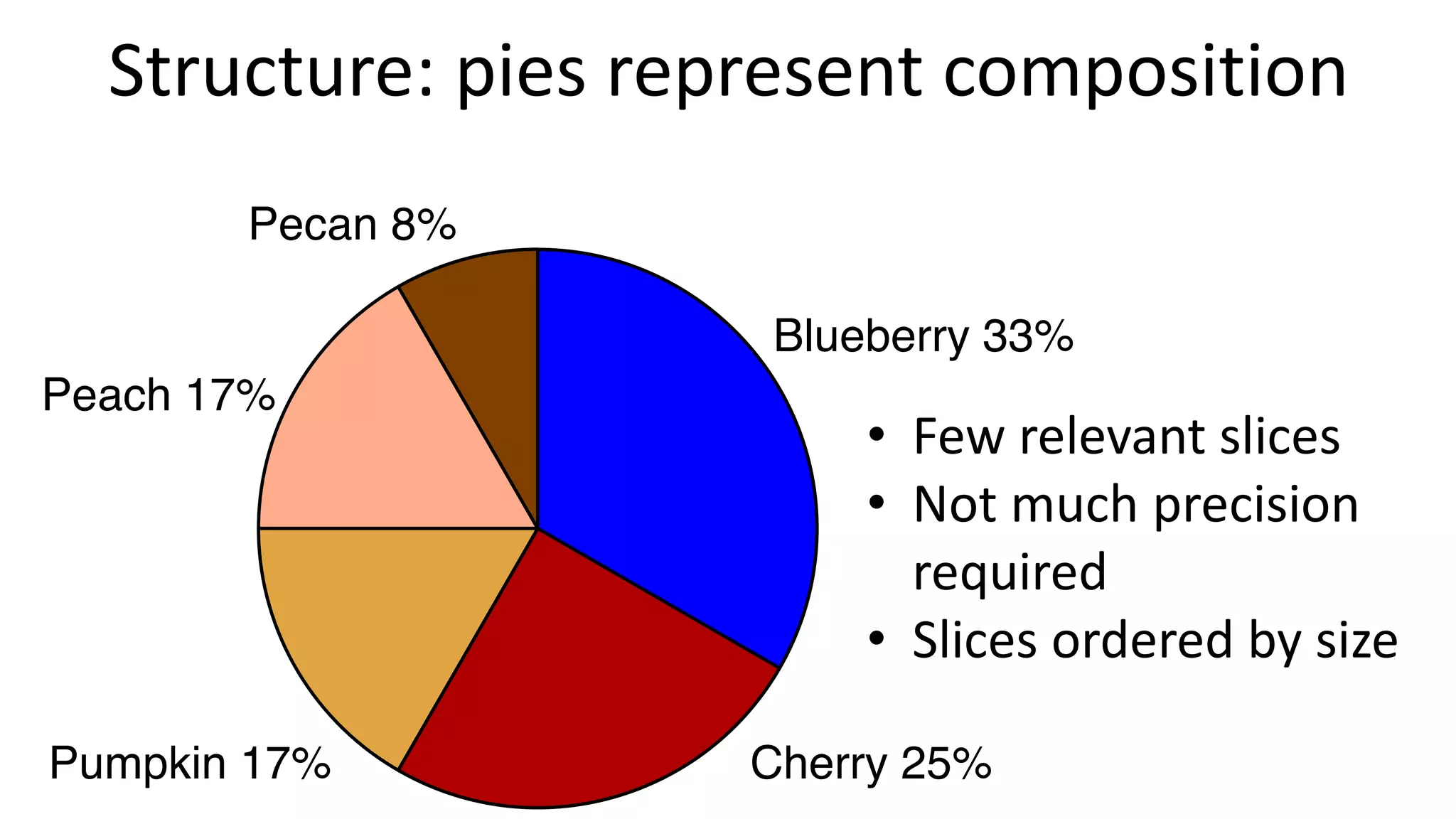
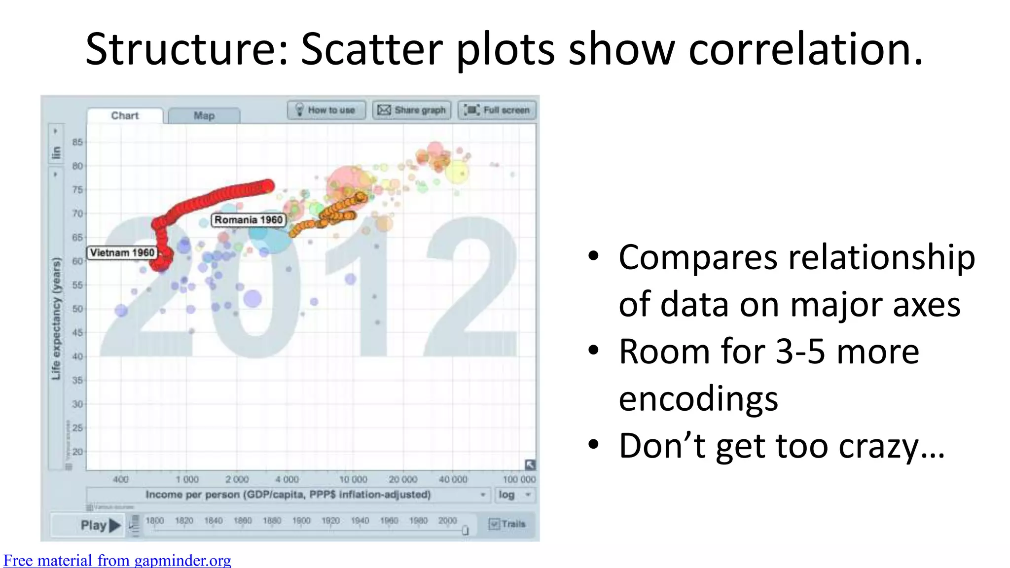
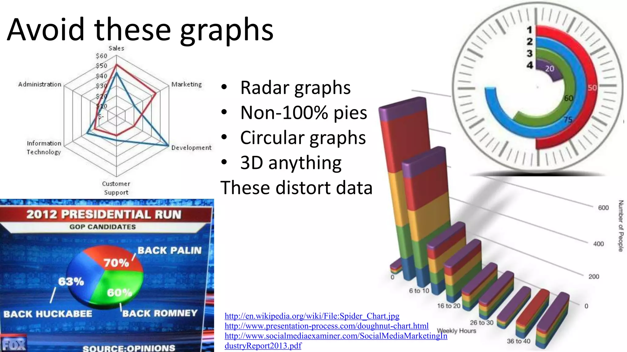
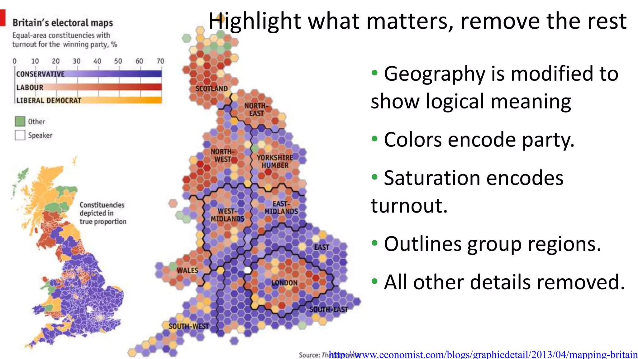
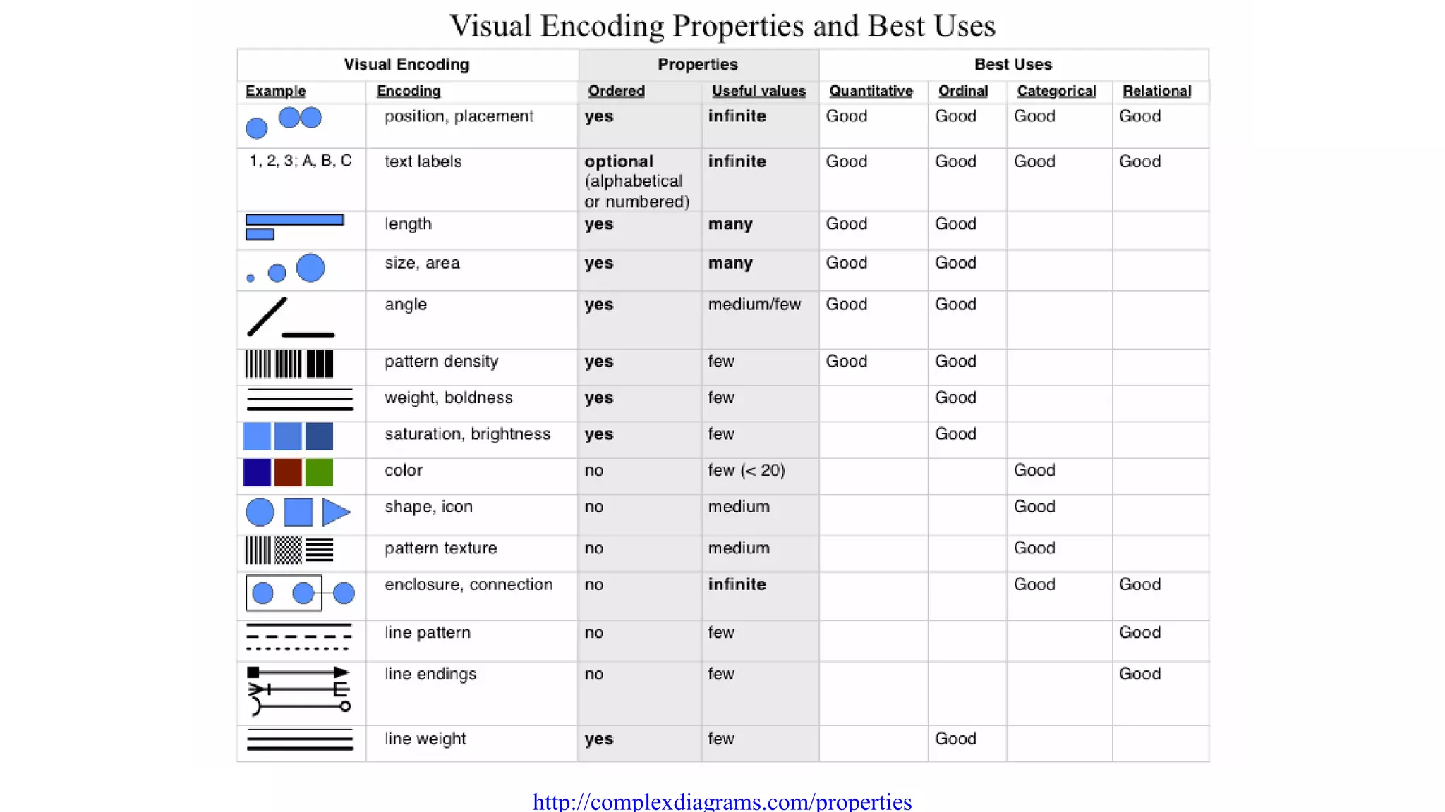
A version of my standard "how to do visualization" talk from summer 2016. This version points out that the same process works for most modes of communication as well.
Power BI Dashboard | Microsoft Power BI Tutorial | Data Visualization | EdurekaEdureka!
This Edureka Power BI Dashboard Tutorial will take you through step by step creation of Power BI dashboard. It helps you learn different functionalities present in Power BI tool with a demo on superstore dataset. You will learn how to create a Power BI dashboard by taking out multiple insights from superstore dataset and representing them visually.
This is the content we cover during the Organizational Network Analysis (ONA) - Practitioner Course Module 2 - Setting up the Survey in ONA Surveys (www.onasurveys.com).
Story telling is a key to susccessfull presentation or to sell an idea, telling a story with simple words wont be useful to create a visual picture. If we can tell stories with proper data and visual that will bring a great meaning.
Presented to The Ottawa IT Community Meetup Group (Ottawa SQL - PASS Chapter) on Thursday September 19
Powerful Self-Service BI in Excel 2013 - Data search and discovery with Power Query (formerly "Data Explorer"), analyzing and modeling with Power Pivot, visualizing and exploring with Power View and Power Map (formerly codename "GeoFlow")
Bound Tech is the Top Institute For Tableau training. Tableau Hands On Training and Tableau Job Oriented Training is taught by Our Real Time Trainer with real time scenario’s and examples. We teach our students from the fundamental concepts to the highly developed concepts.
Tableau is one of the fastest evolving Business Intelligence (BI) and data visualization tool. It is very quick to deploy, easy to learn and very spontaneous to use for a customer. It has evolved into one of the fastest and easiest way to share analytics in the cloud.
An introduction to Microsoft Power BI, emphasisng on the usability of Power Query and how it's useful for the excel population. A session delived at Orion India Systems Pvt. Ltd.
BI: new of the buzz words that everyone is talking about but what is it? How can it be used to make a impact in my organization? How do I get started? This session was delivered for SharePoint Saturday Reston.
Below are the topics covered in this tutorial:
What is Data Visualization?
What is Tableau?
Why Tableau?
Tableau Job Trends
Companies using Tableau
Who should go for Tableau?
Tableau Architecture
Tableau Visualizations
Real time Use Case
Power BI Tutorial For Beginners | Power BI Tutorial | Power BI Demo | Power B...Edureka!
( Power BI Training - https://www.edureka.co/power-bi-training )
This Edureka videoon "Power BI Tutorial" will provide you with the fundamental knowledge on Power BI (Blog: https://goo.gl/uFTDU3). Below are the topics covered in this tutorial:
1. Why do we need Business Intelligence?
2. What is Self Service Business Intelligence?
3. Why Power BI?
4. What is Power BI?
5. Demo: Report and Dashboard Creation
Power BI Desktop | Power BI Tutorial | Power BI Training | EdurekaEdureka!
This Edureka "Power BI Desktop" tutorial will help you to understand what is Power BI Desktop with examples and demo. Below are the topics covered in this tutorial:
1. Why Power BI?
2. What Power BI?
3. Who use Power BI?
4. Flow of Work
5. Power BI Trends
In case of business, Corporate Governance is a new era. It has potential scope to find it useful though it hasn't actually been evolved from one theory. Many theories from different disciplinary area contributed to develop fundamental of corporate governance.
What Is Power BI? | Introduction To Microsoft Power BI | Power BI Training | ...Edureka!
( Power BI Training - https://www.edureka.co/power-bi-training )
This Edureka "What Is Power BI?" tutorial will help you an introduction to Power BI. This video helps you to learn the following topics:
1. Why Power BI?
2. What Is Power BI?
3. Who Use Power BI?
4. Components Of Power BI
5. Building Blocks Of Power BI
Check out our Power BI Playlist: https://goo.gl/97sJv1
Power BI Full Course | Power BI Tutorial for Beginners | EdurekaEdureka!
YouTube Link: https://youtu.be/3u7MQz1EyPY
** Power BI Training - https://www.edureka.co/power-bi-training **
This Edureka PPT on "Power BI Full Course" will help you understand and learn Power BI in detail. This Power BI Tutorial is ideal for both beginners as well as professionals who want to master up their Power BI concepts.
Guaranteed successful design!
This talk includes a lot of examples that are either not well known, or are well known and still not practiced. If you think “yes, I know that one” then ask yourself if you’re actually doing it as often and thoroughly as you could be. I first address #2 (design it well), and then #1 (design the right thing).
I borrowed this structure form Dan Gilbert in his 2006 SxSW talk: How to Do Precisely the Right Thing at All Possible Times.
Slides from my talk Guaranteed Successful Design, at the O'Reilly Design Conference, 2017.
This talk includes a lot of examples that are either not well known, or are well known and still not practiced. If you think “yes, I know that one” then ask yourself if you’re actually doing it as often and thoroughly as you could be. I first address #2 (design it well), and then #1 (design the right thing).
How to Buy a Practical Bike, by Noah Iliinskyiliinsky
About twice a month, all summer, someone asks me for help or advice on buying a bike. Now, inspired by the famous Rob Gruhl, here's a talk that covers everything you need to know to buy a practical bicycle.
Domain-driven design is a collaborative process involving both domain experts and software practitioners that attempts to address issues of complexity in software. This process is described in the book Domain-Driven Design written by Eric Evans. Domain-driven design starts with the assertion that complexity is in the domain, not in the technology. Accordingly, we must let technology play a supporting role.
A person practicing domain-driven design does not attempt to model reality. Instead, domain experts and software practitioners use a mental model as a tool for solving problems within a given domain. The domain experts and software practitioners collaborate to explore and develop this model. We will look at the concept of a bounded context within which models can be isolated and explored. We will talk about domain-driven design's building block patterns including entities, value objects, aggregates, repositories, services, and domain events. We will see how test-driven development can be used as a means of exploring the model.
Embodied Critique: Design critique methodology for the whole team and the who...Billie Mandel
Bringing your whole self to your design critique practice is not only good for the soul, but good for the quality of a creative team's output. Resolve conflict, make awesomer work, and feel more satisfied and happy while doing it. Here's how.
Présentation FrenchWeb: Qu'est-ce que la visualisation des données?Clement Levallois
Slides du Webinar FrenchWeb par Clément Levallois.
Pour en savoir plus:
https://executive.em-lyon.com/Formations/Certificats/EMS02-Transformation-Digitale-des-Organisations
Data visualization in data science: exploratory EDA, explanatory. Anscobe's quartet, design principles, visual encoding, design engineering and journalism, choosing the right graph, narrative structures, technology and tools.
Severe Testing: The Key to Error Correctionjemille6
D. G. Mayo's slides for her presentation given March 17, 2017 at Boston Colloquium for Philosophy of Science, Alfred I.Taub forum: "Understanding Reproducibility & Error Correction in Science"
Scaling online and hybrid training rutgers university 1-14-15 submittedMarshall Sponder
Presenting this deck at the Online and Hybrid Learning Conference (January 14 and 15, 2015) at NJIT and Rutgers.
My presentation in on Wednesday afternoon, January 14th, https://onlinelearning.rutgers.edu/ruonline2015/scaling-online-and-hybrid-courses-effective-design-and-rubrics
Analytics for Musicians - Presentation to Chamber Music America - December 2n...Marshall Sponder
This presentation covers the kind of data that can be collected and how it might be used to promote the local and online following of Classical and Jazz Musicians.
In particular, we take a tour of some of the more exotic enhancements in Google Analytics combined with Geo-Location that I have become found of lately.
The work in this course also draws on the work I do at Baruch College Zicklin School of Business, where I am a Lecturer Faculty - much of the work I present has been informed by students who helped to pull the data around certain of the slides.
Finally, the need to develop the assessments also draws upon the Rutgers University Social Media for the Arts.
This deck does a nice job of blending the thinking behind the teachings I've done in both places, and is a true synthesis.
Content is not king, it's CORE. Content is a functional part of every experience and needs to be treated as such. UX needs to take an active role in leading the content creation work stream, and testing content like the UI it is. This deck includes some case studies to show massive impact that UX led content work can lead to. It also includes a few tips and tools to make it happen. Enjoy.
Introduction to information visualisation for humanities PhDsMia
Training workshop for the CHASE Arts and Humanities in the Digital Age programme. (
This session will give you an overview of a variety of techniques and tools available for data visualisation and analysis in the humanities. You will learn about common types of visualisations and the role of exploratory and explanatory visualisations, explore examples of scholarly visualisations, try some visualisation tools, and know where to find further information about analysing and building data visualisations.
Taking portfolio benefits management to the next level with modern analytics webinar
Wednesday 13 June 2018
presented by Ian Stuart, Altis Consulting, Principal
hosted by Merv Wyeth, Benefits Management SIG Secretary
The link to the write up page and resources of this webinar:
https://www.apm.org.uk/news/taking-portfolio-benefits-management-to-the-next-level-with-modern-analytics-webinar/
This presentation have the concept of Big data.
Why Big data is important to the present world.
How to visualize big data.
Steps for perfect visualization.
Visualization and design principle.
Also It had a number of visualization method for big data and traditional data.
Advantage of Visualization in Big Data
This presentation was given to the Tech Change Technology for Monitoring and Evaluation Diploma course on 25th September 2015. It covers:
Why visualise data?
Where to start?
Which tools to use?
It ends with an overview of Kwantu's approach to this area and the technology choices that we've made.
Project Explanation: Book Recommendation System
The goal of this project was to develop a book recommendation system that provides personalized recommendations to users based on their preferences and past reading behavior. The project involved the following key steps:
1. Data Collection: I gathered a comprehensive dataset of books, including information such as titles, authors, genres, and user ratings. This data was obtained from various reliable sources, such as online bookstores or publicly available book datasets.
2. Data Preprocessing: The collected data required cleaning and preprocessing to ensure its quality and consistency. I handled missing values, resolved inconsistencies in book titles or authors, and standardized the data format for further analysis.
3. Exploratory Data Analysis: I performed exploratory data analysis to gain insights into the dataset. This included analyzing book genres, distribution of user ratings, and identifying popular authors or books.
4. Feature Engineering: To capture the preferences and interests of users, I created relevant features from the available data. These features could include book genres, authors, user demographics, or historical reading behavior.
5. Recommendation Model Development: I developed a recommendation model using collaborative filtering techniques or content-based filtering methods. Collaborative filtering utilizes the preferences of similar users to make recommendations, while content-based filtering suggests books based on their attributes and user preferences. I employed popular machine learning algorithms, such as matrix factorization or k-nearest neighbors, to build the recommendation model.
6. Model Evaluation: I evaluated the performance of the recommendation system using metrics such as precision, recall, or mean average precision. I also conducted A/B testing or cross-validation to assess the system's effectiveness and optimize its performance.
7. User Interface Development: I created a user-friendly interface where users could input their preferences and receive personalized book recommendations. The interface provided an intuitive and interactive experience, allowing users to explore recommended books and provide feedback.
8. Deployment and Feedback Loop: The recommendation system was deployed in a production environment, where users could access it and provide feedback on the recommended books. This feedback was incorporated into the system to continually improve its accuracy and relevance over time.
By completing this project, I gained hands-on experience in data collection, preprocessing, exploratory data analysis, and recommendation system development. I demonstrated my ability to leverage machine learning algorithms and user data to build a personalized book recommendation system that enhances user engagement and satisfaction.
Olist Store Analysis
ccording to the data, Olist E-commerce has about 99,440 orders. With about 89,940 orders being delivered, the company has a 90% delivery success rate.
✔Their average product rating is 4.09 stars, with product categories going as high as 4.67 stars and as low as 2.5 stars. 1 Star reviews are on third place in the review score distribution ranking which likely indicates that there could be problems with product quality in some product categories
✔It helps in understanding the spending patterns of customers in sao paulo city .it also helps Olist in identifying high value customers and creating targeted marketing campaigns.
Graphs for Recommendation Engines: Looking beyond Social, Retail, and MediaNeo4j
We’re all familiar with recommendations in a number of different areas of our lives. Recommendations for social media connections, e-commerce products, or streaming media content are ubiquitous.
Perhaps less well known are applications for recommendations in different contexts, like education, HR, fraud, business process management, or offender rehabilitation.
In this webinar, we will discuss some of these recommendations use cases in more detail, and look at how graph data can be used to model each domain and power a recommendations engine. We’ll also see an example use case demonstrated using Neo4j.
The following resource was developed by RESYST for a research uptake workshop held in Kilifi, Kenya.
In this resource:
- Introduce data visualisation and demonstrate its value for research uptake and communications
- Compare different types of chart
- Share design tips for a visualisation
- Explore online data visualisation tools
Find more: http://resyst.lshtm.ac.uk/resources/resource-bank-research-uptake
Data visualization is the representation of data through use of common graphi...samarpeetnandanwar21
Data and information visualization (data viz/vis or info viz/vis)[2] is the practice of designing and creating easy-to-communicate and easy-to-understand graphic or visual representations of a large amount[3] of complex quantitative and qualitative data and information with the help of static, dynamic or interactive visual items. Typically based on data and information collected from a certain domain of expertise, these visualizations are intended for a broader audience to help them visually explore and discover, quickly understand, interpret and gain important insights into otherwise difficult-to-identify structures, relationships, correlations, local and global patterns, trends, variations, constancy, clusters, outliers and unusual groupings within data (exploratory visualization).[4][5][6] When intended for the general public (mass communication) to convey a concise version of known, specific information in a clear and engaging manner (presentational or explanatory visualization),[4] it is typically called information graphics.
Data visualization is concerned with visually presenting sets of primarily quantitative raw data in a schematic form. The visual formats used in data visualization include tables, charts and graphs (e.g. pie charts, bar charts, line charts, area charts, cone charts, pyramid charts, donut charts, histograms, spectrograms, cohort charts, waterfall charts, funnel charts, bullet graphs, etc.), diagrams, plots (e.g. scatter plots, distribution plots, box-and-whisker plots), geospatial maps (such as proportional symbol maps, choropleth maps, isopleth maps and heat maps), figures, correlation matrices, percentage gauges, etc., which sometimes can be combined in a dashboard.
Webinar - Harness the Power of Data with Tableau - 2016-02-18TechSoup
Learn how to harness the power of data to tell your organization’s story with Tableau! Join Tech Impact's Jordan McCarthy and learn how to use Tableau to collect data in more meaningful ways and understand the science behind data analysis. We show you easy tips to maneuver through this data analytics tool to gain a better understanding of your nonprofit or library’s data.
Similar to 4 pillars of visualization & communication by Noah Iliinsky (20)
ARENA - Young adults in the workplace (Knight Moves).pdfKnight Moves
Presentations of Bavo Raeymaekers (Project lead youth unemployment at the City of Antwerp), Suzan Martens (Service designer at Knight Moves) and Adriaan De Keersmaeker (Community manager at Talk to C)
during the 'Arena • Young adults in the workplace' conference hosted by Knight Moves.
Can AI do good? at 'offtheCanvas' India HCI preludeAlan Dix
Invited talk at 'offtheCanvas' IndiaHCI prelude, 29th June 2024.
https://www.alandix.com/academic/talks/offtheCanvas-IndiaHCI2024/
The world is being changed fundamentally by AI and we are constantly faced with newspaper headlines about its harmful effects. However, there is also the potential to both ameliorate theses harms and use the new abilities of AI to transform society for the good. Can you make the difference?
White wonder, Work developed by Eva TschoppMansi Shah
White Wonder by Eva Tschopp
A tale about our culture around the use of fertilizers and pesticides visiting small farms around Ahmedabad in Matar and Shilaj.
Book Formatting: Quality Control Checks for DesignersConfidence Ago
This presentation was made to help designers who work in publishing houses or format books for printing ensure quality.
Quality control is vital to every industry. This is why every department in a company need create a method they use in ensuring quality. This, perhaps, will not only improve the quality of products and bring errors to the barest minimum, but take it to a near perfect finish.
It is beyond a moot point that a good book will somewhat be judged by its cover, but the content of the book remains king. No matter how beautiful the cover, if the quality of writing or presentation is off, that will be a reason for readers not to come back to the book or recommend it.
So, this presentation points designers to some important things that may be missed by an editor that they could eventually discover and call the attention of the editor.
Technoblade The Legacy of a Minecraft Legend.Techno Merch
Technoblade, born Alex on June 1, 1999, was a legendary Minecraft YouTuber known for his sharp wit and exceptional PvP skills. Starting his channel in 2013, he gained nearly 11 million subscribers. His private battle with metastatic sarcoma ended in June 2022, but his enduring legacy continues to inspire millions.
EASY TUTORIAL OF HOW TO USE CAPCUT BY: FEBLESS HERNANEFebless Hernane
CapCut is an easy-to-use video editing app perfect for beginners. To start, download and open CapCut on your phone. Tap "New Project" and select the videos or photos you want to edit. You can trim clips by dragging the edges, add text by tapping "Text," and include music by selecting "Audio." Enhance your video with filters and effects from the "Effects" menu. When you're happy with your video, tap the export button to save and share it. CapCut makes video editing simple and fun for everyone!
9. The Four Pillars of Visualization
This is the design process!
1. purpose – why this visualization
2. content – what to visualize
3. structure – how to visualize it
4. formatting – appeal and focus
http://complexdiagrams.com/4pillars
11. Defining your purpose
• Why am I creating this visualization?
• Who is it for?
• What do they need to understand?
• What actions do I need to enable?
• How will it be consumed?
• What is the most important take-away
message?
12. Your purpose should be specific
Show our data
Show our revenue and customer base
improvements over the last three
years to potential investors
*yawn*
20. • Comparison: rank airports by the number of
weather-delayed departures
• Change: show rates of malaria, over the last 10
years for these countries
• Composition: show relative contribution to
revenue by product line
• Correlation: show how free school lunches affect
graduation rates
• Geography: show population density per country
Example purposes
22. Structure: bars support comparison
• Value vs. category (count, region)
• Value vs. multiple categories (count, region, age)
23. Structure: lines imply time, continuity
• Line graphs are the standard for change over time
• Too many lines look like spaghetti
24. Structure: pies represent composition
• Few relevant slices
• Not much precision
required
• Slices ordered by size
25. Structure: Scatter plots show correlation.
Free material from gapminder.org
• Compares relationship
of data on major axes
• Room for 3-5 more
encodings
• Don’t get too crazy…
31. Summary
• Clear purpose, accounting for who and why,
is crucial.
• Edit down content to only what’s necessary.
• Select a structure that supports your purpose
and reveals your content.
• Use formatting to focus, not to distract.
32. Thank you!
Reference & Resources
• @noahi Twitter is the best way to get in touch
• http://complexdiagrams.com/4pillars
• http://complexdiagrams.com/properties
• More on designing visualizations (1h 50m)
• My favorite talk: When Not to Use Maps (11m)
• Cole Nussbaumer’s Excel template
• QuickSight annoucement