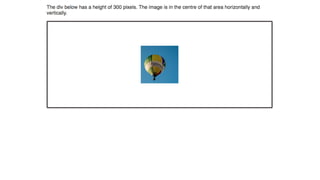
Download as PDF, PPTX

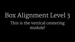
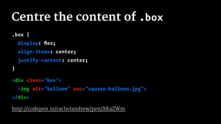
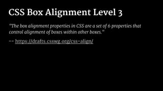
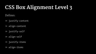


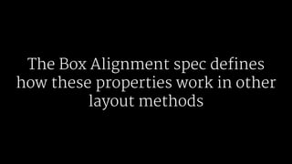

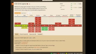

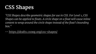
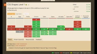
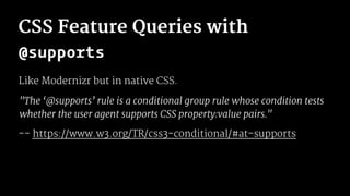
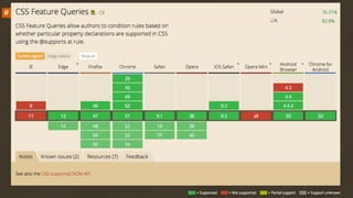
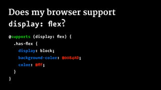
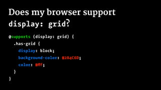
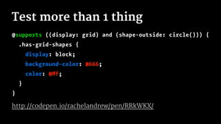
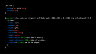
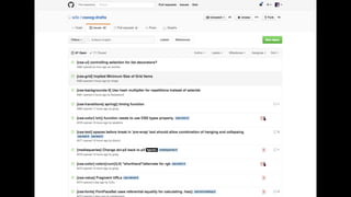
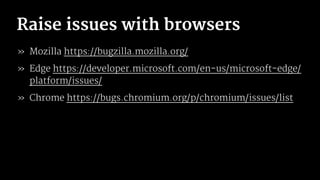

This document summarizes upcoming CSS features like Box Alignment Level 3, CSS Grid Layout, CSS Shapes, CSS Feature Queries, and CSS Custom Properties. It explains what each feature does at a high level and provides example code snippets. The document also encourages developers to get involved by filing issues on browser bug trackers, requesting new features, and creating blog posts/demos to help drive adoption of these new CSS specifications.


![Getting Started with Apache Spark: Big Data Made Simple [Free Meetup]](https://cdn.slidesharecdn.com/ss_thumbnails/apachesparkgettingstarted-260203175547-8361bcc3-thumbnail.jpg?width=640&height=640&fit=bounds)


