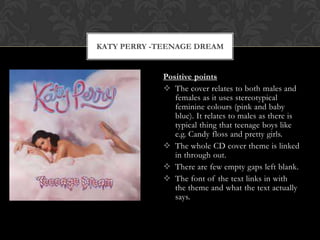
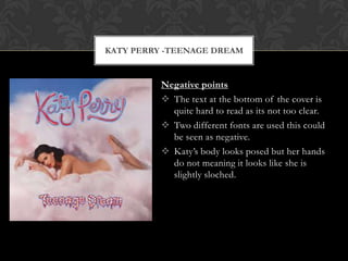
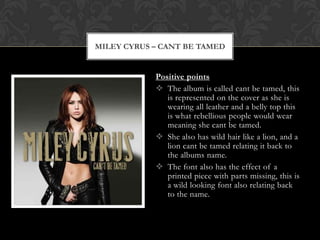
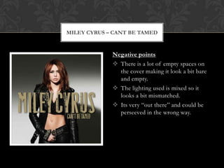
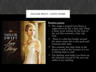
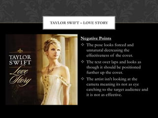
CD COVER EVALUATION
  By Rachel Bloomfield
KATY PERRY -TEENAGE DREAM


             Positive points
              The cover relates to both males and
                females as it uses stereotypical
                feminine colours (pink and baby
                blue). It relates to males as there is
                typical thing that teenage boys like
                e.g. Candy floss and pretty girls.
              The whole CD cover theme is linked
                in through out.
              There are few empty gaps left blank.
              The font of the text links in with
                the theme and what the text actually
                says.
KATY PERRY -TEENAGE DREAM


          Negative points
           The text at the bottom of the cover is
            quite hard to read as its not too clear.
           Two different fonts are used this could
            be seen as negative.
           Katy’s body looks posed but her hands
            do not meaning it looks like she is
            slightly sloched.
MILEY CYRUS – CANT BE TAMED


            Positive points
             The album is called cant be tamed, this
               is represented on the cover as she is
               wearing all leather and a belly top this
               is what rebellious people would wear
               meaning she cant be tamed.
             She also has wild hair like a lion, and a
               lion cant be tamed relating it back to
               the albums name.
             The font also has the effect of a
               printed piece with parts missing, this is
               a wild looking font also relating back
               to the name.
MILEY CYRUS – CANT BE TAMED


             Negative points
              There is a lot of empty spaces on
               the cover making it look a bit bare
               and empty.
              The lighting used is mixed so it
               looks a bit mismatched.
              Its very “out there” and could be
               perseeved in the wrong way.
TAYLOR SWIFT – LOVE STORY


            Positive points
             The single is named Love Story, it
               supposed to be like a fairy tale. There
               is fancy posh writing for the font of
               the text this connotes a fairy tale
               style.
             There is a slim line border around
               the artists name this is also posh and
               connotes fairy tales.
             Her costume also links back to the
               theme as well as the location it is set
               in linking back as well.
             The lighting used helps you focus on
               the musician instead of the text and
               makes it eye catching.
TAYLOR SWIFT – LOVE STORY


             Negative Points
              The pose looks forced and
               unnatural decreasing the
               effectiveness of the cover.
              The text over laps and looks as
               though it should be positioned
               further up the cover.
              The artist isn’t looking at the
               camera meaning its not as eye
               catching to the target audience and
               it is not as effective.

Cd cover evaluation

  • 1.
    CD COVER EVALUATION By Rachel Bloomfield
  • 2.
    KATY PERRY -TEENAGEDREAM Positive points  The cover relates to both males and females as it uses stereotypical feminine colours (pink and baby blue). It relates to males as there is typical thing that teenage boys like e.g. Candy floss and pretty girls.  The whole CD cover theme is linked in through out.  There are few empty gaps left blank.  The font of the text links in with the theme and what the text actually says.
  • 3.
    KATY PERRY -TEENAGEDREAM Negative points  The text at the bottom of the cover is quite hard to read as its not too clear.  Two different fonts are used this could be seen as negative.  Katy’s body looks posed but her hands do not meaning it looks like she is slightly sloched.
  • 4.
    MILEY CYRUS –CANT BE TAMED Positive points  The album is called cant be tamed, this is represented on the cover as she is wearing all leather and a belly top this is what rebellious people would wear meaning she cant be tamed.  She also has wild hair like a lion, and a lion cant be tamed relating it back to the albums name.  The font also has the effect of a printed piece with parts missing, this is a wild looking font also relating back to the name.
  • 5.
    MILEY CYRUS –CANT BE TAMED Negative points  There is a lot of empty spaces on the cover making it look a bit bare and empty.  The lighting used is mixed so it looks a bit mismatched.  Its very “out there” and could be perseeved in the wrong way.
  • 6.
    TAYLOR SWIFT –LOVE STORY Positive points  The single is named Love Story, it supposed to be like a fairy tale. There is fancy posh writing for the font of the text this connotes a fairy tale style.  There is a slim line border around the artists name this is also posh and connotes fairy tales.  Her costume also links back to the theme as well as the location it is set in linking back as well.  The lighting used helps you focus on the musician instead of the text and makes it eye catching.
  • 7.
    TAYLOR SWIFT –LOVE STORY Negative Points  The pose looks forced and unnatural decreasing the effectiveness of the cover.  The text over laps and looks as though it should be positioned further up the cover.  The artist isn’t looking at the camera meaning its not as eye catching to the target audience and it is not as effective.