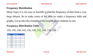
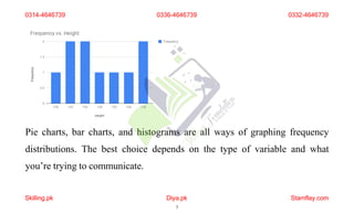
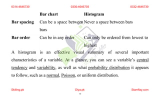
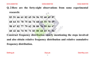
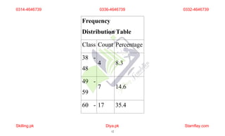
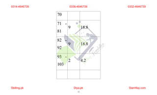
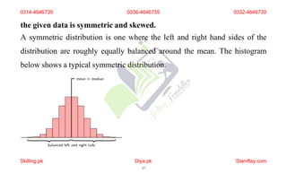
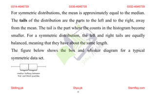
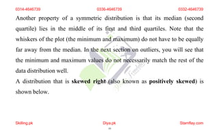
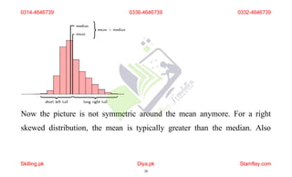
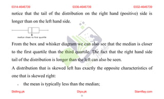
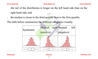
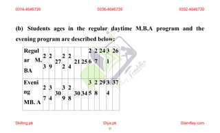
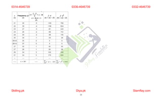
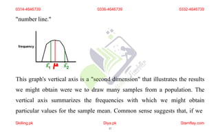
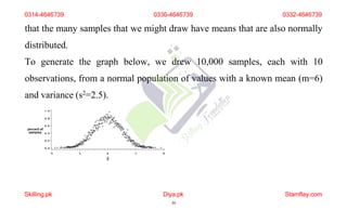
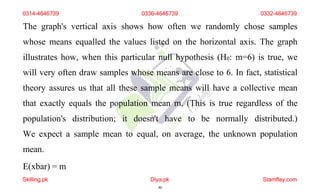
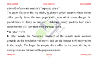
Course: Business Statistics (1430)
Semester: Autumn, 2022
ASSIGNMENT No. 1
Q. 1 Explain different graphs of frequency distribution highlighting
their importance in statistics.
Frequency distribution in statistics provides the information of the number of
occurrences (frequency) of distinct values distributed within a given period of
time or interval, in a list, table, or graphical representation. Grouped and
Ungrouped are two types of Frequency Distribution. Data is a collection of
0314-4646739 0336-4646739 0332-4646739
Skilling.pk Diya.pk
1
Stamflay.com
numbers or values and it must be organized for it to be useful. Let us take a
look at data and its frequency distribution.
The frequency of any value is the number of times that value appears in a
data set. So from the above examples of colours, we can say two children like
the colour blue, so its frequency is two. So to make meaning of the raw data,
we must organize. And finding out the frequency of the data values is how
this organisation is done.
0314-4646739 0336-4646739 0332-4646739
Skilling.pk Diya.pk
2
Stamflay.com
Frequency Distribution
Many times it is not easy or feasible to find the frequency of data from a very
large dataset. So to make sense of the data we make a frequency table and
graphs. Let us take the example of the heights of ten students in cms.
Frequency Distribution Table
139, 145, 150, 145, 136, 150, 152, 144, 138, 138
0314-4646739 0336-4646739 0332-4646739
Skilling.pk Diya.pk
3
Stamflay.com
This frequency table will help us make better sense of the data given. Also
when the data set is too big (say if we were dealing with 100 students) we use
tally marks for counting. It makes the task more organised and easy. Below is
an example of how we use tally marks.
Frequency Distribution Graph
Using the same above example we can make the following graph:
0314-4646739 0336-4646739 0332-4646739
Skilling.pk Diya.pk
4
Stamflay.com
Pie charts, bar charts, and histograms are all ways of graphing frequency
distributions. The best choice depends on the type of variable and what
you’re trying to communicate.
0314-4646739
Skilling.pk Diya.pk
5
Stamflay.com
0336-4646739 0332-4646739
Pie chart
A pie chart is a graph that shows the relative frequency distribution of
a nominal variable.
A pie chart is a circle that’s divided into one slice for each value. The size of
the slices shows their relative frequency.
This type of graph can be a good choice when you want to emphasize that
one variable is especially frequent or infrequent, or you want to present the
overall composition of a variable.
0314-4646739 0336-4646739 0332-4646739
Skilling.pk Diya.pk
6
Stamflay.com
A disadvantage of pie charts is that it’s difficult to see small differences
between frequencies. As a result, it’s also not a good option if you want to
compare the frequencies of different values.
Bar chart
A bar chart is a graph that shows the frequency or relative frequency
distribution of a categorical variable (nominal or ordinal).
The y-axis of the bars shows the frequencies or relative frequencies, and
the x-axis shows the values. Each value is represented by a bar, and the
length or height of the bar shows the frequency of the value.
0314-4646739 0336-4646739 0332-4646739
Skilling.pk Diya.pk
7
Stamflay.com
A bar chart is a good choice when you want to compare the frequencies of
different values. It’s much easier to compare the heights of bars than the
angles of pie chart slices.
Histogram
A histogram is a graph that shows the frequency or relative frequency
distribution of a quantitative variable. It looks similar to a bar chart.
The continuous variable is grouped into interval classes, just like a grouped
frequency table. The y-axis of the bars shows the frequencies or relative
frequencies, and the x-axis shows the interval classes. Each interval class is
0314-4646739 0336-4646739 0332-4646739
Skilling.pk Diya.pk
8
Stamflay.com
represented by a bar, and the height of the bar shows the frequency or
relative frequency of the interval class.
Although bar charts and histograms are similar, there are important
differences:
Type of
variable
Bar chart Histogram
Categorical Quantitative
Value
grouping
Ungrouped (values) Grouped (interval classes)
0314-4646739 0336-4646739 0332-4646739
Skilling.pk Diya.pk
9
Stamflay.com
Bar chart Histogram
Bar spacing Can be a space between
bars
Never a space between bars
Bar order Can be in any order Can only be ordered from lowest to
highest
A histogram is an effective visual summary of several important
characteristics of a variable. At a glance, you can see a variable’s central
tendency and variability, as well as what probability distribution it appears
to follow, such as a normal, Poisson, or uniform distribution.
0314-4646739
Skilling.pk Diya.pk
10
Stamflay.com
0336-4646739 0332-4646739
Q. 2Here are the forty-eight observations from some experimental
research:
83 51 66 61 82 65 54 56 92 60 65 87
68 64 51 70 75 66 74 68 44 55 78 69
98 67 82 77 79 62 38 88 76 99 84 47
60 42 66 74 91 71 83 80 68 65 51 56
Construct frequency distribution clearly mentioning the steps involved
and also obtain relative frequency distribution and relative cumulative
frequency distribution.
0314-4646739 0336-4646739 0332-4646739
Skilling.pk Diya.pk
11
Stamflay.com
Frequency
Distribution Table
Class Count Percentage
38 -
48
4 8.3
49 -
59
7 14.6
60 - 17 35.4
0314-4646739
Skilling.pk Diya.pk
12
Stamflay.com
0336-4646739 0332-4646739
70
71 -
81
9 18.8
82 -
92
9 18.8
93 -
103
2 4.2
0314-4646739
Skilling.pk Diya.pk
13
Stamflay.com
0336-4646739 0332-4646739
Total 48 100.1
element frequency cumulative
frequency
relative frequency cumulative relative
frequency
2 1 1 0.055555555555556 0.055555555555556
4 1 2 0.055555555555556 0.11111111111111
7 1 3 0.055555555555556 0.16666666666667
9 2 5 0.11111111111111 0.27777777777778
0314-4646739
Skilling.pk Diya.pk
14
Stamflay.com
0336-4646739 0332-4646739
17 1 6 0.055555555555556 0.33333333333333
38 1 7 0.055555555555556 0.38888888888889
48 1 8 0.055555555555556 0.44444444444444
49 1 9 0.055555555555556 0.5
59 1 10 0.055555555555556 0.55555555555556
60 1 11 0.055555555555556 0.61111111111111
70 1 12 0.055555555555556 0.66666666666667
0314-4646739
Skilling.pk Diya.pk
15
Stamflay.com
0336-4646739 0332-4646739
71 1 13 0.055555555555556 0.72222222222222
81 1 14 0.055555555555556 0.77777777777778
82 1 15 0.055555555555556 0.83333333333333
92 1 16 0.055555555555556 0.88888888888889
93 1 17 0.055555555555556 0.94444444444444
103 1 18 0.055555555555556 1
Q. 3
(a) Explain symmetric and skewed data. How can we detect whether
0314-4646739
Skilling.pk Diya.pk
16
Stamflay.com
0336-4646739 0332-4646739
the given data is symmetric and skewed.
A symmetric distribution is one where the left and right hand sides of the
distribution are roughly equally balanced around the mean. The histogram
below shows a typical symmetric distribution.
0314-4646739 0336-4646739 0332-4646739
Skilling.pk Diya.pk
17
Stamflay.com
For symmetric distributions, the mean is approximately equal to the median.
The tails of the distribution are the parts to the left and to the right, away
from the mean. The tail is the part where the counts in the histogram become
smaller. For a symmetric distribution, the left and right tails are equally
balanced, meaning that they have about the same length.
The figure below shows the box and whisker diagram for a typical
symmetric data set.
0314-4646739 0336-4646739 0332-4646739
Skilling.pk Diya.pk
18
Stamflay.com
0314-4646739 0336-4646739 0332-4646739
Another property of a symmetric distribution is that its median (second
quartile) lies in the middle of its first and third quartiles. Note that the
whiskers of the plot (the minimum and maximum) do not have to be equally
far away from the median. In the next section on outliers, you will see that
the minimum and maximum values do not necessarily match the rest of the
data distribution well.
A distribution that is skewed right (also known as positively skewed) is
shown below.
Skilling.pk Diya.pk
19
Stamflay.com
Now the picture is not symmetric around the mean anymore. For a right
skewed distribution, the mean is typically greater than the median. Also
0314-4646739
Skilling.pk Diya.pk
20
Stamflay.com
0336-4646739 0332-4646739
notice that the tail of the distribution on the right hand (positive) side is
longer than on the left hand side.
From the box and whisker diagram we can also see that the median is closer
to the first quartile than the third quartile. The fact that the right hand side
tail of the distribution is longer than the left can also be seen.
A distribution that is skewed left has exactly the opposite characteristics of
one that is skewed right:
 the mean is typically less than the median;
0314-4646739 0336-4646739 0332-4646739
Skilling.pk Diya.pk
21
Stamflay.com
the tail of the distribution is longer on the left hand side than on the
right hand side; and
 the median is closer to the third quartile than to the first quartile.
The table below summarises the different categories visually.
Symmetric
Skewed right
(positive)
Skewed left
(negative)
0314-4646739 0336-4646739 0332-4646739
Skilling.pk Diya.pk
22
Stamflay.com
(b) Students ages in the regular daytime M.B.A program and the
evening program are described below:
Regul
ar M.
BA
2
3
2
9
27
2
2
2
4
21 25
2
6
2
7
24 3
1
26
Eveni
ng
MB. A
2
7
3
4
30
3
9
2
8
30 34
3
5
2
8
29 3
4
37
0314-4646739
Skilling.pk Diya.pk
23
Stamflay.com
0336-4646739 0332-4646739
If homogeneity of the class is a positive factor in learning, use a measure
of relative variability to suggest which of the two groups will be easier to
teach.
0314-4646739 0336-4646739 0332-4646739
Skilling.pk Diya.pk
24
Stamflay.com
0314-4646739
Skilling.pk Diya.pk
25
Stamflay.com
0336-4646739 0332-4646739
0314-4646739
Skilling.pk Diya.pk
26
Stamflay.com
0336-4646739 0332-4646739
0314-4646739
Skilling.pk Diya.pk
27
Stamflay.com
0336-4646739 0332-4646739
Q. 4
(a) Explain Chebyshev’s Theorem in connection with mean and
standard deviation.
Chebyshev’s Theorem estimates the minimum proportion of observations
that fall within a specified number of standard deviations from the mean.
This theorem applies to a broad range of probability distributions.
Chebyshev’s Theorem is also known as Chebyshev’s Inequality.
Chebyshev’s Theorem helps you determine where most of your data fall
within a distribution of values. This theorem provides helpful results when
0314-4646739
Skilling.pk Diya.pk
28
Stamflay.com
0336-4646739 0332-4646739
you have only the mean and standard deviation. You do not need to know
the distribution your data follow.
There are two forms of the equation. One determines how close to the mean
the data lie and the other calculates how far away from the mean they fall:
Maximum proportion of
observations that are more than k
standard deviations from the
mean
Minimum proportion of
0314-4646739 0336-4646739 0332-4646739
Skilling.pk Diya.pk
29
Stamflay.com
observations that are within k
standard deviations of the mean
Where k equals the number of standard deviations in which you are
interested. K must be greater than 1.
(b) There are a number of possible measures of sales performance
including consistency of a salesperson. The following data represent the
percentage of goal met by each of three salespersons over the last five
years.
Person 88 68 89 92 103
0314-4646739
Skilling.pk Diya.pk
30
Stamflay.com
0336-4646739 0332-4646739
A
Person
B
76 88 90 86 79
Person
C
104 88 118 88 123
Which salesperson is the most consistent?
we can find the consistency of any thing by taking average of it.
average = total goals percentage/5
average of A= (88+68+89+92+103)/5
0314-4646739
Skilling.pk Diya.pk
31
Stamflay.com
0336-4646739 0332-4646739
average of A = 440/5 = 88%
average of B = (76+88+90+86+79)/5
average of B= 419/5 = 83.8%
average of C= (104+88+118+88+123)/5
average of C = 521/5 = 104.2%
The highest average is of C which means is most consistent.
Q. 5 The power of a test play an important role in hypothesis testing,
explain with the help of figures. Also, explain the procedure to draw a
power curve.
All power and sample size calculations depend on the nature of the null
0314-4646739 0336-4646739 0332-4646739
Skilling.pk Diya.pk
32
Stamflay.com
hypothesis and on the assumptions associated with the statistical test of the
null hypothesis. This discussion illustrates the core concepts by exploring
the t-test on a single sample of independent observations.
A research hypothesis drives and motivates statistical testing. However, test
statistics are designed to evaluate not the research hypothesis, but a specific
null hypothesis. Therefore, researchers must begin by:
 specifying a null hypothesis (H0) that relates to a population parameter.
This requires knowing whether the outcome of interest can be
summarized as, for instance, a mean, a count, or a proportion.
0314-4646739 0336-4646739 0332-4646739
Skilling.pk Diya.pk
33
Stamflay.com
For example, when we can measure the outcome variable at the
interval or ratio scale, we can formulate a null hypothesis in terms of
the population mean, which is designated by the greek symbol m.
0314-4646739 0336-4646739 0332-4646739
Skilling.pk Diya.pk
34
Stamflay.com
H0: m=6
 identifying a test statistic that relates to the hypothesized and unknown
population parameter.
In our example, which states a null hypothesis in terms of the
population mean, a relevant test statistic is the t.
 calculating the test statistic (in this case, a t statistic) using sample data.
Properties of the sample mean
We calculate test statistics from information that we obtain from the sample.
For example, we can calculate a t-statistic using the sample mean and
sample variance. Although we collect just one sample, and therefore
0314-4646739 0336-4646739 0332-4646739
Skilling.pk Diya.pk
35
Stamflay.com
To illustrate the relationship between the sample mean and the hypothetical
but unknown population mean m, we add a second dimension to the
0314-4646739 0336-4646739 0332-4646739
calculate a single sample mean, we understand that the sample that we have
drawn is one of many that we might have drawn. In that respect, the sample
mean is a continuous variable that could take on many values. Depending on
the sample that we draw by chance, the mean's value could be anywhere on
the illustrated number line. Somewhere on the number line is the true but
unknown population mean m.
Skilling.pk Diya.pk
36
Stamflay.com
"number line."
This graph's vertical axis is a "second dimension" that illustrates the results
we might obtain were we to draw many samples from a population. The
vertical axis summarizes the frequencies with which we might obtain
particular values for the sample mean. Common sense suggests that, if we
0314-4646739
Skilling.pk Diya.pk
37
Stamflay.com
0336-4646739 0332-4646739
0314-4646739 0336-4646739 0332-4646739
collect a sample not once but many times, the samples' means would
typically be close to, and often identical to, the population mean that forms
the basis of the null hypothesis. However, we'll also collect samples whose
means are smaller (like that of X1) or larger (like that of X2) than the true
parameter. We'll occasionally collect a sample whose mean is quite different
from the true value.
We can be very specific about the relationship between the sample mean and
the unknown population mean m if we can justify certain assumptions. In
particular, if we can assume that we are measuring an outcome variable
whose values are normally distributed, then statistical theory lets us state
Skilling.pk Diya.pk
38
Stamflay.com
that the many samples that we might draw have means that are also normally
distributed.
To generate the graph below, we drew 10,000 samples, each with 10
observations, from a normal population of values with a known mean (m=6)
and variance (s2=2.5).
0314-4646739 0336-4646739 0332-4646739
Skilling.pk Diya.pk
39
Stamflay.com
0314-4646739 0336-4646739 0332-4646739
The graph's vertical axis shows how often we randomly chose samples
whose means equalled the values listed on the horizontal axis. The graph
illustrates how, when this particular null hypothesis (H0: m=6) is true, we
will very often draw samples whose means are close to 6. In fact, statistical
theory assures us that all these sample means will have a collective mean
that exactly equals the population mean m. (This is true regardless of the
population's distribution; it doesn't have to be normally distributed.)
We expect a sample mean to equal, on average, the unknown population
mean.
E(xbar) = m
Skilling.pk Diya.pk
40
Stamflay.com
where E refers to the statistic's "expected value."
The graph illustrates that we might, by chance, collect samples whose means
differ greatly from the true population mean of 6 (even though the
probabilities of doing so are low.) Statistical theory predicts how much
sample means will vary from their expected value.
Var (xbar) = s2/n
In other words, the "sampling variance" of the sample mean variance
depends on the population variance s2 and on the number n of observations
in the sample. The larger the sample, the smaller the variance, that is, the
more precise our estimate of the population mean.
0314-4646739 0336-4646739 0332-4646739
Skilling.pk Diya.pk
41
Stamflay.com
Sampling distributions
We can construct a graph of the sample means' distribution, like the one
above, for any null hypothesis as long as we specify a population
mean m0 and variance s2, and are confident in assuming that the variable of
interest is normally distributed. Under these assumptions, every distribution
looks vaguely alike; its shape and the location of its peak differ slightly
depending on the hypothesized mean and variance. To eliminate this
variability, we transform the sample means to a standard distribution like the
t. Transforming sample information to a t value permits quick and consistent
comparisons of samples from populations with different means and
0314-4646739 0336-4646739 0332-4646739
Skilling.pk Diya.pk
42
Stamflay.com
variances.
Researchers are interested in sampling distributions, but not because they
collect multiple samples. In practice, they generally collect a single sample
for each combination of a study's independent variables. However, they
understand that the they draw one sample out of many different samples that
they might have drawn.
Knowing the properties of sample means lets us relate any sample mean to
the population's unknown mean and variance by using the t distribution.
0314-4646739 0336-4646739 0332-4646739
Skilling.pk Diya.pk
43
Stamflay.com
t = (xbar - m0) / sqrt(S2/n)
Type 1 error and alpha (a)
The question is difficult to answer. Even sample means that are very
different from the hypothesized mean are possible, just not very probable,
when the null hypothesis is true. We must, therefore, accept the possibility
that we could mistakenly reject the null hypothesis even when it's true. This
type of mistake, a "type 1 error," is unavoidable. Researchers accept that
they will occasionally commit type 1 errors when they examine the test
statistics that they calculate from sample data. In practice, they "control type
1 error," that is, they specify the risk they are willing to take. Researchers
0314-4646739 0336-4646739 0332-4646739
Skilling.pk Diya.pk
44
Stamflay.com
customarily accept probabilities of committing type 1 errors of 0.05 or 0.01,
designating whatever probability they elect with the symbol a. No rule
exists, other than custom, to ordain the choice of a.
Rejection regions
We visualize the probability a as a portion or a region on a graph that
illustrates the sampling distribution of the mean when the null hypothesis is
true. The solid curve depicted below represents a particular t distribution, the
one where df=n-1=9. The area under the curve represents the total
probability that we might produce a given t-statistic. The area under the
curve, by definition, is equal to one. That is because the graphs's horizontal
0314-4646739 0336-4646739 0332-4646739
Skilling.pk Diya.pk
45
Stamflay.com
axis illustrates every possible value for the t statistic that we might calculate
for a given sample. The vertical axis shows the probability of obtaining any
particular t-value. Every possible t statistic is accounted for, so the total
probability is 1.
Because the area under the t distribution's curve represents a probability of
1, regions under the curve represent probabilities that are proportional to the
region's size. Two symmetrical (mirror-image) regions, one at the
distribution's lower extreme and one at its upper extreme, together account
for a=0.05 of the distribution's total probability.
0314-4646739 0336-4646739 0332-4646739
Skilling.pk Diya.pk
46
Stamflay.com

AIOU Code 1430 Solved Assignment 1 Autumn 2022.pptx

  • 1.
    Course: Business Statistics(1430) Semester: Autumn, 2022 ASSIGNMENT No. 1 Q. 1 Explain different graphs of frequency distribution highlighting their importance in statistics. Frequency distribution in statistics provides the information of the number of occurrences (frequency) of distinct values distributed within a given period of time or interval, in a list, table, or graphical representation. Grouped and Ungrouped are two types of Frequency Distribution. Data is a collection of 0314-4646739 0336-4646739 0332-4646739 Skilling.pk Diya.pk 1 Stamflay.com
  • 2.
    numbers or valuesand it must be organized for it to be useful. Let us take a look at data and its frequency distribution. The frequency of any value is the number of times that value appears in a data set. So from the above examples of colours, we can say two children like the colour blue, so its frequency is two. So to make meaning of the raw data, we must organize. And finding out the frequency of the data values is how this organisation is done. 0314-4646739 0336-4646739 0332-4646739 Skilling.pk Diya.pk 2 Stamflay.com
  • 3.
    Frequency Distribution Many timesit is not easy or feasible to find the frequency of data from a very large dataset. So to make sense of the data we make a frequency table and graphs. Let us take the example of the heights of ten students in cms. Frequency Distribution Table 139, 145, 150, 145, 136, 150, 152, 144, 138, 138 0314-4646739 0336-4646739 0332-4646739 Skilling.pk Diya.pk 3 Stamflay.com
  • 4.
    This frequency tablewill help us make better sense of the data given. Also when the data set is too big (say if we were dealing with 100 students) we use tally marks for counting. It makes the task more organised and easy. Below is an example of how we use tally marks. Frequency Distribution Graph Using the same above example we can make the following graph: 0314-4646739 0336-4646739 0332-4646739 Skilling.pk Diya.pk 4 Stamflay.com
  • 5.
    Pie charts, barcharts, and histograms are all ways of graphing frequency distributions. The best choice depends on the type of variable and what you’re trying to communicate. 0314-4646739 Skilling.pk Diya.pk 5 Stamflay.com 0336-4646739 0332-4646739
  • 6.
    Pie chart A piechart is a graph that shows the relative frequency distribution of a nominal variable. A pie chart is a circle that’s divided into one slice for each value. The size of the slices shows their relative frequency. This type of graph can be a good choice when you want to emphasize that one variable is especially frequent or infrequent, or you want to present the overall composition of a variable. 0314-4646739 0336-4646739 0332-4646739 Skilling.pk Diya.pk 6 Stamflay.com
  • 7.
    A disadvantage ofpie charts is that it’s difficult to see small differences between frequencies. As a result, it’s also not a good option if you want to compare the frequencies of different values. Bar chart A bar chart is a graph that shows the frequency or relative frequency distribution of a categorical variable (nominal or ordinal). The y-axis of the bars shows the frequencies or relative frequencies, and the x-axis shows the values. Each value is represented by a bar, and the length or height of the bar shows the frequency of the value. 0314-4646739 0336-4646739 0332-4646739 Skilling.pk Diya.pk 7 Stamflay.com
  • 8.
    A bar chartis a good choice when you want to compare the frequencies of different values. It’s much easier to compare the heights of bars than the angles of pie chart slices. Histogram A histogram is a graph that shows the frequency or relative frequency distribution of a quantitative variable. It looks similar to a bar chart. The continuous variable is grouped into interval classes, just like a grouped frequency table. The y-axis of the bars shows the frequencies or relative frequencies, and the x-axis shows the interval classes. Each interval class is 0314-4646739 0336-4646739 0332-4646739 Skilling.pk Diya.pk 8 Stamflay.com
  • 9.
    represented by abar, and the height of the bar shows the frequency or relative frequency of the interval class. Although bar charts and histograms are similar, there are important differences: Type of variable Bar chart Histogram Categorical Quantitative Value grouping Ungrouped (values) Grouped (interval classes) 0314-4646739 0336-4646739 0332-4646739 Skilling.pk Diya.pk 9 Stamflay.com
  • 10.
    Bar chart Histogram Barspacing Can be a space between bars Never a space between bars Bar order Can be in any order Can only be ordered from lowest to highest A histogram is an effective visual summary of several important characteristics of a variable. At a glance, you can see a variable’s central tendency and variability, as well as what probability distribution it appears to follow, such as a normal, Poisson, or uniform distribution. 0314-4646739 Skilling.pk Diya.pk 10 Stamflay.com 0336-4646739 0332-4646739
  • 11.
    Q. 2Here arethe forty-eight observations from some experimental research: 83 51 66 61 82 65 54 56 92 60 65 87 68 64 51 70 75 66 74 68 44 55 78 69 98 67 82 77 79 62 38 88 76 99 84 47 60 42 66 74 91 71 83 80 68 65 51 56 Construct frequency distribution clearly mentioning the steps involved and also obtain relative frequency distribution and relative cumulative frequency distribution. 0314-4646739 0336-4646739 0332-4646739 Skilling.pk Diya.pk 11 Stamflay.com
  • 12.
    Frequency Distribution Table Class CountPercentage 38 - 48 4 8.3 49 - 59 7 14.6 60 - 17 35.4 0314-4646739 Skilling.pk Diya.pk 12 Stamflay.com 0336-4646739 0332-4646739
  • 13.
    70 71 - 81 9 18.8 82- 92 9 18.8 93 - 103 2 4.2 0314-4646739 Skilling.pk Diya.pk 13 Stamflay.com 0336-4646739 0332-4646739
  • 14.
    Total 48 100.1 elementfrequency cumulative frequency relative frequency cumulative relative frequency 2 1 1 0.055555555555556 0.055555555555556 4 1 2 0.055555555555556 0.11111111111111 7 1 3 0.055555555555556 0.16666666666667 9 2 5 0.11111111111111 0.27777777777778 0314-4646739 Skilling.pk Diya.pk 14 Stamflay.com 0336-4646739 0332-4646739
  • 15.
    17 1 60.055555555555556 0.33333333333333 38 1 7 0.055555555555556 0.38888888888889 48 1 8 0.055555555555556 0.44444444444444 49 1 9 0.055555555555556 0.5 59 1 10 0.055555555555556 0.55555555555556 60 1 11 0.055555555555556 0.61111111111111 70 1 12 0.055555555555556 0.66666666666667 0314-4646739 Skilling.pk Diya.pk 15 Stamflay.com 0336-4646739 0332-4646739
  • 16.
    71 1 130.055555555555556 0.72222222222222 81 1 14 0.055555555555556 0.77777777777778 82 1 15 0.055555555555556 0.83333333333333 92 1 16 0.055555555555556 0.88888888888889 93 1 17 0.055555555555556 0.94444444444444 103 1 18 0.055555555555556 1 Q. 3 (a) Explain symmetric and skewed data. How can we detect whether 0314-4646739 Skilling.pk Diya.pk 16 Stamflay.com 0336-4646739 0332-4646739
  • 17.
    the given datais symmetric and skewed. A symmetric distribution is one where the left and right hand sides of the distribution are roughly equally balanced around the mean. The histogram below shows a typical symmetric distribution. 0314-4646739 0336-4646739 0332-4646739 Skilling.pk Diya.pk 17 Stamflay.com
  • 18.
    For symmetric distributions,the mean is approximately equal to the median. The tails of the distribution are the parts to the left and to the right, away from the mean. The tail is the part where the counts in the histogram become smaller. For a symmetric distribution, the left and right tails are equally balanced, meaning that they have about the same length. The figure below shows the box and whisker diagram for a typical symmetric data set. 0314-4646739 0336-4646739 0332-4646739 Skilling.pk Diya.pk 18 Stamflay.com
  • 19.
    0314-4646739 0336-4646739 0332-4646739 Anotherproperty of a symmetric distribution is that its median (second quartile) lies in the middle of its first and third quartiles. Note that the whiskers of the plot (the minimum and maximum) do not have to be equally far away from the median. In the next section on outliers, you will see that the minimum and maximum values do not necessarily match the rest of the data distribution well. A distribution that is skewed right (also known as positively skewed) is shown below. Skilling.pk Diya.pk 19 Stamflay.com
  • 20.
    Now the pictureis not symmetric around the mean anymore. For a right skewed distribution, the mean is typically greater than the median. Also 0314-4646739 Skilling.pk Diya.pk 20 Stamflay.com 0336-4646739 0332-4646739
  • 21.
    notice that thetail of the distribution on the right hand (positive) side is longer than on the left hand side. From the box and whisker diagram we can also see that the median is closer to the first quartile than the third quartile. The fact that the right hand side tail of the distribution is longer than the left can also be seen. A distribution that is skewed left has exactly the opposite characteristics of one that is skewed right:  the mean is typically less than the median; 0314-4646739 0336-4646739 0332-4646739 Skilling.pk Diya.pk 21 Stamflay.com
  • 22.
    the tail ofthe distribution is longer on the left hand side than on the right hand side; and  the median is closer to the third quartile than to the first quartile. The table below summarises the different categories visually. Symmetric Skewed right (positive) Skewed left (negative) 0314-4646739 0336-4646739 0332-4646739 Skilling.pk Diya.pk 22 Stamflay.com
  • 23.
    (b) Students agesin the regular daytime M.B.A program and the evening program are described below: Regul ar M. BA 2 3 2 9 27 2 2 2 4 21 25 2 6 2 7 24 3 1 26 Eveni ng MB. A 2 7 3 4 30 3 9 2 8 30 34 3 5 2 8 29 3 4 37 0314-4646739 Skilling.pk Diya.pk 23 Stamflay.com 0336-4646739 0332-4646739
  • 24.
    If homogeneity ofthe class is a positive factor in learning, use a measure of relative variability to suggest which of the two groups will be easier to teach. 0314-4646739 0336-4646739 0332-4646739 Skilling.pk Diya.pk 24 Stamflay.com
  • 25.
  • 26.
  • 27.
  • 28.
    Q. 4 (a) ExplainChebyshev’s Theorem in connection with mean and standard deviation. Chebyshev’s Theorem estimates the minimum proportion of observations that fall within a specified number of standard deviations from the mean. This theorem applies to a broad range of probability distributions. Chebyshev’s Theorem is also known as Chebyshev’s Inequality. Chebyshev’s Theorem helps you determine where most of your data fall within a distribution of values. This theorem provides helpful results when 0314-4646739 Skilling.pk Diya.pk 28 Stamflay.com 0336-4646739 0332-4646739
  • 29.
    you have onlythe mean and standard deviation. You do not need to know the distribution your data follow. There are two forms of the equation. One determines how close to the mean the data lie and the other calculates how far away from the mean they fall: Maximum proportion of observations that are more than k standard deviations from the mean Minimum proportion of 0314-4646739 0336-4646739 0332-4646739 Skilling.pk Diya.pk 29 Stamflay.com
  • 30.
    observations that arewithin k standard deviations of the mean Where k equals the number of standard deviations in which you are interested. K must be greater than 1. (b) There are a number of possible measures of sales performance including consistency of a salesperson. The following data represent the percentage of goal met by each of three salespersons over the last five years. Person 88 68 89 92 103 0314-4646739 Skilling.pk Diya.pk 30 Stamflay.com 0336-4646739 0332-4646739
  • 31.
    A Person B 76 88 9086 79 Person C 104 88 118 88 123 Which salesperson is the most consistent? we can find the consistency of any thing by taking average of it. average = total goals percentage/5 average of A= (88+68+89+92+103)/5 0314-4646739 Skilling.pk Diya.pk 31 Stamflay.com 0336-4646739 0332-4646739
  • 32.
    average of A= 440/5 = 88% average of B = (76+88+90+86+79)/5 average of B= 419/5 = 83.8% average of C= (104+88+118+88+123)/5 average of C = 521/5 = 104.2% The highest average is of C which means is most consistent. Q. 5 The power of a test play an important role in hypothesis testing, explain with the help of figures. Also, explain the procedure to draw a power curve. All power and sample size calculations depend on the nature of the null 0314-4646739 0336-4646739 0332-4646739 Skilling.pk Diya.pk 32 Stamflay.com
  • 33.
    hypothesis and onthe assumptions associated with the statistical test of the null hypothesis. This discussion illustrates the core concepts by exploring the t-test on a single sample of independent observations. A research hypothesis drives and motivates statistical testing. However, test statistics are designed to evaluate not the research hypothesis, but a specific null hypothesis. Therefore, researchers must begin by:  specifying a null hypothesis (H0) that relates to a population parameter. This requires knowing whether the outcome of interest can be summarized as, for instance, a mean, a count, or a proportion. 0314-4646739 0336-4646739 0332-4646739 Skilling.pk Diya.pk 33 Stamflay.com
  • 34.
    For example, whenwe can measure the outcome variable at the interval or ratio scale, we can formulate a null hypothesis in terms of the population mean, which is designated by the greek symbol m. 0314-4646739 0336-4646739 0332-4646739 Skilling.pk Diya.pk 34 Stamflay.com
  • 35.
    H0: m=6  identifyinga test statistic that relates to the hypothesized and unknown population parameter. In our example, which states a null hypothesis in terms of the population mean, a relevant test statistic is the t.  calculating the test statistic (in this case, a t statistic) using sample data. Properties of the sample mean We calculate test statistics from information that we obtain from the sample. For example, we can calculate a t-statistic using the sample mean and sample variance. Although we collect just one sample, and therefore 0314-4646739 0336-4646739 0332-4646739 Skilling.pk Diya.pk 35 Stamflay.com
  • 36.
    To illustrate therelationship between the sample mean and the hypothetical but unknown population mean m, we add a second dimension to the 0314-4646739 0336-4646739 0332-4646739 calculate a single sample mean, we understand that the sample that we have drawn is one of many that we might have drawn. In that respect, the sample mean is a continuous variable that could take on many values. Depending on the sample that we draw by chance, the mean's value could be anywhere on the illustrated number line. Somewhere on the number line is the true but unknown population mean m. Skilling.pk Diya.pk 36 Stamflay.com
  • 37.
    "number line." This graph'svertical axis is a "second dimension" that illustrates the results we might obtain were we to draw many samples from a population. The vertical axis summarizes the frequencies with which we might obtain particular values for the sample mean. Common sense suggests that, if we 0314-4646739 Skilling.pk Diya.pk 37 Stamflay.com 0336-4646739 0332-4646739
  • 38.
    0314-4646739 0336-4646739 0332-4646739 collecta sample not once but many times, the samples' means would typically be close to, and often identical to, the population mean that forms the basis of the null hypothesis. However, we'll also collect samples whose means are smaller (like that of X1) or larger (like that of X2) than the true parameter. We'll occasionally collect a sample whose mean is quite different from the true value. We can be very specific about the relationship between the sample mean and the unknown population mean m if we can justify certain assumptions. In particular, if we can assume that we are measuring an outcome variable whose values are normally distributed, then statistical theory lets us state Skilling.pk Diya.pk 38 Stamflay.com
  • 39.
    that the manysamples that we might draw have means that are also normally distributed. To generate the graph below, we drew 10,000 samples, each with 10 observations, from a normal population of values with a known mean (m=6) and variance (s2=2.5). 0314-4646739 0336-4646739 0332-4646739 Skilling.pk Diya.pk 39 Stamflay.com
  • 40.
    0314-4646739 0336-4646739 0332-4646739 Thegraph's vertical axis shows how often we randomly chose samples whose means equalled the values listed on the horizontal axis. The graph illustrates how, when this particular null hypothesis (H0: m=6) is true, we will very often draw samples whose means are close to 6. In fact, statistical theory assures us that all these sample means will have a collective mean that exactly equals the population mean m. (This is true regardless of the population's distribution; it doesn't have to be normally distributed.) We expect a sample mean to equal, on average, the unknown population mean. E(xbar) = m Skilling.pk Diya.pk 40 Stamflay.com
  • 41.
    where E refersto the statistic's "expected value." The graph illustrates that we might, by chance, collect samples whose means differ greatly from the true population mean of 6 (even though the probabilities of doing so are low.) Statistical theory predicts how much sample means will vary from their expected value. Var (xbar) = s2/n In other words, the "sampling variance" of the sample mean variance depends on the population variance s2 and on the number n of observations in the sample. The larger the sample, the smaller the variance, that is, the more precise our estimate of the population mean. 0314-4646739 0336-4646739 0332-4646739 Skilling.pk Diya.pk 41 Stamflay.com
  • 42.
    Sampling distributions We canconstruct a graph of the sample means' distribution, like the one above, for any null hypothesis as long as we specify a population mean m0 and variance s2, and are confident in assuming that the variable of interest is normally distributed. Under these assumptions, every distribution looks vaguely alike; its shape and the location of its peak differ slightly depending on the hypothesized mean and variance. To eliminate this variability, we transform the sample means to a standard distribution like the t. Transforming sample information to a t value permits quick and consistent comparisons of samples from populations with different means and 0314-4646739 0336-4646739 0332-4646739 Skilling.pk Diya.pk 42 Stamflay.com
  • 43.
    variances. Researchers are interestedin sampling distributions, but not because they collect multiple samples. In practice, they generally collect a single sample for each combination of a study's independent variables. However, they understand that the they draw one sample out of many different samples that they might have drawn. Knowing the properties of sample means lets us relate any sample mean to the population's unknown mean and variance by using the t distribution. 0314-4646739 0336-4646739 0332-4646739 Skilling.pk Diya.pk 43 Stamflay.com
  • 44.
    t = (xbar- m0) / sqrt(S2/n) Type 1 error and alpha (a) The question is difficult to answer. Even sample means that are very different from the hypothesized mean are possible, just not very probable, when the null hypothesis is true. We must, therefore, accept the possibility that we could mistakenly reject the null hypothesis even when it's true. This type of mistake, a "type 1 error," is unavoidable. Researchers accept that they will occasionally commit type 1 errors when they examine the test statistics that they calculate from sample data. In practice, they "control type 1 error," that is, they specify the risk they are willing to take. Researchers 0314-4646739 0336-4646739 0332-4646739 Skilling.pk Diya.pk 44 Stamflay.com
  • 45.
    customarily accept probabilitiesof committing type 1 errors of 0.05 or 0.01, designating whatever probability they elect with the symbol a. No rule exists, other than custom, to ordain the choice of a. Rejection regions We visualize the probability a as a portion or a region on a graph that illustrates the sampling distribution of the mean when the null hypothesis is true. The solid curve depicted below represents a particular t distribution, the one where df=n-1=9. The area under the curve represents the total probability that we might produce a given t-statistic. The area under the curve, by definition, is equal to one. That is because the graphs's horizontal 0314-4646739 0336-4646739 0332-4646739 Skilling.pk Diya.pk 45 Stamflay.com
  • 46.
    axis illustrates everypossible value for the t statistic that we might calculate for a given sample. The vertical axis shows the probability of obtaining any particular t-value. Every possible t statistic is accounted for, so the total probability is 1. Because the area under the t distribution's curve represents a probability of 1, regions under the curve represent probabilities that are proportional to the region's size. Two symmetrical (mirror-image) regions, one at the distribution's lower extreme and one at its upper extreme, together account for a=0.05 of the distribution's total probability. 0314-4646739 0336-4646739 0332-4646739 Skilling.pk Diya.pk 46 Stamflay.com