1. For our project, we are required to produce a music video for a pre existing song.
Therefore we decided to produce our own record label and create a logo for it,
which will appear on a lot of our work.
To begin with, we carried out some research, looking at other record labels and
seeing what the conventions were.
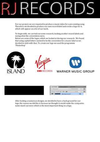
Below are some of the logos, which we looked at during our research. We found
that using capital letters seemed to be the convention for a music label so we
decided to stick with that. To create our logo we used the programme
‘Photoshop’
After looking a numerous designs, we decided to have a back ground for our
logo, the reason we did this is because we thought it would make the companies
name stand out more which is the most important thing on a logo.
2. Here, we have begun the creation of the companies name ‘RJ RECORDS’. We only
started with ‘RJ’ because we wanted to make ‘RJ’ and ‘RECORDS’ different
colours and this was the easiest way to do it.
Here we have added effects to ‘RJ’ in order to make it stand out on the black
background. The effects which we added were a red colour overlay and ‘Bevel
and emboss’ which gave it the hard, metal look.
At this stage we have added ‘RECORDS’ to the logo, we used the same font that
we did for ‘RJ’ so that it didn’t look out of place. In the beginning, we planned to
have ‘RECORDS’ written in a white font, however we thought that it would look
better in a grey/silver font instead.
3. We used the same effects for
‘RECORDS’ as we did for ‘RJ’; again this
was to assure that they didn’t look out
of place. However this time we added
a silver colour over lay rather than a
red one.