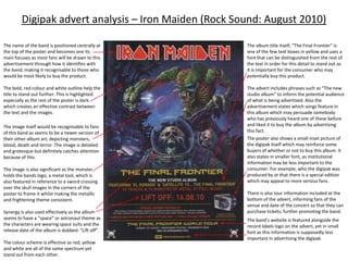
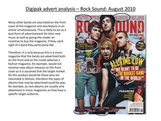
Digipak advert analysis – Young Guns (KERRANG: July 2010)

                                                            Grey, silver background with a grey/brown
                                                            colour scheme is simplistic yet gives the
The font of the band’s name is stylised and
                                                            image a slightly grungy look to imply what
gives off a western feel which could be a
                                                            genre the music of the band is (metal). This
clever use of irony as the band’s name is
                                                            technique allows the product to reach its
“Young Guns” which could mean the guns
                                                            target audience.
used by cowboys.
                                                            The “beams” behind the main image add
The way in which the text curls at the ends
                                                            dimension to the way in which the advert is
is similar to the swirly pattern behind the
                                                            presented which make it appear more
lion, which could represent fire, yet is done
                                                            interesting and therefore a passer by is more
so in a way that may invite female attention
                                                            likely to consider this poster.
as well. Therefore the entire image is
consistent.
                                                            The image of the lion is central to the poster
The title of the album is included, as this is
                                                            which draws attention from potential
important information to the consumer
                                                            purchasers of the digipak.
and all of the text is in capitals which could
be reflective of the “loud” and slightly
                                                             The image itself is of a lion adorning a crown
overwhelming nature of music of the
                                                            of thorns which has connotations of religion
metal genre.
                                                            (the crucifixion of Jesus) or bravery. The lion
                                                            is also crying which suggests emotion (heavy
Information is also included on the release
                                                            rock) yet the mouth is watering meaning he is
date (to inform potential consumers) and
                                                            a predator.
the album’s producers to rightfully credit
them.
                                                             The image is basically ambiguous which
                                                            could mean it is left to interpretation and not
Tour dates are featured in a banner at the
                                                            aimed at a specific audience.
bottom of the advert which are significant
as this helps to promote the album by                       The band’s website is included for further
informing fans of when the band will be on                  information as is the logo of the production
tour, allowing them time to book tickets,                   company of the album to promote their work
ensuring that most of the places will be                    as well as that of the band and to credit their
sold.                                                       contribution to the completion of this
                                                            product.
Digipak advert analysis – Young Guns (KERRANG: July 2010)

                                            Coincidently, as well as having
                                            their digipak advertised on the
                                            back cover of the magazine,
                                            Young Guns also featured on the
                                            front cover as part of promotion
                                            for the new album.

                                            Their poses in the shots taken of
                                            the band themselves could be
                                            suggestive of the type of music
                                            that they play (and that the
                                            album is comprised of). For
                                            example, in the image used for
                                            the front cover, frontman Gustav
                                            Wood shows his fist and has a
                                            “wolf-like” expression
                                            suggesting aggression. Similarly,
                                            in the double-spread feature
                                            image, he holds his fist which is
                                            associated with the intent of
                                            physical violence.


Furthermore, in the single shots of the band, they are all hitting a glass prop which suggests the
chaos and disruption that is associated with heavy rock music. Also, the background is red which
connotes anger or perhaps simply powerful emotions which are usually present in or the focus of
rock and metal songs.

Therefore, both the digipak advert and the images accompanying an interview with the band
promote their music and their status as a heavy rock band.
Digipak advert analysis – Iron Maiden (Rock Sound: August 2010)

The name of the band is positioned centrally at        The album title itself; “The Final Frontier” is
the top of the poster and becomes one its              one of the few text boxes in yellow and uses a
main focuses as most fans will be drawn to this        font that can be distinguished from the rest of
advertisement through how it identifies with           the text in order for this detail to stand out as
the band; making it recognisable to those who          it is important for the consumer who may
would be most likely to buy the product.               potentially buy this product.

The bold, red colour and white outline help the        The advert includes phrases such as “The new
title to stand out further. This is highlighted        studio album” to inform the potential audience
especially as the rest of the poster is dark           of what is being advertised. Also the
which creates an effective contrast between            advertisement states which songs feature in
the text and the images.                               this album which may persuade somebody
                                                       who has previously heard one of these before
The image itself would be recognisable to fans         and liked it to buy the album by advertising
of this band as seems to be a newer version of         this fact.
their other album art; depicting monsters,             The poster also shows a small inset picture of
blood, death and terror. The image is detailed         the digipak itself which may reinforce some
and grotesque but definitely catches attention         buyers of whether or not to buy this album. It
because of this.                                       also states in smaller font, as institutional
                                                       information may be less important to the
The image is also significant as the monster           consumer. For example, who the digipak was
holds the bands logo, a metal tool, which is           produced by or that there is a special edition
also featured in reference to a sword crossing         which may appeal to more serious fans.
over the skull images in the corners of the
poster to frame it whilst making the metallic          There is also tour information included at the
and frightening theme consistent.                      bottom of the advert, informing fans of the
                                                       venue and date of the concert so that they can
Synergy is also used effectively as the album          purchase tickets; further promoting the band.
seems to have a “space” or astronaut theme as          The band’s website is featured alongside the
the characters are wearing space suits and the         record labels logo on the advert, yet in small
release date of the album is dubbed: “Lift off”.       font as this information is supposedly less
                                                       important in advertising the digipak.
The colour scheme is effective as red, yellow
and white are all of the same spectrum yet
stand out from each other.
Digipak advert analysis – Iron Maiden (Rock Sound: August 2010)


Iron Maiden are also featured inside the magazine itself to accompany the advertisement for the new digipak. However, significantly,
this article shows an image of the album cover but the main focus is a shot of the band themselves which is also important in
promoting music as the appearance of the band may influence whether or not someone is willing to pa and see them perform at a
concert. In the image, most of the band members are not smiling, suggesting that their music is serious and their long hair and dark
clothes suggest they play heavy rock/metal compositions.

Furthermore, the band are mentioned on the front cover of the magazine itself which further advertises their new album and acts as
an incentive to buy the magazine too; which gives the editors a reason to make an article about them.
Digipak advert analysis – Rock Sound: August 2010

Many other bands are also listed on the front
cover of the magazine and also feature in an
article simultaneously. This is likely to act as a
duel form of advertisement for their new
music as well as giving the reader an
incentive to buy the magazine, if they catch
sight of a band they particularly like.

Therefore, it is only because this is a music
magazine that the bands are advertised both
on the front and on the inside whereas a
fashion magazine, for example, would not
mention new album releases on the front
cover as it is assumed that the target market
for this product would be those who are
interested in fashion, therefore the types of
albums that may be advertised could be pop,
for example, as rock albums are usually only
advertised in music magazines as they have a
specific target audience.
Digipak advert analysis – KORN (Rock Sound: August 2010)


                                 Interview featuring
                                 an image of the band
                                 and their logo to
                                 identify them.


          Advertisement for
          the band’s tour.       Digipak advert for
          Featuring their logo   their album by HMV.
          and similar imagery    Includes a review
          from their album for   from the magazine at
          the tour – synergy.    the top to further
                                 advertise.
Digipak advert analysis – Architects (Rock Sound: August 2010)


                       Interview featuring
                       an image of a
                       member from the
                       band to present the
                       group to the
                       potential target
                       audience.

                       The singer “in action”
                       shows they are a
                       heavy metal band.


                                             An advert from HMV
                                             shows their digipak
                                             as one of the new
                                             albums available and
                                             contains important
                                             information
                                             concerning its
                                             release.
Digipak advert analysis – Circa Survive(Rock Sound: August 2010)


                                               Interview featuring an image of the
                                               band which may be important for
                                               the audience as an image of them
                                               is not featured in the digipak
                                               advert and through this, the
                                               audience are able to identify the
                                               band.


                        The digipak advert
                        contains a positive
                        review which further
                        promotes the band
                        and their music.
Digipak advert analysis – 36 CrazyFists(Rock Sound: August 2010)
                               The band’s
                               new album is
                               reviewed in
                               the
                               magazine
                               alongside
                               their
                               interview
                               which is
                               useful to the
                               consumer
                               and acts to
                               promote the
                               band.


           An advert for their digipak is also
           featured which includes the relevant
           information on the album’s release,
           specifically naming their previous
           singles which may have been
           successful and persuade an audience
           to purchase the album.

Ad analysis

  • 1.
    Digipak advert analysis– Young Guns (KERRANG: July 2010) Grey, silver background with a grey/brown colour scheme is simplistic yet gives the The font of the band’s name is stylised and image a slightly grungy look to imply what gives off a western feel which could be a genre the music of the band is (metal). This clever use of irony as the band’s name is technique allows the product to reach its “Young Guns” which could mean the guns target audience. used by cowboys. The “beams” behind the main image add The way in which the text curls at the ends dimension to the way in which the advert is is similar to the swirly pattern behind the presented which make it appear more lion, which could represent fire, yet is done interesting and therefore a passer by is more so in a way that may invite female attention likely to consider this poster. as well. Therefore the entire image is consistent. The image of the lion is central to the poster The title of the album is included, as this is which draws attention from potential important information to the consumer purchasers of the digipak. and all of the text is in capitals which could be reflective of the “loud” and slightly The image itself is of a lion adorning a crown overwhelming nature of music of the of thorns which has connotations of religion metal genre. (the crucifixion of Jesus) or bravery. The lion is also crying which suggests emotion (heavy Information is also included on the release rock) yet the mouth is watering meaning he is date (to inform potential consumers) and a predator. the album’s producers to rightfully credit them. The image is basically ambiguous which could mean it is left to interpretation and not Tour dates are featured in a banner at the aimed at a specific audience. bottom of the advert which are significant as this helps to promote the album by The band’s website is included for further informing fans of when the band will be on information as is the logo of the production tour, allowing them time to book tickets, company of the album to promote their work ensuring that most of the places will be as well as that of the band and to credit their sold. contribution to the completion of this product.
  • 2.
    Digipak advert analysis– Young Guns (KERRANG: July 2010) Coincidently, as well as having their digipak advertised on the back cover of the magazine, Young Guns also featured on the front cover as part of promotion for the new album. Their poses in the shots taken of the band themselves could be suggestive of the type of music that they play (and that the album is comprised of). For example, in the image used for the front cover, frontman Gustav Wood shows his fist and has a “wolf-like” expression suggesting aggression. Similarly, in the double-spread feature image, he holds his fist which is associated with the intent of physical violence. Furthermore, in the single shots of the band, they are all hitting a glass prop which suggests the chaos and disruption that is associated with heavy rock music. Also, the background is red which connotes anger or perhaps simply powerful emotions which are usually present in or the focus of rock and metal songs. Therefore, both the digipak advert and the images accompanying an interview with the band promote their music and their status as a heavy rock band.
  • 3.
    Digipak advert analysis– Iron Maiden (Rock Sound: August 2010) The name of the band is positioned centrally at The album title itself; “The Final Frontier” is the top of the poster and becomes one its one of the few text boxes in yellow and uses a main focuses as most fans will be drawn to this font that can be distinguished from the rest of advertisement through how it identifies with the text in order for this detail to stand out as the band; making it recognisable to those who it is important for the consumer who may would be most likely to buy the product. potentially buy this product. The bold, red colour and white outline help the The advert includes phrases such as “The new title to stand out further. This is highlighted studio album” to inform the potential audience especially as the rest of the poster is dark of what is being advertised. Also the which creates an effective contrast between advertisement states which songs feature in the text and the images. this album which may persuade somebody who has previously heard one of these before The image itself would be recognisable to fans and liked it to buy the album by advertising of this band as seems to be a newer version of this fact. their other album art; depicting monsters, The poster also shows a small inset picture of blood, death and terror. The image is detailed the digipak itself which may reinforce some and grotesque but definitely catches attention buyers of whether or not to buy this album. It because of this. also states in smaller font, as institutional information may be less important to the The image is also significant as the monster consumer. For example, who the digipak was holds the bands logo, a metal tool, which is produced by or that there is a special edition also featured in reference to a sword crossing which may appeal to more serious fans. over the skull images in the corners of the poster to frame it whilst making the metallic There is also tour information included at the and frightening theme consistent. bottom of the advert, informing fans of the venue and date of the concert so that they can Synergy is also used effectively as the album purchase tickets; further promoting the band. seems to have a “space” or astronaut theme as The band’s website is featured alongside the the characters are wearing space suits and the record labels logo on the advert, yet in small release date of the album is dubbed: “Lift off”. font as this information is supposedly less important in advertising the digipak. The colour scheme is effective as red, yellow and white are all of the same spectrum yet stand out from each other.
  • 4.
    Digipak advert analysis– Iron Maiden (Rock Sound: August 2010) Iron Maiden are also featured inside the magazine itself to accompany the advertisement for the new digipak. However, significantly, this article shows an image of the album cover but the main focus is a shot of the band themselves which is also important in promoting music as the appearance of the band may influence whether or not someone is willing to pa and see them perform at a concert. In the image, most of the band members are not smiling, suggesting that their music is serious and their long hair and dark clothes suggest they play heavy rock/metal compositions. Furthermore, the band are mentioned on the front cover of the magazine itself which further advertises their new album and acts as an incentive to buy the magazine too; which gives the editors a reason to make an article about them.
  • 5.
    Digipak advert analysis– Rock Sound: August 2010 Many other bands are also listed on the front cover of the magazine and also feature in an article simultaneously. This is likely to act as a duel form of advertisement for their new music as well as giving the reader an incentive to buy the magazine, if they catch sight of a band they particularly like. Therefore, it is only because this is a music magazine that the bands are advertised both on the front and on the inside whereas a fashion magazine, for example, would not mention new album releases on the front cover as it is assumed that the target market for this product would be those who are interested in fashion, therefore the types of albums that may be advertised could be pop, for example, as rock albums are usually only advertised in music magazines as they have a specific target audience.
  • 6.
    Digipak advert analysis– KORN (Rock Sound: August 2010) Interview featuring an image of the band and their logo to identify them. Advertisement for the band’s tour. Digipak advert for Featuring their logo their album by HMV. and similar imagery Includes a review from their album for from the magazine at the tour – synergy. the top to further advertise.
  • 7.
    Digipak advert analysis– Architects (Rock Sound: August 2010) Interview featuring an image of a member from the band to present the group to the potential target audience. The singer “in action” shows they are a heavy metal band. An advert from HMV shows their digipak as one of the new albums available and contains important information concerning its release.
  • 8.
    Digipak advert analysis– Circa Survive(Rock Sound: August 2010) Interview featuring an image of the band which may be important for the audience as an image of them is not featured in the digipak advert and through this, the audience are able to identify the band. The digipak advert contains a positive review which further promotes the band and their music.
  • 9.
    Digipak advert analysis– 36 CrazyFists(Rock Sound: August 2010) The band’s new album is reviewed in the magazine alongside their interview which is useful to the consumer and acts to promote the band. An advert for their digipak is also featured which includes the relevant information on the album’s release, specifically naming their previous singles which may have been successful and persuade an audience to purchase the album.