Download as PDF, PPTX
![“[P]erceptions of interface aesthetic are closely
related to apparent usability and thus increase
the likelihood that aesthetics may considerably
affect system acceptability.”
- Noam Tractinsky
Attractive things work better](https://image.slidesharecdn.com/schlattervisualusabilitysm-141010081756-conversion-gate02/75/Tania-Schlatter-Visual-Usability-21-2048.jpg)
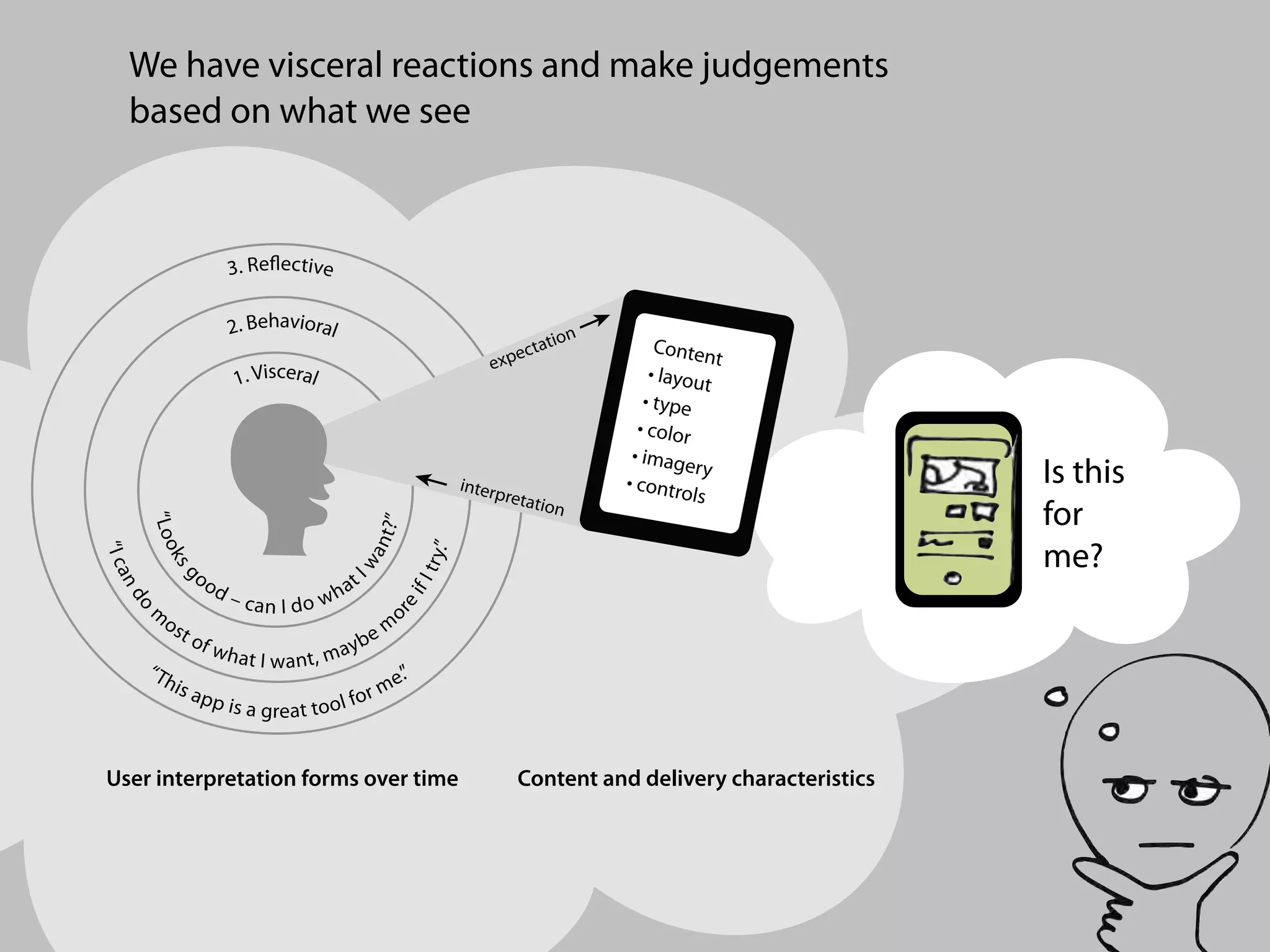
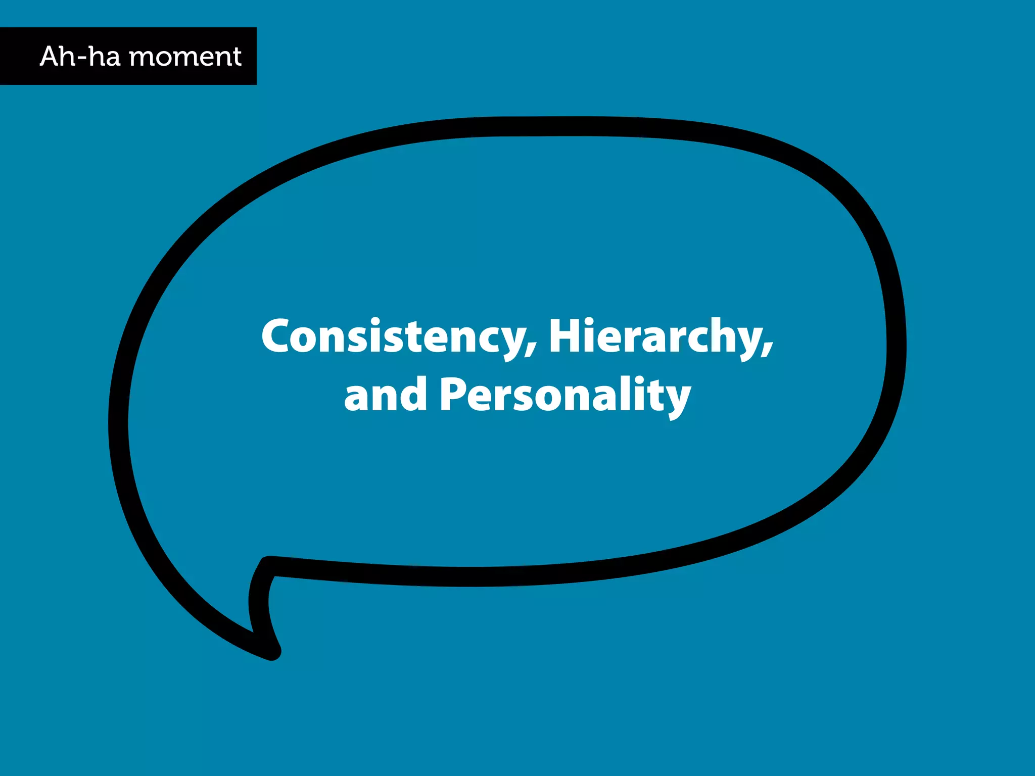
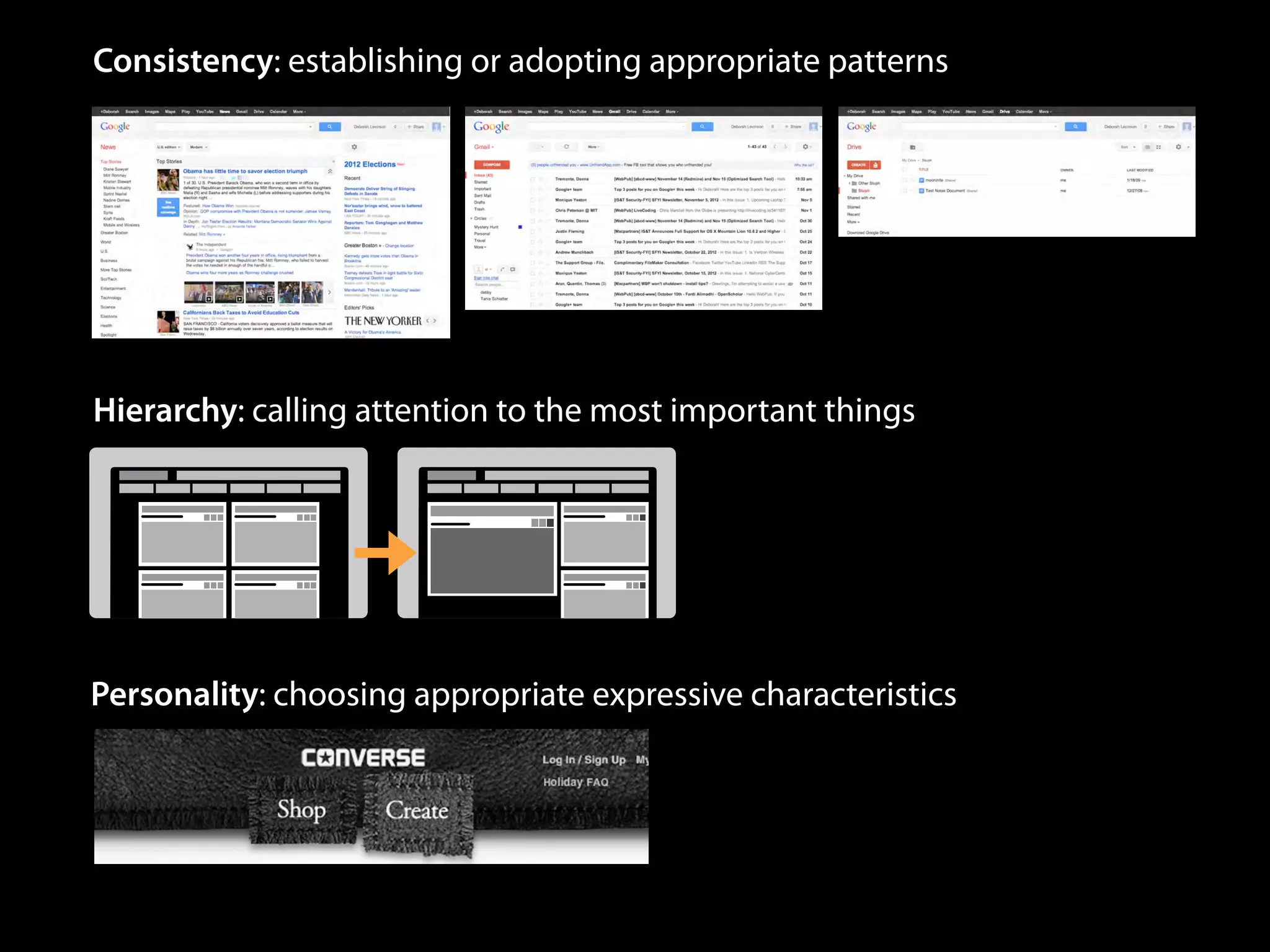
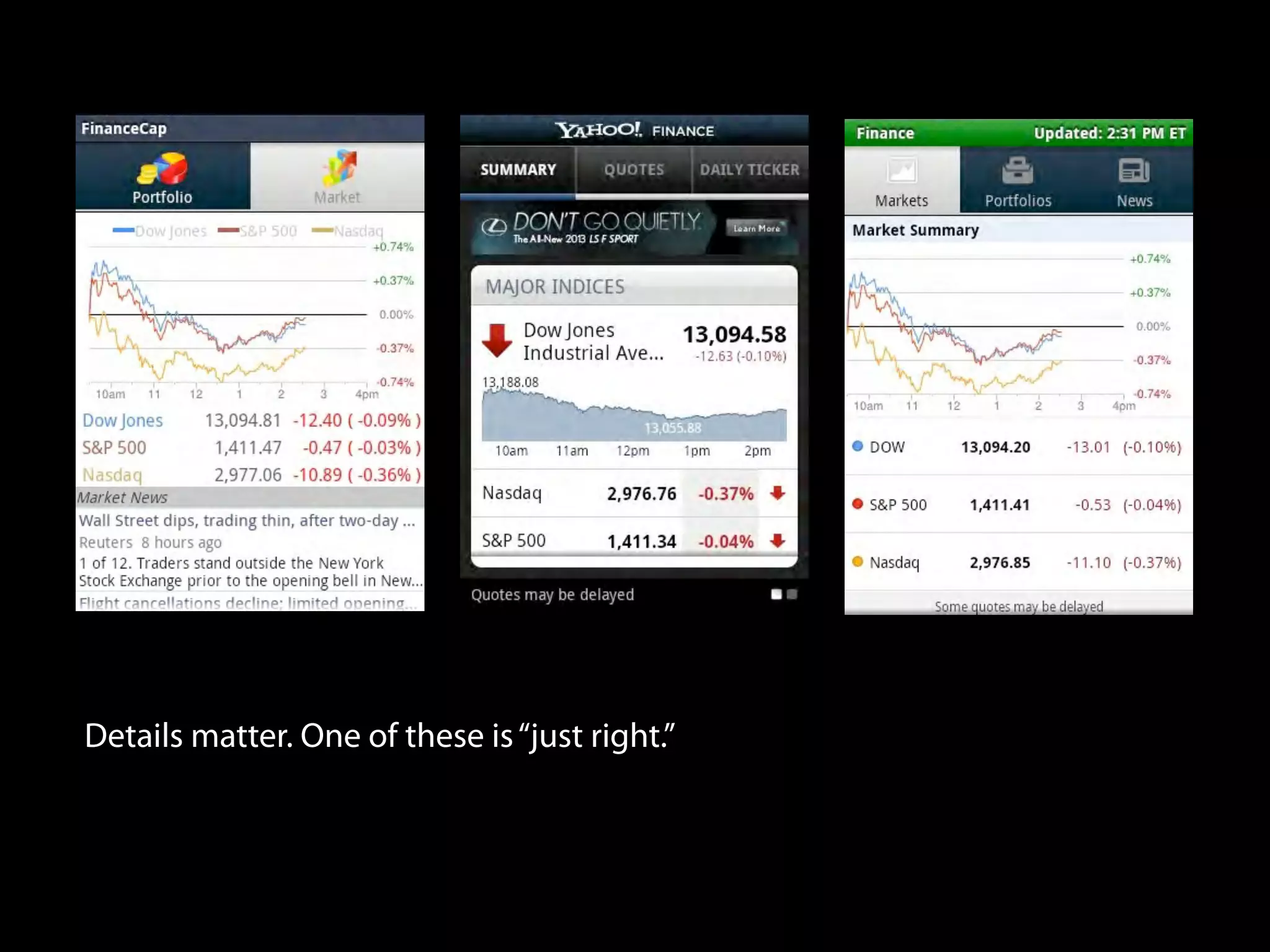
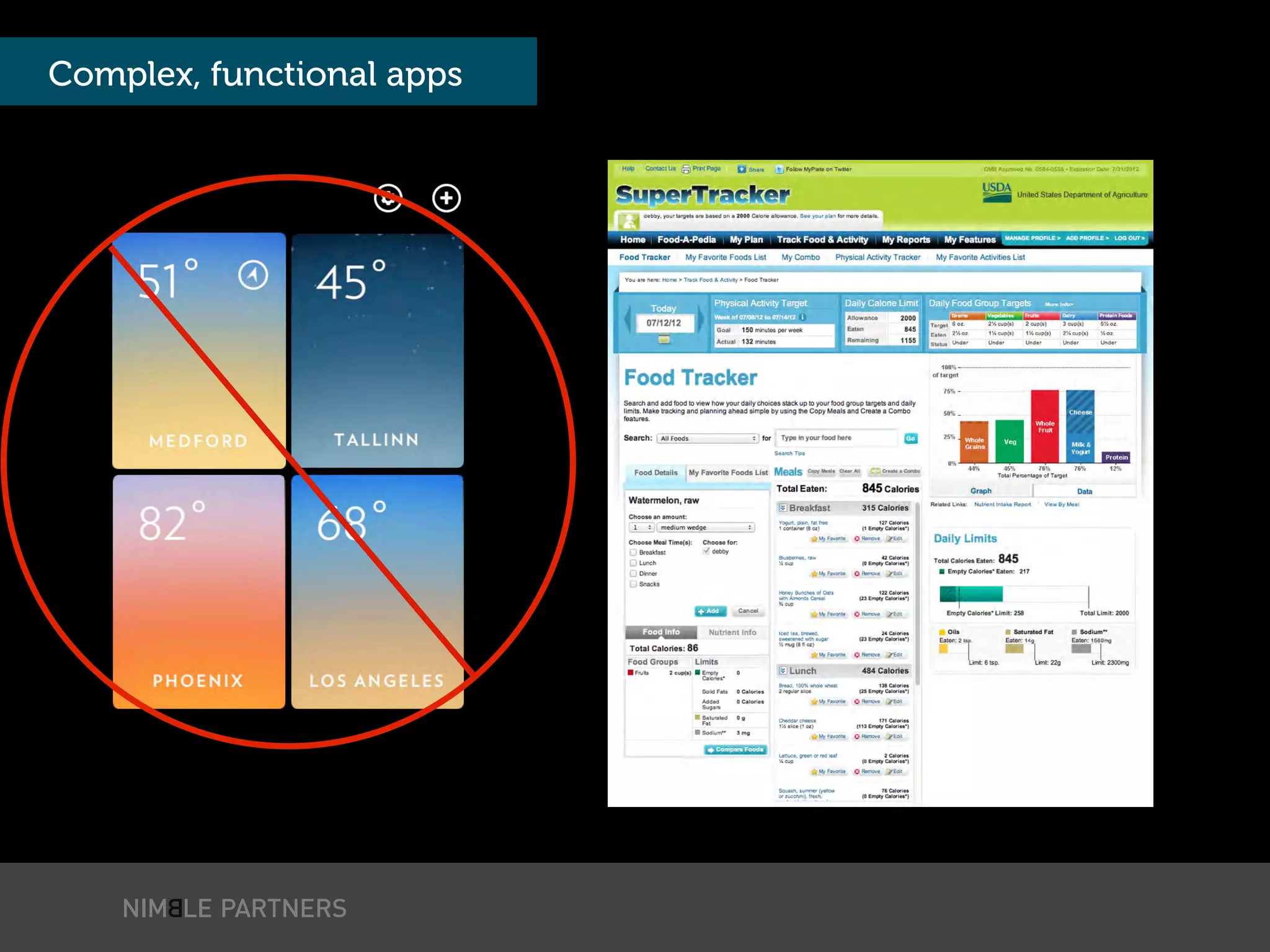
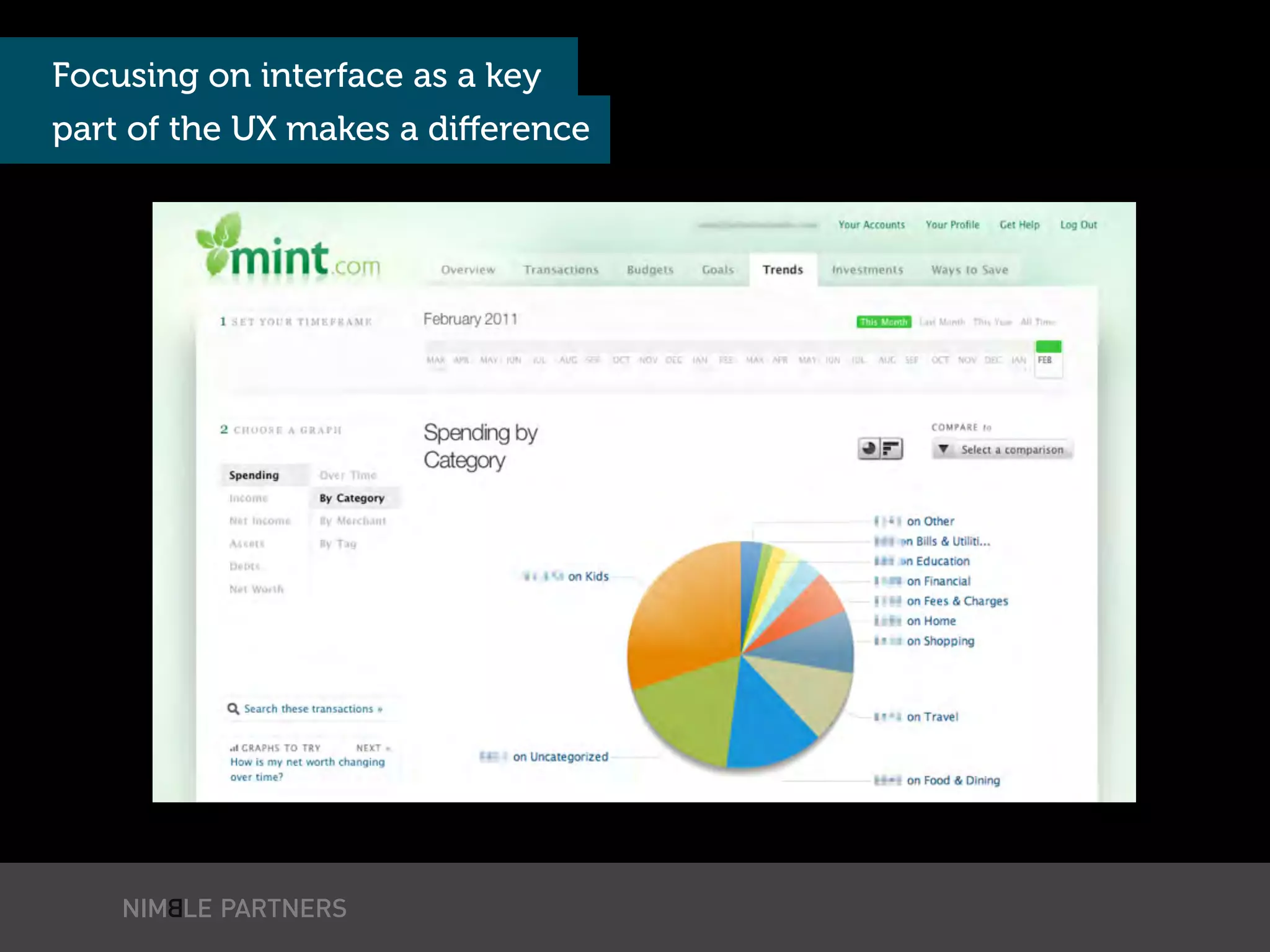
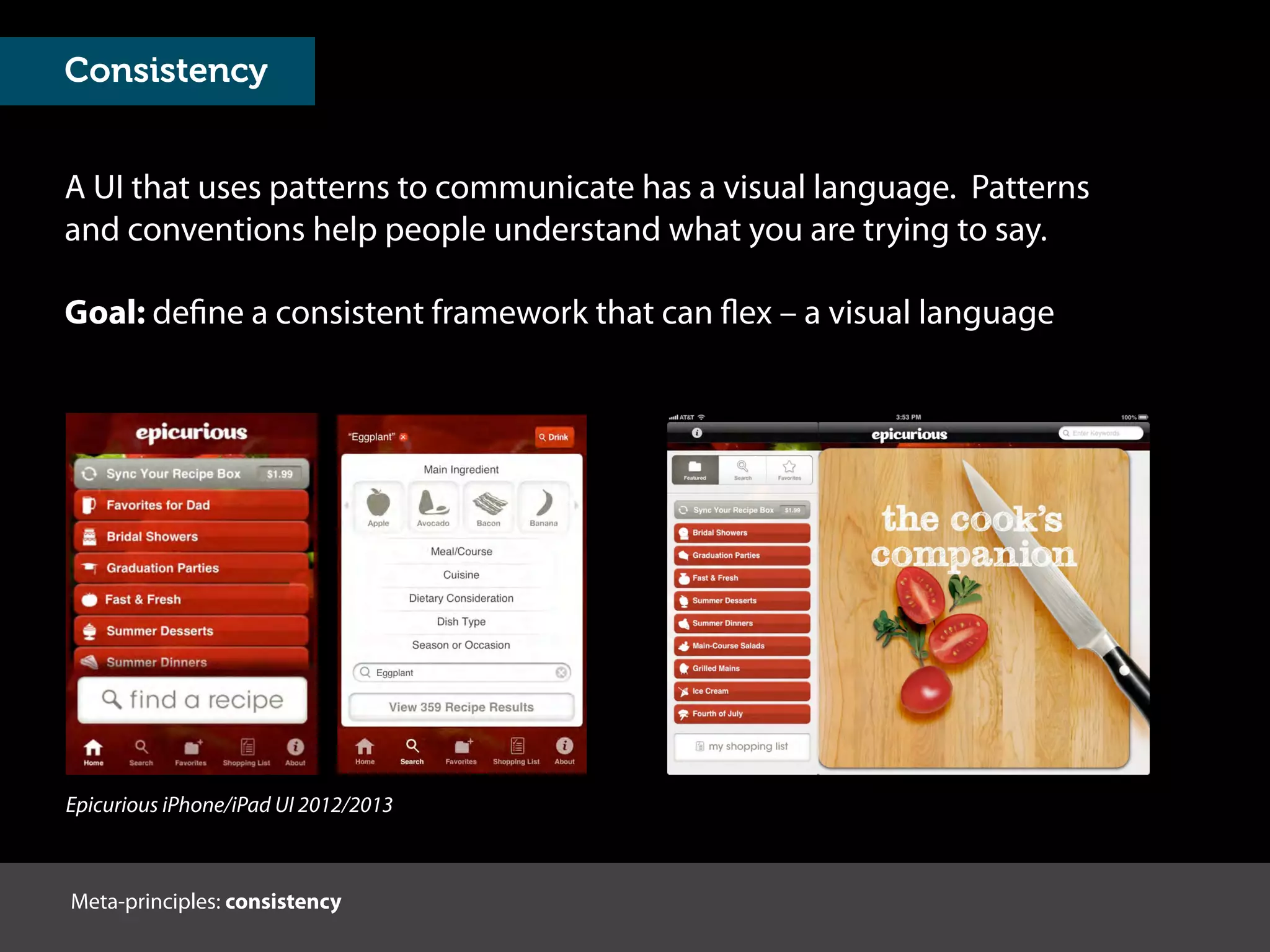
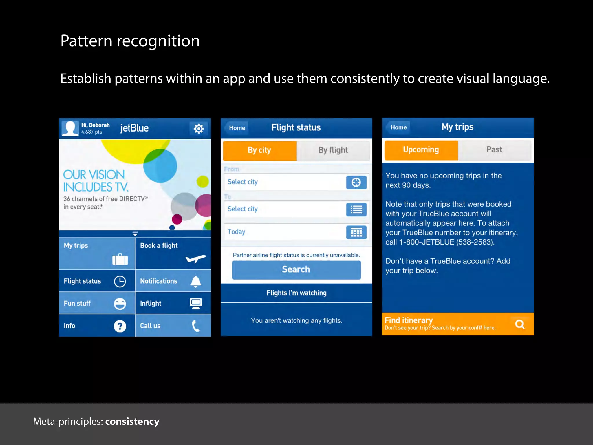
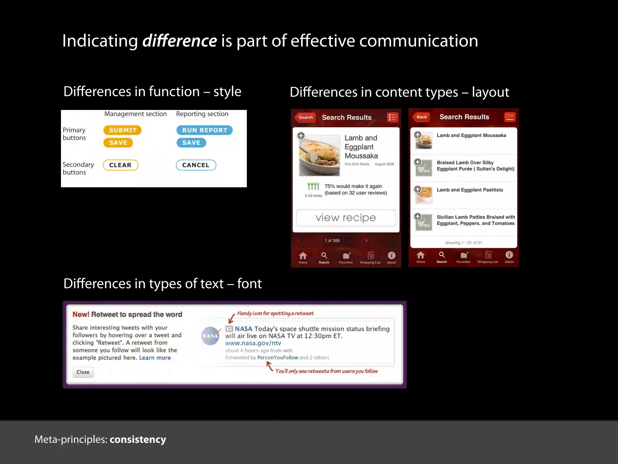
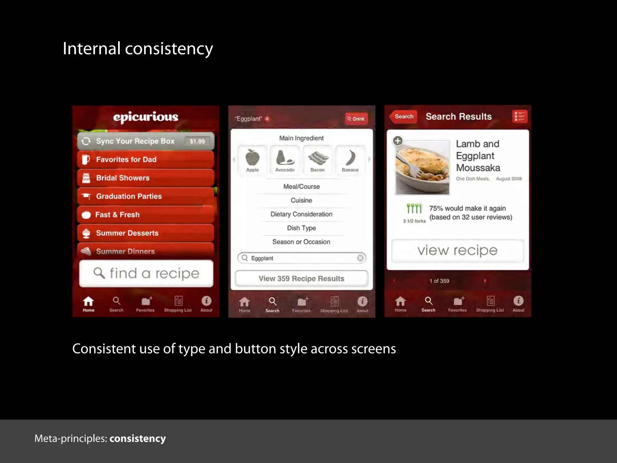
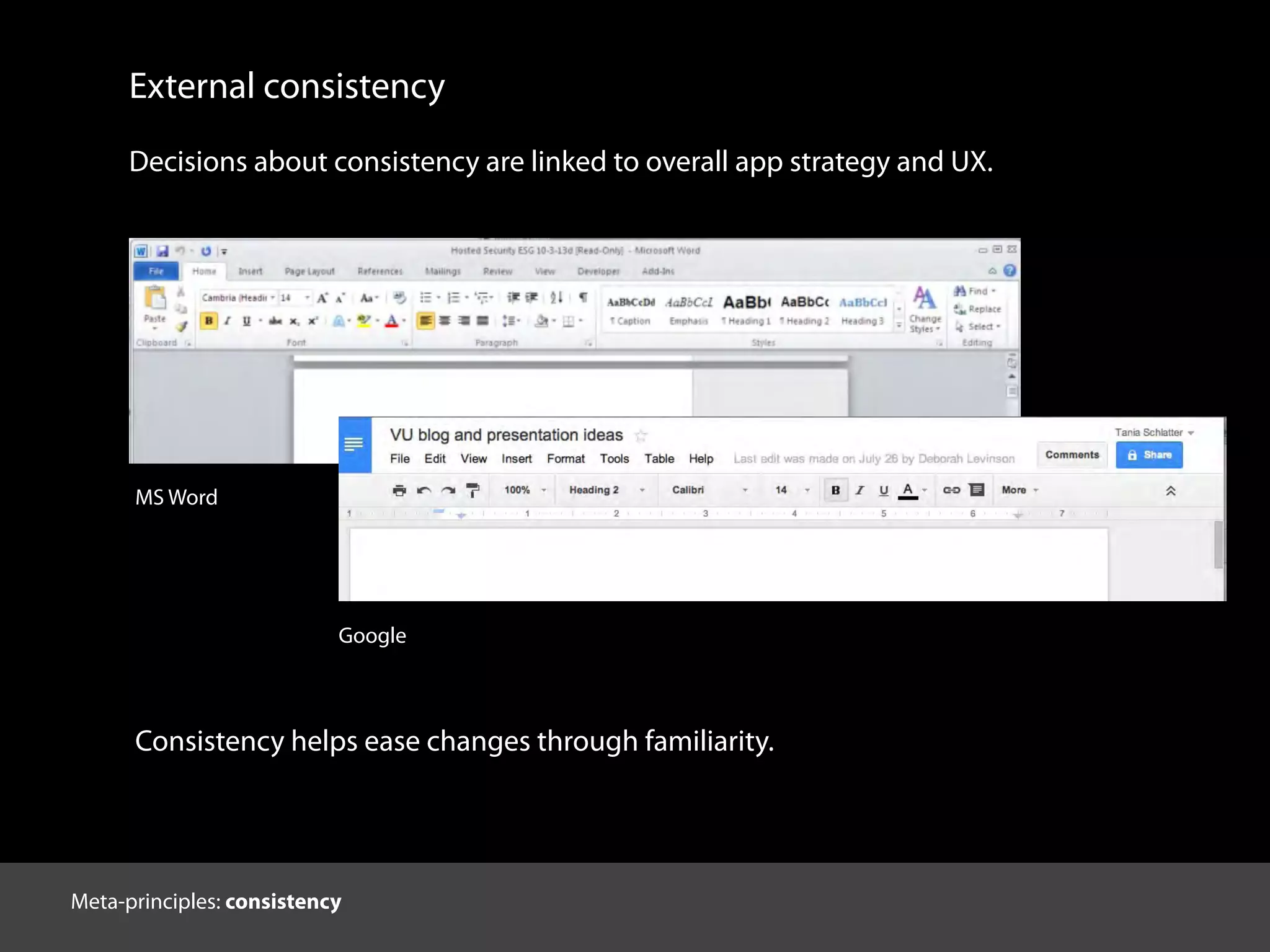
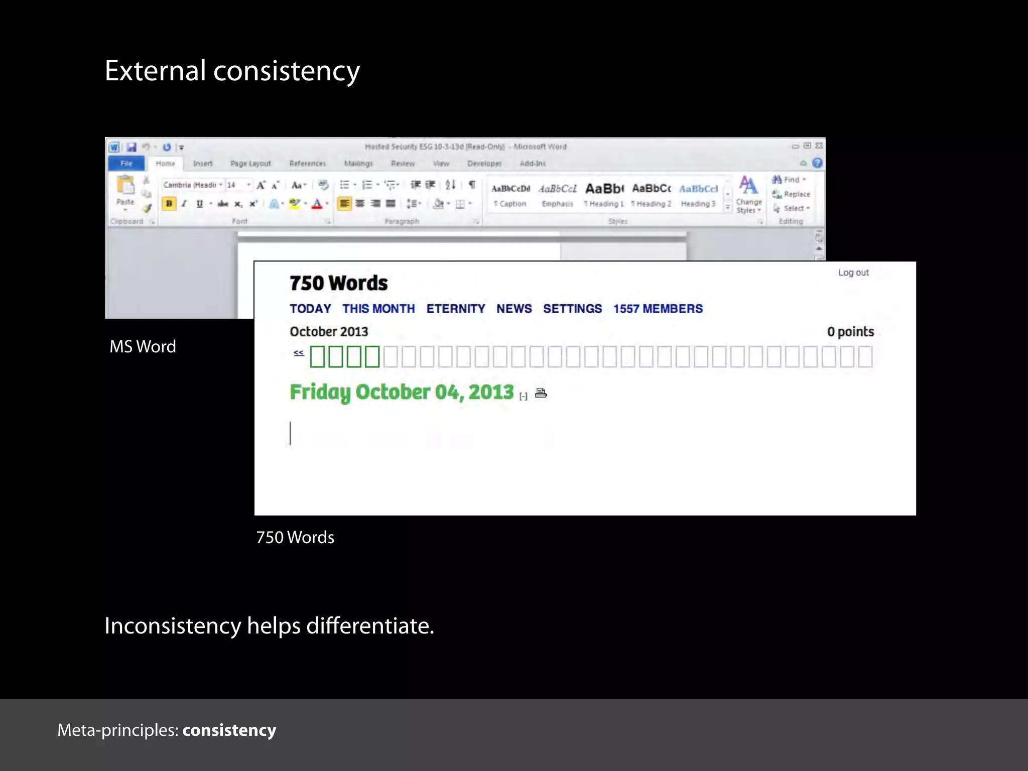

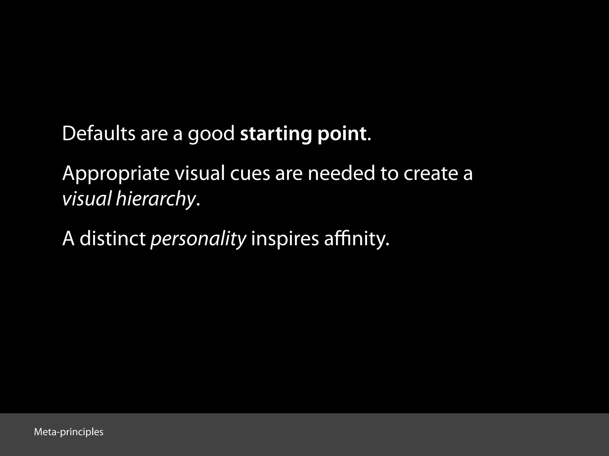
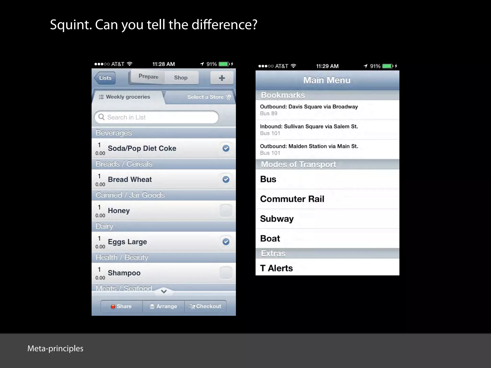
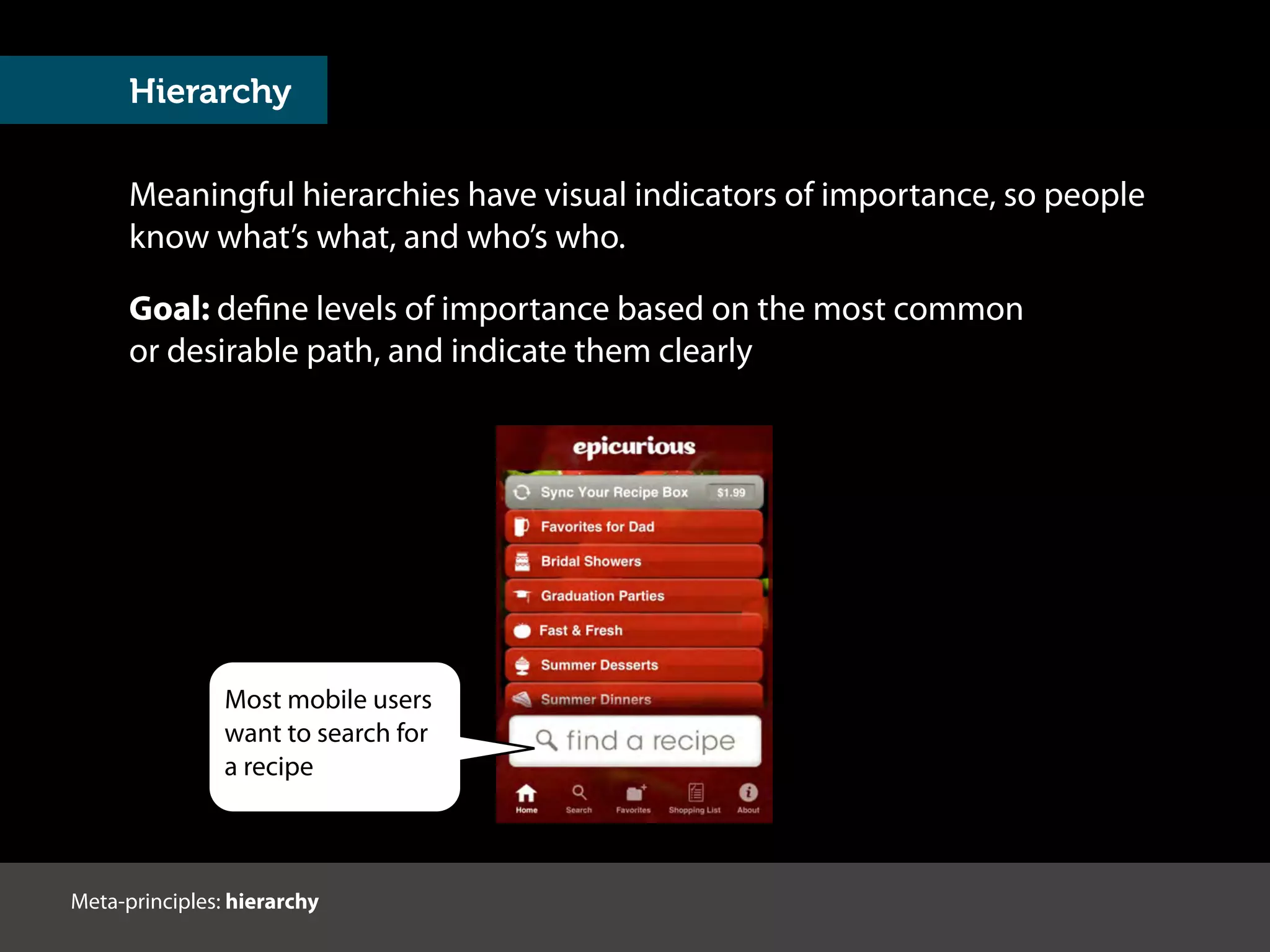
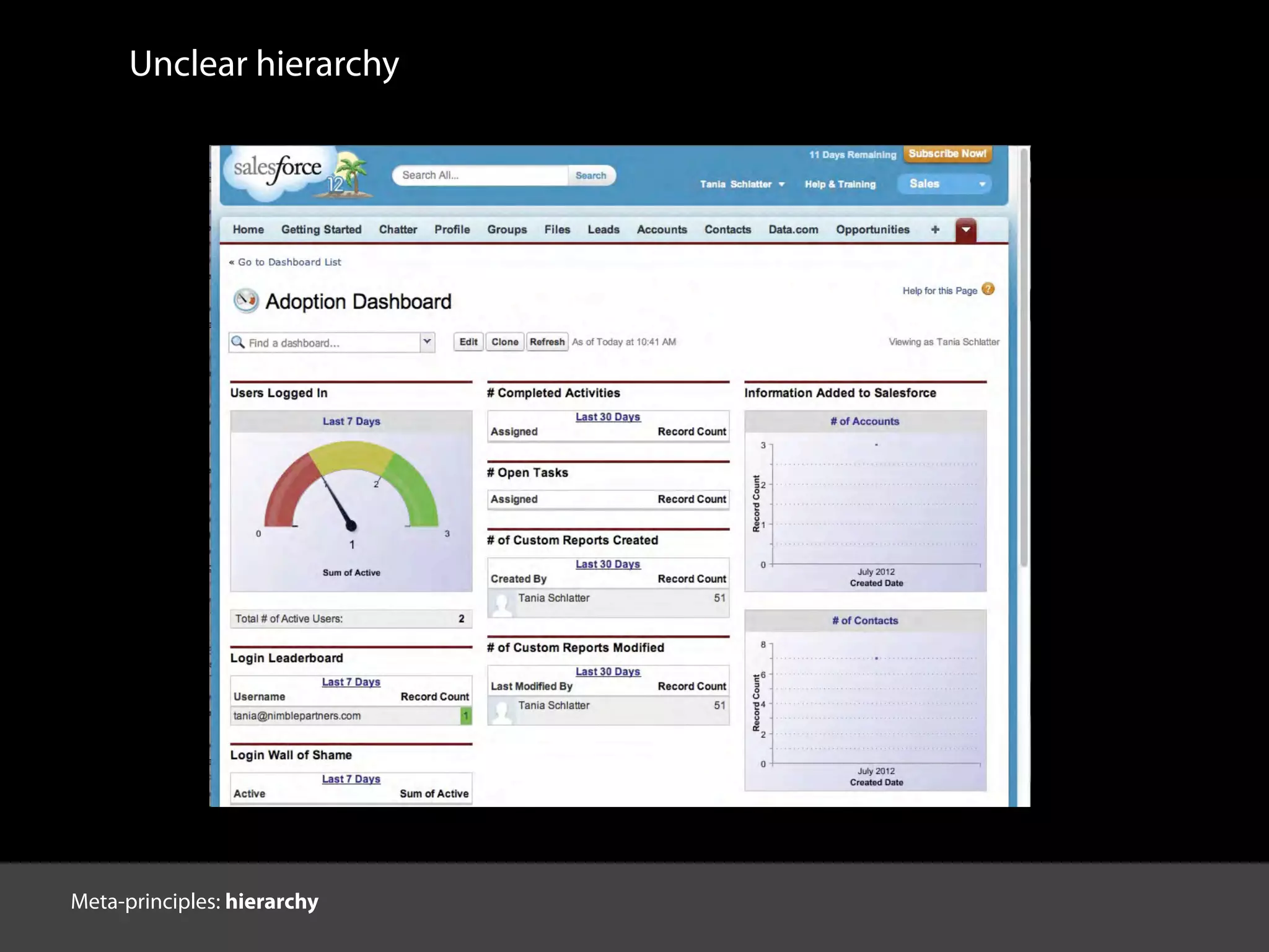
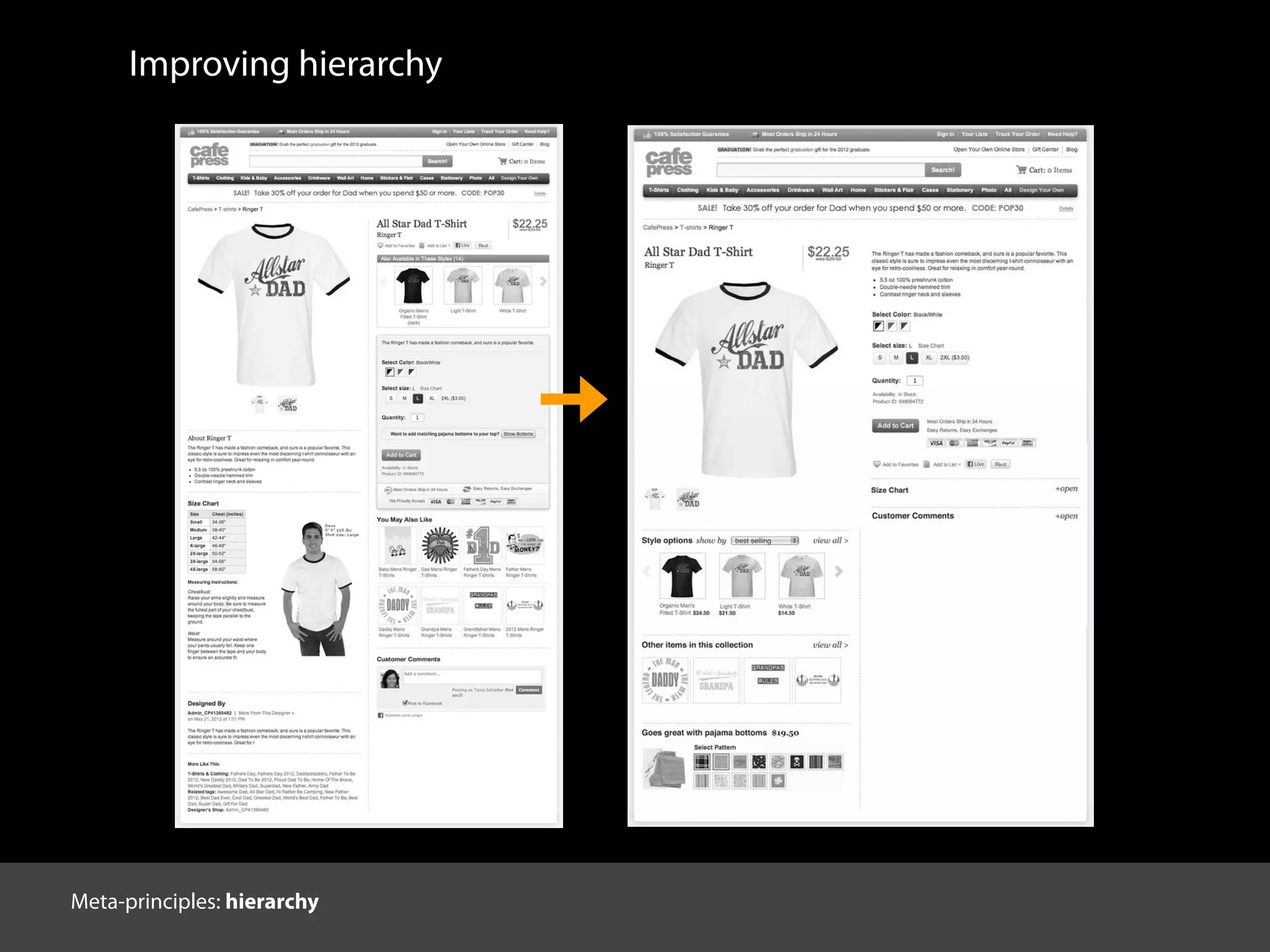
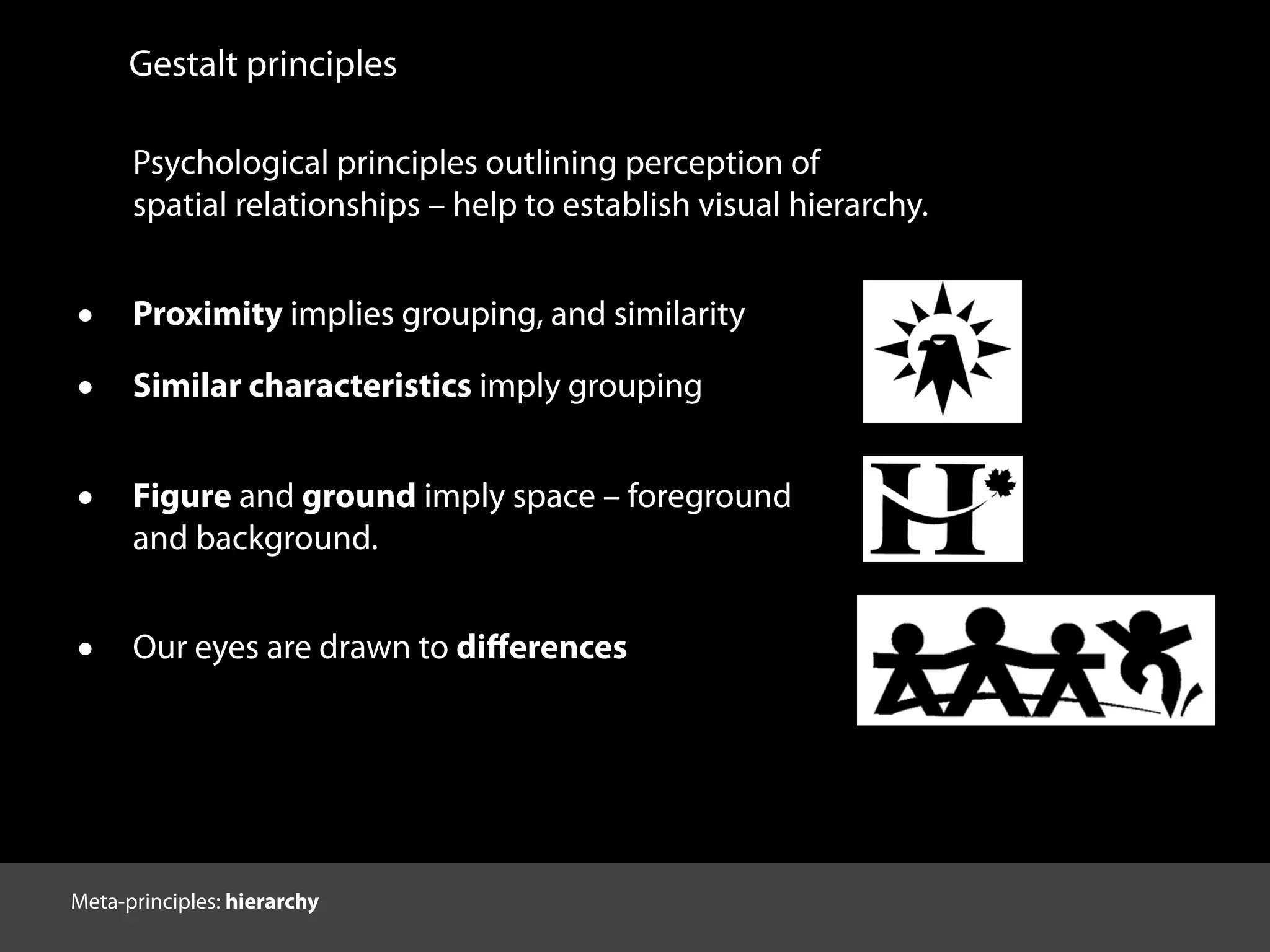
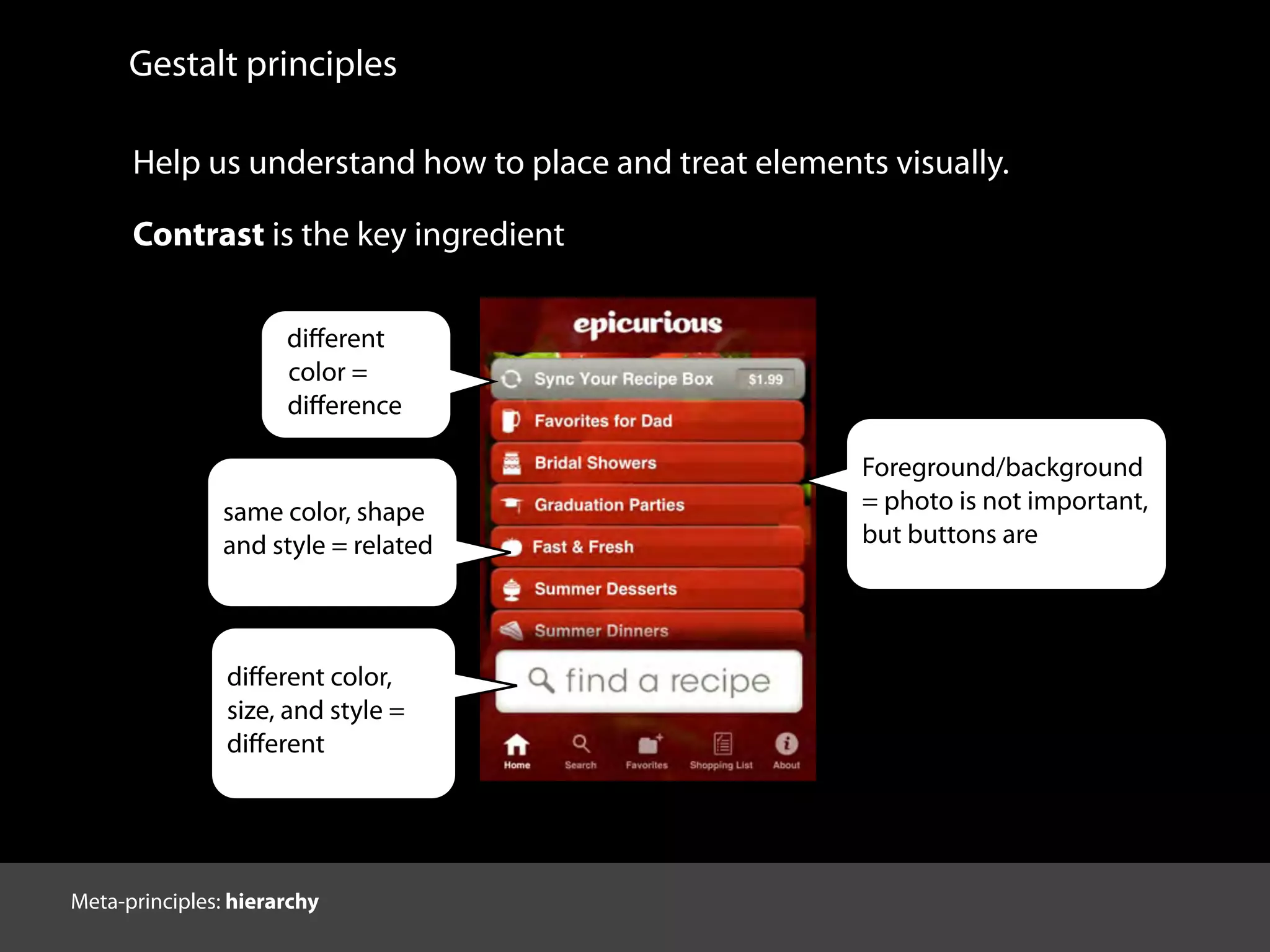
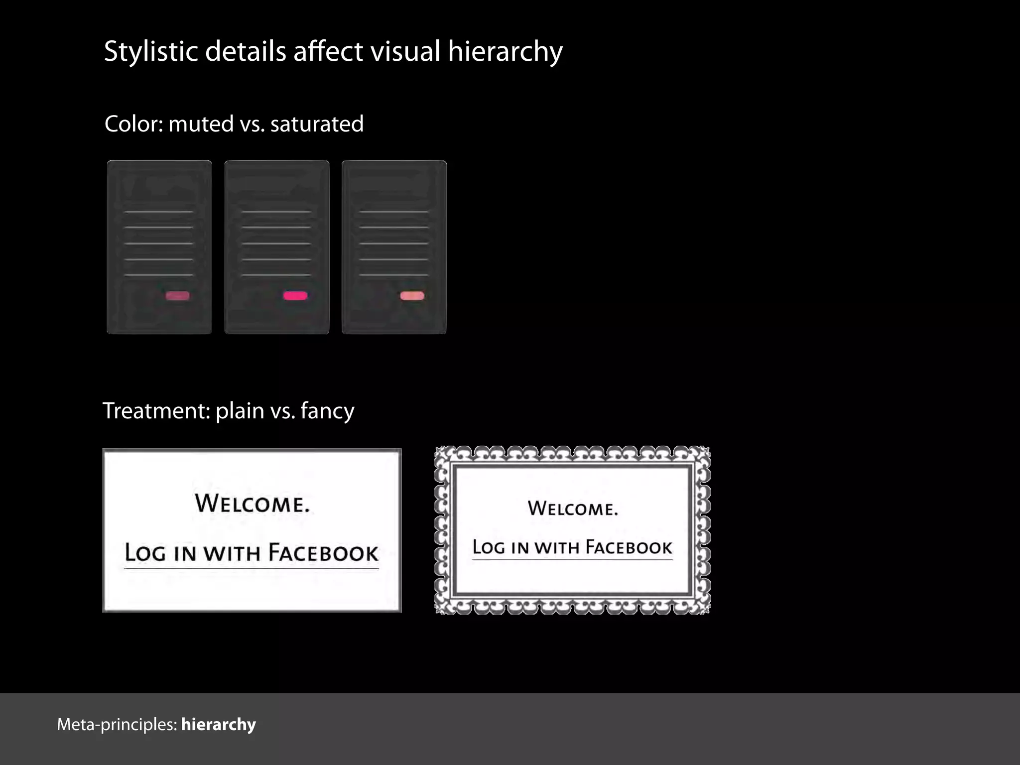

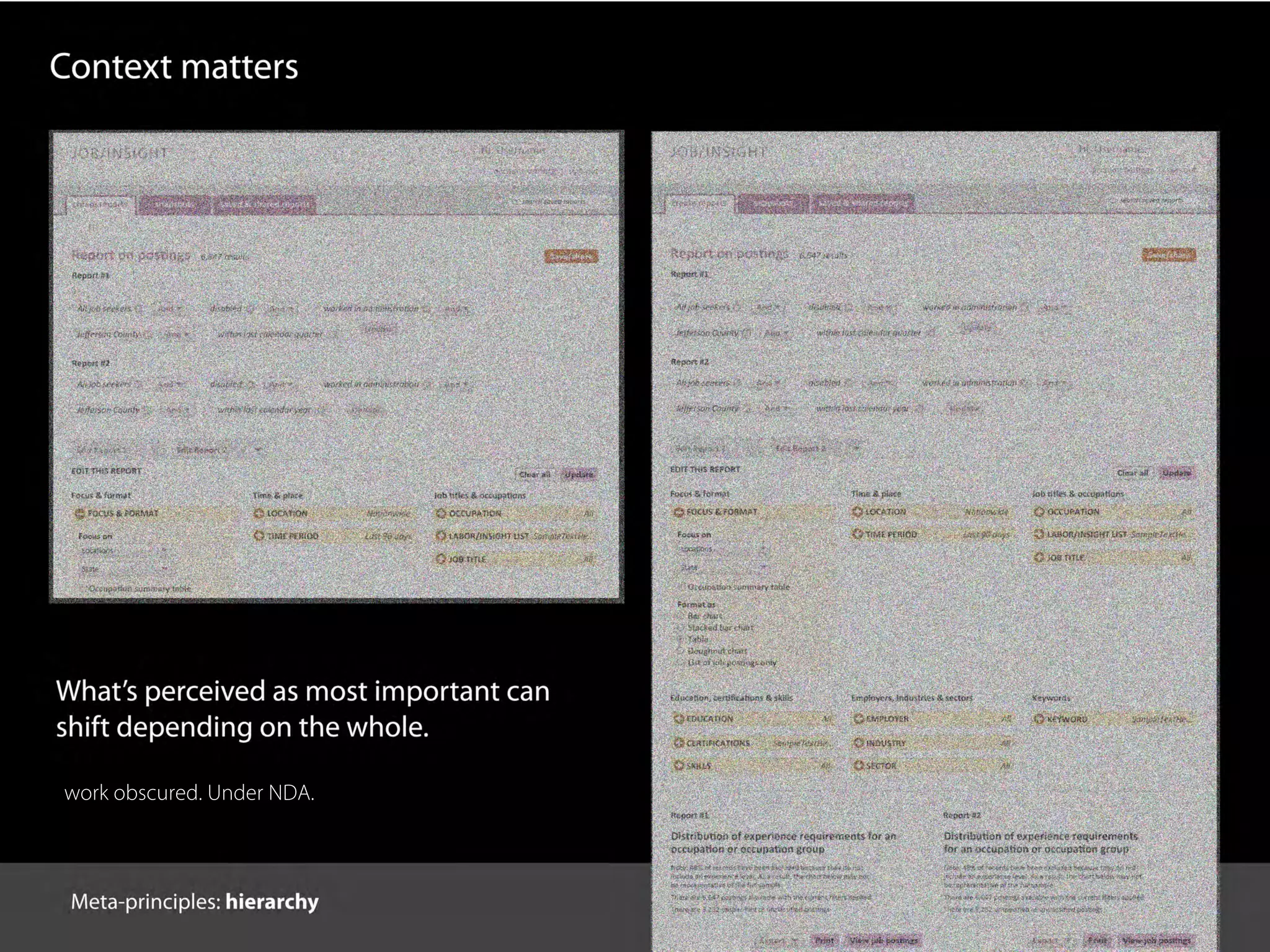

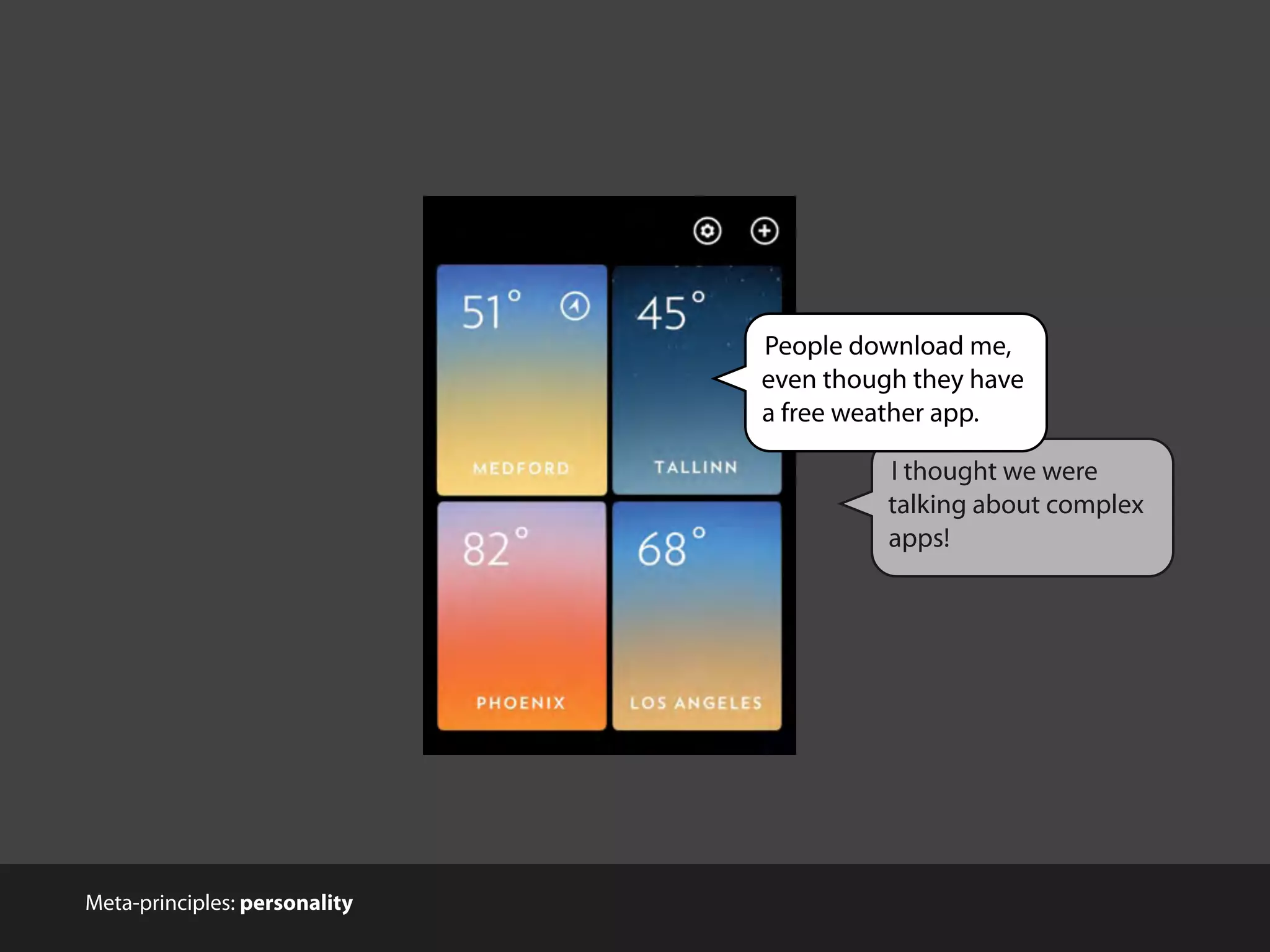
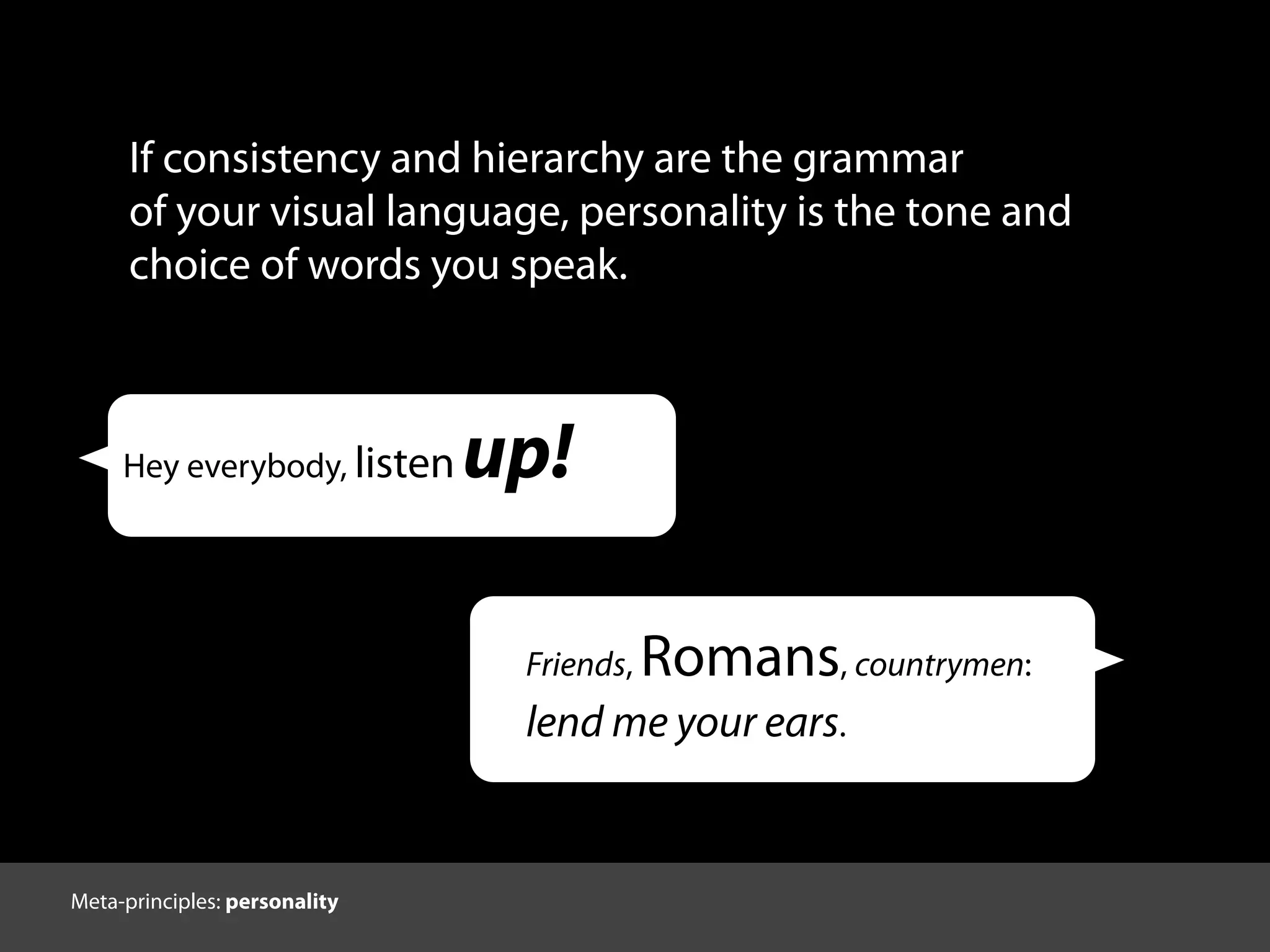
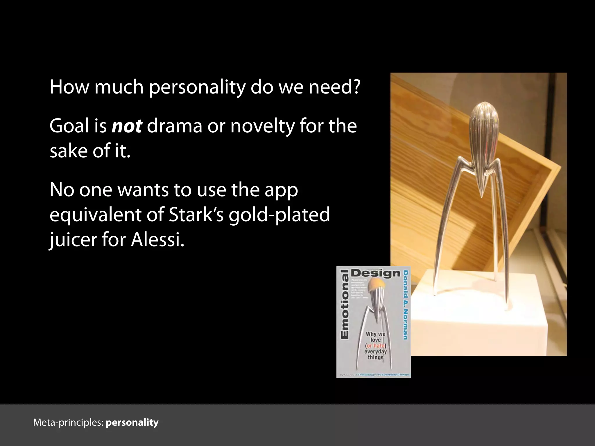
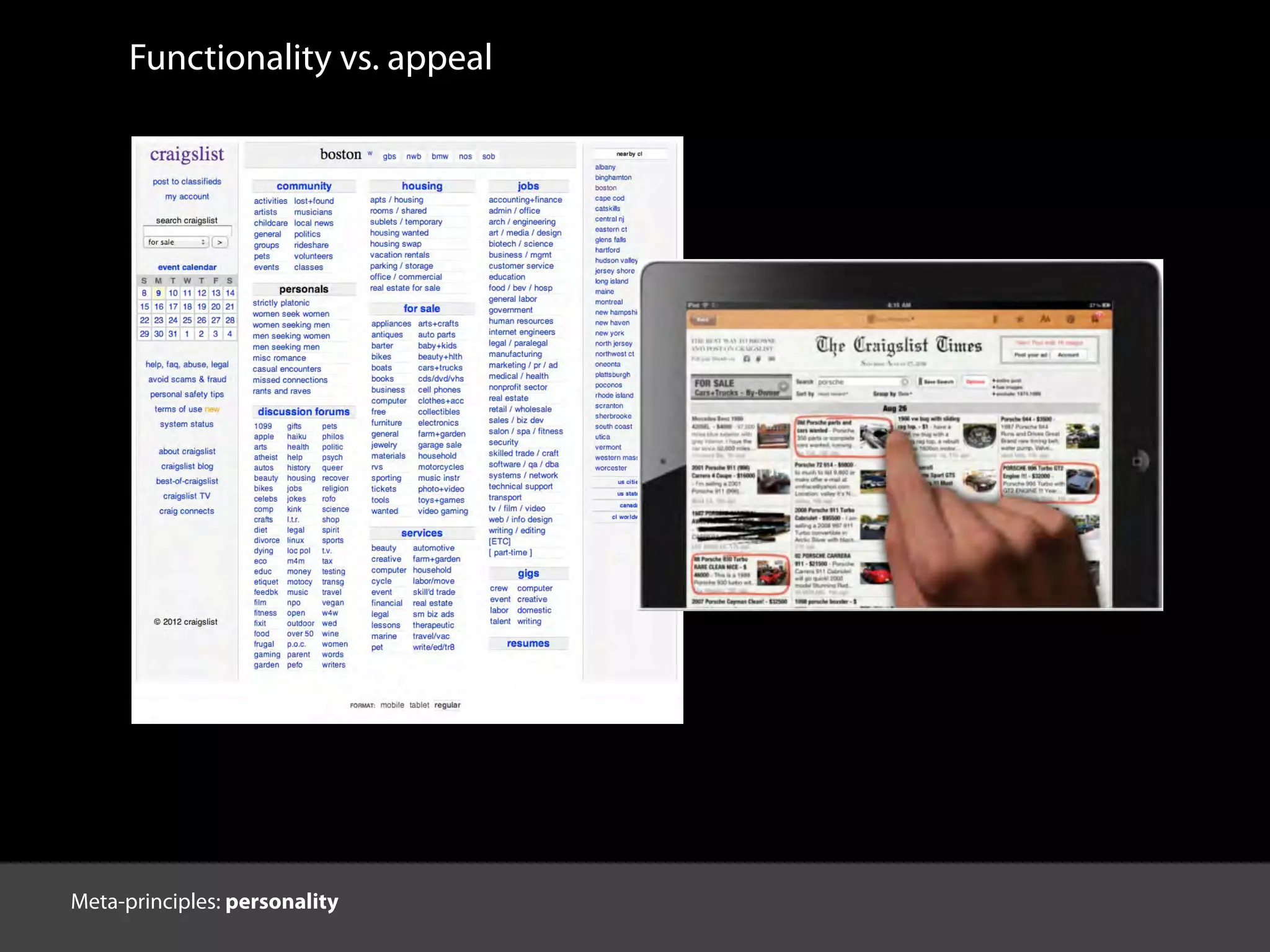
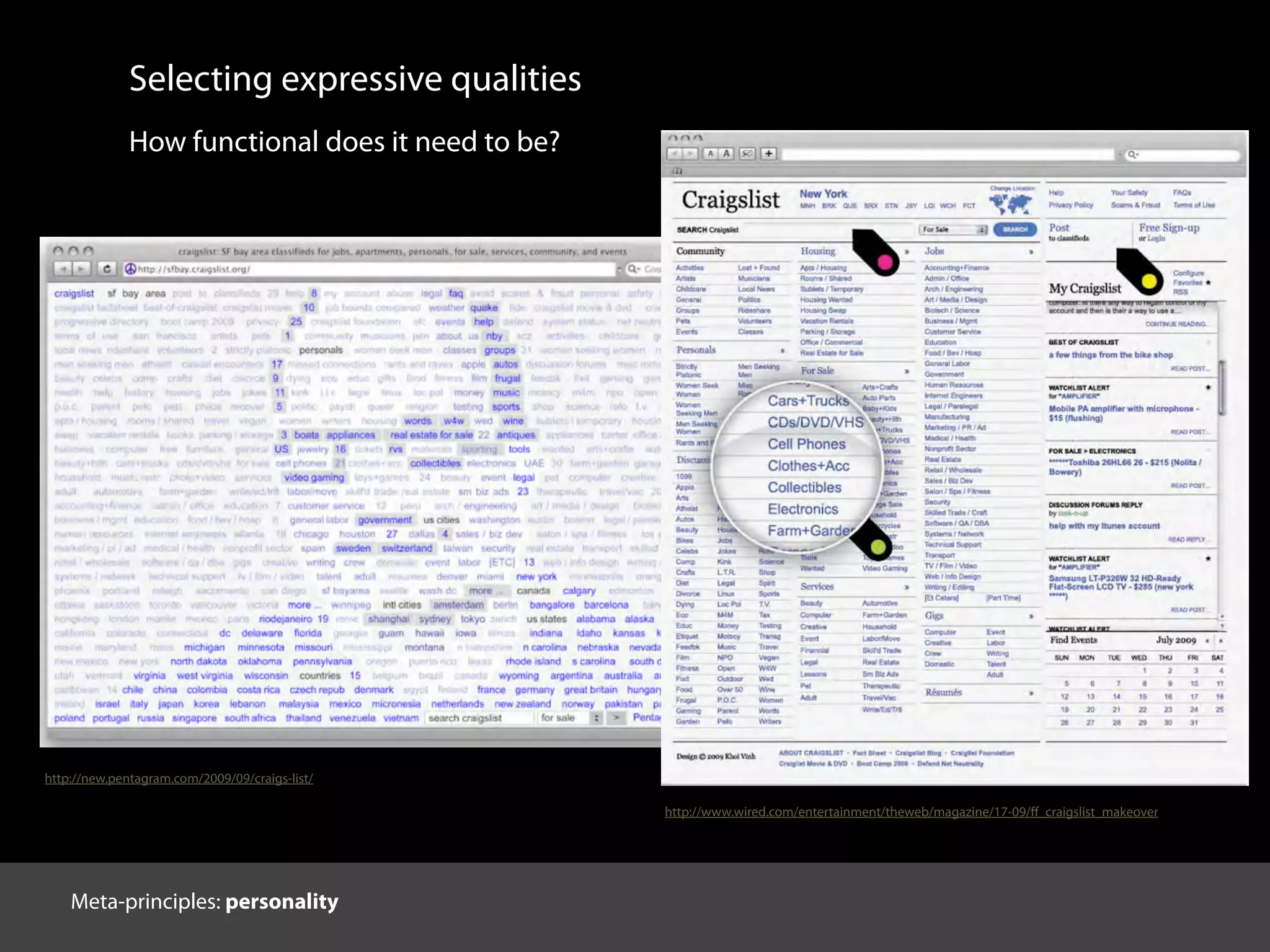
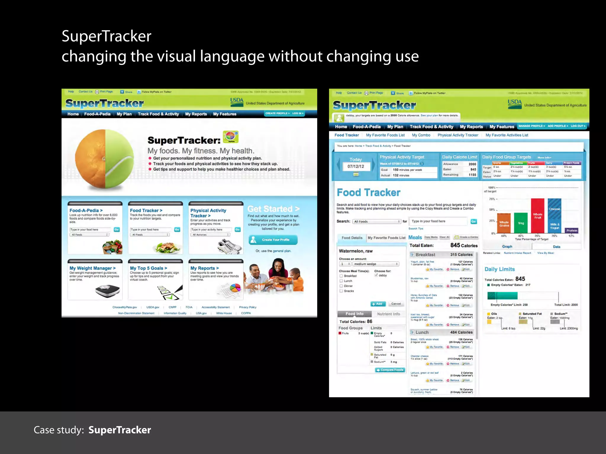
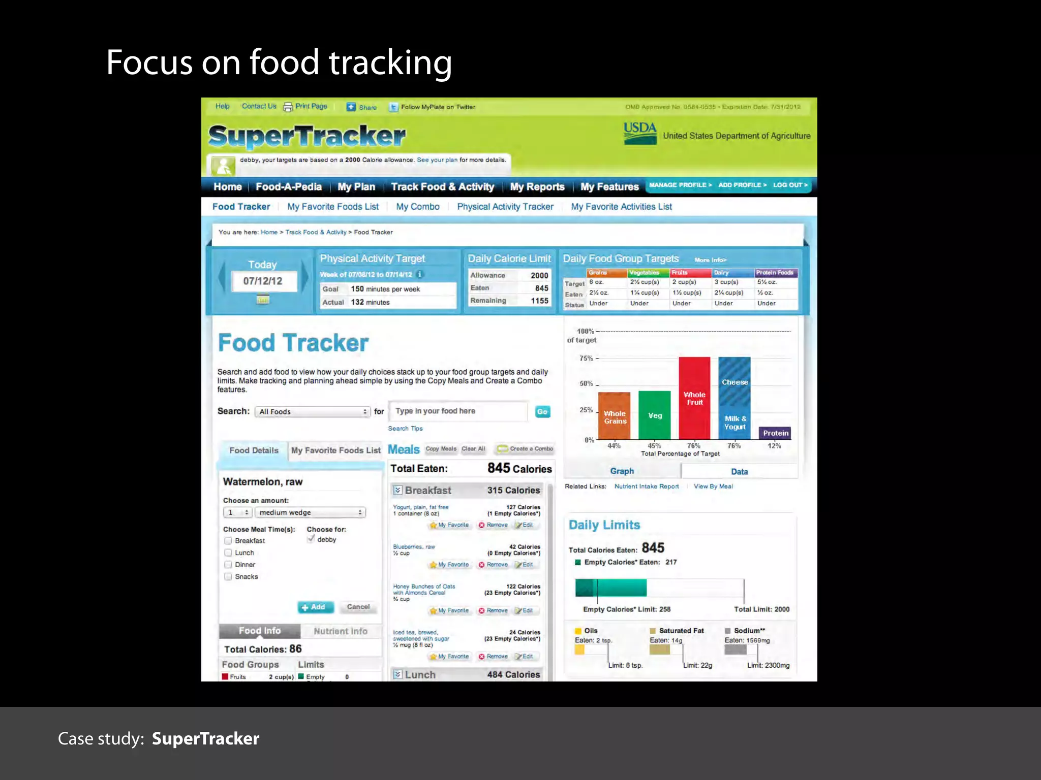

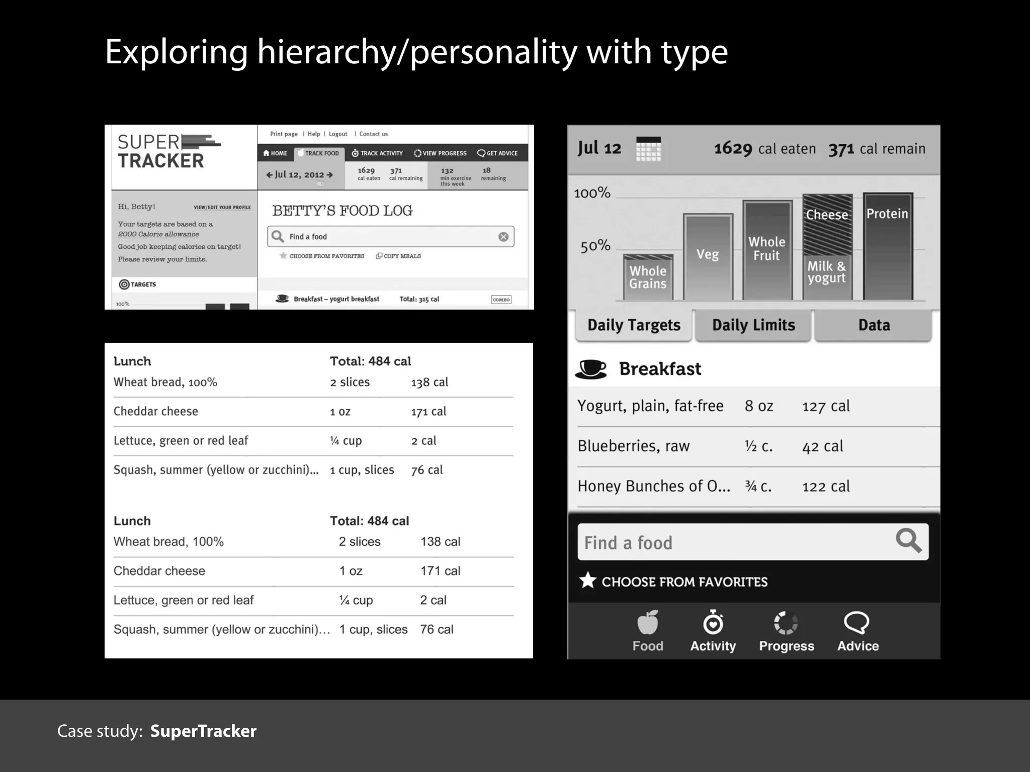


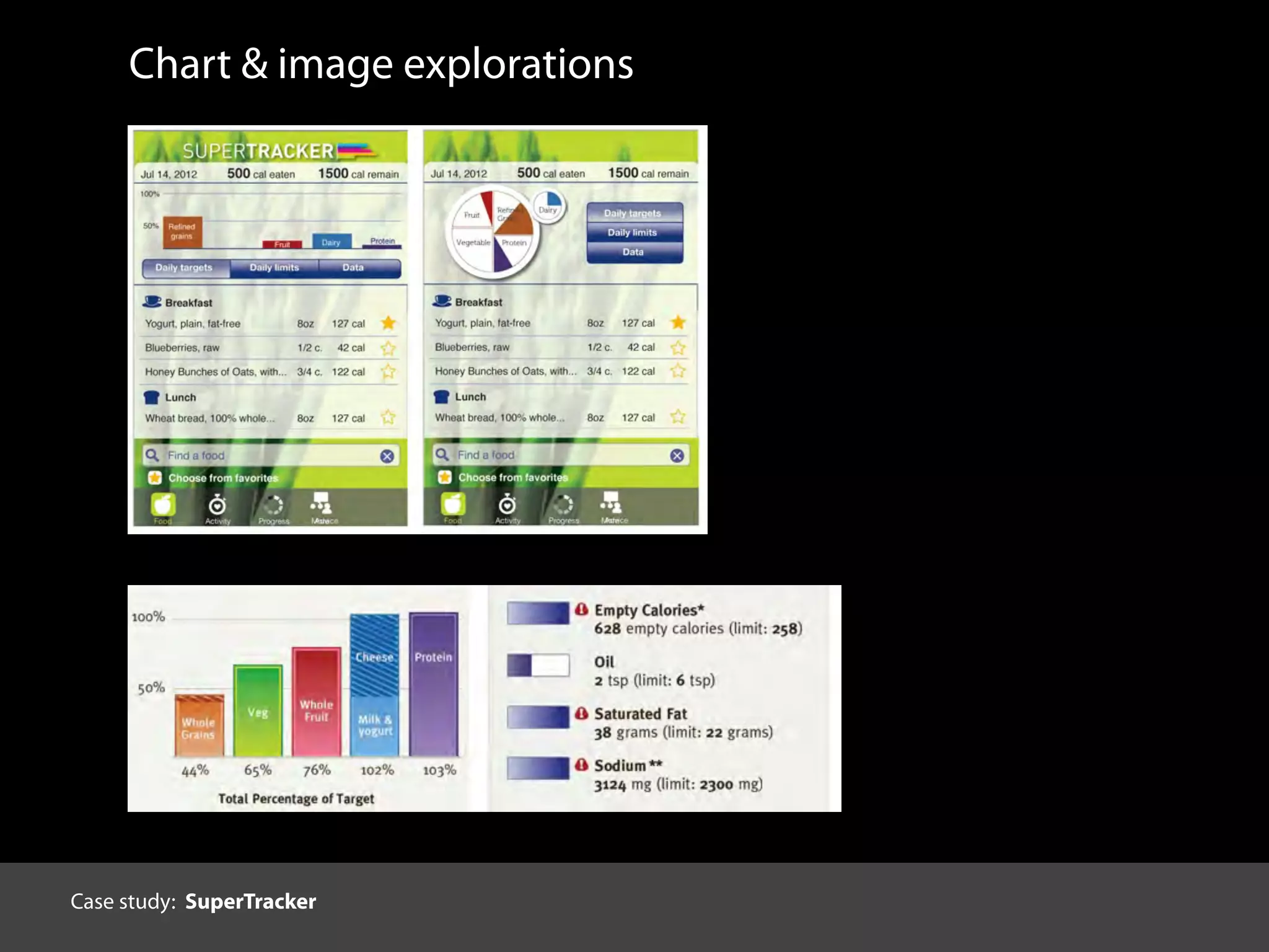
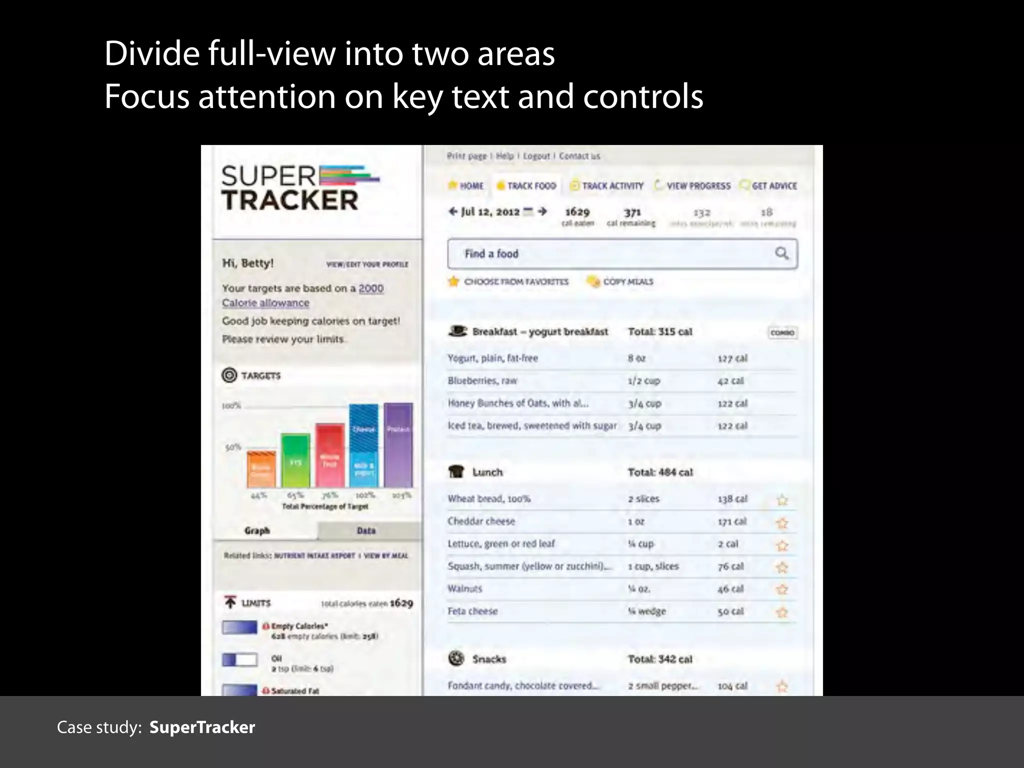
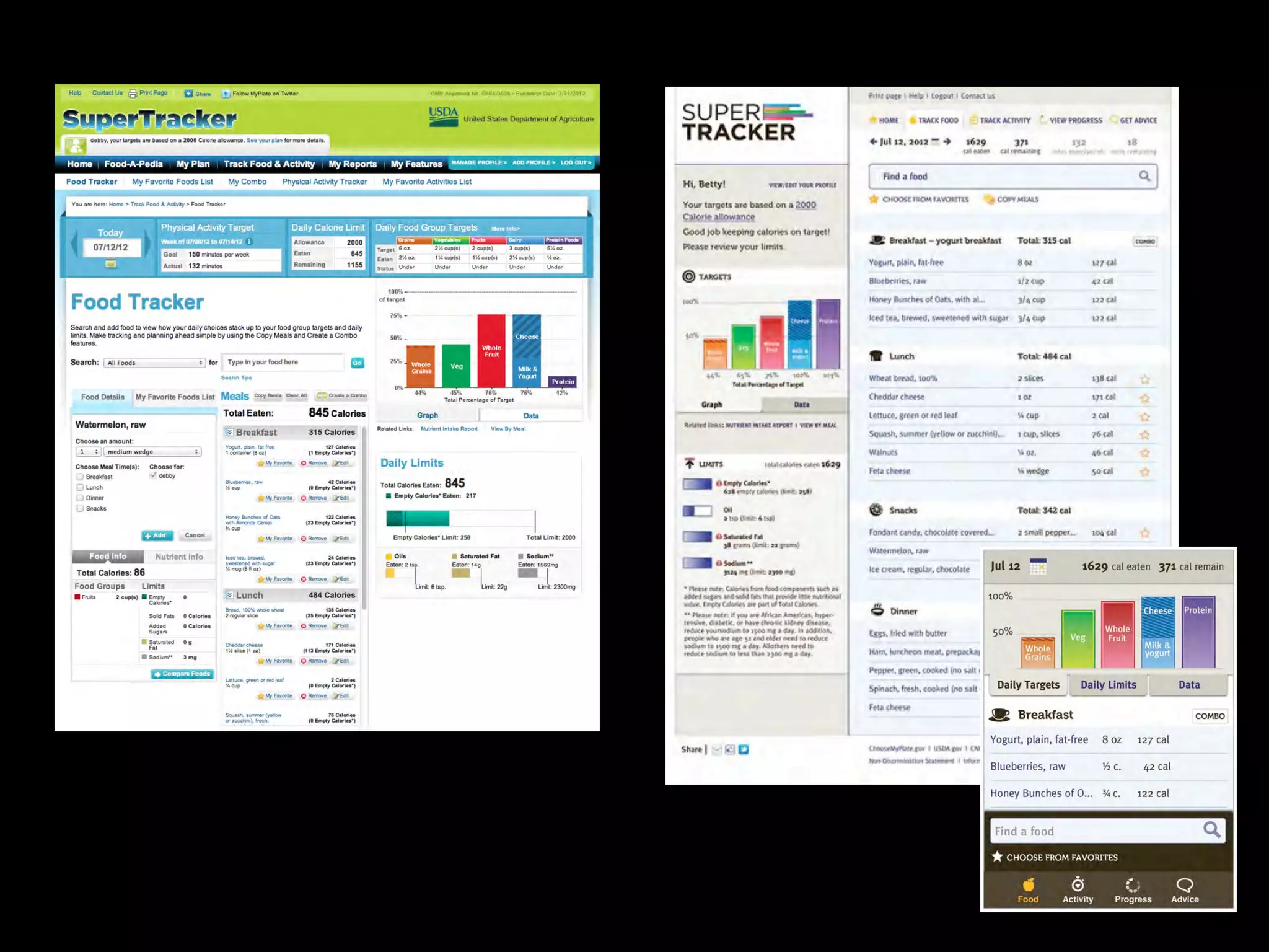

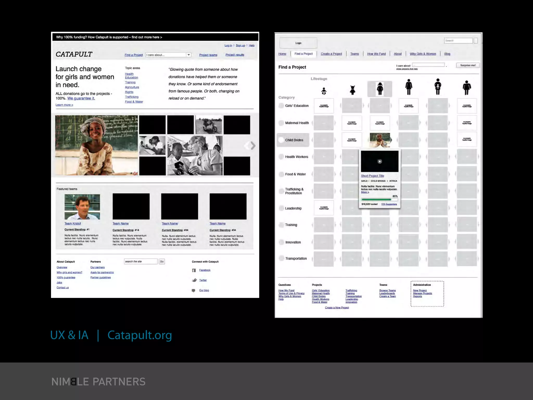
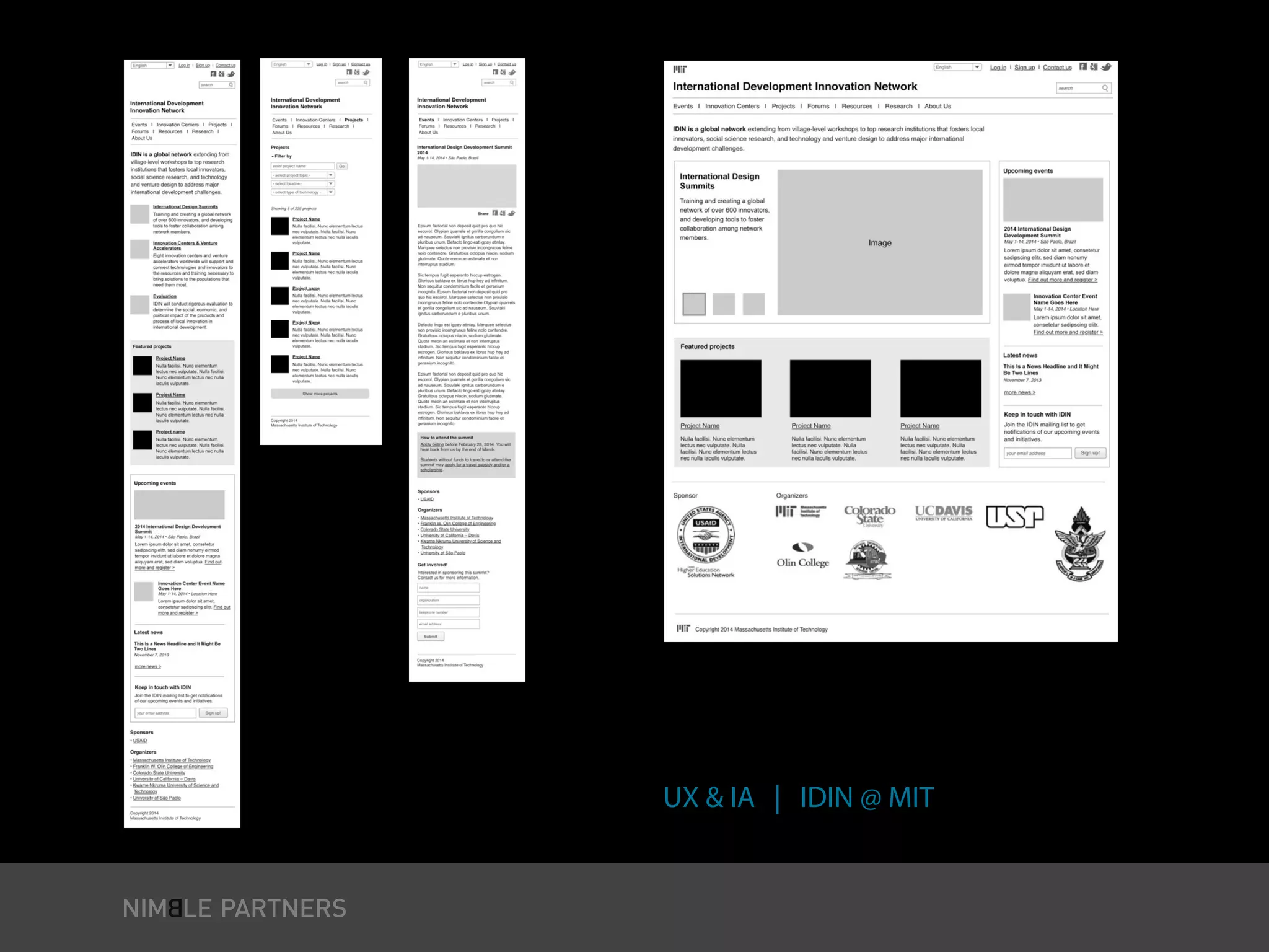
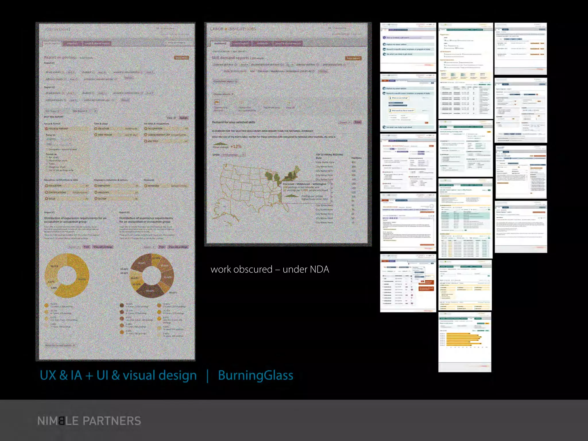
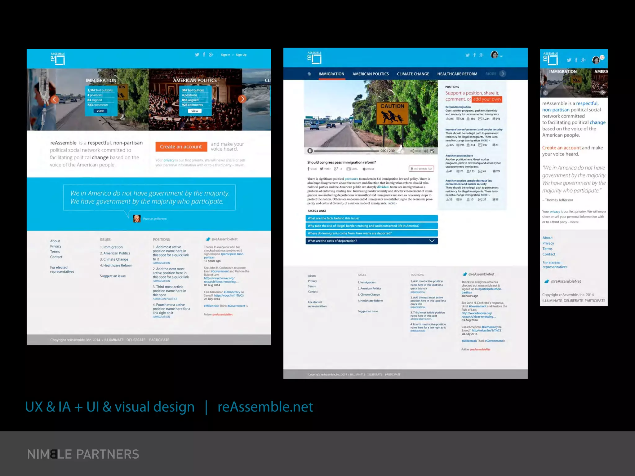
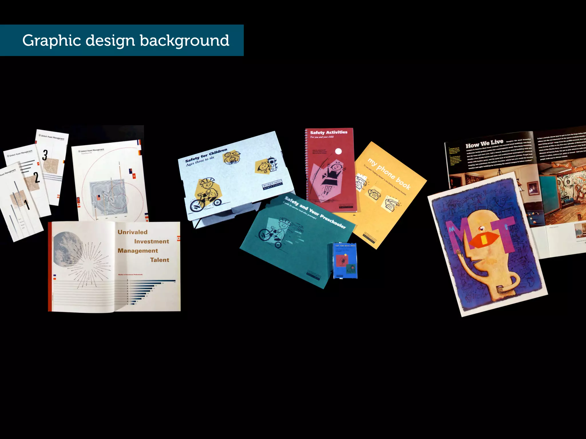
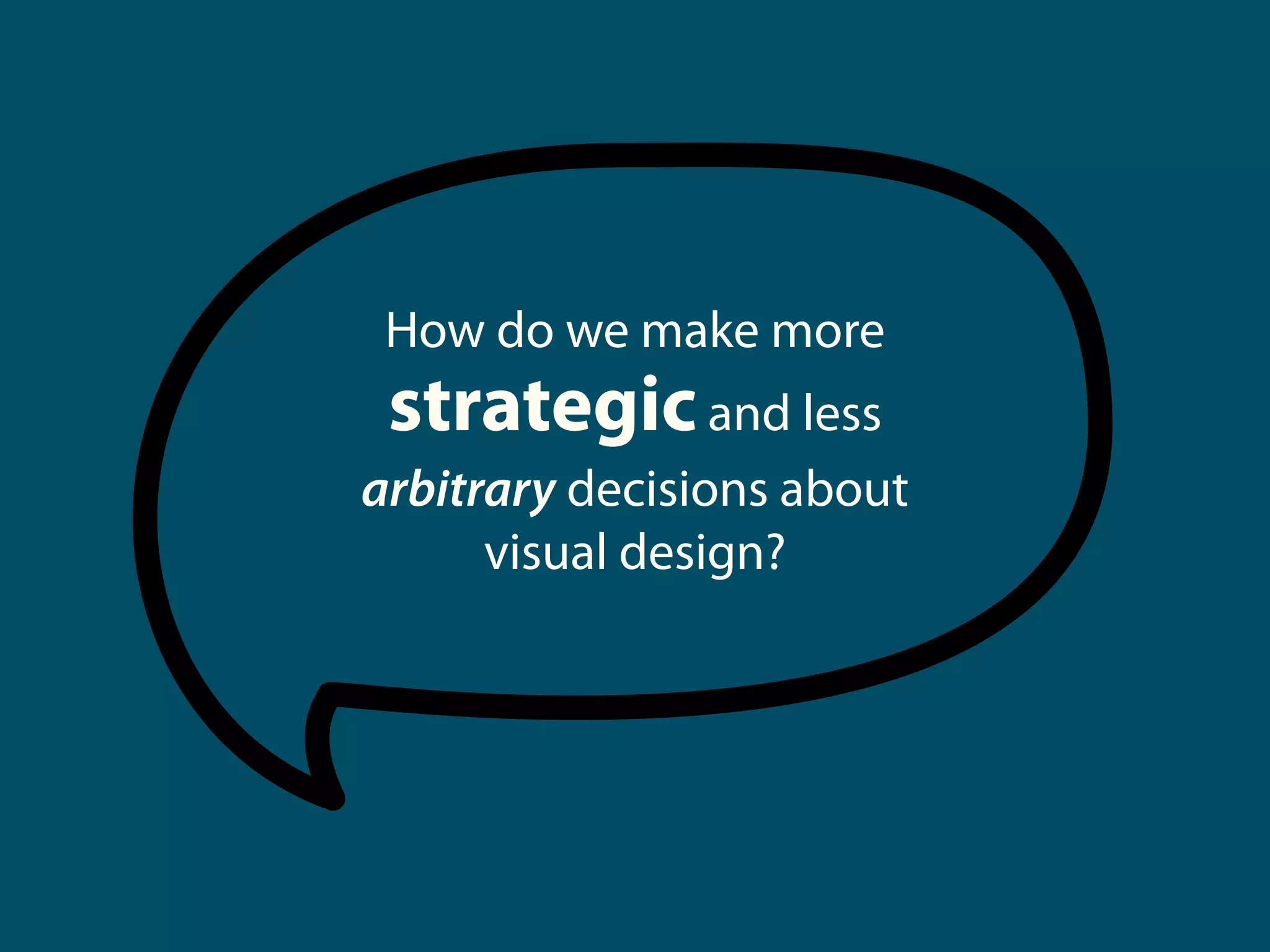
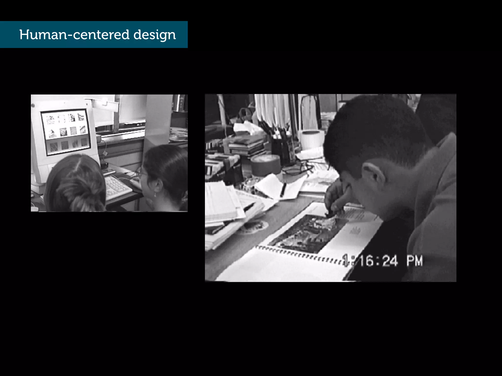
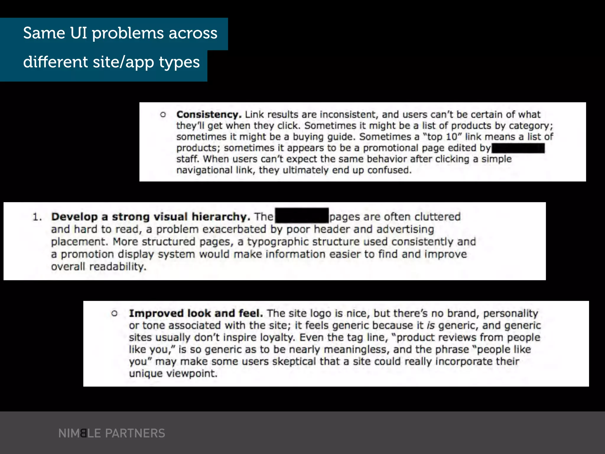
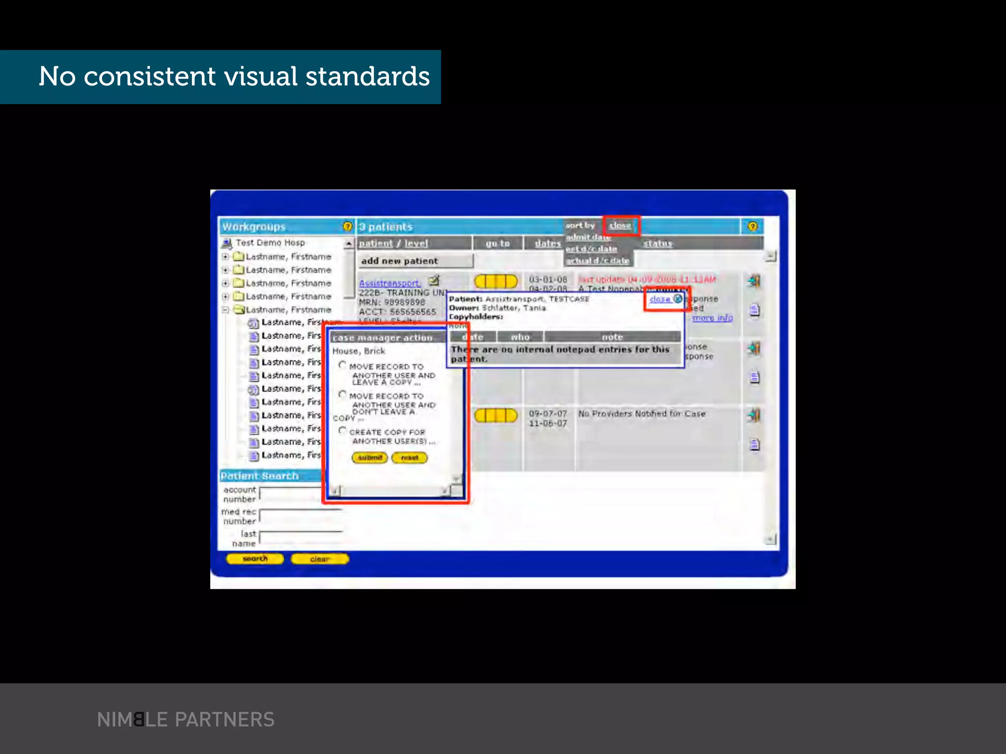
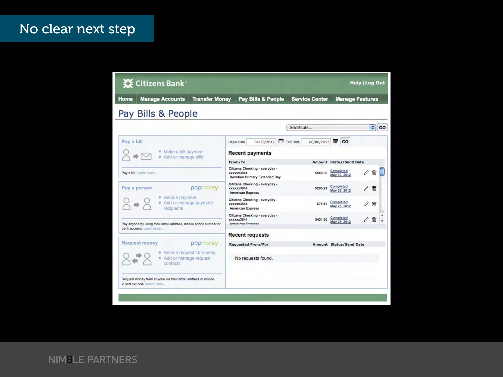
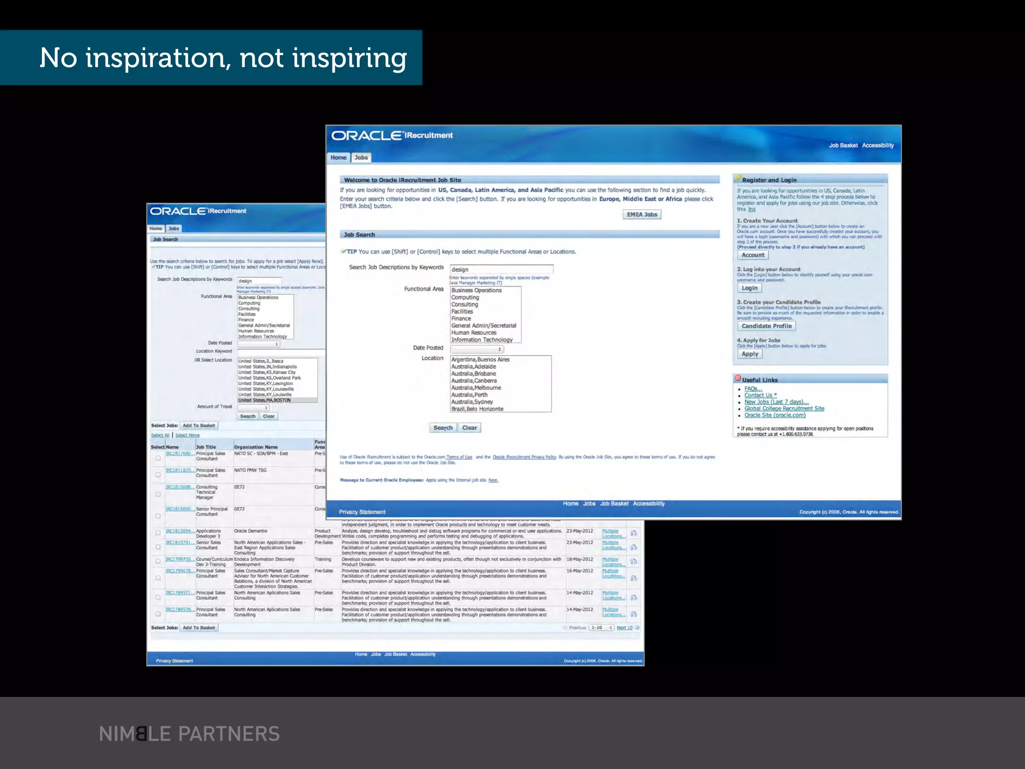
The document discusses the integration of visual design and usability, emphasizing the importance of consistency, hierarchy, and personality in UI design. It highlights how users perceive interfaces and the role of visual language in communication, supported by case studies like SuperTracker that illustrate these principles in practice. Key meta-principles outline the need for strategic decision-making regarding aesthetics to enhance user experience and acceptance of applications.


![Vibe Coding vs. Spec-Driven Development [Free Meetup]](https://cdn.slidesharecdn.com/ss_thumbnails/vibecodingvsspecdrivendevelopment-251209105622-43f455e7-thumbnail.jpg?width=640&height=640&fit=bounds)


