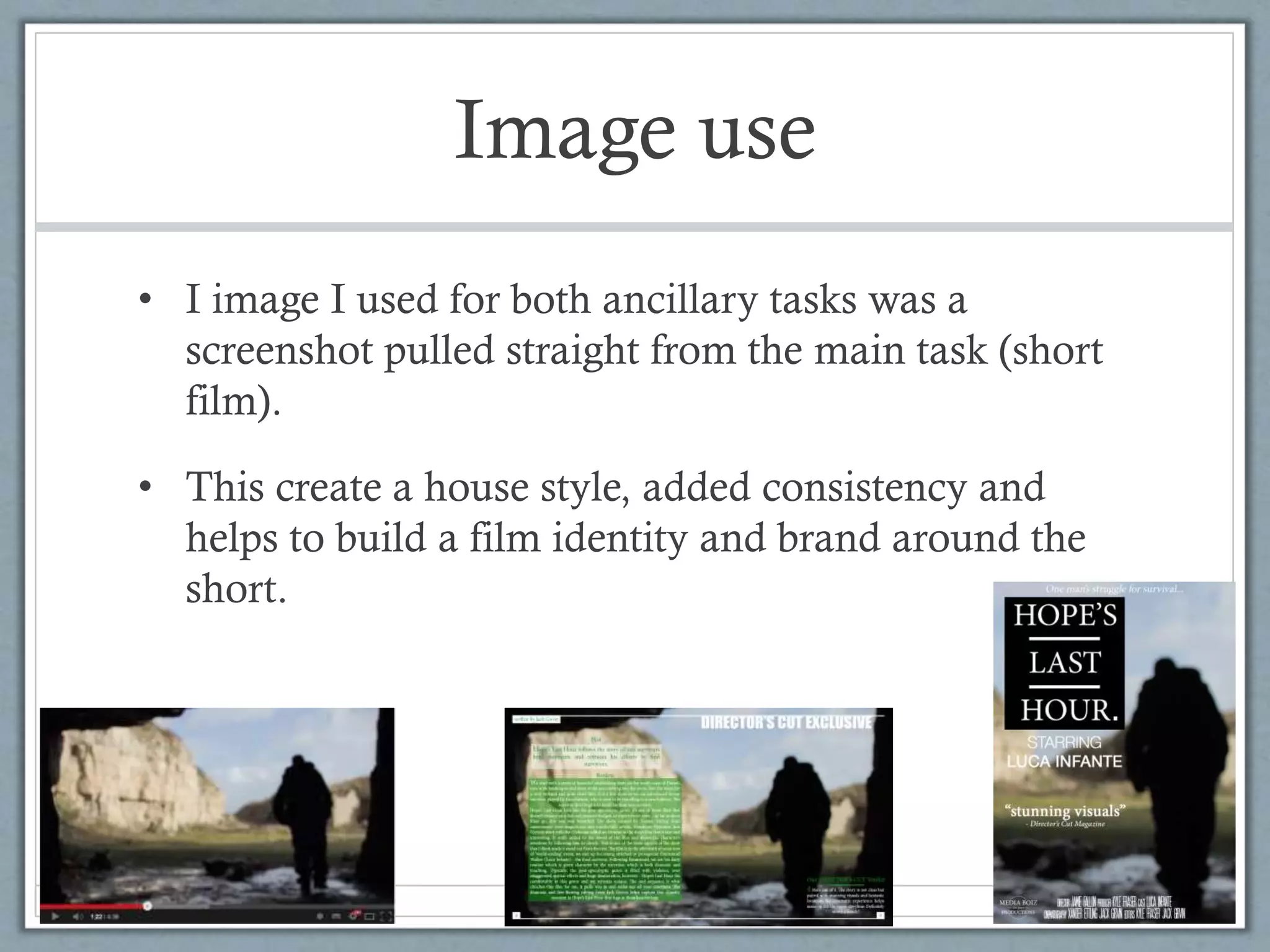
How effective is the
combination of your main
product and ancillary texts?
Evaluation Question 2
Image use
• I image I used for both ancillary tasks was a
screenshot pulled straight from the main task (short
film).
• This create a house style, added consistency and
helps to build a film identity and brand around the
short.
Image use continued
• The reason for using this image is because I thought
it was very powerful and showed an insight into the
film’s genre and plot without giving away details.
• It worked well with text and allowed me to have
plenty of work around the main figure within the
image as a background which was useful for the
ancillary tasks.
• It creates a feel for the film across the two ancillary
pieces which is useful for advertising and marketing.
Image use continued
• By using the image across both ancillary tasks it
gives the viewer a familiarity with the film so when
they see it in the film it feels more natural and
anticipated.
• The image itself shows the main characters isolation
and solitude with helps the viewer engage with the
character and empathies with him.
Colour grade
• The colour grading on the image is identical in all
three pieces.
• This means the film poster is an accurate
representation of the look and feel of the short film
itself so the viewer know what kind of short they are
going to watch.
• Sometimes film posters come across as being one
genre when in reality their film is much darker or
much funnier than the film posters grade lets on.
Font use
• In both the title of the short film and also in both
ancillary pieces the same font of: Minion Pro
• By using the same font it adds to a house style across
all three pieces and again we start to see a brand and
an identity of the short film emerging.
• It means when the viewers see that font they begin to
associate it with the short film.
• Importantly it gives a clear and consistent feel of the
film as we see a theme/trend across all three pieces.
Font use examples
The body text of
the magazine
and the title text
of the film
poster are both
Minion Pro. As
well as the film
title which is
very similar to
the title shown
on the film
poster.
Conclusion
• In conclusion I think that the combination of the
three pieces work very well in creating a house style
and theme.
• They work together to give the short film a brand
and an identity through the use of font selection and
consistent image use.
• The two ancillary pieces give an insight and feed
into the short film accurately and represent the short
film correctly and well.

How effective is the combination of your main product and ancillary texts?

  • 1.
    How effective isthe combination of your main product and ancillary texts? Evaluation Question 2
  • 2.
    Image use • Iimage I used for both ancillary tasks was a screenshot pulled straight from the main task (short film). • This create a house style, added consistency and helps to build a film identity and brand around the short.
  • 3.
    Image use continued •The reason for using this image is because I thought it was very powerful and showed an insight into the film’s genre and plot without giving away details. • It worked well with text and allowed me to have plenty of work around the main figure within the image as a background which was useful for the ancillary tasks. • It creates a feel for the film across the two ancillary pieces which is useful for advertising and marketing.
  • 4.
    Image use continued •By using the image across both ancillary tasks it gives the viewer a familiarity with the film so when they see it in the film it feels more natural and anticipated. • The image itself shows the main characters isolation and solitude with helps the viewer engage with the character and empathies with him.
  • 5.
    Colour grade • Thecolour grading on the image is identical in all three pieces. • This means the film poster is an accurate representation of the look and feel of the short film itself so the viewer know what kind of short they are going to watch. • Sometimes film posters come across as being one genre when in reality their film is much darker or much funnier than the film posters grade lets on.
  • 6.
    Font use • Inboth the title of the short film and also in both ancillary pieces the same font of: Minion Pro • By using the same font it adds to a house style across all three pieces and again we start to see a brand and an identity of the short film emerging. • It means when the viewers see that font they begin to associate it with the short film. • Importantly it gives a clear and consistent feel of the film as we see a theme/trend across all three pieces.
  • 7.
    Font use examples Thebody text of the magazine and the title text of the film poster are both Minion Pro. As well as the film title which is very similar to the title shown on the film poster.
  • 8.
    Conclusion • In conclusionI think that the combination of the three pieces work very well in creating a house style and theme. • They work together to give the short film a brand and an identity through the use of font selection and consistent image use. • The two ancillary pieces give an insight and feed into the short film accurately and represent the short film correctly and well.