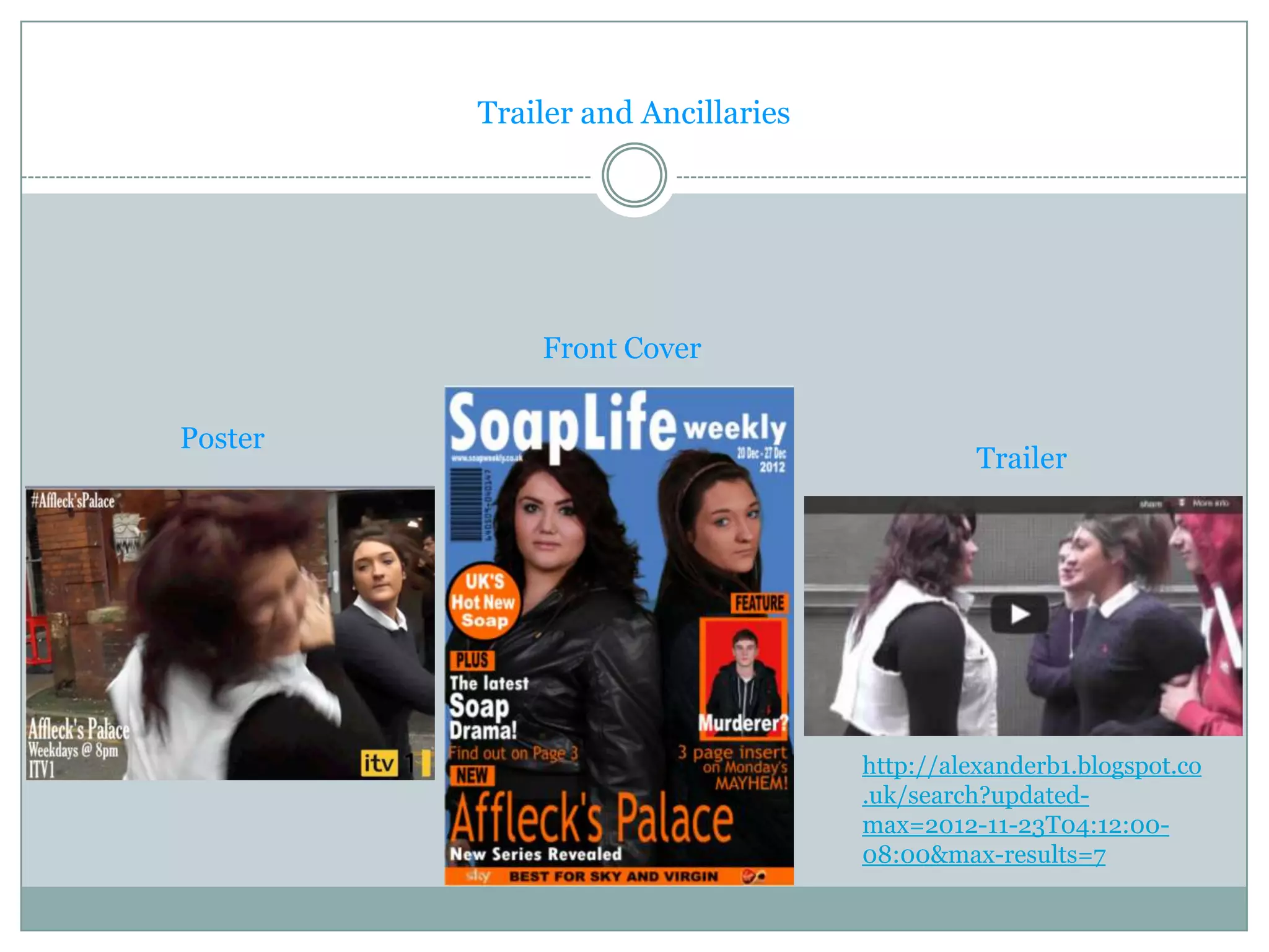
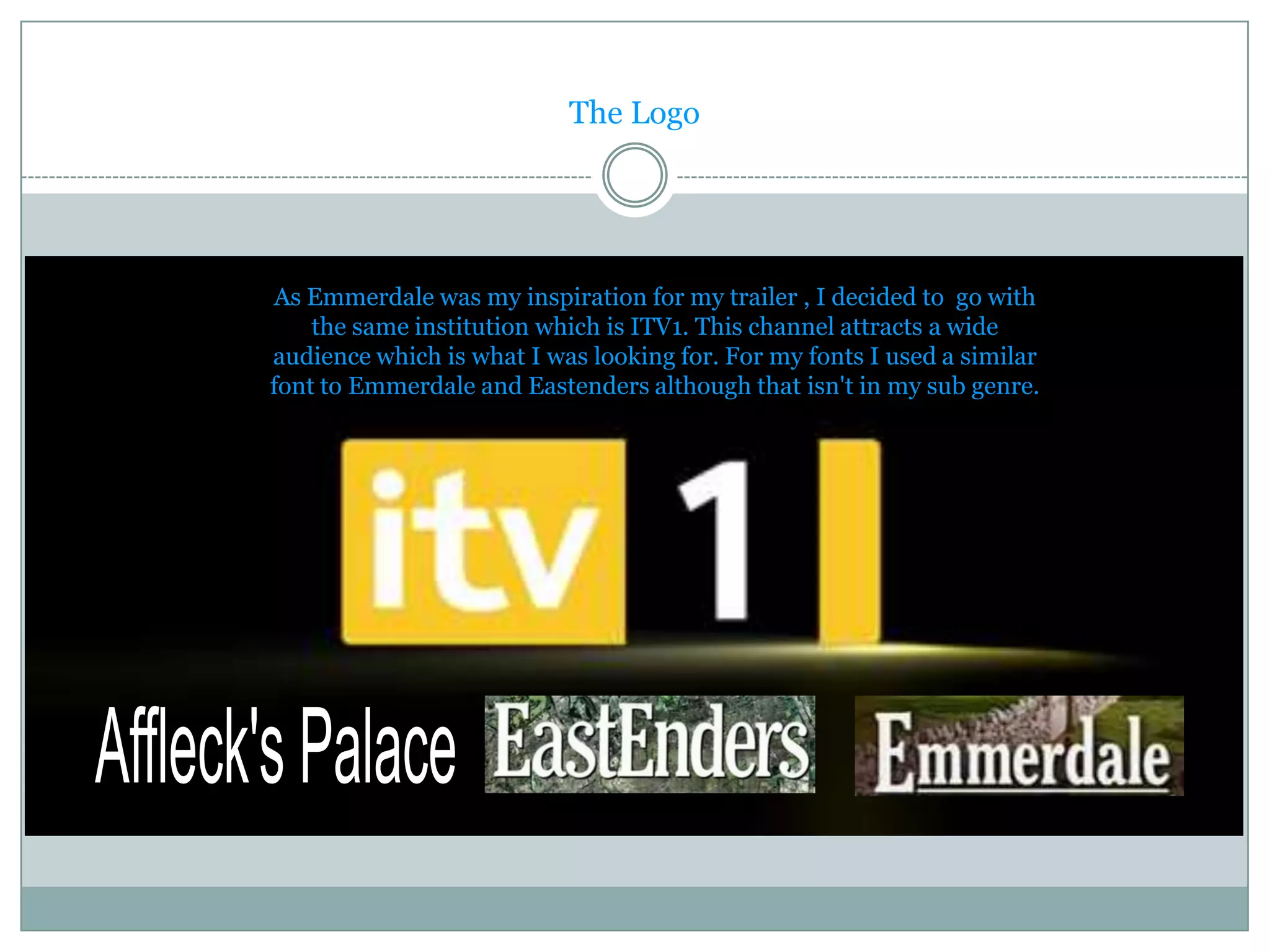
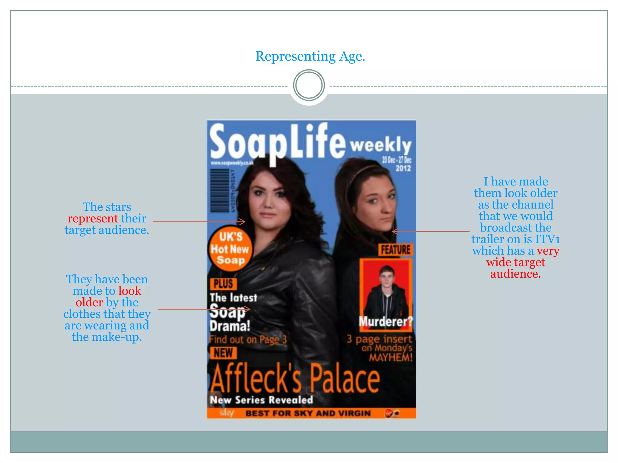
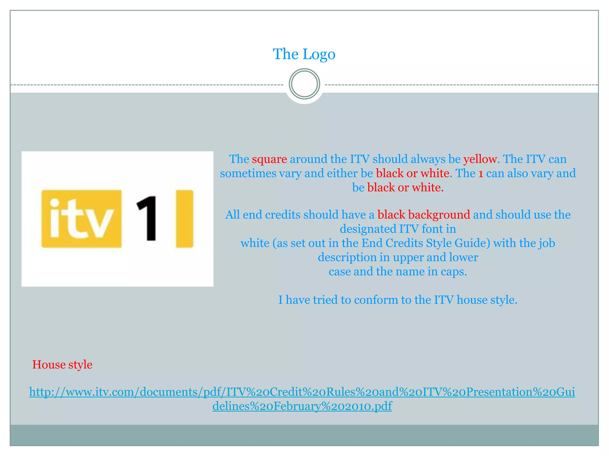
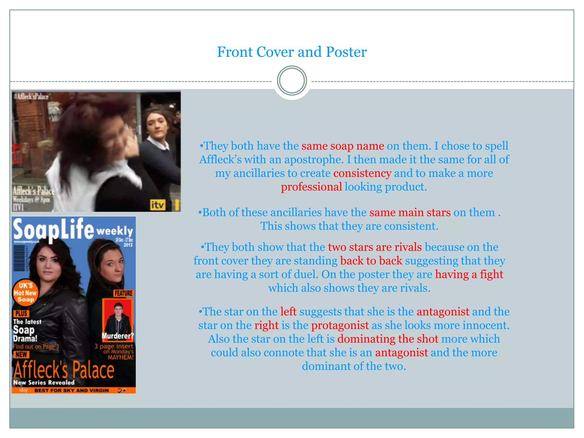
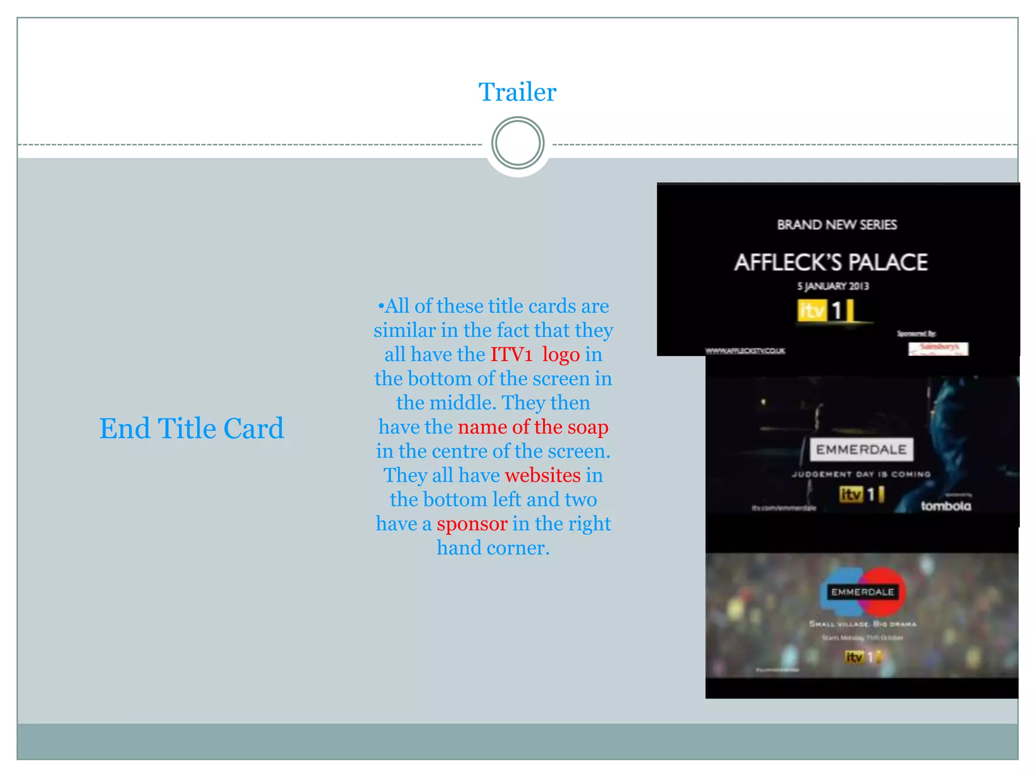
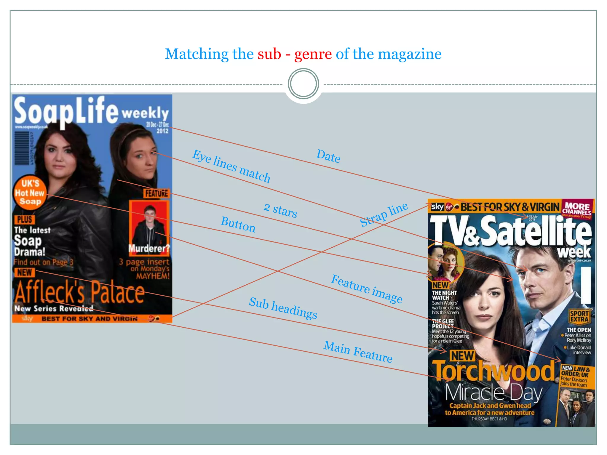
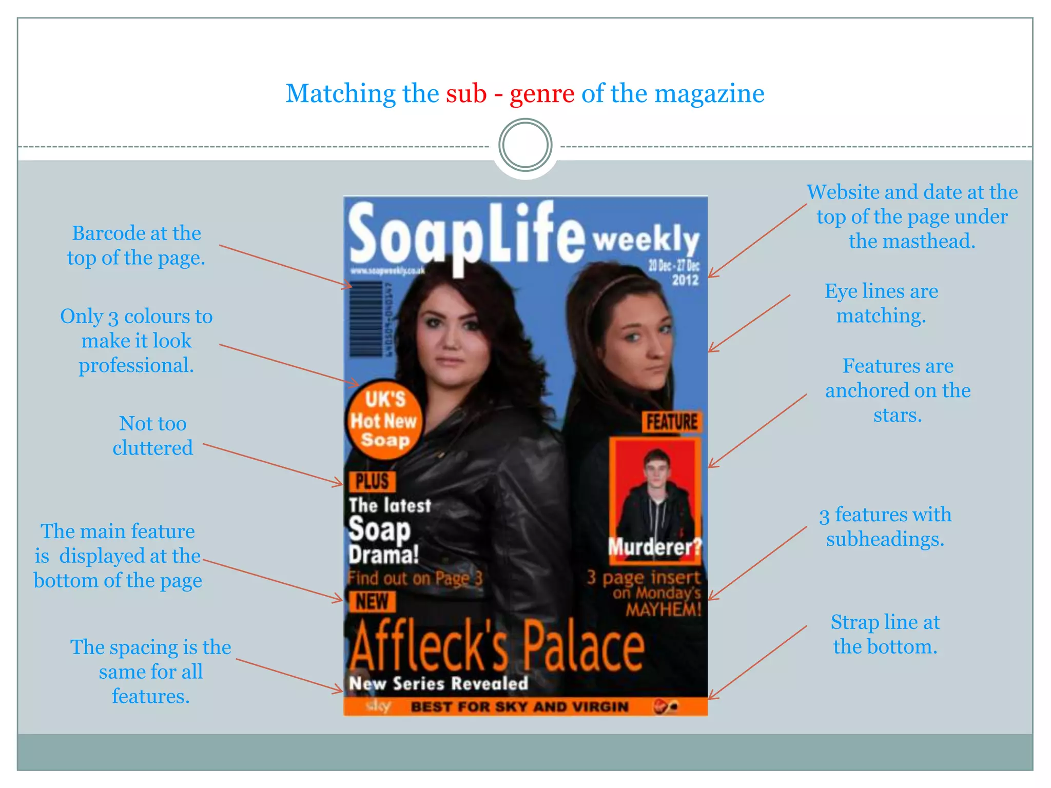
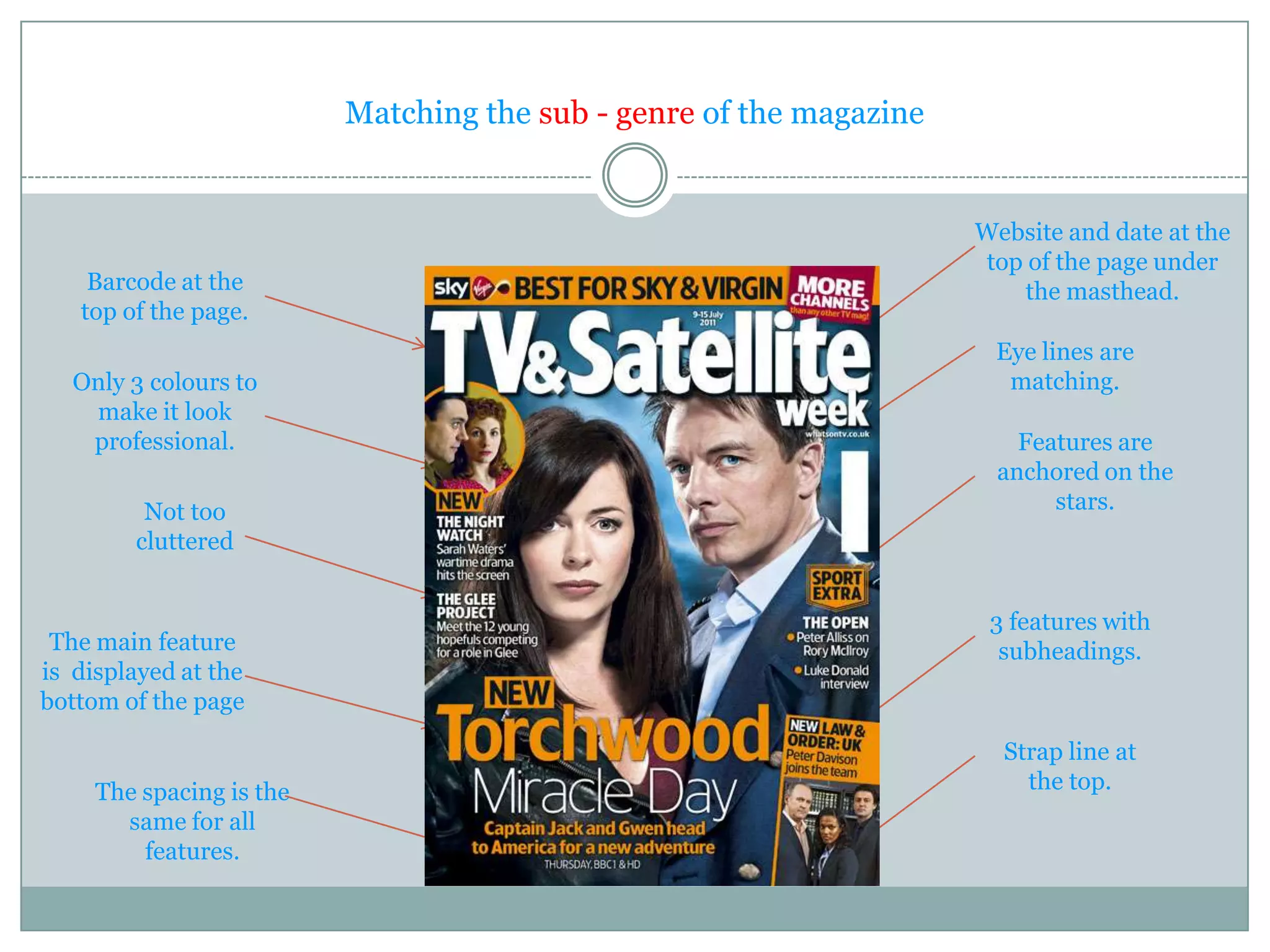
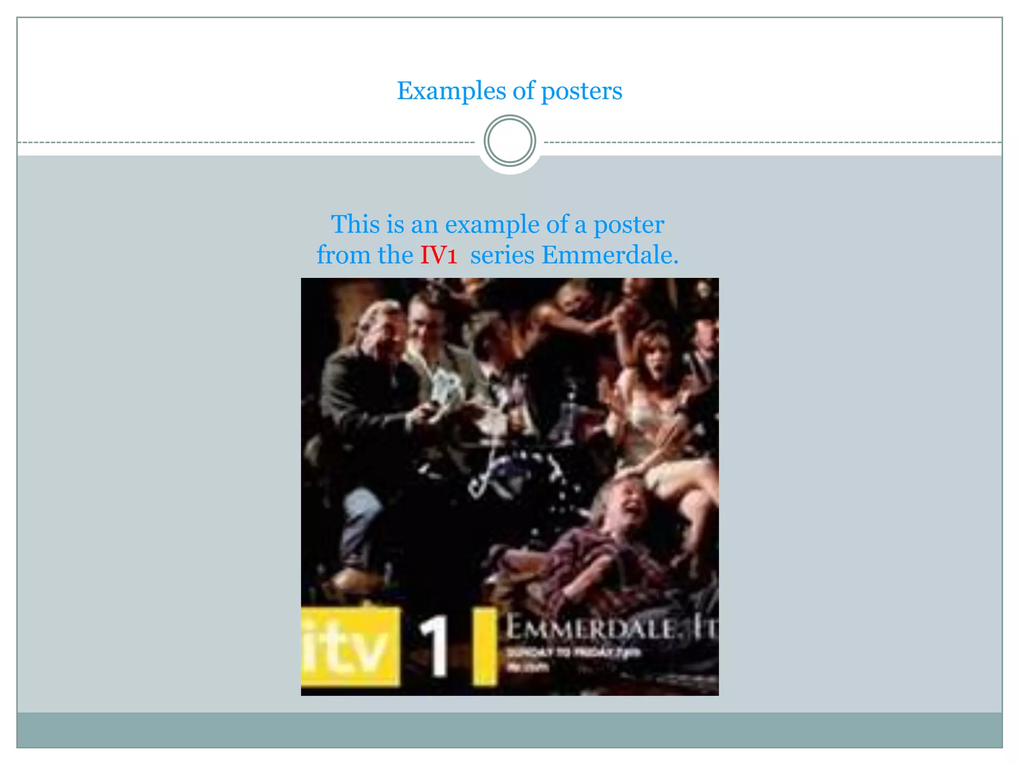
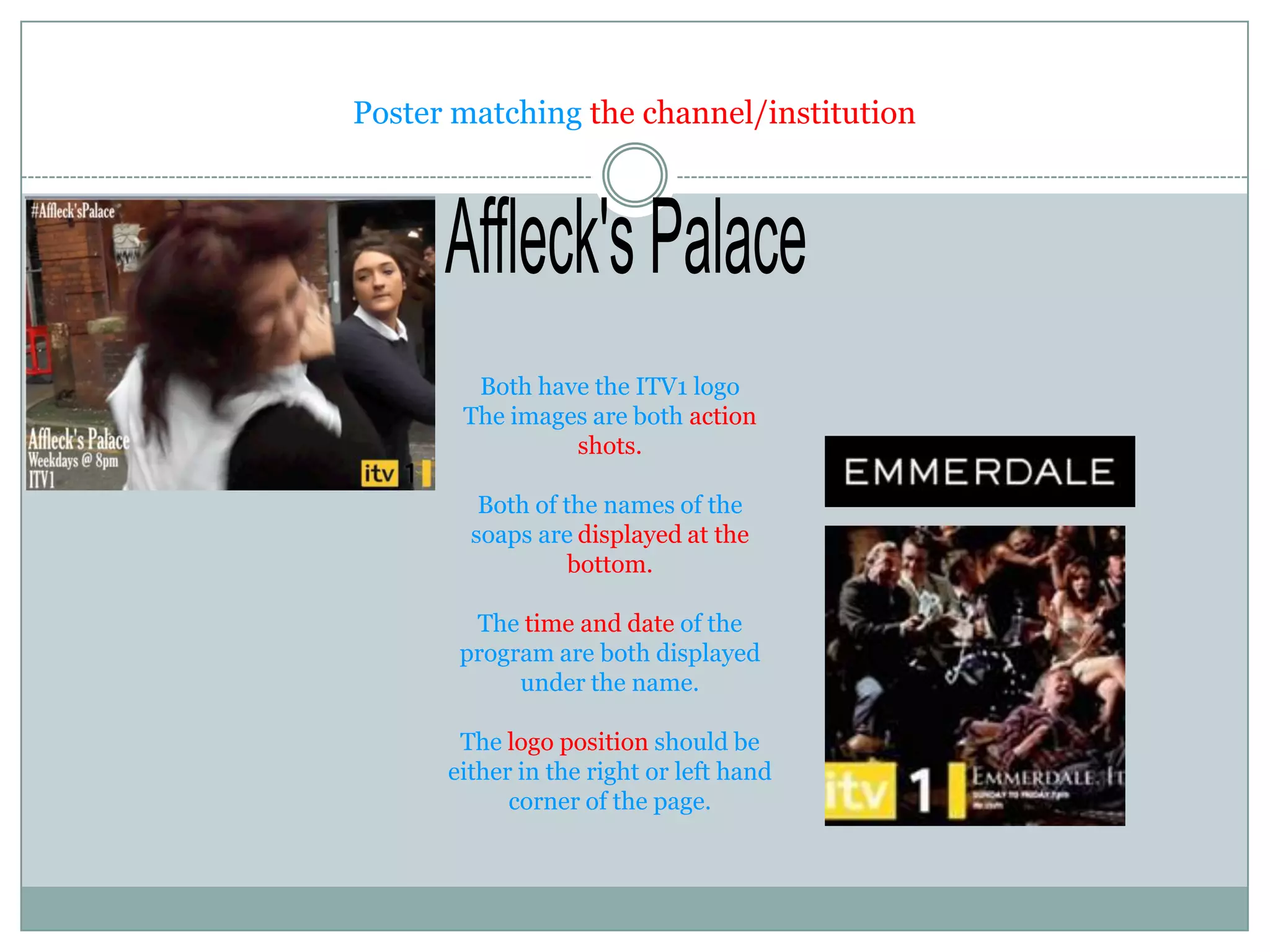
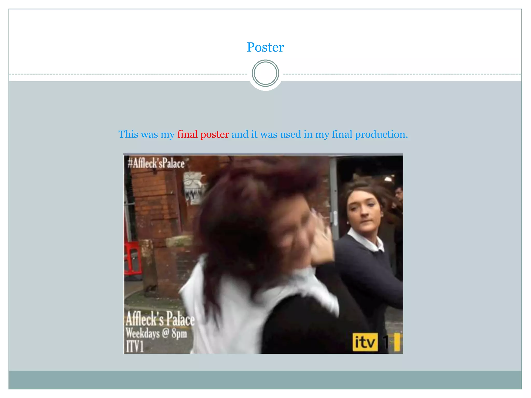
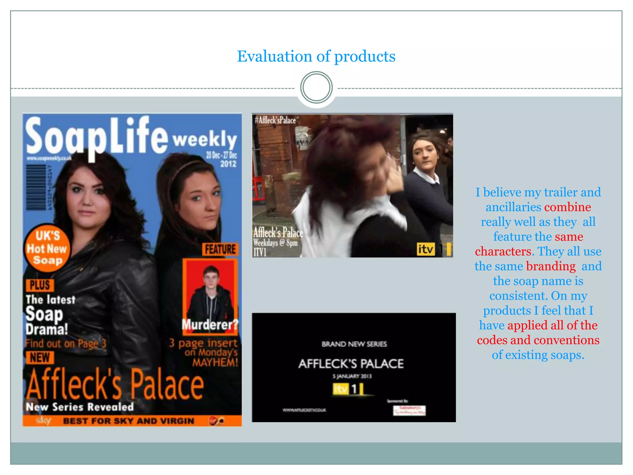
Question 2


How effective is the combination of your main and ancillary products?
Trailer and Ancillaries


             Front Cover

Poster
                                             Trailer


                                   http://alexanderb1.blogspot.co
                                   .uk/search?updated-
                                   max=2012-11-23T04:12:00-
                                   08:00&max-results=7
The Logo


As Emmerdale was my inspiration for my trailer , I decided to go with
    the same institution which is ITV1. This channel attracts a wide
audience which is what I was looking for. For my fonts I used a similar
font to Emmerdale and Eastenders although that isn't in my sub genre.
Representing Age.


                                           I have made
                                         them look older
    The stars                             as the channel
 represent their                          that we would
target audience.                          broadcast the
                                        trailer on is ITV1
                                        which has a very
                                            wide target
They have been                               audience.
  made to look
   older by the
clothes that they
are wearing and
  the make-up.
The Logo


                                The square around the ITV should always be yellow. The ITV can
                              sometimes vary and either be black or white. The 1 can also vary and
                                                      be black or white.

                               All end credits should have a black background and should use the
                                                      designated ITV font in
                                  white (as set out in the End Credits Style Guide) with the job
                                                 description in upper and lower
                                                    case and the name in caps.

                                         I have tried to conform to the ITV house style.


House style

http://www.itv.com/documents/pdf/ITV%20Credit%20Rules%20and%20ITV%20Presentation%20Gui
                              delines%20February%202010.pdf
Front Cover and Poster


 •They both have the same soap name on them. I chose to spell
 Affleck’s with an apostrophe. I then made it the same for all of
    my ancillaries to create consistency and to make a more
                  professional looking product.

•Both of these ancillaries have the same main stars on them .
             This shows that they are consistent.
  •They both show that the two stars are rivals because on the
front cover they are standing back to back suggesting that they
 are having a sort of duel. On the poster they are having a fight
                which also shows they are rivals.

•The star on the left suggests that she is the antagonist and the
star on the right is the protagonist as she looks more innocent.
  Also the star on the left is dominating the shot more which
   could also connote that she is an antagonist and the more
                       dominant of the two.
Trailer


                 •All of these title cards are
                 similar in the fact that they
                   all have the ITV1 logo in
                 the bottom of the screen in
                     the middle. They then
End Title Card    have the name of the soap
                 in the centre of the screen.
                  They all have websites in
                    the bottom left and two
                 have a sponsor in the right
                         hand corner.
Matching the sub - genre of the magazine


                                                                    Website and date at the
                                                                    top of the page under
    Barcode at the                                                     the masthead.
   top of the page.
                                                                     Eye lines are
   Only 3 colours to                                                  matching.
    make it look
    professional.                                                       Features are
                                                                      anchored on the
         Not too                                                           stars.
        cluttered


                                                                     3 features with
 The main feature                                                     subheadings.
is displayed at the
bottom of the page

                                                                      Strap line at
    The spacing is the                                                the bottom.
      same for all
        features.
Matching the sub - genre of the magazine


                                                                     Website and date at the
                                                                     top of the page under
    Barcode at the                                                      the masthead.
   top of the page.
                                                                      Eye lines are
   Only 3 colours to                                                   matching.
    make it look
    professional.                                                        Features are
                                                                       anchored on the
         Not too                                                            stars.
        cluttered


                                                                      3 features with
 The main feature                                                      subheadings.
is displayed at the
bottom of the page

                                                                       Strap line at
     The spacing is the                                                  the top.
       same for all
         features.
Audience


 The TV easy magazine caters
for a much younger audience.
  We know this by the use of
 colours. For example, on the
   TV easy mag there are 7
 colours on there, whereas on
   mine there is only 3. This
     creates a much more
professional looking product.

The stars on the TV easy mag
are all young implying that it
 is aiming for a young target
           market.
Examples of posters


  This is an example of a poster
from the IV1 series Emmerdale.
Poster matching the channel/institution


        Both have the ITV1 logo
       The images are both action
                shots.

         Both of the names of the
        soaps are displayed at the
                  bottom.

        The time and date of the
       program are both displayed
            under the name.

       The logo position should be
      either in the right or left hand
            corner of the page.
Poster


This was my final poster and it was used in my final production.
Evaluation of products


                         I believe my trailer and
                            ancillaries combine
                           really well as they all
                              feature the same
                         characters. They all use
                         the same branding and
                              the soap name is
                             consistent. On my
                           products I feel that I
                          have applied all of the
                          codes and conventions
                             of existing soaps.

A2 media coursework evaluation q2

  • 1.
    Question 2 How effectiveis the combination of your main and ancillary products?
  • 2.
    Trailer and Ancillaries Front Cover Poster Trailer http://alexanderb1.blogspot.co .uk/search?updated- max=2012-11-23T04:12:00- 08:00&max-results=7
  • 3.
    The Logo As Emmerdalewas my inspiration for my trailer , I decided to go with the same institution which is ITV1. This channel attracts a wide audience which is what I was looking for. For my fonts I used a similar font to Emmerdale and Eastenders although that isn't in my sub genre.
  • 4.
    Representing Age. I have made them look older The stars as the channel represent their that we would target audience. broadcast the trailer on is ITV1 which has a very wide target They have been audience. made to look older by the clothes that they are wearing and the make-up.
  • 5.
    The Logo The square around the ITV should always be yellow. The ITV can sometimes vary and either be black or white. The 1 can also vary and be black or white. All end credits should have a black background and should use the designated ITV font in white (as set out in the End Credits Style Guide) with the job description in upper and lower case and the name in caps. I have tried to conform to the ITV house style. House style http://www.itv.com/documents/pdf/ITV%20Credit%20Rules%20and%20ITV%20Presentation%20Gui delines%20February%202010.pdf
  • 6.
    Front Cover andPoster •They both have the same soap name on them. I chose to spell Affleck’s with an apostrophe. I then made it the same for all of my ancillaries to create consistency and to make a more professional looking product. •Both of these ancillaries have the same main stars on them . This shows that they are consistent. •They both show that the two stars are rivals because on the front cover they are standing back to back suggesting that they are having a sort of duel. On the poster they are having a fight which also shows they are rivals. •The star on the left suggests that she is the antagonist and the star on the right is the protagonist as she looks more innocent. Also the star on the left is dominating the shot more which could also connote that she is an antagonist and the more dominant of the two.
  • 7.
    Trailer •All of these title cards are similar in the fact that they all have the ITV1 logo in the bottom of the screen in the middle. They then End Title Card have the name of the soap in the centre of the screen. They all have websites in the bottom left and two have a sponsor in the right hand corner.
  • 8.
    Matching the sub- genre of the magazine
  • 9.
    Matching the sub- genre of the magazine Website and date at the top of the page under Barcode at the the masthead. top of the page. Eye lines are Only 3 colours to matching. make it look professional. Features are anchored on the Not too stars. cluttered 3 features with The main feature subheadings. is displayed at the bottom of the page Strap line at The spacing is the the bottom. same for all features.
  • 10.
    Matching the sub- genre of the magazine Website and date at the top of the page under Barcode at the the masthead. top of the page. Eye lines are Only 3 colours to matching. make it look professional. Features are anchored on the Not too stars. cluttered 3 features with The main feature subheadings. is displayed at the bottom of the page Strap line at The spacing is the the top. same for all features.
  • 11.
    Audience The TVeasy magazine caters for a much younger audience. We know this by the use of colours. For example, on the TV easy mag there are 7 colours on there, whereas on mine there is only 3. This creates a much more professional looking product. The stars on the TV easy mag are all young implying that it is aiming for a young target market.
  • 12.
    Examples of posters This is an example of a poster from the IV1 series Emmerdale.
  • 13.
    Poster matching thechannel/institution Both have the ITV1 logo The images are both action shots. Both of the names of the soaps are displayed at the bottom. The time and date of the program are both displayed under the name. The logo position should be either in the right or left hand corner of the page.
  • 14.
    Poster This was myfinal poster and it was used in my final production.
  • 15.
    Evaluation of products I believe my trailer and ancillaries combine really well as they all feature the same characters. They all use the same branding and the soap name is consistent. On my products I feel that I have applied all of the codes and conventions of existing soaps.