SlideShare a Scribd company logo
Image: The image for this issue of Kerrang!s double page spread is
about My Chemical Romance, MCR are a rock band and thus suits the
magazine well. The main image takes up the hole of the left page and
the image falls off the page. The other images are a lot smaller and
they are at the bottom of the right page. None of the images are
                            <iframe
looking at the audience as they are images of them performing and
recording. These images are in a dark sepia/black and white contrast
                            src="http://www.slideshare.net/slideshow/em
as they are a rock band this represents them well as it looks dark
and slightly rebellious andbed_code/15609202" width="427"
                             as this is a rock band the dark colours
represent their music well.
                            height="356" frameborder="0"
                                                                                           Box Out: This box out
                            marginwidth="0" marginheight="0"                               highlights the other
Colour Scheme: The colour scrolling="no" style="border:1px solid                           features on the page
scheme is black, white and                                                                 as it stands out from
red. This is because it     #CCC;border-width:1px 1px 0;margin-                            the dark black
represents danger, anger    bottom:5px" allowfullscreen                                    background as this is
and even love, these are                                                                   white.
thing that My Chemical      webkitallowfullscreen mozallowfullscreen>
Romance sing about (in a    </iframe> <div style="margin-bottom:5px">                      Pull Quote: This
‘rock’ way).                                                                               pull quote is what
                            <strong> <a                                                    was said by MCR
Drop Capital: There is a    href="http://www.slideshare.net/perri_94/dou                   during the
                                                                                           interview.
drop capital which shows    ble-page-spread-15609202" title="Double
the reader where to start
reading from in the         page spread" target="_blank">Double page                       Gutter: The gutter
article.                    spread</a> </strong> from <strong><a                           separates the
                                                                                           columns of text.
                            href="http://www.slideshare.net/perri_94"
Heading: The heading for this article is a quote Background: The background is the image
from the artist/band. This target="_blank">perri_94</a></strong> </div>
                            is eye catching and that is on the left side of the double
different from the other headings as this is a    page spread. This as a very dark         Text: The mode of
quote. Some parts of it are bigger and are more   background the it and is followed onto   address is peer to
eye catching than other parts. This is seen in    the right side page to continue the      peer thus informal.
white which also makes the text jump from the     theme.
page.
Heading: The heading of this              Image: This is NME double page spread, the image is of Florence
double page spread is, ‘USA               Welch sat on what looks like a US flag, you can see this because of
got the love’, immediately                the strips that traditionally represent the flag. She is dressed in
you can see the ‘got the                  all black thus making the only colour on the page come from the red
love’ as this is in black                 stripes which match Florence Welch’s hair, she is directly gazing
and is bold compared to the               into the audience which engages the audience.
other text on the page, if
you look closer you can also
see the USA in grey in the
background, this is also                                                                     The Lead: This is
implied in the image with                                                                    the leading
the stripes.                                                                                 paragraph of the
                                                                                             article which is in
                                                                                             bold in comparison
                                                                                             to the other text.
Drop Capital: The drop
capital highlights the
start of the main
article, this is
normally in a different                                                                       Gutter: The gutter
font to the other texts.                                                                      separates the
                                                                                              columns of text.


                           Colour Scheme: The colour scheme for this      Background: The background colour is a
                           NME double page spread is black and white,     grey, slightly lighter than the USA in
                           it has a hint of red that highlight            the background. The background is very
                           certain features of the magazine.              simple and makes the image pop out and
                                                                          become bold.


NME (New Musical Express)
Colour Scheme: The colour scheme for this magazine is
 primarily white and black through the background and
                                                                       Classic Rock
 text, however there is some colour on the page in the
 quotes that are a red colour. There is also colour in the
 box out that highlights the subheading of the box out.


  Text: The mode of
  address is peer to peer
  and very relaxed.


                                                                          Background: The
  Gutter: The gutter                                                      background for this
  separates the columns of                                                magazine if plain white
  text.                                                                   with little features, for
                                                                          example the spade sign
                                                                          that is in a faint grey
                                                                          behind the red quote,
 Drop Capital: The drop
 capital highlights each
 new paragraph start point.

                                                                          Pull Quote: The pull
                                                                          quote is from Steve
Image: The image is eye catching as it is the only image that is in
                                                                          Tyler, this engages the
colour on the page, this could be because the left hand image is          audience as it feels like
modern times and the images that are black and white are from the         he is speaking to them
past. Steve Tyler is dressed like a rock star, looking rebelish with      personally.
no top, jeans and boots, this is typical for his style and genre.
Steve is also making direct gaze with the audience, in the black and
white images he looks like he was on stage performing with his band
Aerosmith.
Image: This image for Q is of Lady Gaga, this image takes up the
                             whole of the left page, the image is in black and white as this
                             could be because she is a colourful character and in order to create
Colour Scheme: Q’s colour    some kind of normality about her. She is covering her modesty as she
scheme is consistent         is know for being ‘out of the box’ and being very ‘eccentric’.
throughout the magazine
and this has created a
house style also.


                                                                            Text: This mode of
                                                                            language is peer to peer
Drop Capital: This drop                                                     as it is an interview
capital takes up the whole                                                  with Lady Gaga.
page, it adds colour to
the whole double page
spread, this is in red
which follows the colour
scheme of Q magazine.                                                         Gutter: The gutter
There are other drop                                                          separates the columns
capitals on the page, they                                                    of text.
are a lot smaller than the
red ‘L’ and are in
black. These are where a
new paragraph starts.
                              Background: The background for this Q           House style: This is part
                              double page spread is white, the only           of the house style as it
                              colour on the page come from the ‘L’,           is seen on every page, it
                              the image also has no colour to it              contains the Q logo.
                              which makes it work well with the plain
                              white background on the right page.

 Q

More Related Content

What's hot

4 DPS of my Own Choice
4 DPS of my Own Choice4 DPS of my Own Choice
4 DPS of my Own Choice
caitlinosul
 
CDJ Evaluation
CDJ EvaluationCDJ Evaluation
CDJ Evaluation
Warren School
 
Double Spread Analysis
Double Spread AnalysisDouble Spread Analysis
Double Spread Analysis
baninadeem
 
Magazine double spread analysis muskaaaannnnnnnn media work
Magazine double spread analysis muskaaaannnnnnnn media workMagazine double spread analysis muskaaaannnnnnnn media work
Magazine double spread analysis muskaaaannnnnnnn media work
Mahnoor Tariq
 
Double page spread research
Double page spread researchDouble page spread research
Double page spread researchomarc17
 
Dps research
Dps researchDps research
Dps researchsana0001
 
Analysis of covers, contents and double pages
Analysis of covers, contents and double pagesAnalysis of covers, contents and double pages
Analysis of covers, contents and double pages
Abbie Waterson
 
Magazine cover analysis horror
Magazine cover analysis horrorMagazine cover analysis horror
Magazine cover analysis horror
rebeccadahl98
 
Colour palettes
Colour palettesColour palettes
Colour palettes
Abbie Waterson
 
Tv magazine analysis new
Tv magazine analysis newTv magazine analysis new
Tv magazine analysis newhhaannaahhc
 
Tv magazine analysis
Tv magazine analysisTv magazine analysis
Tv magazine analysishhaannaahhc
 
Magazine research-Contents page and Double Page Spread
Magazine research-Contents page and Double Page SpreadMagazine research-Contents page and Double Page Spread
Magazine research-Contents page and Double Page SpreadHarriet Thompson
 
Ancillary development
Ancillary developmentAncillary development
Ancillary developmentchloemasonnn
 
Analysis of Professional Double Page Spreads
Analysis of Professional Double Page SpreadsAnalysis of Professional Double Page Spreads
Analysis of Professional Double Page SpreadsLauren6789
 

What's hot (19)

4 DPS of my Own Choice
4 DPS of my Own Choice4 DPS of my Own Choice
4 DPS of my Own Choice
 
Task 1
Task 1Task 1
Task 1
 
CDJ Evaluation
CDJ EvaluationCDJ Evaluation
CDJ Evaluation
 
Double Spread Analysis
Double Spread AnalysisDouble Spread Analysis
Double Spread Analysis
 
Magazine double spread analysis muskaaaannnnnnnn media work
Magazine double spread analysis muskaaaannnnnnnn media workMagazine double spread analysis muskaaaannnnnnnn media work
Magazine double spread analysis muskaaaannnnnnnn media work
 
Cherly cole
Cherly coleCherly cole
Cherly cole
 
Double page spread research
Double page spread researchDouble page spread research
Double page spread research
 
Dps research
Dps researchDps research
Dps research
 
Analysis of covers, contents and double pages
Analysis of covers, contents and double pagesAnalysis of covers, contents and double pages
Analysis of covers, contents and double pages
 
Magazine cover analysis horror
Magazine cover analysis horrorMagazine cover analysis horror
Magazine cover analysis horror
 
DPS Analysis
DPS AnalysisDPS Analysis
DPS Analysis
 
Colour palettes
Colour palettesColour palettes
Colour palettes
 
Tv magazine analysis new
Tv magazine analysis newTv magazine analysis new
Tv magazine analysis new
 
Tv magazine analysis
Tv magazine analysisTv magazine analysis
Tv magazine analysis
 
Magazine research-Contents page and Double Page Spread
Magazine research-Contents page and Double Page SpreadMagazine research-Contents page and Double Page Spread
Magazine research-Contents page and Double Page Spread
 
F:\Magazine Radials
F:\Magazine RadialsF:\Magazine Radials
F:\Magazine Radials
 
Task 3
Task 3Task 3
Task 3
 
Ancillary development
Ancillary developmentAncillary development
Ancillary development
 
Analysis of Professional Double Page Spreads
Analysis of Professional Double Page SpreadsAnalysis of Professional Double Page Spreads
Analysis of Professional Double Page Spreads
 

Viewers also liked

дз№5 информационная безопасность
дз№5 информационная безопасностьдз№5 информационная безопасность
дз№5 информационная безопасностьfdtvfhbz
 
Bai tap nguyen ly thong ke kinh te
Bai tap nguyen ly thong ke kinh te Bai tap nguyen ly thong ke kinh te
Bai tap nguyen ly thong ke kinh te phamthikimtu
 
электронный портфолио
электронный портфолиоэлектронный портфолио
электронный портфолиоaleksandra69
 
ショートプレゼン20121204
ショートプレゼン20121204ショートプレゼン20121204
ショートプレゼン20121204
Aizu Entrepreneurs Club
 
Phieudanhgiasanphamhocsinh
PhieudanhgiasanphamhocsinhPhieudanhgiasanphamhocsinh
PhieudanhgiasanphamhocsinhTung Dao
 
7konsepdasarwebdesign
7konsepdasarwebdesign7konsepdasarwebdesign
7konsepdasarwebdesignTria_Tifunny
 
Causulas
CausulasCausulas
1609 RECURSOS HUMANOS 250 HORAS
1609 RECURSOS HUMANOS 250 HORAS1609 RECURSOS HUMANOS 250 HORAS
1609 RECURSOS HUMANOS 250 HORASBel Bisbal
 
электронный портфолио
электронный портфолиоэлектронный портфолио
электронный портфолиоaleksandra69
 
Setofslides images
Setofslides imagesSetofslides images
Setofslides images
FALE - UFMG
 

Viewers also liked (11)

дз№5 информационная безопасность
дз№5 информационная безопасностьдз№5 информационная безопасность
дз№5 информационная безопасность
 
EMAIL FLYER
EMAIL FLYEREMAIL FLYER
EMAIL FLYER
 
Bai tap nguyen ly thong ke kinh te
Bai tap nguyen ly thong ke kinh te Bai tap nguyen ly thong ke kinh te
Bai tap nguyen ly thong ke kinh te
 
электронный портфолио
электронный портфолиоэлектронный портфолио
электронный портфолио
 
ショートプレゼン20121204
ショートプレゼン20121204ショートプレゼン20121204
ショートプレゼン20121204
 
Phieudanhgiasanphamhocsinh
PhieudanhgiasanphamhocsinhPhieudanhgiasanphamhocsinh
Phieudanhgiasanphamhocsinh
 
7konsepdasarwebdesign
7konsepdasarwebdesign7konsepdasarwebdesign
7konsepdasarwebdesign
 
Causulas
CausulasCausulas
Causulas
 
1609 RECURSOS HUMANOS 250 HORAS
1609 RECURSOS HUMANOS 250 HORAS1609 RECURSOS HUMANOS 250 HORAS
1609 RECURSOS HUMANOS 250 HORAS
 
электронный портфолио
электронный портфолиоэлектронный портфолио
электронный портфолио
 
Setofslides images
Setofslides imagesSetofslides images
Setofslides images
 

Similar to Double page spread

Front Cover Analysis
Front Cover Analysis Front Cover Analysis
Front Cover Analysis
perri_94
 
Contents analysis
Contents analysisContents analysis
Contents analysisLongmark12
 
Case study magazine - Rock Sound
Case study magazine - Rock SoundCase study magazine - Rock Sound
Case study magazine - Rock SoundElisaNarborough
 
Magazine analysis
Magazine analysisMagazine analysis
Magazine analysisandreaoar
 
Double page spread analysis
Double page spread analysisDouble page spread analysis
Double page spread analysisJack Allinson
 
Print analysis
Print analysisPrint analysis
Print analysisLeahhBoyd
 
Entertaintment magazine
Entertaintment magazineEntertaintment magazine
Entertaintment magazinevaishali1993
 
Product research
Product researchProduct research
Product researchmaxdowling
 
Dps of my chosen genre
Dps of my chosen genreDps of my chosen genre
Dps of my chosen genre
caitlinosul
 
Article analysis homework
Article analysis homeworkArticle analysis homework
Article analysis homework
RoseGMediaWork
 
second assessment
second assessmentsecond assessment
second assessment
Lukeforster1801
 
Magazine double spread analysis muskaaaannnnnnnn media work
Magazine double spread analysis muskaaaannnnnnnn media workMagazine double spread analysis muskaaaannnnnnnn media work
Magazine double spread analysis muskaaaannnnnnnn media work
baninadeem
 
Homework double page spread 2
Homework double page spread 2Homework double page spread 2
Homework double page spread 2
JadeOckerby
 
Music magazine analysis
Music magazine analysisMusic magazine analysis
Music magazine analysisb_jones4
 
Analysis of mag kerrang
Analysis of mag kerrangAnalysis of mag kerrang
Analysis of mag kerrangasmediaf12
 
Magazine case studies
Magazine case studiesMagazine case studies
Magazine case studiesJohannaMunley
 

Similar to Double page spread (20)

Front Cover Analysis
Front Cover Analysis Front Cover Analysis
Front Cover Analysis
 
Contents analysis
Contents analysisContents analysis
Contents analysis
 
Q cover
Q coverQ cover
Q cover
 
Case study magazine - Rock Sound
Case study magazine - Rock SoundCase study magazine - Rock Sound
Case study magazine - Rock Sound
 
Magazine analysis
Magazine analysisMagazine analysis
Magazine analysis
 
Double page spread analysis
Double page spread analysisDouble page spread analysis
Double page spread analysis
 
Print analysis
Print analysisPrint analysis
Print analysis
 
Double Page
Double PageDouble Page
Double Page
 
Entertaintment magazine
Entertaintment magazineEntertaintment magazine
Entertaintment magazine
 
Product research
Product researchProduct research
Product research
 
Dps of my chosen genre
Dps of my chosen genreDps of my chosen genre
Dps of my chosen genre
 
Article analysis homework
Article analysis homeworkArticle analysis homework
Article analysis homework
 
Nme
NmeNme
Nme
 
second assessment
second assessmentsecond assessment
second assessment
 
Magazine double spread analysis muskaaaannnnnnnn media work
Magazine double spread analysis muskaaaannnnnnnn media workMagazine double spread analysis muskaaaannnnnnnn media work
Magazine double spread analysis muskaaaannnnnnnn media work
 
Homework double page spread 2
Homework double page spread 2Homework double page spread 2
Homework double page spread 2
 
Music magazine analysis
Music magazine analysisMusic magazine analysis
Music magazine analysis
 
Analysis of mag kerrang
Analysis of mag kerrangAnalysis of mag kerrang
Analysis of mag kerrang
 
Ali (1)
Ali (1)Ali (1)
Ali (1)
 
Magazine case studies
Magazine case studiesMagazine case studies
Magazine case studies
 

More from perri_94

Primary comparison
Primary comparisonPrimary comparison
Primary comparisonperri_94
 
Results primary and secondary
Results primary and secondaryResults primary and secondary
Results primary and secondaryperri_94
 
School magazine plan! better
School magazine plan! betterSchool magazine plan! better
School magazine plan! betterperri_94
 
Magazine template
Magazine templateMagazine template
Magazine templateperri_94
 
Pop magazines
Pop magazinesPop magazines
Pop magazinesperri_94
 

More from perri_94 (8)

Primary comparison
Primary comparisonPrimary comparison
Primary comparison
 
Risk ass
Risk assRisk ass
Risk ass
 
R&p
R&pR&p
R&p
 
R&p
R&pR&p
R&p
 
Results primary and secondary
Results primary and secondaryResults primary and secondary
Results primary and secondary
 
School magazine plan! better
School magazine plan! betterSchool magazine plan! better
School magazine plan! better
 
Magazine template
Magazine templateMagazine template
Magazine template
 
Pop magazines
Pop magazinesPop magazines
Pop magazines
 

Double page spread

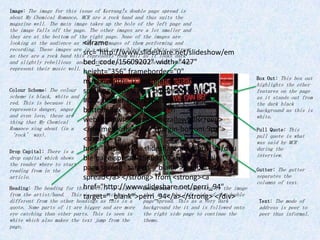
  • 1. Image: The image for this issue of Kerrang!s double page spread is about My Chemical Romance, MCR are a rock band and thus suits the magazine well. The main image takes up the hole of the left page and the image falls off the page. The other images are a lot smaller and they are at the bottom of the right page. None of the images are <iframe looking at the audience as they are images of them performing and recording. These images are in a dark sepia/black and white contrast src="http://www.slideshare.net/slideshow/em as they are a rock band this represents them well as it looks dark and slightly rebellious andbed_code/15609202" width="427" as this is a rock band the dark colours represent their music well. height="356" frameborder="0" Box Out: This box out marginwidth="0" marginheight="0" highlights the other Colour Scheme: The colour scrolling="no" style="border:1px solid features on the page scheme is black, white and as it stands out from red. This is because it #CCC;border-width:1px 1px 0;margin- the dark black represents danger, anger bottom:5px" allowfullscreen background as this is and even love, these are white. thing that My Chemical webkitallowfullscreen mozallowfullscreen> Romance sing about (in a </iframe> <div style="margin-bottom:5px"> Pull Quote: This ‘rock’ way). pull quote is what <strong> <a was said by MCR Drop Capital: There is a href="http://www.slideshare.net/perri_94/dou during the interview. drop capital which shows ble-page-spread-15609202" title="Double the reader where to start reading from in the page spread" target="_blank">Double page Gutter: The gutter article. spread</a> </strong> from <strong><a separates the columns of text. href="http://www.slideshare.net/perri_94" Heading: The heading for this article is a quote Background: The background is the image from the artist/band. This target="_blank">perri_94</a></strong> </div> is eye catching and that is on the left side of the double different from the other headings as this is a page spread. This as a very dark Text: The mode of quote. Some parts of it are bigger and are more background the it and is followed onto address is peer to eye catching than other parts. This is seen in the right side page to continue the peer thus informal. white which also makes the text jump from the theme. page.
  • 2. Heading: The heading of this Image: This is NME double page spread, the image is of Florence double page spread is, ‘USA Welch sat on what looks like a US flag, you can see this because of got the love’, immediately the strips that traditionally represent the flag. She is dressed in you can see the ‘got the all black thus making the only colour on the page come from the red love’ as this is in black stripes which match Florence Welch’s hair, she is directly gazing and is bold compared to the into the audience which engages the audience. other text on the page, if you look closer you can also see the USA in grey in the background, this is also The Lead: This is implied in the image with the leading the stripes. paragraph of the article which is in bold in comparison to the other text. Drop Capital: The drop capital highlights the start of the main article, this is normally in a different Gutter: The gutter font to the other texts. separates the columns of text. Colour Scheme: The colour scheme for this Background: The background colour is a NME double page spread is black and white, grey, slightly lighter than the USA in it has a hint of red that highlight the background. The background is very certain features of the magazine. simple and makes the image pop out and become bold. NME (New Musical Express)
  • 3. Colour Scheme: The colour scheme for this magazine is primarily white and black through the background and Classic Rock text, however there is some colour on the page in the quotes that are a red colour. There is also colour in the box out that highlights the subheading of the box out. Text: The mode of address is peer to peer and very relaxed. Background: The Gutter: The gutter background for this separates the columns of magazine if plain white text. with little features, for example the spade sign that is in a faint grey behind the red quote, Drop Capital: The drop capital highlights each new paragraph start point. Pull Quote: The pull quote is from Steve Image: The image is eye catching as it is the only image that is in Tyler, this engages the colour on the page, this could be because the left hand image is audience as it feels like modern times and the images that are black and white are from the he is speaking to them past. Steve Tyler is dressed like a rock star, looking rebelish with personally. no top, jeans and boots, this is typical for his style and genre. Steve is also making direct gaze with the audience, in the black and white images he looks like he was on stage performing with his band Aerosmith.
  • 4. Image: This image for Q is of Lady Gaga, this image takes up the whole of the left page, the image is in black and white as this could be because she is a colourful character and in order to create Colour Scheme: Q’s colour some kind of normality about her. She is covering her modesty as she scheme is consistent is know for being ‘out of the box’ and being very ‘eccentric’. throughout the magazine and this has created a house style also. Text: This mode of language is peer to peer Drop Capital: This drop as it is an interview capital takes up the whole with Lady Gaga. page, it adds colour to the whole double page spread, this is in red which follows the colour scheme of Q magazine. Gutter: The gutter There are other drop separates the columns capitals on the page, they of text. are a lot smaller than the red ‘L’ and are in black. These are where a new paragraph starts. Background: The background for this Q House style: This is part double page spread is white, the only of the house style as it colour on the page come from the ‘L’, is seen on every page, it the image also has no colour to it contains the Q logo. which makes it work well with the plain white background on the right page. Q