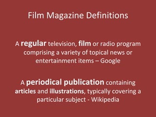
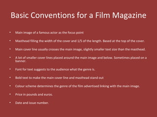
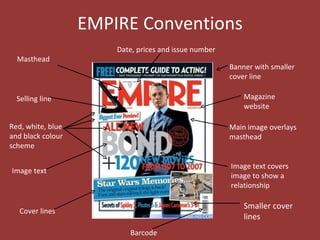
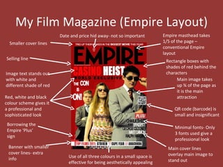
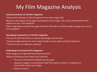
Film Magazine


  In what ways does your media
product use, develop or challenge
  forms and conventions of real
        media products?
Film Magazine Definitions

A regular television, film or radio program
   comprising a variety of topical news or
      entertainment items – Google


  A periodical publication containing
articles and illustrations, typically covering a
         particular subject - Wikipedia
Basic Conventions for a Film Magazine
•   Main image of a famous actor as the focus point

•   Masthead filling the width of the cover and 1/5 of the length. Based at the top of the cover.

•   Main cover line usually crosses the main image, slightly smaller text size than the masthead.

•   A lot of smaller cover lines placed around the main image and below. Sometimes placed on a
    banner.

•   Font for text suggests to the audience what the genre is.

•   Bold text to make the main cover line and masthead stand out

•   Colour scheme determines the genre of the film advertised linking with the main image.

•   Price in pounds and euros.

•   Date and issue number.
EMPIRE Conventions
                       Date, prices and issue number
  Masthead
                                                       Banner with smaller
                                                       cover line

  Selling line                                             Magazine
                                                           website

Red, white, blue                                       Main image overlays
and black colour                                       masthead
scheme

                                                       Image text covers
Image text
                                                       image to show a
                                                       relationship

                                                           Smaller cover
   Cover lines
                                                           lines
                          Barcode
TOTAL FILM Conventions
                       Main image overlays masthead

   Masthead                                            Cover lines

Selling line

                                                      Film website
  Red, grey,
  blue and
  black colour
  scheme
                                                       Smaller Cover
Image text
                                                       lines


Smaller Cover
                                                      Barcode
lines

                     Image text covers image
EMPIRE + TOTAL FILM ANALYSIS
Comparisons
•They both include different the basic conventions and placed similarly on the cover
•Their target markets are between the ages of 16- 30
•Have colour schemes to set the tone of the cover in relation to the main image
•The main image obstructs the view of the magazine title
•Barcode is placed in the corner because it is not a focal point
•Price and date is small as it is insignificant

Contrasts
•Empire tends to be more clustered rather than the more sophisticated look which Total
Film has
•Total Film’s title is very bold aiming to grab the audience’s attention, Empire’s is skinner
but sharper
•The structure for Total Film’s magazines are predominately centred
•Empire’s structure is placed in no chronological order
•Empire includes extra images for different stories, however Total Film sticks to one image
(main image)
My Film Magazine (Empire Layout)
                         Date and price hid away- not so important          Empire masthead takes
  Smaller cover lines                                                       1/5 of the page –
                                                                            conventional Empire
                                                                            layout
Selling line                                                                 Rectangle boxes with
                                                                             shades of red behind the
Image text stands out                                                        characters
with white and                                                                    Main image takes
different shade of red                                                            up ¾ of the page as
                                                                                  it is the main
Red, white and black                                                              attraction
colour scheme gives it
a professional and                                                               QR code (barcode) is
sophisticated look                                                               small and insignificant
 Borrowing the
                                                                                 Minimal fonts- Only
 Empire ‘Plus’
                                                                                 3 fonts used give a
 sign
                                                                                 professional look
 Banner with smaller                                                          Main cover lines
 cover lines- extra                                                           overlay main image to
 info                        Use of all three colours in a small space is
                             effective for being aesthetically appealing      stand out
My Film Magazine Analysis
Using Conventions of real film magazines
•Using colour schemes to show the genre of the main image’s film
•Banner at the bottom of the page overlaying the main image. This is extra information for the
audience to see – less important
•Main image takes up half of the page whilst the title takes up a fifth usually crossing over such as
in my magazine

Developing Conventions of real film magazines
•The use of a QR code which is a recent technology improvement
•Using rectangles behind my main image to help my Lewis, Beau and Scott stand out
•‘The Con Is On’ is in different sized font

Challenging Conventional Film Magazines
•Main image at an angle with text placed around it
•Mixture of features from Empire and Total film
     – The use of the Empire masthead and plus sign
     – Using one image is a conventional Total Film style as it wants it’s audience to
        concentrate on the main image.
     – Empire structure

Magazine

  • 1.
    Film Magazine In what ways does your media product use, develop or challenge forms and conventions of real media products?
  • 2.
    Film Magazine Definitions Aregular television, film or radio program comprising a variety of topical news or entertainment items – Google A periodical publication containing articles and illustrations, typically covering a particular subject - Wikipedia
  • 3.
    Basic Conventions fora Film Magazine • Main image of a famous actor as the focus point • Masthead filling the width of the cover and 1/5 of the length. Based at the top of the cover. • Main cover line usually crosses the main image, slightly smaller text size than the masthead. • A lot of smaller cover lines placed around the main image and below. Sometimes placed on a banner. • Font for text suggests to the audience what the genre is. • Bold text to make the main cover line and masthead stand out • Colour scheme determines the genre of the film advertised linking with the main image. • Price in pounds and euros. • Date and issue number.
  • 4.
    EMPIRE Conventions Date, prices and issue number Masthead Banner with smaller cover line Selling line Magazine website Red, white, blue Main image overlays and black colour masthead scheme Image text covers Image text image to show a relationship Smaller cover Cover lines lines Barcode
  • 5.
    TOTAL FILM Conventions Main image overlays masthead Masthead Cover lines Selling line Film website Red, grey, blue and black colour scheme Smaller Cover Image text lines Smaller Cover Barcode lines Image text covers image
  • 6.
    EMPIRE + TOTALFILM ANALYSIS Comparisons •They both include different the basic conventions and placed similarly on the cover •Their target markets are between the ages of 16- 30 •Have colour schemes to set the tone of the cover in relation to the main image •The main image obstructs the view of the magazine title •Barcode is placed in the corner because it is not a focal point •Price and date is small as it is insignificant Contrasts •Empire tends to be more clustered rather than the more sophisticated look which Total Film has •Total Film’s title is very bold aiming to grab the audience’s attention, Empire’s is skinner but sharper •The structure for Total Film’s magazines are predominately centred •Empire’s structure is placed in no chronological order •Empire includes extra images for different stories, however Total Film sticks to one image (main image)
  • 7.
    My Film Magazine(Empire Layout) Date and price hid away- not so important Empire masthead takes Smaller cover lines 1/5 of the page – conventional Empire layout Selling line Rectangle boxes with shades of red behind the Image text stands out characters with white and Main image takes different shade of red up ¾ of the page as it is the main Red, white and black attraction colour scheme gives it a professional and QR code (barcode) is sophisticated look small and insignificant Borrowing the Minimal fonts- Only Empire ‘Plus’ 3 fonts used give a sign professional look Banner with smaller Main cover lines cover lines- extra overlay main image to info Use of all three colours in a small space is effective for being aesthetically appealing stand out
  • 8.
    My Film MagazineAnalysis Using Conventions of real film magazines •Using colour schemes to show the genre of the main image’s film •Banner at the bottom of the page overlaying the main image. This is extra information for the audience to see – less important •Main image takes up half of the page whilst the title takes up a fifth usually crossing over such as in my magazine Developing Conventions of real film magazines •The use of a QR code which is a recent technology improvement •Using rectangles behind my main image to help my Lewis, Beau and Scott stand out •‘The Con Is On’ is in different sized font Challenging Conventional Film Magazines •Main image at an angle with text placed around it •Mixture of features from Empire and Total film – The use of the Empire masthead and plus sign – Using one image is a conventional Total Film style as it wants it’s audience to concentrate on the main image. – Empire structure