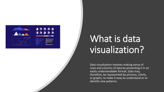
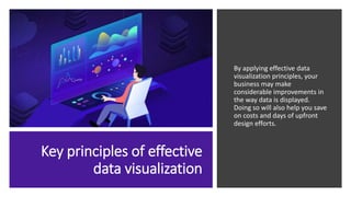
7 Key Principles of
Effective Data
Visualization
What is data
visualization?
Data visualization involves making sense of
rows and columns of data by presenting it in an
easily understandable format. Data may,
therefore, be represented by pictures, charts,
or graphs, to make it easy-to-understand or to
identify new patterns.
Key principles of effective
data visualization
By applying effective data
visualization principles, your
business may make
considerable improvements in
the way data is displayed.
Doing so will also help you save
on costs and days of upfront
design efforts.
Determine the
best visual
To begin with, it is imperative to understand the
volume of data in hand. You may then identify
the aspects that you wish to visualize along
with the information that you wish to convey.
After this, you may select the best-suited and
simplest visual format for your target audience.
Balance the
design
This refers to equally distributed visual
elements across the plot such as texture, color,
shape, and negative space. You may select the
visual to be symmetrical, asymmetrical or
radial, and figure out the right balance of
elements that work best for visualizing your
data.
Focus on the
key areas
Ensure that the key areas are well- highlighted.
You may place key data points towards the top-
left corner as a user’s attention is generally
drawn towards that quadrant.
Keep it simple
Keep in mind that the ultimate goal of data
visualization is simplicity. You may build
additional visuals if you wish to convey a
multi-faceted story.
Incorporate
interactivity
You may deploy data visualization tools that infuse
interactivity into your graphs or charts. However,
ensure that this does not confuse the target
audience since the main purpose is to clarify
doubts or queries.
Use patterns
You may display similar types of
information as one with the help of
patterns. You may establish a pattern
by using similar chart types, colors,
or any other element.
Compare
aspects
You may display a side-by-side comparison of
aspects to make understanding of data easier.
You may also align data either horizontally or
vertically so that it can be compared accurately.
Conclusion
It is necessary to apply
effective data
visualization principles to
improve the way data is
displayed to your target
audience. Some of the
key aspects of effective
data visualization include
determining the best
visual, balancing the
design, focusing on key
areas, keeping the visuals
simple, using patterns,
comparing parameters,
and creating interactivity.

7 key principles of effective data visualization

  • 1.
    7 Key Principlesof Effective Data Visualization
  • 2.
    What is data visualization? Datavisualization involves making sense of rows and columns of data by presenting it in an easily understandable format. Data may, therefore, be represented by pictures, charts, or graphs, to make it easy-to-understand or to identify new patterns.
  • 3.
    Key principles ofeffective data visualization By applying effective data visualization principles, your business may make considerable improvements in the way data is displayed. Doing so will also help you save on costs and days of upfront design efforts.
  • 4.
    Determine the best visual Tobegin with, it is imperative to understand the volume of data in hand. You may then identify the aspects that you wish to visualize along with the information that you wish to convey. After this, you may select the best-suited and simplest visual format for your target audience.
  • 5.
    Balance the design This refersto equally distributed visual elements across the plot such as texture, color, shape, and negative space. You may select the visual to be symmetrical, asymmetrical or radial, and figure out the right balance of elements that work best for visualizing your data.
  • 6.
    Focus on the keyareas Ensure that the key areas are well- highlighted. You may place key data points towards the top- left corner as a user’s attention is generally drawn towards that quadrant.
  • 7.
    Keep it simple Keepin mind that the ultimate goal of data visualization is simplicity. You may build additional visuals if you wish to convey a multi-faceted story.
  • 8.
    Incorporate interactivity You may deploydata visualization tools that infuse interactivity into your graphs or charts. However, ensure that this does not confuse the target audience since the main purpose is to clarify doubts or queries.
  • 9.
    Use patterns You maydisplay similar types of information as one with the help of patterns. You may establish a pattern by using similar chart types, colors, or any other element.
  • 10.
    Compare aspects You may displaya side-by-side comparison of aspects to make understanding of data easier. You may also align data either horizontally or vertically so that it can be compared accurately.
  • 11.
    Conclusion It is necessaryto apply effective data visualization principles to improve the way data is displayed to your target audience. Some of the key aspects of effective data visualization include determining the best visual, balancing the design, focusing on key areas, keeping the visuals simple, using patterns, comparing parameters, and creating interactivity.