The document summarizes Ryan Craft's evaluation of an FMP (Final Major Project) magazine production. Some key points:
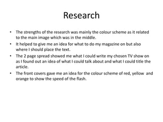
- Research helped with color scheme, placement of text, and story ideas.
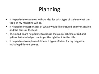
- Planning aided in developing the magazine style/topic and choosing images, fonts, and a red/yellow color scheme.
- Time management was generally good but some elements like the experiment and front cover felt rushed.
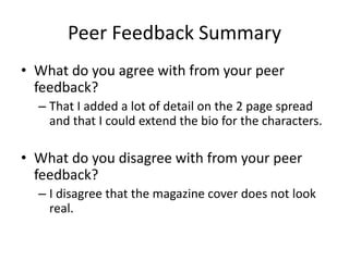
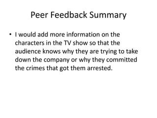
- Peer feedback noted detail in the 2-page spread, extending character bios could improve it, and the magazine cover design was creative though some felt it didn't look "real."