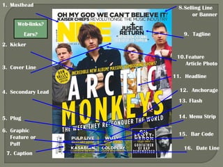
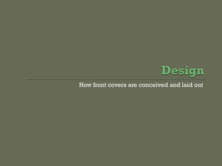
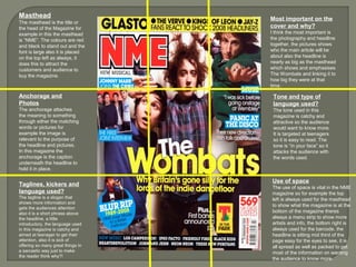
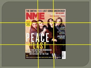
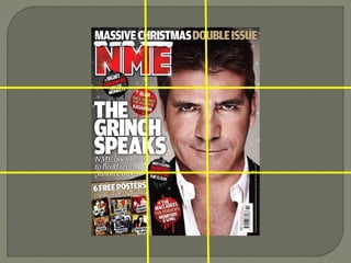
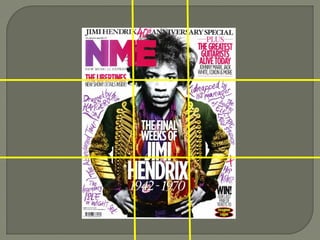
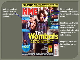
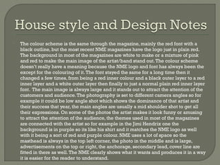
The document discusses how magazine front covers are designed and laid out. It explains that the masthead is prominently displayed in large font at the top left to identify the magazine. The main headline and large central image work together to convey the key article being featured. Additional elements like taglines and anchorage help provide context and meaning. Color schemes, font styles and photo angles are deliberately chosen to attract readers' attention and match the tone of the magazine, which aims to be lively and catch the interest of teenage audiences. Careful use of space throughout the cover effectively presents important information to readers.
Hadj Ounis's most notable work is his sculpture titled "Metamorphosis." This piece showcases Ounis's mastery of form and texture, as he seamlessly combines metal and wood to create a dynamic and visually striking composition. The juxtaposition of the two materials creates a sense of tension and harmony, inviting viewers to contemplate the relationship between nature and industry.
2137ad - Characters that live in Merindol and are at the center of main storiesluforfor
Kurgan is a russian expatriate that is secretly in love with Sonia Contado. Henry is a british soldier that took refuge in Merindol Colony in 2137ad. He is the lover of Sonia Contado.
2137ad Merindol Colony Interiors where refugee try to build a seemengly norm...luforfor
This are the interiors of the Merindol Colony in 2137ad after the Climate Change Collapse and the Apocalipse Wars. Merindol is a small Colony in the Italian Alps where there are around 4000 humans. The Colony values mainly around meritocracy and selection by effort.
Explore the multifaceted world of Muntadher Saleh, an Iraqi polymath renowned for his expertise in visual art, writing, design, and pharmacy. This SlideShare delves into his innovative contributions across various disciplines, showcasing his unique ability to blend traditional themes with modern aesthetics. Learn about his impactful artworks, thought-provoking literary pieces, and his vision as a Neo-Pop artist dedicated to raising awareness about Iraq's cultural heritage. Discover why Muntadher Saleh is celebrated as "The Last Polymath" and how his multidisciplinary talents continue to inspire and influence.
3. 1. Masthead
8. Selling Line
or Banner
Web-links?
Ears?
9. Tagline
2. Kicker
3. Cover Line
10. Feature
Article Photo
11. Headline
4. Secondary Lead
12. Anchorage
13. Flash
5. Plug
6. Graphic
Feature or
Puff
7. Caption
14. Menu Strip
15. Bar Code
16. Date Line
4.
e.g.
Connotations of the Masthead
What meaning is added with the
interaction between anchorage and
photos
What lifestyles are hinted at in taglines,
kickers and use of language in general
What is regarded as most important on
the cover and why you think this is
What tone / type of language is used
5.
The masthead is displayed as the biggest writing on the page to show inspiration and
popularity, the masthead is mainly placed on the top left, right or in the middle top half. The
NME masthead is always on the top left and in a different colour each time but mostly red. The
masthead is the title or the head of the Magazine for example in this PowerPoint the masthead
is “NME”. The colours are red and black to stand out and the font is large also it is placed on
the top left as always, it does this to attract the customers and audience to buy the magazine.
The anchorage attaches the meaning to something through either the matching words or
pictures for example the image is relevant to the purpose of the headline and pictures. In this
magazine the anchorage is the caption underneath the headline to hold it in place. The tagline
is a slogan that shows more information and gets the audiences attention also it is a short
phrase above the headline, a little introductory, the language used in this magazine is catchy
and aimed at teenager to get their attention, also it is sick of offering so many great things in a
sarcastic way just to make the reader think why?! I think the most important thing on a
magazine is the photography and headline together, the pictures shows who the main article
will be about also the headline is nearly as big as the masthead which shows and emphasises
the main band e.g. The Wombats and linking it to how big they were at that time. The tone used
in this magazine is catchy and attractive so the audience would want to know more. It is
targeted at teenagers so it is easy to read. The tone is “in your face” so it attacks the audience
with the words used. The use of space is vital in the NME magazine so for example the top left
is always used for the masthead to show what the magazine is at the bottom of the magazine
there’s always a menu strip to show more artists and info, the bottom right is always used for
the barcode, the headline is sitting mid third of the page easy for the eyes to see, it is all spread
as well as packed to get most of the information on wanting the audience to know more.
7. Masthead
The masthead is the title or
the head of the Magazine for
example in this the masthead
is “NME”. The colours are red
and black to stand out and the
font is large also it is placed
on the top left as always, it
does this to attract the
customers and audience to
buy the magazine.
Anchorage and
Photos
The anchorage attaches
the meaning to something
through either the matching
words or pictures for
example the image is
relevant to the purpose of
the headline and pictures.
In this magazine the
anchorage is the caption
underneath the headline to
hold it in place.
Taglines, kickers and
language used?
The tagline is a slogan that
shows more information and
gets the audiences attention
also it is a short phrase above
the headline, a little
introductory, the language used
in this magazine is catchy and
aimed at teenager to get their
attention, also it is sick of
offering so many great things in
a sarcastic way just to make
the reader think why?!
Most important on the
cover and why?
I think the most important is
the photography and headline
together, the pictures shows
who the main article will be
about also the headline is
nearly as big as the masthead
which shows and emphasises
The Wombats and linking it to
how big they were at that
time.
Tone and type of
language used?
The tone used in this
magazine is catchy and
attractive so the audience
would want to know more.
It is targeted at teenagers
so it is easy to read. The
tone is “in your face” so it
attacks the audience with
the words used.
Use of space
The use of space is vital in the NME
magazine so for example the top
left is always used for the masthead
to show what the magazine is at the
bottom of the magazine theres
always a menu strip to show more
artists and info, the bottom right is
always used for the barcode, the
headline is sitting mid third of the
page easy for the eyes to see, it is
all spread as well as packed to get
most of the information on wanting
the audience to know more.
8.
9.
10.
11. Indirect mode of
address can be
mysterious, lively,
sombre…
Direct mode of
address can appear
‘in yer face’, serious,
warm…
Creates a wacky, fun
image, sharing an
identity with the
reader that offers the
‘independence’ of
indie music.
Enigma – what are
they getting up to
now?
12.
The colour scheme is the same through the magazine, mainly the red font with a
black outline, but the most recent NME magazines have the logo just in plain red.
The background in most of the magazines are white to make or a mixture of pink
and red to make the main image of the artist/band stand out. The colour scheme
doesn’t really have a meaning because the NME logo and font has always been the
except for the colouring of it. The font stayed the same for a long time then it
changed a few times, from being a red inner colour and a black outer layer to a red
inner layer and a white outer layer then finally to just a normal plain red inner layer
font. The main image is always large and it stands out to attract the attention of the
customers and audience. The photography is set to different camera angles so for
example it could be low angle shot which shows the dominance of that artist and
their success that year, the main angles are usually a mid shoulder shot to get all
their expressions. On some of the photos the artist makes it look funny or amusing
to attract the attention of the audience, the themes used in most of the magazines
are connected with the artist so for example in the Jimi Hendrix one the
background is in purple so its like his shirt and it matches the NME logo as well
with it being a sort of red and purple colour. NME uses a lot of space so the
masthead is always in the top left corner, the photo in the middle and is large,
advertisements on the top or right, the anchorage, secondary lead, cover line are
fitted in there as well. The NME clearly shows what it wants and produces it in a way
it is easier for the reader to understand.