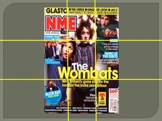
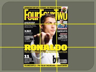
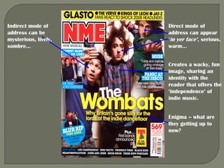
The document describes the typical layout and design conventions of magazine covers. It notes that covers often use a grid system for placement of elements like photos, headlines, and text. For example, magazines with single person photos often place the eye line at the top third of the cover. Headlines usually appear in the lower third. Text is often placed in the left third which is most visible on store shelves. Consistent use of fonts, colors, imagery style and grid placement help create a recognizable brand identity and make important information easily scannable for readers.